
Composition is one of the trickiest and subtlest aspects of photography and is often one of the last things photographers master. If that is something you personally struggle with, you should try this simple change in thinking to make more powerful and compelling images.
Composition is something most of us will continue to work on our entire lives. It is neither simple or possible to objectively codify it in a complete manner, and for every tip or guideline, there is an exception that shows it is not a hard and fast rule. I have spent years playing with different methods of composition, relying on intuition, and more, but one way of thinking has made a bigger difference than any of those heuristics.
The Way Most of Us Work
Most of us, particularly those newer to photography, think of composition in an additive manner. This means that we approach an image as a blank frame into which we add elements in order to create a compelling and complete visual experience.
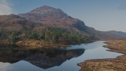
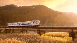
The above were examples of an additive approach. In other words, I kept including more and more elements in the frame until I got something with which I was satisfied. That works fine in some cases, but it can go awry rather quickly. I am sure it has happened to you before: you add one element and it throws the image out of balance. So, you add another, and the balance tips too far in the other direction. And so on. Soon, the image is a jumbled mess that is just too much for the viewer to follow from a narrative perspective, and it feels difficult or almost impossible to fix. It is like a chef adding more and more different seasonings to a dish until the taste is too overwhelming and confused to save the meal.
You can see an example where such an approach went awry above. The layers are well intentioned, but there are too many of them, and the way they work in tandem with the leading lines is confusing. The coastline leads toward the skyline, but it is too far away and too small in the frame to be the payoff. This is because each layer is itself visually interesting — the water and beach, the grass park, the marina, then the city — and without an obviously prominent subject, it is not clear what the eye should be drawn to as a resting place in the photo. The solution here would be either to use less layers or to back up and use a longer focal length to compress them and make the payoff of the skyline relatively bigger.
Subtractive Composition
So, how can we avoid this pitfall and make less work for ourselves in the process? Stop asking what we can add to the frame and start asking what we can remove instead. Think of your favorite images, those that are the most compelling. Often, they have relatively simple compositions in which nothing is extraneous whatsoever. Everything that is in the frame is crucial to its balance and success, and without any single element, the image falls apart. The photographer has reduced the photo to literally its bare essentials.
Working in the same manner can help you improve your images and make your workflow far more efficient, as you are not trying to constantly balance a seemingly never-ending succession of competing elements.
I started flying out over Lake Erie a lot more because the relatively monotonous water prevented me from getting too complicated with my compositions. In the shot above, I initially defaulted to a composition from the other side, with the city skyline in the background. It would have been a fine shot — a sun-kissed skyline in the background as a sailboat lazily floats across the foreground. But that's a relatively busy shot and sort of undermines the casual summer mood I wanted to evoke. So, I turned around and shot away from the city, lining up the sunlight over the water as a simple spotlight on the sailboat. All I needed then was a sliver of coastline on the left to balance the frame. I think it is more visually interesting than my initial impulse and better conveys the simple mood I wanted to evoke.
In the photo above, I realized that I did not need to surrounding busy skyline; just a single building and a splash of light and color in the sky gave the needed contrast and balance.
In the image above, I realized the deep red of the boat contrasted beautifully with the blue and yellow of the water and the sky, and I only needed the breakwall to frame it.
Pitfalls and a Final Note
Any method can go wrong, and subtractive composition is no different. Here, the danger is going too minimal, to the point that you lose visual interest. You still need to have something compelling: the subject, the geometry of the photos, etc. to create a successful image. The idea here is to identify what that compelling element is, then get rid of anything that distracts from it.
One last note: though I have used landscape images as examples here, the principle applies to pretty much any genre. Whatever the genre, identify what it is makes the photo interesting, then remove anything that does not support that.


9 Comments
There is a relation between the way words naturally fall into place for a poet, and how visual qualities like spatial relations, tonal values, and subject relations are perceived by a photographer, as they both come from the same intuitive faculty, driven by a need for narrative or abstraction..
There is a circular relation between these two faculties, if you practice both.
Great article, Alex. Intuitively approaches seem to work best for me. Adding, subtracting, changing the POV, straight or oblique. So many choices. But when the composition clicks, click the shutter. It gets even more complicated when the subject is a person and pose with lighting gets into the mix.
So this brings up the question:
Is it more important to master composition of lighting first?
What do you mean by "composition of lighting"?
I understand what lighting is and how it can be used in many different ways to determine the look and feel of a photo.
And I understand what composition is, and how compositional decisions can be used to determine the look of an image.
But the composition OF lighting? What do you mean when you say that? I have never heard that phrase before.
deleted
I most often do the basic, more minimalist "subtractive" composition that you recommend.
But I feel that my work, as a whole, is rather shallow because I am not incorporating a lot of things into my compositions and figuring out how to get them all working together in a beautiful, cohesive manner.
I think that in order for me to produce work that is truly world class in my genre, that I need to work harder at using the additive approach. The real masters - the world's most successful wildlife photographers - create "additive" compositions that are truly spectacular because there is a lot going on, yet all of the things in the image are cohesive and work together to create a beautiful, yet complex, aesthetic.
I mean, if you're a wildlife photographer and you want a high-end corporation to use one of your images for a huge 12 foot by 8 foot mural in their corporate headquarters, then they're never going to choose something that is just a clean, minimalist widlife portrait. They are going to want something with several layers of complexity, with multiple animals and spectacular scenery, all showcased perfectly in one frame.
But for now I just keep taking the subtractive type images, because I am not skilled or talented enough to focus on the additive masterpieces that I really want to be creating.
Hey Tom, here's a thought, from an admitted amateur who is drawn to more minimalist images. I have always been captivated by the photos of David Yarrow and Tony Stromberg. Yarrow is quite famous. Stromberg maybe not so much. Most of his photos are of horses. They both generally have uncluttered compositions in terms of background but their photos have so much depth and a dynamic sense of motion. Reading your comment made me think about what makes their images so compelling to me. In both cases, their point of view and lighting are not what I would have ever thought to use. Yarrow's use of perspective is sublime (and reading his posts about how he captures his images, quite challenging and even dangerous). Check out his photo titled, "Black Cat". Not much different of a composition than what most would do, but his use of light accentuates the sharpness of the cat's concentration. I could easily see that as a mural at a company headquarters.
Stromberg uses light to isolate and minimize the composition, and in many cases, he breaks the rules that we are constantly taught. Some of his most haunting images are in "harsh" light, which creates dramatic absences in his photos, and his point-of-view takes advantage of the contrast to suppress background. Also, one of my favorite of his images is a close-up of a horse's eye. A seemingly very simple composition, but it tells such a beautiful, subtle story by reducing a complex creature to its most elemental part without any loss of the regal nature of the subject.
I suspect you take the minimalist approach because it is what emotionally appeals to you. Instead of fighting that by trying to add complexity outside of the subject, would it feel more natural to you to try to add more complexity to the subject by other techniques, a la Yarrow and Stromberg? DeBussey wrote beautiful music, but had he tried to compose with the complexity of Mozart or Bach, I imagine his music would not have the emotional drama for which he is known.
I will have to check out the compositions of Yarrow and Stromberg.
As far as me trying to add complexity to the subject via lighting or whatever, do keep in mind that I photograph wild animals, most of which are quite scared of humans and will barely tolerate my presence for a moment or so.
My subject matter also means that I am photographing out in the wilderness, where there is no source of power and the only things I can have with me are those which I carry in myself. So it's not like I can go setting up lighting or anything like that.
And it's not like I can even go walking around the subjects, looking for different ways to compose a scene by lining them up with different backgrounds and so forth. Photographing animals in the wilderness just doesn't work like that. I usually get one chance to approach and rip off a shot or two before they run off or duck into heavy cover. Often times, I don't even get that much of a chance ..... they usually run off before I get anywhere near photo range.
I certainly understand where you're coming from. I like minimalist wildlife shots, so don't give up. I'm rooting for you!