
Black and white conversion can be a complicated ordeal, and you can find yourself down a deep rabbit hole of theory if you're not careful. There are times where that kind of in-depth analysis is critical to a perfect image, but sometimes you just need a quick fix. That's where this tip comes in.
The first time I thought critically about black and white conversion was at Photoshop World in 2010. Nikon Ambassador Vincent Versace had an entire class dedicated to converting and printing black and white images, and it was intense. He's since released a similar hour-long video on YouTube on the same topic if you want to look under the hood at a master's workflow.
For the more fast-paced studio, a quick approximation is often a more practical approach, at least to get started. This is my favorite method of converting, and while it's not perfect for every image (no single technique is), it's saved countless hours over the past few years.
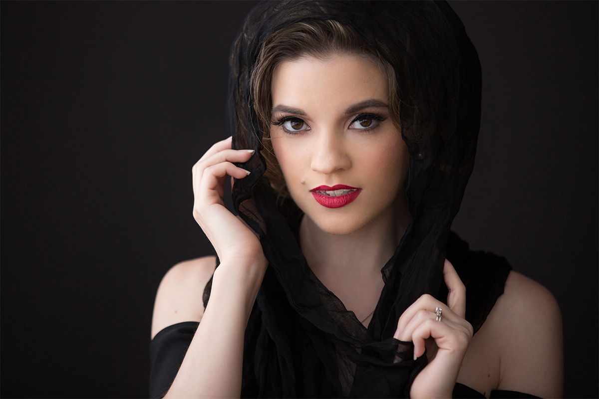
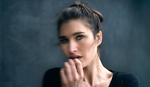
Here is the image we'll be working from (note: I always do my retouching in color before converting to black and white).
Don't Just Desaturate
Before we dive in, I have to briefly mention my biggest pet peeve in monochrome conversion: desaturation. It's almost never the best method, it makes images look muddy and flat, and it takes more time than the method I'm about to show you. This is that same image with the saturation dropped to 0%.

It looks like a bad photocopy. Muddy skin tones are the first sign of a bad conversion.
We can do better without taking any more time!
The Gradient Map
The gradient map adjustment layer is a robust tool for color grading and correction, but it's also my favorite method to create a rich black and white. It takes your foreground and background colors and maps each pixel of the image to it's relative value between those two colors. If you have blue as your foreground and red as your background, your shadows will go blue, your highlights will go red, and your midtones will fall on the continuum in between.
This method requires one keystroke and one click. First, set your foreground and background colors to their default (pure black and pure white) by pressing the D key.

You can also click the little mini swatch icon above the foreground and background swatches, but that would make this a two-click tip, and I'm a man of my word. When I say one click, I mean it.
Next, jump over to your Adjustments panel and click the little gradient icon to create a Gradient Map layer.

That's it. The result is dramatically better than simple desaturation! The shadow tones are rich and dark, the highlights are bright and punchy, and the dynamic range of the overall image is as wide as the original. Even better, this method protects your shadows from going too black and your highlights from getting too bright since it isn't modifying them at all. That means you'll retain detail in both areas exactly as they are in your original image.

Much better.
Beyond Portraits
I'll be honest, I didn't hand pick this sample image because it is tailor-made for this processing method. I just grabbed the first image I saw that I thought would be interesting. It works beautifully on a wide range of images from portraits to landscapes.
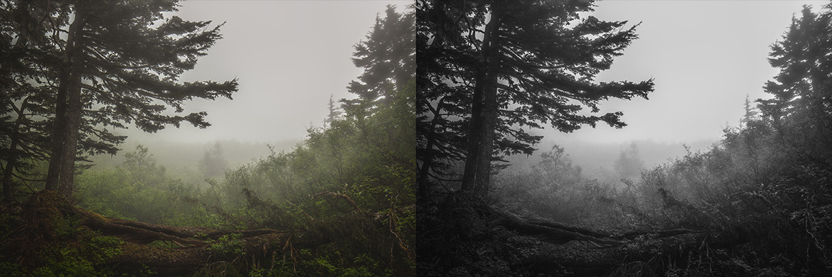
This shot from Juneau, Alaska last summer converts beautifully with no additional effort.

Rich dark tones and bright whites without clipping either one.

Taking It Further
This is by no means the be all and end all solution for all black and white converting. Even in the samples above, I would probably revisit them with some additional dodging and burning or a curves adjustment layer to get them exactly how I want them. Still, I haven't found another method yet that gets me a better starting point than the simple gradient map.
Try it on your own images and post the results in the comments! Just please don't show your clients every image in color and black and white. That's an article for another time.


To be honest, it's difficult to tell the difference between the desaturation method and the gradient map method. Perhaps you can create one of those dual images where you can move a slider back and forth between the results?
That's a good idea. In the meantime, the difference in "punch" in the face - especially the lips - is pretty defined (assuming you're on a somewhat calibrated monitor/screen).
I just got a new computer and haven't calibrated the monitor yet. :-(
You could have done that with the lips using Photoshop BW adjustment and sliding the reds down.
Sure could, but that’s two clicks! ;) And adjusting reds globally has a tendency to affect skin tones. I’m not saying this is a silver bullet method (was that not clear?), I’m saying it’s a solid starting point and produces pretty good results very quickly. It’s Photoshop...there are a thousand ways to do anything.
I don't mean to disparage your method, but I still like nik Silver Effects. There's also an older version of DxO Film Pack. They're now available free.
I'm also a big fan of Nik Silver Effects! When I have time to really dive in deep, that's usually where I start (and I believe I started using it after Vincent Versace's talk - he was a big advocate of that plug-in back then).
Thanks, never even knew about this option!
save both b&w images to your computer. toggle between the two. gradient one works quite well for skin and lips. hair, which is already quite dark, gets more crushed in gradient version. and model's top, right arm section, becomes black/flat. so, maybe not that useful as is. perhaps needs targeted adjustments using masks.
Don't like the gradient map for b/w conversion, because you don't have enough control of your "colors".
Usually use the channel mixer, it gives you you way more control for the b/w conversion.
Basically what you're doing is setting the black and white points and linearize everything in between. I's an oversimplified workflow that doesn't take the content into account. Some like those over-the-top contrasty images, but a lot of detail is lost both in zones II and III, and XIII and IX. Using the channel mixer and/or curves is a much better method to get rich B&W images that respect the tonal content.
Actually, no detail is lost. That's the beauty of the gradient map. It does not introduce contrast, it works on the same values that already exist in the image.
Thanks, Aaron. It indeed creates a great starting point for a lot of images! Personally, I'm amazed at the difference between desaturation and your technique. Dare I say, brilliant!
After I click gradient map my image turned very white and over exposed. What am I missing?
Did you switch to your default colors first with black as your foreground and white as your background colors? If not, you can get all kinds of interesting results depending on what colors you're working with.
The thing I did is to move the color image from LR to PS then I clicked gradient icon per your instruction. Sorry for naive question but what else do I need to do? How do I do to make black as my foreground and so on?
I do not know how it happened but my foreground color is gray. Can you tell me how to make it black?
Press the “D” key on your keyboard, or click the little black and white squares above your foreground/background color swatches in your tool palette. There’s a graphic for it in the article :) Hope that helps!
Thank you, thank you.
Why not simply Lightroom b&w conversion and then adjusting for each colour with the b&w mix tool ?
Two reasons for me. 1) Like I said in the article, I much prefer to retouch in color before converting to black and white, and going back in to LR would disrupt my workflow, and 2) this is a quick, one-click tip; when I write an article on in-depth black and white conversion, adjusting from color tones will be a part of it. This is not that.
Looking at Before and After this is my new starting point for conversion. I see a huge difference. Thanks Aaron!