
We spend years at school learning to read and write text: the meanings of words, what happens when you put them together, how to make yourself more easily understood, methods for convincing others of your point of view, etc. But for many of us, images and visual language are left for us to work out for ourselves. If a picture is worth a thousand words, why do we neglect visual language so much?
When Tools Become Rules
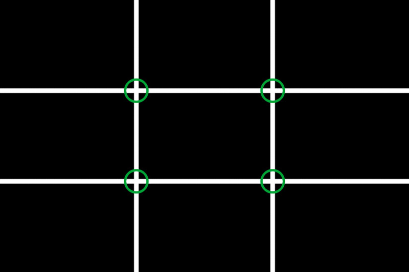
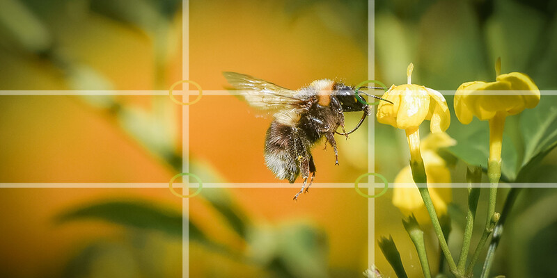
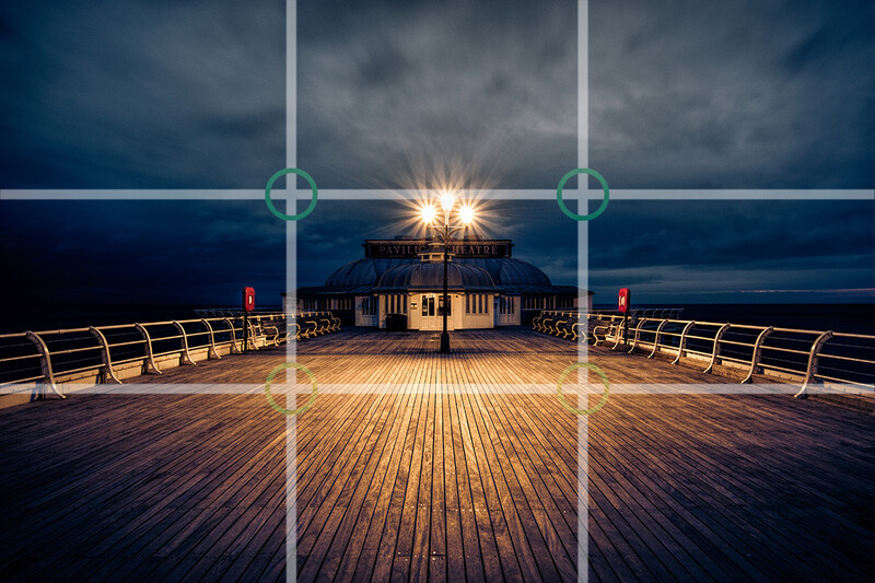
When I started to take my photography more seriously and wanted to learn more about creating images, I joined a local photography club. From many of the conversations there, you’d be forgiven for thinking that the whole topic of composition can be summed up in three words: “rule of thirds.” If you didn’t align something with the vertical and horizontal thirds of the frame, then there was something wrong with your photo. Now, the rule of thirds can, of course, function as a design tool, but it is far from being the only tool in the box and you don’t build a house with just a hammer. This potentially helpful tool had become a “rule” that was used to judge everything and in such a way that it limited creativity. And I didn’t want to be constrained by a load of ROT.
Moving Beyond The Rule of Thirds
If you look at a lot of digital photographers’ images, then you will see many that are composed according to the ROT, which appears to validate the idea. However, look beyond this to images by the great painters of the past, for example, and you will see that the simple grid doesn’t always fit. Other methods have been used to arrange the items within the frame. In some cases, this might be some form of symmetry. In others, it might be based on the Golden Ratio. Still others may be more concerned about the relationships between the various people and items within the image, using “lines of coincidence” or other devices to guide the viewer.
Each era may have its trends. The Ancient Greeks may have liked a more mathematical approach to beauty for their art and architecture, for example. But that doesn’t mean that everyone else has to follow their methods for every building they design. Words can go in and out of fashion. If someone says “cool” a lot or “amazing,” then that might make you think they belong to a particular generation or culture. Neither is right nor wrong. They are options open to us if we want to identify with a community of people and communicate a message.
Who Should You Listen To?
This understanding of communities sharing a trend or similar mindset can help us evaluate comments we might get in response to our images. We don’t want to close ourselves off to constructive feedback that could help us grow. But, we can choose not to listen to those that are trying to put us into a box we don’t want to be in. Perhaps some say your landscapes aren’t realistic enough. But, are you trying to create a realistic picture? If so, then their comments may lead you along the right path. If, on the other hand, you are more interested in conveying a mood and an artistic impression, then why would the potential lack of “realism” bother you? Maybe critique from someone in more of a fine art camp would be more useful. We can choose which communities we listen to and why.
As well as being affected by trends and communities’ preferences, composition is fundamentally about communication. So, I suggest we think more about questions such as: who do we want to communicate with? What do we want the image to say or do? How can I get my message across more clearly? These questions can help guide our thoughts about what we include within the frame.

All Images Communicate Something
You might think this is all very well for someone working in commercial photography trying to create images that persuade people to buy things, but what about someone on their holiday taking a picture? The two actually have a lot in common. When we take a holiday snap, we are creating pictures with purpose. That might be to reignite our memory of the experience at a later date. It could be to show scenery to others so they can see what they were missing. We don’t need a paying audience for there to be an audience. We might ourselves be the only ones viewing the images later, but that doesn’t mean that composition doesn’t matter. The experience of the viewer can be enhanced by taking time to compose an image that fulfills its purpose.
Do you want to show how open the countryside was and how it made you feel free? Then it is probably not a good idea to have a big fence running across the foreground, as it cuts the viewer off and changes the mood. Do you want to show how big a building was? Maybe find some way of introducing something into the image that gives a strong sense of scale. Do you want to show how happy your partner was and how good they looked that day? Make them clearly the focus of the image and prominent within the frame with an appropriate expression so we can see that.
Every image communicates something. Some do so clearly, others less obviously. Composition is what we can use to help influence what the viewer receives. For an advertising image, this might mean that it takes days of analysis, planning, and editing to get the image just right (and even then, it doesn’t always work like you hoped). Regardless of the target audience, our photos can benefit from taking a little more time to present the message more clearly. To do this, we also need to be aware of what visual cues there are that can impact an image and cause it to be more or less successful.
Our response to an image can be swayed by many different factors. I see it as my job as a photographer to keep learning more about those elements so that I can make it easier for people to see the message within the images I create. This includes the emotional impact of colors, body language, and lighting, for example. Associations with other items or props can be powerful too. A good place to start is by looking at images that share similarities with what you are trying to do. So, if you were trying to create an image with a Halloween feel, then maybe you’d look at some posters from horror movies to get an idea for the kind of lighting and styling that gives that effect. Combine enough of these cultural symbols in the image and it will more quickly be recognized for what you intend.
Do Different Or Follow The Crowd?
Sometimes, we might want to challenge the status quo and say something different or even provocative to make a point. By deliberately going against cultural norms, we can make statements about our own views, giving us a distinct voice. However, being different can, of course, be dangerous! I forget how many times I was told something was wrong for not following the rule of thirds. You may have to anticipate others saying your lighting or posing is wrong. Maybe it is if you want to say the same as everyone else. But, what are you saying?
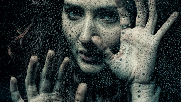
All images by Joe Lenton.


Join the Fstoppers community for free
-
Post comments and join in the discussions
-
Browse the site ad-free
-
Share your work and get featured in the community
-
Compete in the photo contests for fun and prizes
No comments yet