
Mistakes are good because they teach us what not to do. Photographers, like any other people, make lots of mistakes. Here are three I see time and time again. Which ones are you most guilty of making?
I live in Japan, where students are very often so mindful of not making mistakes that they dare not take many chances with their answers. It can be an endearing quality at times, until you’re trying to draw out a response or an opinion, at which time you want to scream to the heavens that mistakes are good and necessary for progress. Whatever it is that you’re doing, whether it’s learning in a formal setting such as the classroom or just taking up a new hobby that interests you, part of the learning process is getting things wrong. We make mistakes as beginners and we continue making mistakes even if we reach the very top of our chosen fields. No-one is immune to mistakes. What we can do, however, is recognize our mistakes so that as time goes by we make fewer of them. In this article, I’ll share three of the most common mistakes I consistently see photographers make.
Being Too Precious
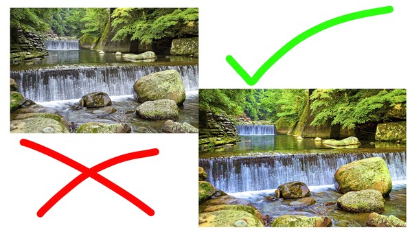
This is perhaps the biggest mistake I see many beginner photographers make. Very often they are far too precious with their compositions and the elements in the frame that they want to include. So many times I look at an image and scan across the frame and see lots of different things that just don’t need to be there. Whenever you’re composing a photo you need to think about which elements to include and which ones to exclude. Ones that you don’t need simply end up as distractions that take the viewer’s attention away from the subject. That’s the last thing you want to do so always ask yourself before you click that shutter button: “Do I absolutely need this in my frame?” Chances are your answer will be no, and in that case, you have to be ruthless. Get rid of whatever it is you don’t need.
This is where cropping comes in so handy. When you take your shot it’s fine to go wider than you need because you can always cut things out later, but you can never get things back in if you miss them in-camera. However, you need to remind yourself of what it is you’re trying to convey in the image, and if some elements in that image don’t help to convey your intentions, crop them out. Indeed, some of the most interesting books I’ve ever read have been from writers discussing what they included and excised from their final manuscripts. Incredibly beautiful writing ended up on the floor because it didn’t serve the writer’s overall purpose. It’s the same with music or film, as well as photography. Don’t get emotionally attached to parts of an image. If it doesn't serve your agenda, scrap it. Take a look at the images below for an example.
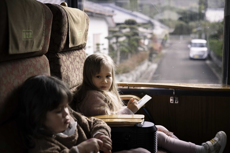
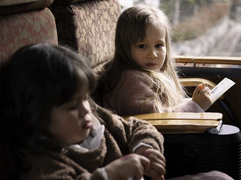
When I took this image I wanted it for two reasons: firstly because my eldest daughter seldom looks into the camera without an expression bordering on devilish, and secondly because at that moment there was some beautiful light coming in through the window which was bouncing gorgeously off her hair. For this shot, I used the Canon RF50 mm f/1.8 lens and it got more in the frame that I needed, which was fine because I knew I could crop it out later. But that’s the important thing, I knew I was going to crop and I had absolutely no problem saying goodbye to my daughter's legs or to other parts of the frame that might have taken away attention from her eyes and her hair. The final shot is below, which is much more powerful and alluring because you’re not looking out the window at the cars or the street, nor at her outstretched leg.
Not Being Experimental Enough With Editing
And that brings me to digital photography. When you take a digital photo and bring it into Photoshop or any other form of software that you are using, there are no limits to what you can do. That’s why I never really understand why people don’t experiment more in the post-production stage of their photography. It’s digital, which means you can make as many edits as you want. Turn it green, turn it red, or remove the head. Turn it colorless, crop it out, crop it vertically, it doesn’t matter. It doesn’t cost you anything except time but with that time comes greater understanding and experience about what you might like and what you might not like. Without experimentation, it’s very hard to find your own voice or your own unique style.

Take a look at the image above to see what I mean. In this image, I have quite obviously cranked up the saturation slider. It’s rather disgusting and offensive how colorful and overdone it is but it only took me a second or two to crank that slider up and then realize how ridiculous it looked. However, by doing so I could quickly get an understanding of how understated colors can often be far more pleasing.

Of course, this doesn’t just apply to colors, it could apply to composition, too. In the first example above with my two daughters, I played around with different crops in order to find a composition that I liked. In the world of digital photography and post-production editing there really are no limits except for your imagination. Thus, it’s crazy not to fully use the tools that are at your disposal and try out everything available. Even if it looks terrible, you'll soon understand that it looks terrible and, in turn, have more of an idea about what pleases your eye.
One and Done
Finally, I think many photographers fall into the trap of going to a location once, taking some shots, and then crossing that location off their list of destinations forever. Whether it’s local, interstate, or international, people have a tendency to shoot something once then delete it from their minds as though it’s some kind of bucket list achievement. That's a big mistake because conditions and light and colors are so variable that you can get so many different shots from a single location.
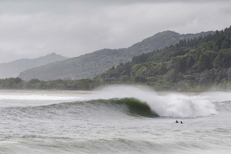
A good example is a bay that’s not far from my home. In certain, overcast conditions you get a beautiful layer of mountains that softly recede into the background. The foreground has a lovely body of water that is usually placid but when the typhoons come that bay turns into a treacherous place where giant waves break across volcanic rocks. I've shot many angles of that spot when the ocean's been flat and calm but I know from living here twelve years that with the right winds, tides, and swell direction this place would make an absolutely wonderful shot if I could get all of those elements coming together at once. I must’ve been to that place 30 to 40 times during typhoons over the years always to be greeted by winds that weren’t quite right or swell direction that meant the waves were big slabs of whitewash closeouts. That never deterred me, however, because I knew there was always potential, and finally last year everything came together and gave me the shot I had always envisioned. Perseverance pays off and it's something I always press into my students.
Summing Up
Mistakes are a huge part of the learning process no matter what you're trying to do. What's most important in hastening your improvement is recognizing mistakes quickly and eliminating them from your process. The three mistakes I've listed here to day are by no means exhaustive, but they are some of the most common I see time and again.
What are your thoughts? I'd love to hear from you in the comments below.


Join the Fstoppers community for free
-
Post comments and join in the discussions
-
Browse the site ad-free
-
Share your work and get featured in the community
-
Compete in the photo contests for fun and prizes
14 Comments
The uncropped of your daughter is much more engaging due to the windowframing.
This is the beauty of photography and art - we all have different opinions. I disagree with you here because my intention was not to show anything outside, my subject was my daughter. Uncropped, the eye comes to rest on the car outside, or on the street, neither of which add any interest. If it was something far more interesting outside and thought-provoking, sure, you could leave it in. But a parked car on a nondescript suburban street? Just shifts focus away from my daughter.
As I said, it depends on what you’re trying to achieve. This shot, for me, was all about the light on my daughter’s hair
Funny enough, I didn't even notice the car outside, or anything on the street for that matter, until you mentioned it in this comment. Like R.P Above here, I also think the uncropped version is the superior image. The outside of the window isn't distracting because it is totally out of focus.
It's all subjective though, there is no right or wrong :)
I think you tend to have a much more critical eye when it’s your own image. I do anyway. I always scan the frame meticulously and ask myself “does this really need to be here in order for me to get the shot I’m looking for?” If not, it’s gone.
R.P. that's what I thought, too. And I'm also no friend of "overcolored" images.
It's a nice snap shot of your kid but not sure it works as a teaching tool. If anything the cropped version splits it attention to both girls and one is not in focus so that is distracting. The crop is too tight too much going on. Potentially you could dodge and burn to direct but I'm sure you have better composed photos to demonstrate. Not sure what you are going for here.
My take on the "daughter" pic. I read the comments and depending on the desired result there's no right or wrong. ;-)
Nice crop. There’s never any “right” or “wrong” in subjective fields like photography, music etc only what the creator is endeavouring to convey. If it’s street photography, then more of the scene is warranted. If it’s a portrait, there’s no need to include extraneous elements. Of course, if you want to, that’s fine. Point being, crop like crazy til you get what you’re after and don’t be afraid of cutting things out. The mistake I touch on in the article is that too many people are afraid to touch or cut what comes out of camera if it means removing part of someone/something they might be fond of. Be ruthless is the salient point
In photography there is a huge amount of subjectivity. Once you have all the basics right, exposure and focus, in the right place, the rest is up for grabs. Though who says all images need to be in focus! For example I preferred the uncropped image of your daughters, which for me is just an ok shot, nothing special, but for you with its strong emotional connections its something else. It’s not an image I would have used in a piece like this given its emotional baggage, as you have to be almost brutal when culling and rating your own images. Culling images of family members is not an easy thing to do neither is judging their photographic merit.
While judging the quality of images can be a thankless task I don’t think any of the images you have used are strong or compelling enough to validate the points you are trying to make or to convince others to take you seriously. It makes the points you are trying to make look rather weak. I see this all to often photographers who have an over inflated opinion of their own abilities. You come over as being rather dogmatic and loose at the same time. Case in point being your views around editing. I think in general most serious photographers who have a style when they take an image will have a fair idea of how the final image will look. Taking an image with the hope of discovering something in the edit is a clear sign that the original motivation for taking the image in the first place was rather ill formed. That’s not to say experimentation is a bad thing. That’s the problem, ones mans photographic mistakes can be another’s mans photographic intentions.
I would also watch your use of language and use the correct terminology where appropriate.
Good info! BTW, I like the cropped photo of your daughter much better than the original.
For what it's worth, I liked the cropped version of the shot of your daughter more. The uncropped one to me felt like there's way too much dead space on the right and especially above your kids. The seat looks kinda cool but I'd definitely chop off at least the right half of the window.
For sure, the 'visit a site once' is okay if you live in Winnipeg and the shot you've taken is in New Orleans. It makes getting back to that spot a little more difficult. However, for local shooting, this is something I ask photographers when I see a photo, especially landscapes/cityscapes. "Can you get back there at a different time of day?" or "is this shot facing East or West?" Timing.
I like the cropped version better as the brightness of the background grabs too much of my attention.
Yeah obviously it depends on logistics. I’m not getting back to Mykonos any time soon.....
As for the crop, it’s interesting to see so many different reactions here, but I think the salient point is the intention of the photographer *before* the photo is taken. If it’s a snapshot portrait, as mine was, there’s no need for extraneous things like cars etc. Hence the crop. If it was a look into life in Japan, perhaps you could make a case for keeping the outside elements. However, then you’d ask “why shoot a parked car on a street of you’re trying to give the viewer a glimpse into rural Japan?”
One of the reasons people oversaturate photos is because their own eyesight is failing and they need cataract surgery.