

A while ago, someone commented on an article that composition is meaningless and people drawing wiggly lines on a photo were pulling the wool over people’s eyes. Initially, I dismissed that as being a naïve comment. Then, I did a little research and found something surprising.
What is composition? For me it is the careful placement of shape, form, tone, and color within a picture that combine to reveal both the subject and the story the photo is trying to tell. We all know that composition is one of the essential building blocks of a successful photo. You master it so you know what layout is best for supporting the story you are trying to tell. With practice, it becomes second nature, and you don’t even have to think about it when you hold your camera to your eye.
As a young child, the photos I took were very symmetrical. Then, when I was about 10 years old, I was on a week-long school trip to the other side of the country. During a long walk, a teacher suggested a few handy hints to improve my photos. Those hints included using the rule of thirds, finding foreground interest, looking for leading lines, and placing people, animals, or recognizable objects in the landscape to give the picture a sense of scale.
I tried each of those techniques, and my photos improved. However, although those rules made sense, I soon realized that they were not hard and fast. Symmetry still worked, as did landscapes without foreground interest, and not all photos required lines to lead the eye, nor did I necessarily want a person in the frame.
Apart from that t10-minute distraction from a hike across Dartmoor, my art lessons at school were not that great. I can’t remember many compositional techniques being taught. However, it is something I have studied a lot since.

When children are aged around four or five, they can all draw and paint to a similar level, and they do so with joy. However, I find it shocking that something happens in the school system where so many lose both the fascination and the ability to progress in art. By senior school, I had lost all interest in art because the teaching wasn’t inspiring. Consequently, I still draw like a 12-year-old. Yet, art is a unique feature of what it is to be human, which I think is why photography is so popular; photography is an accessible way to create art.
Nevertheless, I did pick up a couple of things at school. The idea of complementary and contiguous colors stayed with me. The choice of colors and how they are placed in a photograph is an important part of composition. I learned that blue, yellow, and red were the primary paint colors that could not be broken down into other colors. However, if you mix any two of those colors together you will get the secondary colors:
- Blue + Yellow = Green
- Yellow + Red = Orange
- Red + Blue = Purple

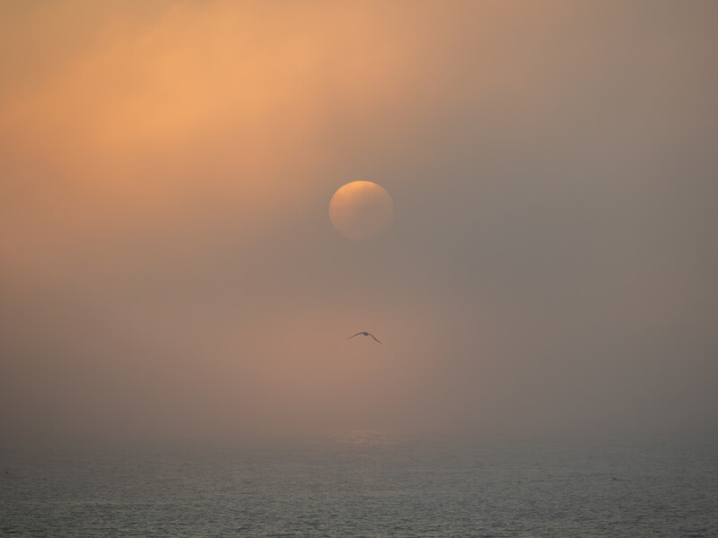
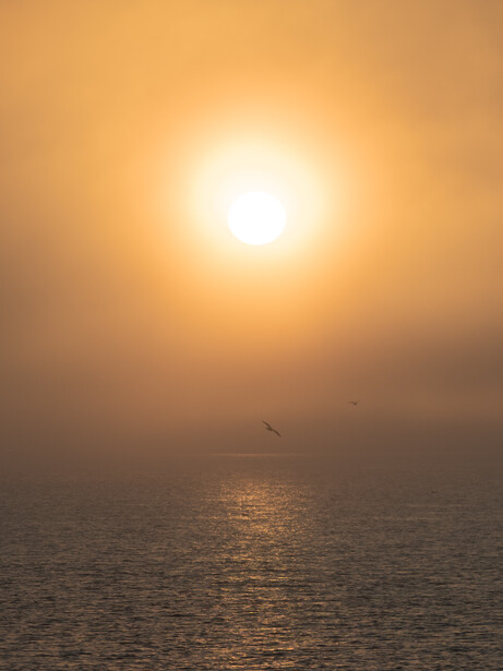
Each of those secondary colors omitted one primary color from its makeup. Green lacks red, orange lacks blue, and purple lacks yellow. Each of those pairs has a complementary color. It is why red poppies stand out in a green field, orange lifejackets are easily seen against the blue sea, and the yellow stamens of some flowers against purple petals are so striking. That’s the reason I hope that the person walking through the lush green landscape is wearing a scarlet coat.
Graphic designers often use complementary color combinations when creating logos because they are noticeable.
On the other hand, contiguous colors are those where the primary color is included in the secondary color’s formation, and those combinations are usually more soothing. Think of the oranges and yellows of an autumnal sunrise or the greens of a cornfield against a blue sky.
According to classic color theory, there is more to the way colors harmonize than where they sit on a color wheel. (If you don’t have a color wheel, there are many apps available; it's worth downloading one.) The proportions of the different colors that are most effective relate to their brightness. For example, violet is dark, and yellow is bright. Consequently, compositions work well with a large area of purple and a splash of yellow. Red and green are seen as having equal brightness, so they would have equal weight and proportions in a picture. This theory was proposed by the German polymath J.W. von Goethe, who assigned numerical values to hues, and ideal proportions of these colors are suggested by those values. His theory is still considered a practical approach today.
Getting those proportions is all very well when you are wielding a paintbrush. To a certain extent, it is achievable in a studio too. But for those of us who shoot landscapes and wildlife, nature isn’t quite so obliging. However, it doesn’t stop us from looking for those color proportions.
The successful layout of subjects in a photo is much about proportions too. Photos seem to work best when the subjects cohere with certain proportions, often – but not always – when they provide balance. Two small objects on the left will balance a larger one on the right.

The rule of thirds works because it approximates how we see the world around us, paying closer attention to the ground in front of us than to the sky above. If we had evolved for threats to come from the sky, we would observe the world more like meerkats, spending a lot of time looking upwards.
But that isn’t the only way we can work. Having a subject in the middle of the frame is an option. However, sometimes it may seem aggressive towards the subject. That’s because humans evolved as predators. When hunting, animals look directly at their prey. We instinctively know if people are looking at us because there is a section of our brain that detects where other people or animals are looking; it's useful for our ancestors to know if a lion was staring at them. Other creatures have a similar defense mechanism. This is why, when photographing wildlife, it is best to not stare directly at them beforehand, it will frighten them off because they think you want to eat them.
But what about the golden section? Many push it as being the ultimate compositional rule because of its natural structure. Discovered thousands of years ago, it mimics much of what we see in nature. It is based on the Fibonacci Sequence, named after the 12th-century Italian mathematician, Leonardo Fibonacci.

As an interesting aside, although we attribute it to Fibonacci, he adopted it from the Egyptian mathematician Abū Kāmil Shujāʿ ibn Aslam ibn Muḥammad Ibn Shujā, who lived around 900 AD. However, the sequence was also said to have been discovered by Euclid, somewhere around 300 BCE, Praxiteles knew of it a century earlier than that, and it was also known about in India by the mathemetician Pingala as early as 200 BC. The sequence is a series of numbers where each number is formed by adding together the two numbers before it.
- Start with 1 and 1
- 1 + 1 = 2
- 2 + 1 = 3
- 3 + 2 = 5
- 5 + 3 = 8
- 8 + 5 = 13
- 13 + 8 = 21, and so on.

The way trees grow, snail shells form, and even the proportions of the human body are governed by this sequence. It was an obvious conclusion to draw that there was something pleasing about the proportions, especially when viewed through religious, creationist eyes. Indeed, many major artists throughout history have composed their paintings, sculptures, and architecture based on the golden ratio, derived from the Fibonacci sequence.
But here’s the twist. An experiment in 2015 showed participants a series of patterns and were asked to independently assess the aesthetic appeal of different patterns. No preference was found for golden-sectioned patterns.
…the relationship of the golden section to aesthetic preference… weighs in against the idea of golden sectioning as a major principle underlying aesthetic preference.
So, what’s going on? Why are artists and photographers tied to the idea of the golden section if it isn’t especially more aesthetically pleasing than another layout? Nature uses those proportions because they are efficient, but does it necessarily follow that art should cohere with the same structure? After all, bees create hexagonal cells in honeycombs, snowflakes are based on the same shape, and the compound eyes of many insects are six-sided too. That's because hexagons, like the Fibonacci ratios, are efficient, yet we are not compelled to adopt six-sided shapes in our photographs or art.
Could it be that this is an example of peer pressure? Great artists throughout history used the golden section because of how it appears in nature, so we should too. The persuasiveness of popularity certainly happens in photography and not just with compositions. For example, a client who is learning to be a pet photographer told me she was going to switch from her brand to another. When I asked why, she said it was because everyone else at the dog shows she shoots at seemed to use that other brand. I demonstrated to her that her camera, or any other brand’s, would do just as good a job. She had a visible wave of relief. She didn’t really want to be the same as everyone else and, furthermore, couldn’t really afford to change.
Although they deny it, people do buy popular brands just because they are popular. They want to be part of the in-crowd and buy the same sneakers, burgers, and cameras as everyone else. That doesn’t mean those brands are the best, just that they have effective advertising. Also, many people want to be seen as being the same as others, even if the products are not as good. The most popular sports shoes don't fit me, I've certainly eaten far better fast food meals than you get from the most popular burger chains, and the most popular camera brands don't provide what I need a camera to do.
Likewise, the golden section is the market leader in composition, so it follows that people feel compelled to use it. But, just because seashells grow in a certain way, branches on trees subdivide at particular intervals, and Leonardo da Vinci painted The Last Supper to cohere using the golden section, it doesn’t necessarily mean it’s the best option for your photos.
So, perhaps breaking free from the constraints of established compositional techniques will allow us all to grow as photographers.


Join the Fstoppers community for free
-
Post comments and join in the discussions
-
Browse the site ad-free
-
Share your work and get featured in the community
-
Compete in the photo contests for fun and prizes
11 Comments
You're right that we should think about composing by color more often. Colors are seen as "patches" or "surfaces" so they can cover large areas of an image and almost becomes subjects in their own right. Guy Bourdin was really good at it:
Bruno Munari said that the Japanese flag was probably the simplest and most effective design possible since it draws attention immediately. But he also said that he spent his entire career trying to escape from that basic formula of subject in the middle with high contrast. It's easy. My thought is that artists can position themselves anywhere between the Japanese flag and a Davinci composition but where they position themselves determines how good of an artist they happen to be.
For me as a wildlife photographer is mostly about working with what I have in the scene before me, as I do not get to set things up or create elaborate color combinations.
So, it is usually about three things:
1: what do I want to put behind my subject so that the subject will stand out the way I want it to and not have anything overlapping it to create an aesthetic awkwardness?
2: what do I want to include in the scene that will either a) show the viewer something interesting about the place or b) just "look good"
3: what do I want to exclude from the scene so that there will not be anything in the image that is distracting or aesthetically incongruous with the other things in the scene?
The image below represents these 3 main concerns that I usually face when composing an image.
1: I needed to get something behind the Elk's head and bust that would allow him to visually stand out. The vegetation in the background was bright and vivid green and rather busy so I had to find a position to get my camera into that would align the Elk with the blue sky in the distance. Lying prone on the ground was the only way to get a something behind the Elk that was not visually distracting or busy or overvivid.
2: I liked the way the distant hills gave a "sense of place" and hinted at the Elk's habitat, so I didn't want to go any lower with the camera position, lest those distant hills would be obscured by the trees in the mid-ground.
I also liked the one evergreen on the far right of the scene and the way it had a more distinctly "pointy" top than the others of its kind, so I made sure to shoot wide enough so that I could include it in the frame.
3: There was a road with a guardrail and manmade (and hence ugly) road signs right behind the Elk, so I had to move way over to the left of where I was when I first saw the Elk, in order to exclude those unsightly manmade elements from the frame. Fortunately, doing so also enabled me to align the Elk so that he came clear of the vegetation and would have the blue sky behind him, so I got kinda lucky that doing something to improve one aspect of the composition also allowed me to improve another aspect of the composition. Often the opposite is true, and then you just don't have any shot worth taking.
I guess the point of me writing all of this is to show that we often don't have a lot of options about how to compose an image. The scene before us is what it is, and we are not allowed to alter it. This scene that we must work with has so many challenges and problems in it that once we solve the problems, there are few/no other options that will give us an equally good looking image. It is sometimes like a puzzle to which there is only one right answer.
We have to go in to a shoot with an open mind, and let the subject and the scene tell us how to shoot them, and then we have to listen and obey what the scene is telling us. Having preconceived notions about how to shoot, and sticking to them, can prevent us from seeing the path to a pleasing composition.
Of course there are times when a scene is so beautiful from so many different perspectives that we can capture a wide array of beautiful images that all have a different look and feel to them, but such situations are the exception, not the norm, when shooting noncaptive wildlife.
full frame sensor, 82mm, uncropped, f6.3 1/125th of a second, 800 ISO
Tom, I appreciate your explanation but I saw the picture before reading the text and my first thought was "repetition of pointy things"...then I read that you added the "pointy top" on purpose. In other words, your picture said that on it's own. In my opinion, that's the key to getting it right and it sounded like you may have done it intuitively or off-the-cuff so to speak and unplanned. To me that's how we have to see a composition in photography. We need to find some element that brings it together fast and go beyond the normal.
This is just my opinion, but an elk in the woods is boring unless there is something to connect them together. In other words, it can't just be subject here and background there. In your photo, the low horizon emphasizes the similarity of the lines of the antlers pointing up with the points at the top of the trees and brings them all together according to the "law of similarity: https://en.wikipedia.org/wiki/Gestalt_psychology
In composition there is something called a binary opposition and it is a way of achieving balance with infinite possibilities. An example might be warm/cold or straight/crooked. It could also be one animal looking up in a photo while another animal is looking down. Literally any dichotomy you can think of could become, in the right context, a way of achieving balance.
In your photo I see this binary opposition immediately:
Elk is the figure and trees are the background = difference
Elk has pointy antlers and trees have pointy tops = similarity
Binary opposition = difference/similarity
That's a good way of composing quickly and getting away from geometric formulas IMHO
Many writers including mathematician George Markowsky in his paper, Misconceptions about the Golden Ratio, wrote the Golden Ratio and its claimed aesthetic properties are rather fanciful and over hyped. Given that billing it should therefore fit quite nicely into the photography world where so many claims are made for so many alleged photographic magic bullets. While using it, the golden ratio, may not automatically make a great shot but neither will actively avoiding it make one. Saying not to use it is almost as pointless as saying to use it.
The world of photography is unfortunately full of photographers making similar claims for all sorts of things; cameras, lenses and software, use this and don’t use that. F stoppers and other photographic landing sites are full of it. Photography is hard, get used to it, there is no one easy answer to that ridiculously simple yet baffling question; what makes a great shot? It’s that very enormity, complexity and mystery that makes photography so all all encompassing demanding and compelling. Trying to produce that great shot, it’s s bit like trying to find the lost chord.
Markowsky's essay is a great read! He totally demolishes much of the popular writing on the subject. There are a lot of dubious claims made by overzealous writers that try to attribute the golden ratio to art and architecture from the past that might not actually fit in those proportions depending on how the measurements were taken. So he really did a great job of dispelling those myths. It's also true that objects with the golden ratio are not necessarily the most aesthetically pleasing and this can be studied empirically with scientific polling and sociological research.
I think what's happening is that photographers don't actually know WHY the golden ratio was used in the first place. We shouldn't make the mistake to think that artists used the golden mean because it was the most aesthetically pleasing. That's not true because they also used geometric patterns that were more radially symmetrical. The reason they used the golden ratio was to imply motion. Let me write that again....THE GOLDEN RATIO WAS USED TO IMPLY MOTION
In photography, any rectangular frame that isn't 1:1 can be divided into the golden spiral and that's where our "rule of thirds" comes from. The golden spiral is associated with growth patterns in plants and animal life: https://en.wikipedia.org/wiki/On_Growth_and_Form Plants and animals are living creatures that move, so the geometric patterns associated with their growth also metaphorically represent movement. The opposite of movement is stability and other types of more symmetrical patterns (like crystals and snowflakes) were used by artists to imply solidity.
So basically, the "rule of thirds" that we use is about using composition to metaphorically imply movement. It's also called "Dynamic Symmetry" like the title of Hambridge's famous book on the subject: https://en.wikipedia.org/wiki/Jay_Hambidge
Photographers that put the subject in the center of the frame are using "Static Symmetry" which is just another kind of geometric pattern like what is found in crystals or snowflakes.
In the end, photographers that think they can "break" the rule of thirds by placing the subject in the middle of the frame are just following another rule. They're using the rule of static symmetry instead of dynamic symmetry. The fact that so many Youtubers, bloggers, article writers and commenters don't seem to know this just shows how widespread mythologies are today even in the modern photo community. Honestly, a lot of them should be embarassed by their ignorance.
Very well said.
I especially appreciate the last paragraph that you wrote. Photographers who have big loud opinions against any type of composition are just showing how shallow their comprehension is, and I enjoy that you are calling them out for it.
I can't even visualise the golden ratio in a scene when I am shooting, so it's not a problem.
You are a very wise man. You also have an excellent body of work…
I find the entire concept of “rules composition”to be confusing and generally not useful. In the “heat of image making”, your brain is involved in doing a myriad of things simultaneously. Pushing rules is how we cause children to lose interest. What works for me is to constantly study the images of the great masters without words or writing. This gives me an unconscious inventory of placement, lighting and balance. In the field, these concepts flow to my brain and my heart. Modern cameras also provide a choice of aspect ratio guides to give you real time feedback. Then, in the darkroom or post processing I get yet another chance to see how things feel.
Fill the frame. That’s a good rule. Go by instinct, forget about golden ratio and complicated composition. Unless you build your own set it’s a question of having a eye for what makes for a good photo - at least in general terms.