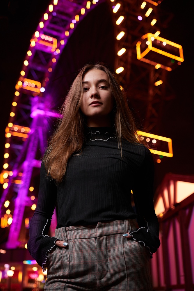
This could have been a very unique and great photo but unfortunately her trousers are lit as brightly as her face, maybe more so. I encourage you to try this shot again if you can with less brightness on her trousers and maybe a little fill light on her left (our right) side.
She is competing with the background. I get more of "I really wanted to get this kind of shot i saw somewhere" and rushed it. Her arms need to have more space between her body. Also, think about all the colors. The neons clash with the colors in her pants, in an unpleasant manner.
I actually think they made the right choice with the focal length (looks like a 50mm to my eye). A 35 would have given some more distance between her and the ferris wheel, but I don't mind the background in this image. I really like the shadows and the colors, overall I rated this a 3. Nice job.
I like this. Her thumbs sticking out look more natural than a lot of the other images you see. I like that she is backlight with the Ferris wheel. I think you did an amazing job.I would have liked a light under her to fill the shadows (JUST A LITTLE) bring back some detail that way.


4 Comments
This could have been a very unique and great photo but unfortunately her trousers are lit as brightly as her face, maybe more so. I encourage you to try this shot again if you can with less brightness on her trousers and maybe a little fill light on her left (our right) side.
She is competing with the background. I get more of "I really wanted to get this kind of shot i saw somewhere" and rushed it. Her arms need to have more space between her body. Also, think about all the colors. The neons clash with the colors in her pants, in an unpleasant manner.
I actually think they made the right choice with the focal length (looks like a 50mm to my eye). A 35 would have given some more distance between her and the ferris wheel, but I don't mind the background in this image. I really like the shadows and the colors, overall I rated this a 3. Nice job.
I like this. Her thumbs sticking out look more natural than a lot of the other images you see. I like that she is backlight with the Ferris wheel. I think you did an amazing job.I would have liked a light under her to fill the shadows (JUST A LITTLE) bring back some detail that way.
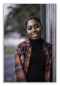
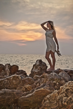
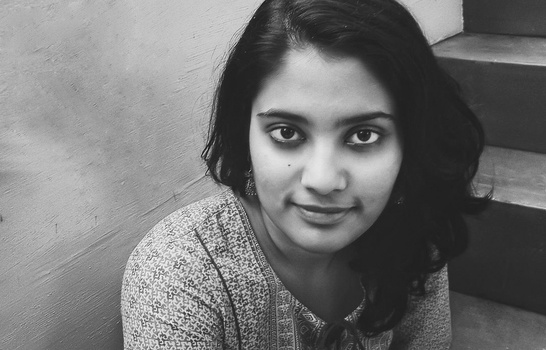
Nice shot!!! 4-star in my opinion.