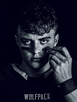
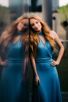
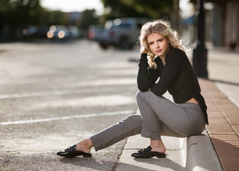
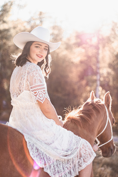
Contest Submissions
Click on the thumbnails below to comment and rate each image.
Click here to learn about the Fstoppers rating system and what each star value means.
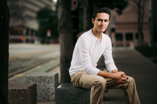
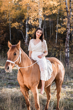
Click on the thumbnails below to comment and rate each image.
Click here to learn about the Fstoppers rating system and what each star value means.


4 Comments
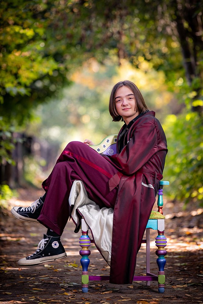
Chuckle. I like it! A very "non-traditional" senior portrait but at least it looks like a senior portrait whereas many if not most in this contest do not. I feel the contrast between the light and dark areas of the arch is too pronounced and so draws too much attention away from the subject instead of bringing the viewer's focus to the subject as it is intended. I would prefer spacing between the feet and the edge of the frame the same as that from his back to the edge of the frame. Well done and fun.
Thank you for taking the time to comment/critique (agreed with), Anonymous! This is the photo the student picked for the yearbook.
Looks like he won quidditch championship. Photo is really nice.
Thank you, Lukasz!