House of Cards, in my opinion, is one of the best shows available to stream on Netflix - if not anywhere. Their breakout drama series exploded on the scene just a few short years ago well before their original content became synonymous with high quality shows, movies and documentaries currently on the network. House of Cards' true appeal (outside of the hilariously twisted Frank Underwood) is the way it's artistically shot. This video demonstrates just how powerful two colors can make a show about corrupt American government that much more beautiful.
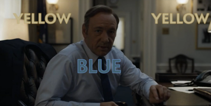
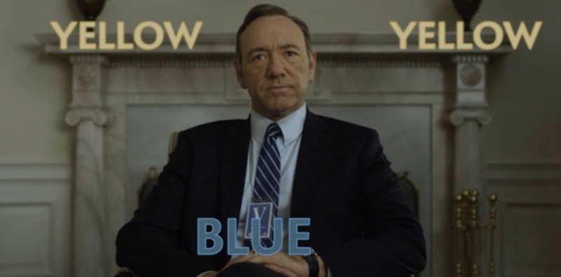
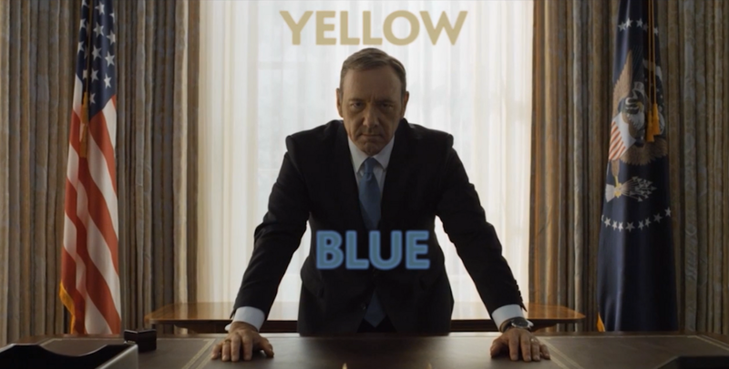
In this breakdown of each of the first two seasons of House of Cards, the guys over at The Slate show us how powerful the colors blue and yellow can add such a dynamic and creative pallet to the show's overall tone. Having seen all three seasons myself, no I wont spoil it for you, but I have finally found a new appreciation about how the show was creatively shot. To create a consistent color pallet and overall tone to a show of this nature is no easy task. The soft ambient look and feel feeds to the political drama perfectly, though this small trick of a blue foreground and a yellow/orange background truly blew me away in how a show is perceived. Its basic separation of each brings forth a great primary and secondary focal point. Outside of the obvious extreme depth of field the show already puts forth, I am even more appreciative of the thought that goes into a production like this.
Check out the photos below along with the video to explore scenes from the show that take advantage of this seemingly basic tactic. Also be sure to call out more small details you may have noticed in the show and leave them in the comments below!
Now that I have finished three full seasons of House of Cards, it's my new goal to run back through the seasons and find how much I missed in the details of this incredibly artistic show.
[via Slate]


Join the Fstoppers community for free
-
Post comments and join in the discussions
-
Browse the site ad-free
-
Share your work and get featured in the community
-
Compete in the photo contests for fun and prizes
11 Comments
Not just the blue/yellow thing... the lighting is absolutely beautiful. Most scenes only have just enough light. Lots of shadows. Outdoor scenes and colors in general are muted. I absolutely love everything visually about this series. Very "moody" look.
I totally agree! There is something about the series that give you that feel it's all very very well done, but I cannot really tell what it is.. you nailed it: "Most scenes only have just enough light. Lots of shadows."
The light seems soft but placed in such a way for you to focus on exactly what they want you to see. Brilliant!
I think it goes beyond just the simple blue and yellow on the surface, but actually plays a part in depicting something with a deeper meaning. Like blue is more connected to Francis and certain things going on through out the episodes. Another color not talked about is green, there are certain scenes in a lot of the episodes where green is dominant color and yellow and blue are non existent. Still trying to figure out what they all mean though :)
Don't most cinematic movies do exactly this? Color grading with complimentary colors on highlights vs. shadows is nothing new. In fact, I'm pretty sure I JUST saw something on FStopper about color grading to get that "cinematic look". Most broadcast TV shows don't have the time or budget to post-process for this but higher budget TV shows (GoT, BB, and Netflix/Amazon series) and movies will do something to this effect.
Thanks for the video, but it covers a pretty basic aspect of modern cinematography and color grading. Just watch almost every movie or series in the last 30 years and you will find the same blue/teal yellow/orange combination. Yellow (skin color) - Teal (yellow complementary color)
While I agree with those here who are talking about color grading, this is a bit different. This is also production design. It extends to costuming (the color of suits and clothes of the characters), basic cinematography in choosing the color temps of the interior lights vs. exterior, etc.
I've played with the ideas of mixing daylight and tungsten sources in the past, but this raises it to high art. And this would also be somewhat difficult to pull off with film.
I've only just started watching this show, but am looking forward to catching up on it.
Agreed, high art indeed. After reading about the show when it first came out and its production value for a Netflix show I was blown away. Its brought me to find specific directors and designers and follow their movies/shows. I think I saw another bit about how the camera angles and panning was all done the exact same way or direction for the first two seasons. Pretty outstanding what goes into each and every episode.
What makes the lighting so seamless is that they use kino flos as just a little fill in their scenes. I heard the cinematographer talk about it on a blog somewhere. It allows the camera to be opened more that is why there is so much depth in their scenes. Great series.
One thing that struck me at least as much as the colors is the fact that the camera is always absolutely dead straight. Look at the scenes above. The camera does not have the slightest tilt in any direction. There's someone working really seriously with spirit levels.
I have never seen that in any other Series. And its the consistency of these things (colors, styling, framing, levels) that ends in this absolutely brilliant mood, HoC has.
If you are not watching this show in 4K you are doing it wrong.