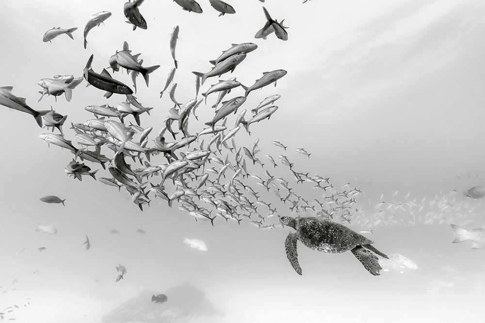
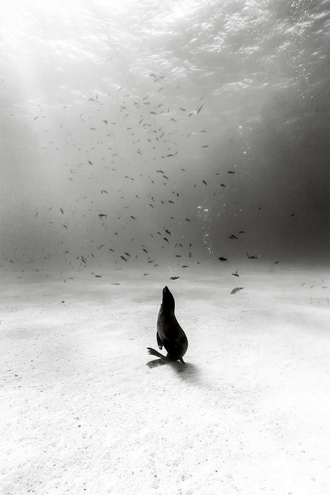
One might think the vibrant colors of sea life would make color a non-negotiable in underwater photography. But photographer Christian Vizl produced some of the most compelling images of ocean life I’ve ever seen — and they’re all black-and-white.
Shooting a wedding may be a technical challenge, but once you have your settings down, it’s all about relationships (and keeping them afloat — literally). Under water, Vizl faces additional obstacles masked by the tranquility of the dense environment surrounding him. Backscatter — the small particulates in water that put every subject in a dust storm when backlit — always threatens to muck up your images. Knobs on underwater housings are notoriously finicky (no smooth Leica focusing, here). And you either need to stay mindful of your oxygen or constantly go back up for air. There is no standing in one spot, no swapping lenses, no grabbing an extra memory card or quick snack. And yet Vizl’s images have an awe-inspiring tranquility to them that seems largely contrary to the — in a large part exactly because of his choice to shoot black and white.
With much of it below the surface water through which we can’t see without diving in, ocean life isn’t always on our minds as much as it should be. But Vizl’s career catalog serves as a reminder of what the ocean and the the life within it mean (or at least should mean) to us. For a resource that contains 99 percent of the living space on the planet, we likely don’t think of it enough. The work in Vizl’s latest book is a beautiful homage to this incredible ecosystem.
For photographers, Vizl’s selection of the medium of black-and-white photography serves as another reminder that monochrome is not simply old fashioned. In fact, it transcends time and maintains a strong place as a creative choice that helps isolate subjects in the viewer’s gaze — a gaze that is too used to this oversaturated world we live in today. It seems nearly every photographer out there is in a color rut. But whether you shoot under water or on the drier surface, Vizl’s photographs give you the opportunity to reconsider your choices of film or your post-processing workflow as you ask yourself how color is enhancing or detracting from your work.
In many ways, the black-and-white tonality adds a coolness to the work. The lack of bright yellows, oranges, reds, or greens is what provides the stillness to these meditative works and really allows us to focus on the life in each image more as an observer and contemplator than a consumer of that imagery and, subsequently, life. And in turn, we’re reminded, thankfully, that black-and-white photography has its place, even in 2019. But your work doesn’t necessarily have to be cold.
Gregory Colbert’s perhaps too-famous “Ashes and Snow” series is a good precursor to Vizl’s work, as its warm sepia tones show an alternate side of the monochrome coin as we’re reminded of the difference between monochrome and black-and-white. Browns are merely shades of oranges, and they can also exist in subdued tones and still be considered monochromatic. To that end, one could say the same of any color. But it’s experimenting outside of the concept of literal color representation and perfectly calibrated monitors that will end up freeing you (if not in your professional work, then perhaps at least on the weekends or in a limited series of personal work).
In the meantime, let Christian Vizl’s new book, “Silent Kingdom: A World Beneath the Waves,” help you take a chance and push yourself. For photographers, its study would serve an important lesson in setting intentions for what you want to communicate in your work as you drive yourself to form a plan of execution. Take the time to get lost in the calm of black-and-white photography for yourself. These days, it’s as easy as a single slider in Lightroom to test it out. As I recently did, you might discover a certain freedom as you concentrate purely on the tonality and not at all on any of that HSL nonsense.
All images courtesy of Insight Editions and Christian Vizl. See more of Vizl's work on his website.


the photos in the post have a funny overlay... might want to fix that.
Beautiful shots. For perspective, check out Ernest Brooks II - One of the pioneers of underwater B&W photography from many decades ago. Film + darkroom = no digital manipulation.
Are the photos posted supposed to have zero contrast?
This is the second comment about that, but I can't seem to see it. Can you share the browser/system you're using? Wondering if there's something else going on since they have quite a bit of contrast, actually.
Definitely something wrong with what you have uploaded or linked. Here's a comparison from his actual website. Both tabs are latest version of Chrome.
Just confirmed this. Seems to be something with Chrome. We're looking into it (thank you!).
You're obviously on it but Chrome vs. Edge screen cap.
Thanks for pointing that out. The photos on this page are completely washed out. They look so much better on his page. I never would have thought to check them out if you hadn't posted the comparison.
These are nice compositions and contrast (when viewed with Edge) but I'll still greatly prefer properly balanced color for underwater. Definitely does not make me rethink to print in black & white.
these are amazing! thanks for sharing!
ps - must be fixed. I'm on chrome and they look great.
Yup! Had some help and we figured it out. Thanks!