Is there a perfect light for your food photography? In past posts, I have mainly talked about using large lighting modifiers to create a soft light over my subject. I tend to choose softer light, because I think it looks better on my food. Is this the only lighting option? No. Like fashion photography, there are many different types of lighting that you can use on a subject. To get a better understanding of what will fit your style, let's take a closer look at the characteristics of hard and soft light and how they affect your food shot.
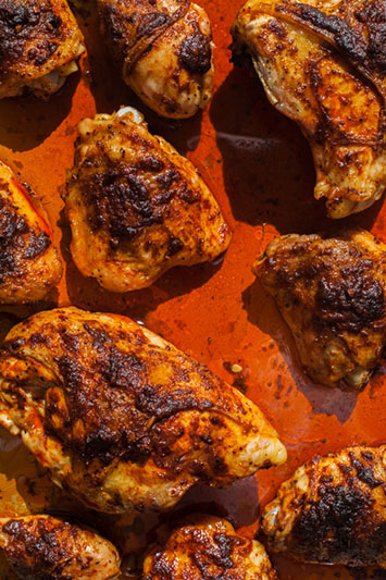
With food, you can see the effects of your quality of light in the shadows and the reflective surface of your subject. Let's take a look at a plate of roasted chicken lit with a diffused natural light source.

Here is a set shot.

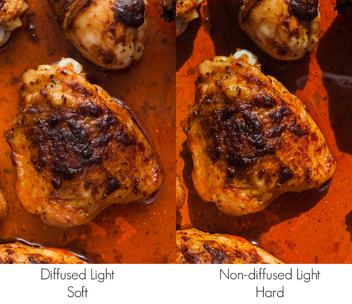
With a diffused light source, the edge of the shadow will be soft and smooth. The highlights on the reflective surfaces will be long and white.
Now, let's take a look at the same shot without diffusion.

Here is a look at the set shot.

With the hard light source, the shadow edges are hard and distinct and the reflections of the subject's surface are small white dots.
Here is a zoomed in side-by-side look.

Which do you prefer? I tend to like the diffused look more, but you will see publications that will have their food shot with a harder looking light. This is neither right nor wrong, it is just a preference of style. If you prefer a harder and edgier look to your food, try using a smaller harder light source. The examples I have given above are two extremes. You may find that for your style, you prefer to use a diffused light source, but a smaller one which will give a look that is somewhere in between the two. If you know that your client likes their shots with a higher contrast look, then try shooting your food with this look. I generally see harder and more distinct lighting styles on meats and grilled items. Take a look at magazines geared towards men and then at magazines geared towards women. You will notice that if they have a food or recipe section, you will see a difference in the lighting styles. As time progresses, trends and styles will certainly change. If you look at the cookbooks shot today and then at ones shot 30, 20, or 10 years ago, you will see that the lighting and propping styles will all be different. What is popular now, may not be popular one or five years from now. Don't be afraid to try a different style and see if it works for you.
Is there a certain quality of light that you prefer?


I gotta say, the hard light looks great. Lots of sharpness and contrast. Good color and texture too!
Totally agree. The red is powerful and this is definitely a manly meal. Plus the diffused lighting makes the chicken look more greasy.
These photos made me think of that last episode of walking dead.
For this photo, I prefer the hard light. Makes me think of being out in the sun at a barbecue. The food has more depth and looks richer.
Obviously there is a place for both types of light and people most often look more attractive with soft light but I find it too simplistic and boring in a lot of cases. That said, I don't do a lot of work with people. A lot of my photography involves inanimate objects, food, animals or other situations where soft light would not add much to the photo.
As with any tool it involves using it properly but I do appreciate the interest, texture and contrast that harder light produces in a lot more situations. Too often I feel like someone buys a fast 50, a big umbrella and an entry-level strobe then puts "professional photographer" behind their name. I believe I read it first on Strobist, "Often what you do to restrict the light that matters more than where you add light."
The diffused lighting looks much more like the typical editorial food shot with very consistent lighting over the whole photo and smooth gradations, but the hard light looks like the food was shot at an outdoor barbecue. It looks more casual.
Personally, I like both. The soft-lit one looks more...idk...juicy? While the hard-lit photo is more graphical.
Best solution, diffused hard. Mix it.
I like the hard light on the chicken, but soft light on the oil.
Think of context. Imagine this chicken was from a BBQ. BBQ's are outside. The diffused lighting gives the feeling of a dull cloudy day, the hard light is a bright sunny day. Light to fit the context.
IMO The hard light does make me think "bright summer day BBQ", but to my photographers eye, the soft light looks more sophisticated and aesthetically pleasing (especially with the liquids). I do think the highlights on the chicken look more clean and appealing on the hard light shot though. I might consider doing a composite of the soft light all around the chicken with the highlights of the hard light added onto the top of the chicken wing.
Whatever, I'm hungry...just give me the chicken.
I mostly go for hard light in my work. Just feels more dramatic.
Ok I posed this question under another post but it belongs here... Any suggestions what lighting is used here? (Aran Goyoaga's Canelle de Vanille blog) http://news.sunday-suppers.com/wp-content/uploads/2012/07/EDOC9206.jpg