Every finished dish in a restaurant or final recipe shot is made up of different ingredients. These ingredients can be a wide range of things. Some ingredients, like fruits and vegetables, are equally delicious as a component in a dish or as a meal on their own. Other ingredients like flour, salt, and sugar, are best used as the building blocks for that final meal. When your are assigned to shoot a series of recipes or plated dishes at a restaurant, it is very common that your Art Director or client will want to include an overhead shot of just the common ingredient. Here are a few examples of when this shot is useful.
There are two situations where I have most commonly been assigned to shoot an overhead ingredient shot. The first is when the story is highlighting the variety of an ingredient. Let's take a look at the tomato. If you think tomatoes are only available in the color red, you are very mistaken.

Heirloom tomato varieties can be found in in all shades, shapes and sizes of green, orange, yellow, red, and purple. If you're shooting a recipe spread that is focused on summer tomatoes, a great way to show off the diversity of the tomato is to create an overhead ingredient spread like the one you see above. This doesn't just work with tomatoes; it can be any fruit, vegetable, or spice that is available in a wide range of varieties. If you think ahead about your placement of the items, you can easily create negative space for type to be added in.
The second reason that I am commonly assigned an overhead ingredient shot is because the story is on one ingredient or only one variation of an ingredient. In these shots, you will have a color palette with only one or two main colors. This monochromatic color palette will draw your viewers into the shape and texture of the ingredients. Here is an example of apples and carrots from the farmers market.

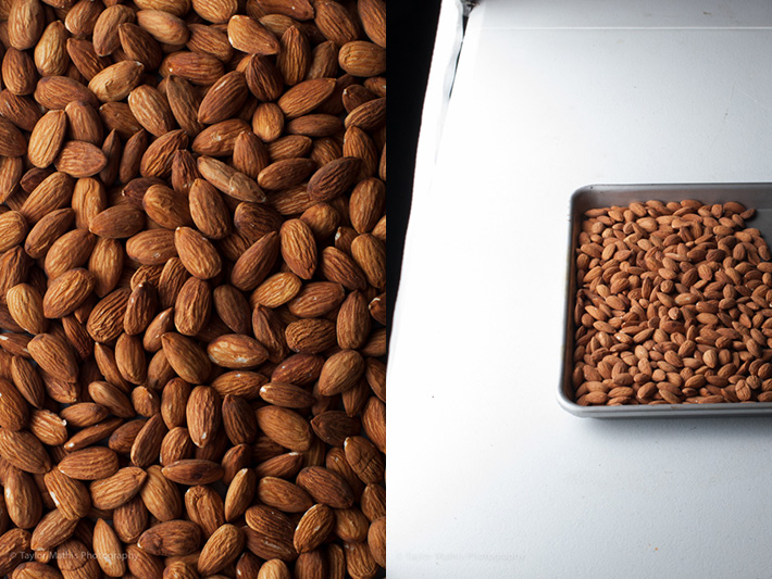
These images were shot outdoors using available light. When you light ingredient shots in the studio, you can use your lighting to emphasize and bring out the shape and texture of your ingredient. Here is a shot of almonds lit from two different directions.
In the first shot, the almonds are lit from the left.

In the second shot, the almonds are lit from the back.

The quality of the light is the same in each example, but the direction differs. Can you tell a difference in where the shadows fall? Which do you prefer?
With an all brown color palette the shape and texture of the almonds are more noticeable than they when other colors are brought in. If your ingredient has a monochromatic color palette, take the time to try different lighting directions. With this experimentation, you may find a new direction to light from!
If you have never created an overhead ingredient shot, keep it in mind. You never know when a client or Art Director will want to showcase an ingredient's variety or its shape and texture! For more food photography tips and tutorials like this, check out Issues 1-7 of photographing FOOD.


Probably one of the most boring and useless post ever...
Then why did you read it? Or spend your time commenting? You should find something more productive to do with your time! I liked it! What a great idea!
there are plenty of reasons for reading and even commenting on it, albeit negative. 'why read it / why comment?' why not? just because you see the negatives in things doesn't mean you should be quiet or avoid things. its not a 'if you have nothing nice to say dont say anything' case. Those that preach that (past parenting) arent willing to accept negatives. Just a part of life isnt it, the good and the bad xD. I agree it was rather boring, something I already knew, but some people may not know this. The site caters to all skill levels, which is great. I still think people are entitled to their comments/opinions though. Rather it be constructive, of course, but hey-ho!
Agreed. Captain obvious post of the day.
These articles are awesome and the results kick ass. When is the next mag coming out?? Gotta get my fix! =)