
In my last Fstoppers post, I shared an interesting video called Briefly, which discussed how and why a company or advertising agency might approach developing or executing a creative brief.
Remember, the brief is the information that you receive going into an assignment and client relationship. It can serve as your guide to understand what your client aspires to accomplish; a jumping off point to get your own mind working to produce concepts and content ideas. Some briefs are short; some briefs are lengthy and detailed. Some are open for interpretation; others seem rigid and strict.
This time around, let’s break down a couple of briefs that I received and executed.
Example One: An International Pharmaceutical Corporation
Earlier this summer, I was contacted to produce images for an international pharmaceutical testing corporation. After discussing various licensing and budget considerations, I agreed to take on the photo shoot.
The next day we received the go-ahead, and with all of our paperwork in line, I asked for some of the specifics regarding the images we would be creating. The art director and I had discussed some of these scenes in vague terms. But I was seeking a better understanding as to why we would create the images she had described.
That’s when a brief came into play. My art director was able to share with me that while the corporation’s new facilities would allow for new testing in the United States, the underlying feeling was a desire to illustrate what set them apart from other competitors. Plainly, we need to convey a strong sense of professionalism, scientific knowledge and a warm demeanor. Furthermore, the images needed to show that while the employees are functioning in a scientific environment, they certainly aren’t robotic, unapproachable workers. They are real people that are able to work with other real people.
After we arrived on set, we were given a revised shots list for the session. One of the key images was a photo in the testing lab. We needed to create an image that included those aspects discussed above, and included some of the actual actions workers would perform while in the laboratory.
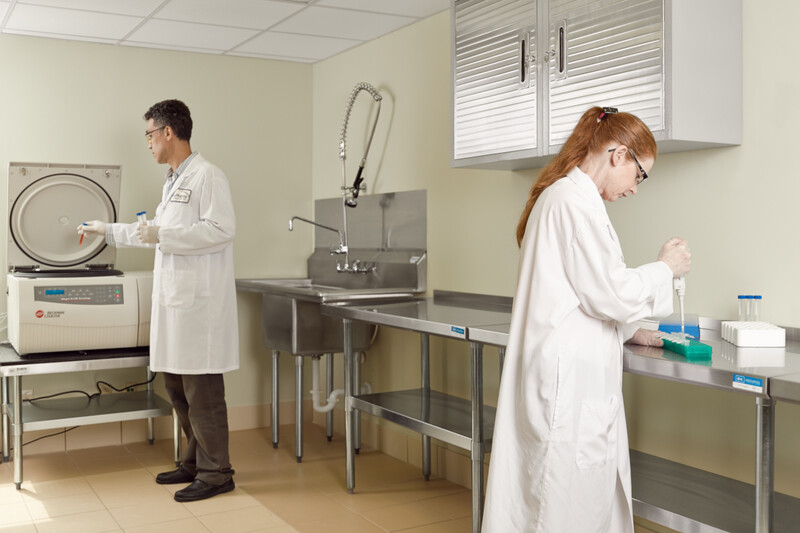
The lab presented a few particulars that we needed to work around. Given the position of the lab tables and machinery, I would have a decent amount of space to manipulate.
I decided a good bit of negative space in the middle of the image would help separate the two subjects, but the mirrored posing and matching lab coats retains a connection between the lab workers. There’s action and machinery in the image, but neither are emphasized or de-emphasized; equal part human workers and science. My client was happy with the photo, as was I, so we moved on to the next image.
In the scheme of things related to a brief, this is a good example of how a brief relates to the shoot, but doesn’t provide any real requirements at the same time. The art director chose to deliver and modify the specific requirements during the actual shoot. She still gave me the necessary room to work, and relied on me to insure that the original concepts present in her brief were also present in the final image.
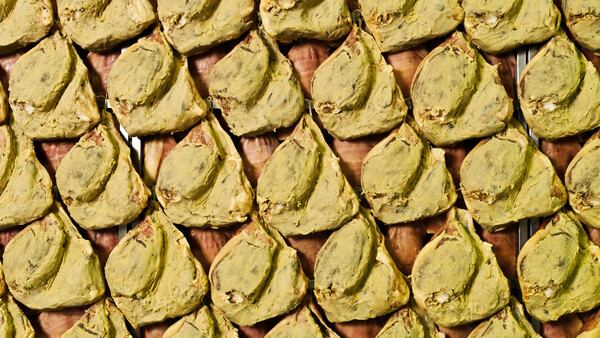
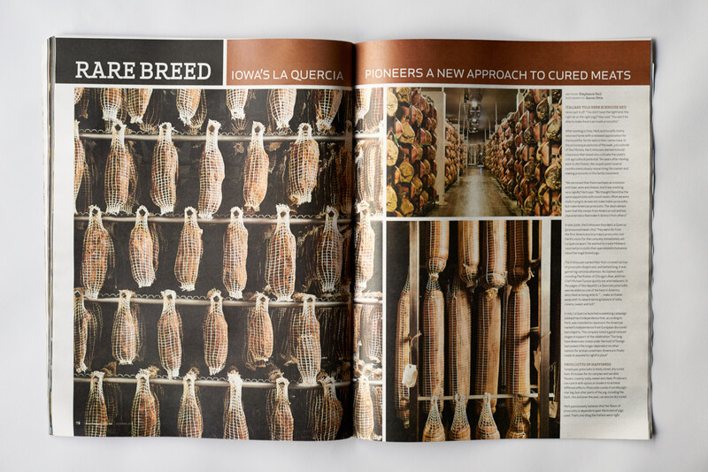
Example Two: La Quercia for FEAST Magazine
Another assignment I completed recently was a feature story on La Quercia Handcrafted Cured Meats in Norwalk, Iowa. I was given the photo assignment by FEAST Magazine, a regional food magazine that is published monthly.
This brief was the exact opposite of our previous example, yet it was incredibly similar. For this particular story, I was working with Lisa, FEAST’s art director. Lisa knew that she wanted a very particular image for the opening of the story. In fact, she had narrowed down that idea enough that should provided me with a sketch to help me best understand her request. That’s where this conversation was really different from the pharmaceutical example.
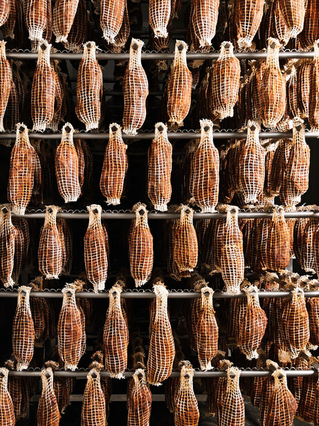
Here’s the related discussion, when compared to the pharmaceutical brief: Lisa, while she did give me that sketch, told me that ultimately I could photograph whatever I wanted. She wanted me to turn in photos that properly represented La Quercia’s product and process, however I decided to interpret. She’s looking for narrative, rich colors, and interesting textures. She believes that food can be something other than just stuff on a plate.
Off to Des Moines we go, and the first images I am able to create revolve around the actual curing process. I haven’t approached the particular image Lisa requested at this point. I’m still fixated with working whatever I wanted to photograph.
After I completed the curing process images, I made a second pass through the facility, this time with the Lisa’s idea in mind. Granted, I’m still trying to weigh plenty of other factors into the images: if the image fits my own style and if the image is any good, within the context of the session.
I was able to work with the idea Lisa provided while still adding my own little twists. The images have been well received, and were published in the October 2014 issue. You can see some examples of the actual pages designs below. The first image – the one on the far left of the first story page -- was the result of Lisa’s brief and sketch.

Join the Fstoppers community for free
-
Post comments and join in the discussions
-
Browse the site ad-free
-
Share your work and get featured in the community
-
Compete in the photo contests for fun and prizes
No comments yet