Starting today PhotoShelter released their new "Beam" portfolio websites templates on top of the secure cloud storage, e-commerce capabilities, SEO, image delivery and client proofing tools that are available to PhotoShelter’s existing members with Standard and Pro accounts. PhotoShelter's CEO Andrew Fingerman gave me a quick rundown of the new designs during a walkthrough last week and from everything I saw it looks like it could be great tool for account holders who need a functioning website with minimal set up.
"Our new Beam portfolio websites are exciting and innovative, both in their design and functionality," said PhotoShelter CEO Andrew Fingerman. "They're responsive, easy to build, integrate with services photographers use everyday, and place photography front and center. We've dedicated years to building top-notch online business tools to help photographers streamline their workflow and make more money, and are delighted we can offer a suite of new portfolios to match that standard. This is a huge leap forward for PhotoShelter."
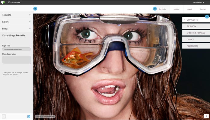
Jumping right into this, I uploaded a handful of photos and broke them down into galleries in preparation of the test run. Once everything was uploaded and hosted it was easy to arrange and navigate the software and start building the website. The online editor was simple to edit and customize. I was able to quickly set up and run a clean website for showcasing work with quite a few customizations to each template.
You can see the build at http://aaronlindberg.photoshelter.com
Current PhotoShelter users who are familiar with the navigation and functions on the backend will be able to get set up and running in no time. Those new to Photoshelter will be able to move through the editing once they become familiar with the functions of the PhotoShelter account. Once image are in place it is easy to create galleries, arrange images and keyword for SEO searching.
 Backend database of Photoshelter
Template features:
- Responsive behavior: The sites are created using HTML5 and CSS3, which allow images to scale according to screen size so photos will render on virtually any device. Advanced techniques such as dynamic load optimization, pre-fetching, priority queuing and client device detection also optimize the responsive experience.
- Real-time editing capabilities: PhotoShelter’s new Site Builder lets photographers make quick changes to their site’s look and feel, including edits to font and color, background color, logo, and on-page text. The websites are also intuitive to build and require no extra coding or design experience.
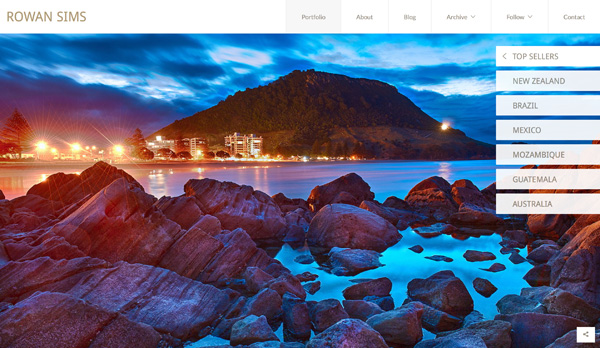
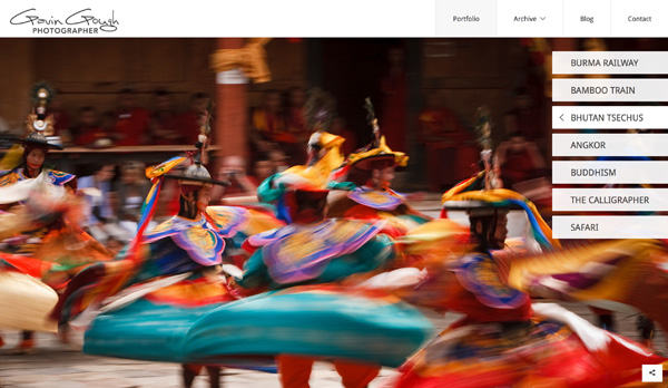
- Website designs: Today’s launch unveils four distinct portfolio designs. Each design offers unique ways to present imagery, including full-bleed image presentation, a responsive photo wall, or a minimalist and simple display. PhotoShelter will continue to reveal additional designs throughout the upcoming months. At the moment Photoshelter has 4 different customizable templates available and plans to add to that list in the upcoming months. Marque/Element/Promenade/Shuffle are the current templates in place. Below are a couple examples of how photographers are currently customizing the templates and using the websites to showcase work and market their photographs.
Element:
- Corey Hendrickson: http://hpwstock.photoshelter.com/
- Chris Owyoung: http://www.chrisowyoung.com/
Promenade:
- Gregory Cannon: www.cannon.photoshelter.com
- Ervin Sarkisov: http://ervin.photoshelter.com
Shuffle:
- Inger Klekacz: http://www.inger.net
Marquee:
- Robin Moore: http://robinmoore.photoshelter.com/
- Gavin Gough: http://archive.gavingough.com/


Pricing:
Standard accounts are $29.99/month or $329/year includes 60GB storage
Pro accounts are $49.99 a month or $549.99 a year 1,000GB storage
Who would this benefit?
Photographers who need a good looking website up and running with minimal work or knowledge of creating dynamic website design.
Photographers who are interested in creating a searchable database of marketable images that can be downloaded and purchased.
Photographers who need to proof and deliver photographs from assignments/weddings/sessions.
What I liked:
- Easy customization, up and running with minimal work.
- Ability to link to your archive of photographs that are searchable through keywords.
- FTP/File transfer images to clients
- Video page looks neat and simple.
- Protected images with no right clicks, ability to add watermarks across photographs.
- Desktop and mobile device ready
- On mobile devices, galleries scroll with a swipe
What could use improvement: (I am being nitpicky with this section since the review was during beta, but I wanted to cover this as neutrally as possible.)
- The motion/videos are not hosted, they pull in from Vimeo account.
- The Photoshelter logo is not removable as of now. Maybe down the road an extra fee could be added to remove it?
- Larger selection of templates - (I heard they are in progress at the posting of this review.)
If you are a photographer in need a dynamic functioning website that works across computers and devices and do not have the time to create your own website, this is a great option. If you have a slew of archived images that you are hoping to showcase and make available for download/purchase this would work well for you as well. If you deliver images via FTP/digitally deliver or transfer proofs and final images to clients, this a good option for photographers keeping everything under one roof and being able to showcase work.


Absurd pricing.
I agree at 30$ a MONTH.
I've been using Photoshelter Standard for two years now and think it's worth the money. If it was just a portfolio site, I might agree. But PS has a full backend system for client proofing and image delivery, as well as integrated photo sales. As a community, they put out a lot of good resources for photographers. Still, obviously not for everyone and there are definitely things that need improvement. But being in the beta, it looks like they're taking a lot of feedback into consideration.
They have made adjustments almost immediately once they got some feedback from the opening. I was informed not more than 10 minutes after this post went live that they removed the logo from the templates.
With the FotoQuote pricing engine built in on the backend... everything is about generating commercial sales from your images with PhotoShelter. It's also easier for personal-use customers to jump from a portfolio image, to buying a print or digital download of it. Very powerful stuff, just signed up for a month last week to give it a go.
I think it is not as clear as it should be from this post that the website templates are an extra tool that PS is building to help out photographers who use their service. The templates plus the ability to archive and create sales should have been clearer in my post. I assumed most people understood the difference but it's reading as if I missed that.
Zenfolio is pretty nice, and less than half the price at $120 a year. unlimited storage and 2gb video hosted on-site as well, I believe.
zenfolio.com
My site for an example of what it's like: www.siblephoto.com
It's comparable to smugmug but more intuitive than smug, when I tried both about a year ago.
Printing is through Mpix, and so far I've done well with the site. I wish the ordering system was a little better but it's not bad.
We have been beta testing the Marquee template for a few weeks, and absolutely love it. Works great on iOS and Android OS devices.
And then people critique pricing of the Adobe CC :)
The reason people "critique" is that they don't make enough money to pay for all of this! $30 here $30 there, it ads up pretty quick, and we also have electric bill, water bill, mortgage/rent, cable, gas, food, clothes, equipment upgrades, etc etc etc
We don't make the money "back" to justify all of this, because everyone is expecting us to work for free or very little! Never heard: "we have no budget for photography" from fortune 500 companies? I did! more than once.
"The sites are created using HTML5 and CSS3, which allow images to scale
according to screen size so photos will render on virtually any device." who made this statement it clearly doesn't know anything about web developing
60GB isn't what it used to be....
Well technically it is, but you know what I mean.
So how do you think they compare with SquareSpace?
The pricing kills it for me. I like PS and their services, but $29 per month is not going to work.
I have an aphotofolio.com site and a full Photoshelter site. I love them both for different reasons; PS is absolutely the best way to show and deliver commissioned work to my clients, period. I have tried the one from aphotofolio.com but it is no where near as robust as PS, they have an awesome product. As far as the pricing goes I feel it is cheap for what you get; a great HTML5 site that is only getting better and the ONLY way to distribute and manage your images.
Let me tell you a quick note about the distribution part. I can set it up a collection (the ad/design/client agency) then have separate galleries (jobs/shoots/projects) so the sales dept can only view them but anyone in the art dept can download them. I can separate anyone in the sales dept I really do trust, so they can download for themselves (I can set it to any pixel dimension) or have any one in the art dept set up to only download specific pixel sized files. All this I have set up on an invite only basis, so you have to log in through the email invite first, then after that only through pc's that are set up as "yours" on the basis of your email system. Saying that you can also set it so its just a simple password system.
I love it because I know when a specific someone has viewed images or downloaded them. That alone is invaluable when clients say "they never say them" or "I never had those files so how could I hand them to that 3rd party?" Awesome for tracking.
Photoshelter was always a little clunky for me though on the front end as a primary portfolio website for clients to see me, that's why I have the aphotofolio.com site. I'm looking forward to exploring more the new templates to see how slick they really are.
If they are amazing I might give up my APF site but even if they aren't I don't mind, its all part of my advertising budget and a write off any how; the bottom line is how easy it is for the clients, and right now with PS its damn easy.
I am considering setting up a portfolio site initially and expanding from there. would really like to see a comparison between this and what squarespace has to offer. However $30 a month does sound a little on the expensive side.
that it does. I paid a little over $100 for a year at zenfolio and it's paid for itself already in sales. Prints through mpix and the site customizing isn't bad.
Here's mine, working on some updates as I post:
www.siblephoto.com
Whilst it is pretty expensive, I do see the benefits. I use photoshelter for client delivery, for image backup upon delivering a job, and it also seamlessly can deliver blog ready images to my wordpress site. The whole integration thing is massive for me. I can sell prints, blog my images, no need to use my wordpress hosting space, no need to resize/sharpen images for the blog, and I don't need to pay for any more external backup space. My photoshelter site looks exactly the same as my blog/website, bar the URL so clients aren't thrown into differently designed sites.
I was one of the first to setup one of these new sites (in beta admittedly) but I struggled with quite a lot of it. Whilst it pulls your blog in, and formats it the same, what appears in google for that blog post? The wordpress post, or the photoshelter branded one? The scaling didn't work very well at all for me, the images scaled, but the menus crunched into each other. I still question the SEO in a photoshelter based site as opposed to a self hosted wordpress one. I know they preach a lot about their SEO goodness, but there are numerous complaints on the forum about not appearing at all in google image searches etc. I do find my images only appear anywhere in google if I blog them, and not through keywording, titling etc as they recommend.
However one of my main concerns was the fact that it is essentially a template, and (bar the actual images on the site) a lot of websites could end up looking exactly the same (as proven by the screenshots above really) as each other with no individuality.
I love Photoshelter as it currently is, and it is essentially the complete cornerstone of my business, however moving over to a template site, there was just too much out of my control and not enough customisation available (that I currently have with a wordpress site, and css mirroring through photoshelter) If I want to change something I can do it myself, I would find a template like this just too restrictive. Again just my opinion and I pay for Photoshelter so I'm not just having a bitch because I can.
As compared to Fine Arts America, what are the advantages here?
They lost me with the pricing. Why is it that Australian companies price so high for the use of their sites? They are losing customers to overseas business'.
Just recently I purchased two items from an Australian site (my own work) One printed in Australia and sent to an Australian address. The second printed in the USA and sent to Canada. As I said, these were both from the same AUSTRALIAN site (Red Bubble) and both the same photo and yet, the print done in the USA and sent to Canada was cheaper than the one that was processed in Australia and forwarded to an Australian address.
It doesn't make sense and shows a complete lack of business acumen. I am currently looking for a new outlet for my work including setting up a decent web site. But the prices charged by the Aussie companies is chasing me overseas as I am sure it has done with many other prospective customers..
If the Aussie companies want to compete with those overseas then they have to adhere to the old business adage of "an initial small profit = a larger turnover and a larger overall profit". Greed will get them the initial customers, but the customers wont stay with that company if they can find the same or better service at a lower cost elsewhere.
After hours of research, I have zeroed down to these four options. In order of preference, they are -
1) Squarespace (Starts at 8$, Great looking functional themes)
2) 4ormat (Starts at 6$, Clean themes, okay looking)
3) 22slides (10$ flat, super minimal with large images)
4) Virb (10$ flat, great potential)
All the other existing services are great, but it's less affordable and I found a lot of flaws in the way their themes functioned publicly. I haven't done an indepth research on each of the above mentioned services' backend, but by the looks of it - they're all pretty good.
Going to prepare a portfolio before I do the 14 day trial on all of them.
http://royc.in/
If you need all the backend stuff (client proofing, download access for clients, fotoquote integration) photoshelter is ok but if you care at all about SEO or having customization over the look of your website, there are a lot of better solutions out there. They are always claiming that they are developing new tools but whenever I call in about a bug/issue or feature request they usually just shrug it off and suggest some clunky workaround. Also, it is super frustrating that they show samples of their sites that have customizations that are not available to the average person. How can they offer up an example site that you can't actually get with their service? Bait and Switch... not cool!
Sorry to say, but the SEO of Photoshelter sucks badly!!! I had a look into the BEAM and was more than disappointed about it. The pages to customize SEO was just not possible at that time. The Meta Description swopped to all pages generated! Excuse me!! I don't know if that is still the case, but that is a huge no go in SEO for me. You run in quite a few difficulties setting you site up. I have listed a few things here: https://anettemossbacher.com/photoshelter-beam-review/
It is not that easy to do all yourself. When you have no idea about SEO and just enter text here and there, fine. But when you have an idea about SEO and you want your website to be found, well... good luck with BEAM.