
April theme & banner competition - Minimalism
With a new month looming I think it might be fun to spotlight a single genre and provide members the opportunity to submit considerations for a new banner.
While keeping discussions open to all the regular themes I think providing a focus might provide challenge, stimulation and hopefully a bit of fun. For the month of April I'd like members to think about minimalism, and hopefully engage in discussions and peer image reviews throughout the month
Please submit any images you feel banner-worthy direct to this discussion, I will select the image that I feel works best given consideration to the required banner aspect ratio
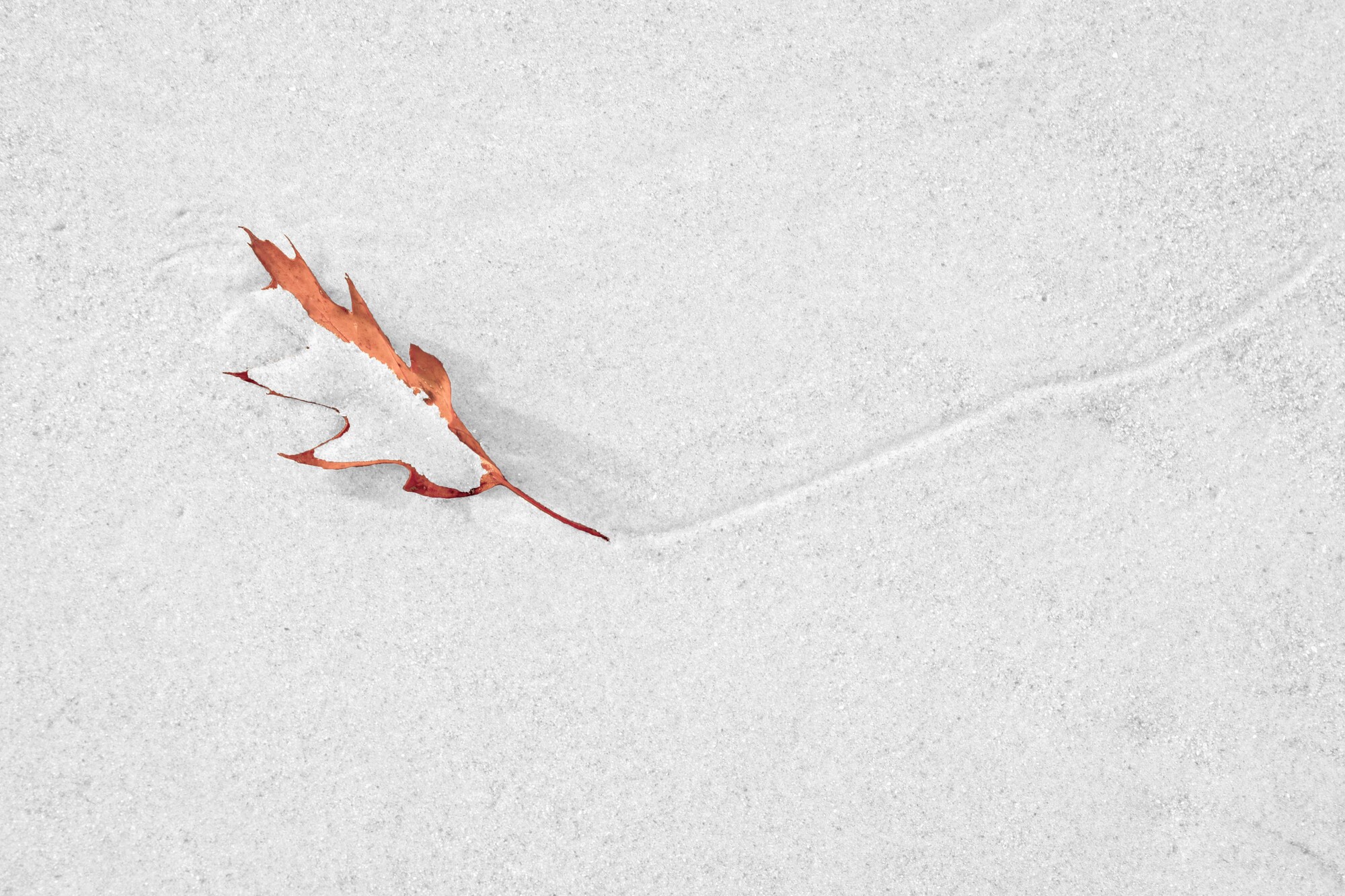
Just to kick things off here's an image I took a few years ago. Now go find (or take) your own shots that best describe the theme and get posting!
UPDATE 4/5/2021
I plan to change the banner periodically to reflect entries. Due to the format and a complete inability to edit (unlike profile banner) some images may be better suited than others.
Please bear with me if I have to skip over images that just don't work in this unforgiving format.


32 Comments
I've posted it before, but this one is probably minimalist enough, Alan. Could be cropped at the top to get the required aspect ratio, which I can't work out easily.
That's a really cool photo, Alan.
Thanks Charles!
Here's a shot I took at the pond behind my house on a foggy morning.
This looks really good as the banner.
Ha! I didn't even know it was up! Thanks, Matthew. It grabbed right at the center like Alan said. Thanks, Alan.
I think it came up today. This is the first time I noticed anyway.
I finally found and re-edited the one I was looking for. I went with a monochrome, high-key edit. It may still need some cropping to fit the size requirements, though.
Much as I love colour, Matthew, the high-key mono works well here. Curiously, it makes the perspective look a bit different to me, for some reason. Nice job.
I've tried various versions of the colour in the past, but this is the first time I tried the high-key mono look, which was incidentally inspired by the edit you did of Mike's zebra photo a few days back.
I tend to find B&W oppressive, even depressing, which is one reason I like colour, Matthew. But the high-key mono look (which I've used for a couple of tree images in my portfolio) can have an airy atmosphere I quite like. Textured subjects can also develop a crispness that appeals to me.
I have to agree with the perspective comment Chris. There is s totally different feel between the photos.
I did apply a small crop and a little bit of cloning to enhance the minimalism in the photo. Perhaps that's what you're picking up on.
I will start changing the banner to reflect entries. Due to the format and a complete inability to edit (unlike profile banner) some may be better suited than others.
Please bear with me if I have to skip over some that just don't work in this restricted format.
What is the aspect ratio of the banner? We may be able to format/crop to fit.
That would be good as well, or even if we could predict what would be cut off.
It's all good. We appreciate any efforts you make for the forum. Thanks!
Hi Alan! I take your point about the inability to edit the banner image here; we don't know what goes on "under the hood", as you say, at FS before an image appears as a banner in a Group.
I note that my "One Sister" image has been oddly cropped, with more off the top than bottom. The banner above on my screen comes out at 1701 X 413 pixels, a ratio of 4.1186etc:1. So I've cropped the original to these proportions below. You could post this up instead, and see how the banner compares to it.
Just a thought. No, actually it's just that I can't bear my PERFECT composition being desecrated. ;-)
Thanks Chris. I actually tried this 3 times but must say it was eyeballed rather than using precise ratios. If that works I will apply to others.
I tried my best to get the entire rock in, cropped madly from the top - honest .....
Thanks Joe. Unfortunately the group banner allows zero flexibility.
I have tried various aspect ratios prior to uploading (unlike the personal banner there is no tool to crop/move) but end up getting frustrated each time.
Hey Chris, I tried once again using the aspect ratio you mention and it produces a similar result. I even tried copying the banner into LR to verify the ratio.
It looks like fstoppers just grabs the central portion (both vertical & horizontal) of the uploaded image.
Unlike personal profile banner images there is no allowance for cropping/movement etc.
For now I guess we have to accept this as-is, and view the banner as simply a teaser for the 'perfect' original.
If anyone has greater insight into how this function works let me know.
UPDATE - just to show the issue I have copied a screen grab of the banner, and reimported that. You would think it would look the same, but no, it decides to enlarge the central section.......
Thanks for all your effort, Alan! FS wins.
Here's a more tolerant alternative.
Hello Everyone,
I am new here, and pretty new to FS.
Actually, I am even new to photography.... just got serious over the last year or so.
I live alone in an off grid cabin in Alaska. It has been a very long winter, and I will be tickled for spring to show. Meanwhile, here is a shot in my front yard.
Warm Smiles,
Heather
Hi Heather! If you're new to photography, I'm amazed! This photo is beautiful and would put many other posts to shame. Love the colours, the forms, the composition. Well done!
Thank you! The encouragement is cherished.
I totally agree with Chris on this one Heather. You have a good eye and have created such a wonderful, moody composition.
Keep shooting!
Aww thank you! I’m my own worst critic lol.
And yes, I will definitely keep shooting!
Finally on a sunday drive up Hatcher Pass, Alaska... I found my very own lone tree pic. Those shots are harder to find than I thought!
LOL.
Another great effort, Heather. You must post more.
I totally agree with your lone tree dilemma, they are so hard to find (or at least so in Vermont).
My kind of image - keep them coming!
PS - please consider commenting on other discussions. All viewpoints are respected, and those newer to photography often provide a fresh and welcome perspective.
No pinion can be wrong......
Thank you Alan. Vermont? So beautiful there! What a playland for a photographer!
Beautiful.