If you're not already in the loop, December is the month that we learn from Pantone what the color of the year will be for 2022. Ready to start using it everywhere?
It's that time of the year again when Pantone, the worldwide standard for color communication, has locked themselves in a dark room to deliberate what color will be important for the coming 12 months. As the pandemic continues to cast a shadow over everything, it will come as no surprise to learn that the color chosen was influenced in some way by such events. This year, though, things do feel increasingly optimistic, with words such as transformation and transition being used to describe not only the color of the year but the mood in the air. For 2022, PANTONE 17-3938 Very Peri is the color they have chosen, and they hope it will be marching forward with those very themes attached.
For those not familiar with Very Peri as a color, think of a blue-purple shade with a violet-red undertone. While many may think declaring a color of the year is nothing more than a marketing gimmick, Pantone does do their homework to arrive at the selection choice. They claim to look at all manner of industries, from the entertainment industry and fashion to new technologies, as well as all areas of design. For photographers working in some of those industries, it can't be a bad thing to at least know what the color of the year is, as I can assure you many of the art directors, designers, or commercial clients we work for will know what it is.
I always think the announcement is a good chance for photographers to get ahead of the curve and create some interesting work while the shade is not quite on everyone's radar yet. Think photo shoots, marketing materials, and website tweaks as a way to tell clients that you're someone who keeps up to date on such things.
Will you be using any of the new colors of the year in 2022? We'd love to hear your thoughts in the comments below.
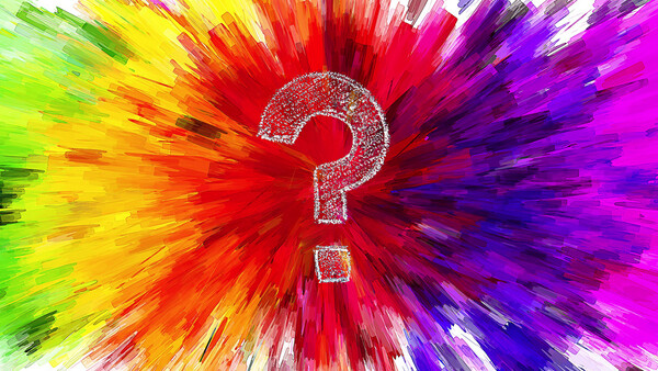
Lead image by geralt, used under Creative Commons.


4 Comments
Imo the best use of color of the year is to leverage it as a guide on what color to avoid so that your work doesn't look like everyone else's.
Ha! but it makes the client feel safe in their decisions.
Pantone, please create a plan for people to have a unique palette - like those porn star name games.
Has anyone seen the colorstrology book? https://books.google.com/books?id=oGv3DvdMPbcC&printsec=frontcover&sour…
Does anyone actually buy books like this? I agree with Ryan: Don't do what everyone else is doing, but also do what the clients want you to do.
I'm not really a fan of this color, nor do I know what the color for 2021 was.