
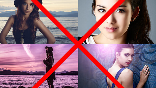
Part of building a professional looking portfolio is in learning to retouch your photos in a way that gives them an elegant, high-end polish. However, I unfortunately encounter dozens of images on a daily basis that were quite strong to begin with but ended up looking bewilderingly amateur because of one or two very easily solved retouching mistakes that drags their quality to abysmal depths.
Demon Eyes
You usually are trying to retouch someone to look like a human, right? So why layer so many changes onto their eyes that they begin to look like a possessed monster? I will give you a hint: eye whites shouldn’t ever be white. It is OK to slightly soften the whites of the model’s eyes and you are certainly advised to remove any distracting red veins, but make sure that you don’t brighten them so much that the eye no longer looks spherical.
Furthermore, when highlighting the iris don’t highlight it to such an extreme level that it begins to look like it is glowing. Instead, be subtle. Don’t be afraid to drop the opacity of your eye adjustment layer by 50 percent or more in order to return the eye to slightly “human-like” form.
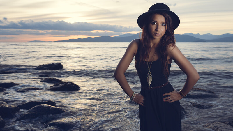

Flare From Nowhere
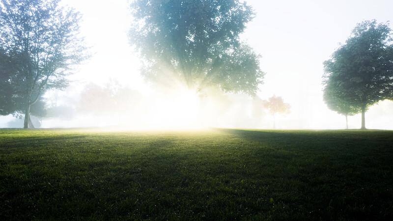
Before creating fake flare in your photos, please do me a huge favor: learn how real flare works. Flare is caused by a light source that is reflecting inside the lens, which means there must be a light in the frame or slightly out of frame that could be causing that flare. Don't dump a fake flare in the middle of a brick wall unless you want to make your image look tremendously fake.
When adding a lens flare to an image be mindful of where the image’s light sources are and only place a flare if there is a viable light source that could actually create a flare.
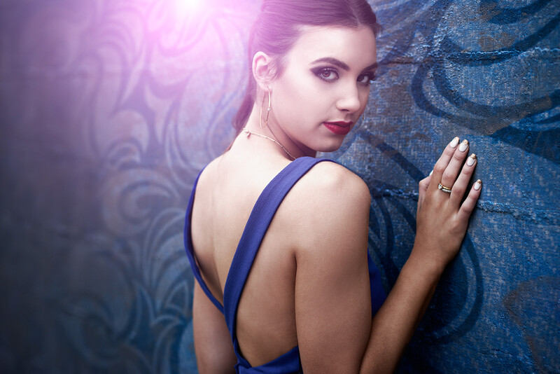
Plastic Skin
I really wish this one was as obvious as it seems, but every single day I come across at least several images that have had the model’s skin blurred into a smear of plastic miasma. The goal of retouching isn’t to make the model look like she was molded in a toy factory. Humans have skin texture! Your job is to make that skin texture look perfect, not to remove it.
If you get the urge to use blurring as part of your retouching workflow, call upon every ounce of your inner strength to resist it. Yes, I know that frequency separation uses blurring but that is a special case that is designed to preserve detail.
If the skin has blemishes, clone them away. If the skin has discoloration, use color layers to fix it. If the skin texture is too sharp, decrease the contrast to make it less obnoxious. Don’t ever blur it.


Failing To Clean Up Highlight Clutter
When color grading an image the contrast often gets bumped and certain minor highlights get pushed towards being blown out. Often these highlights are normally no more than a pixel or two in size and are especially prominent on things like grass or rocks. When glancing at an image you probably won’t even notice most of the time but if you clone those little highlights away all away it is amazing how much cleaner an image can look.

Making Your Image Too “Crunchy”
You know what I mean. That look when tonal contrast runs amok making an image look like all the edges are glowing while the contrast and saturation goes crazy. It creates a similar headache-inducing nausea that is common in excruciatingly over-processed HDR shots. Here is a hint: highlights shouldn’t be pure white, clouds shouldn’t be black, and their edges certainly shouldn’t be glowing. There is a time and a place for this sort of look and it is extremely easy to overdo even in the best circumstances. Be careful of tonal contrast-like sliders such as “clarity” for they are the tools of the devil designed to woo unsuspecting photographers towards the blighted depths of crunchdom.
Over Dodging
Dodge and burn can be a tremendously useful tool when used well. It can also utterly decimate the credibility of an image when used poorly. Dodge and burn with a very light touch. Use a soft brush at low flow so that you can subtly build up your highlights and shadows without making an image look like it was shrink wrapped.
Conclusion
Photoshop is a dangerous tool, it can either help you craft an image into an elegant piece of art, or it can enable the destruction of even the most beautiful capture. Take the time to learn to use each technique in a subtle and elegant way so that you can best equip yourself to create images that will impress even the most stringent of editors.


Join the Fstoppers community for free
-
Post comments and join in the discussions
-
Browse the site ad-free
-
Share your work and get featured in the community
-
Compete in the photo contests for fun and prizes
40 Comments
Great article, Ryan. Plastic skin seems particularly symptomatic when people discover the clarity slider.
Thank you for this article! See this stuff too much. I'm surprised over vignetting wasn't included in the article though.
Totally agree, vignetting!! But otherwise some very good points in this article.
Totally! Especially square and oval vignettes, ugh! Its kinda like the flair, unless you know how a real vignette is produced, don't try to fake it!
Indeed. It's fine to add vignetting when appropriate, but if you can see it then it's usually too much.
Oh my god. That was almost painful to look through. Great article. Great points. All these simple things everyone can do to improve... Well done all around ;-)
ha! You think you had it bad! I had to butcher my poor photos to make examples because I didn't want to call anyone out. ;)
Ha! So sorry...
Great article alright. I'm actually a preparing a blog post along similar lines. I recently shot a deliberately awful shoot with a great model who was a great sport about the whole thing. I just wanted to highlight some of the common mistakes I see photographers regularly make. It actually takes effort to make a lot of these mistakes too.
Really fun, quick article. Love the examples! Vignetting and over lifting shadows to a crazy level would be another few that hurt so see
Are you referring to that faded effect that's really trendy right now? I've noticed that a lot of photographers will add that effect to many photos that don't "need" it, causing them to become muddy.
Clarity, Sharpening, Contrast, Extreme Highlights/Shadow adjustments, not removing chromatic aberration.
The 5 sins of photography :D
Great article. Best. J
I see that faux-flare EVERYWHERE now. It's in so many fashion/beauty portfolios it seems.
I'd never thought about the highlight clutter point though. It's subtle but it makes sense.
The same applies to "gum on sidewalks" or "marks on walls", etc. It's amazing the difference a little clean up can make to an image.
everyone thinks they're jjabrams!
I haven't noticed too many "plastic" faces lately (not that I'm looking for them). What I've been noticing far too much of lately are the "orange peel" skin effects that come from overuse of freq sep. Yeah, we want to see skin texture on the model while seeing smooth skin. Congratulations, you've learned P.S. Now turn the texture down a notch so the skin looks natural.
Orange peel that's a good description!
I think what drives me nuts the most about plastic skin and glowing eyes is that I see photos like that all the time in online photo contests, and they do REALLY well in the voting! Same with crazy lens flare, and even selective color. So, they may get laughed out of a real photo contest, but online, those awful photos are actually popular.
To the above, I would add wrinkled clothes. I see so many photographers that shoot fashion and spend hours retouching the model's skin, but pay zero attention to the clothing. I sometimes spend almost as much time retouching wardrobe as I do skin – liquify the edge of folds, clone out lint, dodge/burn wrinkles. Below is (a bad screenshot of) an example I did for an ecommerce client to sell in retouching services. (Just the sweater).
There is no should or shouldn't. Do what da heck you want with photoshop... Artists are not conformists ;)
Note that the article wasn't titled: "What you shouldn't do when retouching", it is specifically oriented to things photo editors do not like. IF you are just aiming to be creative and don't care about making commercially viable images then it really doesn't matter what you do. Just do what you love. This post was more for the people who are trying to make their work into a career and are struggling to understand why their images don't sell.
One can be creative and make "commercially viable images", and moreover, one will not be competing with everyone that is trying to do the things like everyone else.
Check out website of photographer/digital artist/film maker who perfected all the things you are criticizing here. He has his own unique style that got him commercial clients.
http://andrzejdragan.com
Nailed it. To me the golfen rule is if you're not confident in your post abilities, keep it light. An image that could use a bit more love is much more palatable than an image that's obviously been baked.
Awesome post, i've been fighting against this here where i live, i critique a lot and people tend not to understand that no "portrait magic app" will help them. Other than that, waxing models, making them look like made out of wax, hate it, God knows how i hate it. Over dodging, i've teached some friends on how to use a 50% gray layer (easy way) to dodge and burn, some people make the pics look fake, others understand how to do it.
I didn't see white vignette in this so I suppose these are still okay to keep adding to pictures :)
Yup absolutely! In fact, thats going to be the next big trend! That and selective color! :)
You *really* need to add vignetting, specifically over-vignetting to this list. That's the one i see the most and also the most poorly done. Another vote goes to people who crank up the Clarity slider in Lightroom in an attempt to make the photo look "edgy" and "grungy"- and end up ruining a perfectly good photo. Great article, btw!
Thank you for this great write up
Great article!
Ugh I hate the crunchy photos. Just like this image recently posted by REI. Who the hell is their social media manager?
https://www.instagram.com/p/_FQWrQDu7k/?taken-by=rei
hope no "photographer" got paid to deliver this mastershit :D
Thanks for the tips. I'm learning how to use LR and one of the first things I discovered was I hate the clarity slider. I can never find a spot that looks better than the center. I've also found a lot of the presets are way past my liking. The teeth whitening setting is crazy and the skin softening preset is way, way over done IMO. I find it hard to believe anyone uses those defaults.
Great article. How about a tutorial on doing the before and after slider. Thanks.
Frequency separation is also frowned on by REAL high-end retouchers. Just FYI ;)
preach
Nice Article. Well Done.
interesting read, i used to be of the same opinion,
but i find it just shows where the photographer is in there photoshop experience.
All the photographers on here calling out others or saying i hate this and that,
go back to your first digital images and i bet you were on this path.
I know i was but have learnt so much,
just because there is that special button, you do not have to press it.
I even saw professionals making tutorials go crazy with contrast and skin retouching.
demon eyes..., always funny
Great article