
When starting out in photography, we get busy trying to understand the basics: shutter speed, aperture, composition, etc. As we progress, we start to care about much subtler things, such as color reproduction, sharpness, and, of course, color accuracy. But is color accuracy just a myth? Let’s find out.
When doing commercial assignments, photographers such as myself are often using multiple cameras for different purposes. In fact, there are times when there are several sets, with a camera for each. Other times, there is a complex composite where a landscape has to be added to an otherwise studio image. Making this work look realistic and accurate is difficult, to say the least. Of course, with enough time, anything is possible. But, what if I told you there are ways to save time with these tasks?
Introducing the color accuracy tools from Datacolor. It’s in the name: every color that is digitally reproduced is just data. Datacolor is a company that specializes in making accurate color possible, with SpyderX and the Spyder accessories. The brilliance of these products is that they make color accuracy as easy as clicking a few buttons. But does it make a big difference in professional photography workflows? Let’s dive in and explore a few elements of my own workflow to see if it’s a waste of money or a nifty purchase that makes life easier.
Multiple Monitors
The easiest thing to talk about is the fact that I use several monitors. An image may be shown on a ton of different machines. For example, if it’s a commercial set, I might tether, and the image will come up on the client monitor as well as my own. Then, this very image will make its way to the office, where I will use a third monitor to edit it. Then, it will travel to my brilliant retouchers, who will again see it from a different machine. Each and every one of these monitors will have a different opinion on what is blue and what is red. This can cause misunderstandings among all members of the production, and arguments will eventually occur. For example, the client monitor may show the whites with a greenish tint, while yours will show it with a magenta. The client tells you to adjust for the magenta, and you end up with a green image. Who has the right version? Well, frankly, no one unless you're calibrated. 
A rarely mentioned feature of the SpyderX Elite is that it can also calibrate projectors. So, if you are showing your images to an audience and want them to see things how you see them, simply use the SpyderX Elite to calibrate that.
In order to avoid these misunderstandings, monitor (and projector) calibration is imperative. Luckily, the SpyderX Elite has a feature to do just that: calibrate and align several monitors. Using it, you can align several displays, regardless of them being connected to one machine. So, in this case, the SpyderX helps me a lot in creating the perfect image so that bothe the team and I see the same.
Different Print and Screen Types
Let's picture a fairly standard commercial assignment: you need to create images that will run in the local free magazine made from cheap paper on digital boards with an average resolution, and to top things off, on social media as well as billboards. Disregarding the fact that there is a significant resolution required to execute this job, there will be a big difference in how the image will be seen on each of those media. 
The Elite version of the software allows you to proof the image on print by using a profile. That way, it is easy to see what colors get lost. This is not only helpful when shooting, but also when exporting because the regular paper will naturally decrease contrast, but the digital screen will increase it. Therefore, a slightly different version of the image has to go for print and digital. Previewing your work using the Softproofing feature of the SpyderX Elite will allow you to do that, and having your monitor calibrated will make sure that you see the image exactly how it will come out in the end. Guesswork is out.
In this regard, it also makes sense to invest in Datacolor products.
Peace of Mind
If I know for a fact that I am looking at a calibrated monitor, in a good setting, I am sure of what I am sending off to the client. More often than not, someone may open a photo on their phone while commuting to or from work. So, of course, what they get is likely an image that is significantly off. An angry email might follow, saying that your yellows are too yellow and the skin tone is just wrong. Yet, upon receiving and reading the email while comfortably sipping on a drink of your choice, you will know that what you sent is correct. Why? Well, because you used industry-standard monitor calibration for the images and didn’t view them from your phone. A silly example will be posting to Instagram. Every time I do that, I slightly change the photo so that it looks less saturated. Not sure why, but iPhones just like to saturate stuff to extremes. 
What Should You Buy?
I hate giving buying advice because it can never be tailored to the exact needs of the audience. But this time, it is fairly simple because there is literally one device that does all this and more: the Datacolor SpyderX.
This nifty device will help you calibrate your monitor in under two minutes and ensure that what you’re seeing is correct. I would strongly suggest using a monitor calibrator if you are doing photography. And the Elite version calibrates projectors too!
Additionally, there are accessories that can make the SpyderX easier to use: I personally love the SpyderShelf, as it gives some vertical storage space which I use to keep the monitor calibrator itself. 
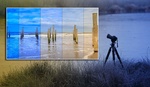
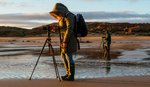
For optimal ambient light readings with your calibrator, I suggest getting the Spyder Tripod with flexible legs. It will let you screw on your calibrator. It's also the perfect portable tool you can bring on any photo excursion.
So, does color accuracy make a big difference in professional photography? Yes, it does.

Save up to 25% now through 4/10/22 during the Spring Savings Sale!


Yes it does, but once you get out of your closed loop, there is not a lot you can do. The calibration tools have their own way of deciding what is right. Different brands of monitors will be pretty close and look good but will not match. Sony, Canon and Nikon all are different.
I have seen designers and retouchers working in bright rooms with windows as well as dim rooms with low light.
The best you can do is to make your devices play nice together and let others do the same.
Here's the thing though, while you may have a perfectly calibrated monitor setup - what does your client/end user have? What do they view most of their content on? Primarily a phone. So while you can have a perfectly dialed in setup - ultimately it is about making the content look best on a cell phone screen (assuming digital creator). Get the while balance right/remove any color casts, dial in a little less contrast/saturation than you would normally (because phones naturally boost those) and call it good.
Clients can be a nightmare, but when sending off, I know exactly that what I have is right.
I agree with the other commenters, while it sure is nice to have your setup calibrated, there is almost a guarantee, it's certain that either your coworkers and/or your customers and audience don't have a calibrated screen, especially for mobile users, so if your red is maybe a bit more true to the real red, it doesn't matter at all, and Especially for that price. And why do you only list off one product? Normally at least two devices are compared, this does seem like it is endorsement
yes, unfortunately! But hopefully, more and more people will start using monitor calibrators :))
Yep, in terms of calibrating, whether you're a professional or hobbyist. At the very least, it matters for your viewing and editing pleasure. And, it's just best practice to have a baseline of accuracy.
As for color accuracy, depends. For clothing, food, products, etc, I can see accurate colors may be a requirement. However, weddings, events, portraits, etc, they are often color graded so you can throw accuracy out the window. It's not a bad thing, it's a creative decision thing.
And I'd add that if one of your monitors is hardware calibrated, than it all becomes a mess, as you have to use the datacolor sw on your standard monitor and the monitor's sw on the calibrated one.
thanks for reading and adding to the discussion!!!
How do you decide what parameters to calibrate to? What color and what brightness?
Everyone always says “calibrate your monitor” but never suggest what parameter values to use.
Odd.