
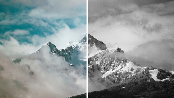
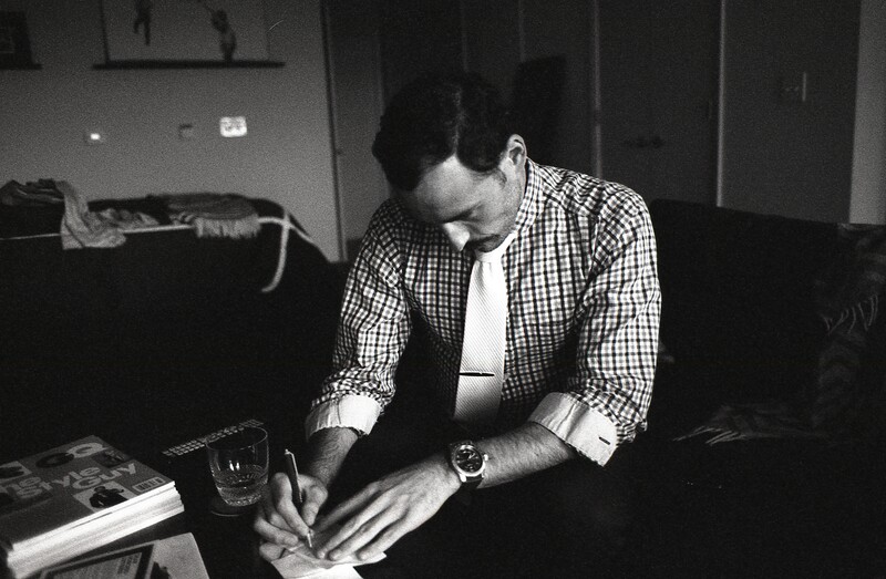
Just about every photographer experiences those moments where they decide their photograph would be better suited monochromatic. How and when to convert it can make a critical difference.
Why?
It’s a simple enough question without a simple answer. Why would someone make their color photograph black and white? For many photographers, when they get started, myself included, most every photograph felt better in black and white. Well, maybe not most every photo, but at least the ones that would otherwise be boring. Nowadays, I shoot black and white film with intention and occasionally convert my color photographs to black and white (that's not to say that I've moved on from taking the occasionally boring photograph) if I think they would benefit from simplifying the image.

I would argue that beyond the "why not?" of black and white photography, I believe it's undeniable that some photographs are absolutely gorgeous in black and white and would not reach their full potential in color. I'll admit that this does not often happen, but it does happen. It's true that beauty is in the eye of the beholder, and as such, what photographs are best monochromatic versus color is up to you. In this article, I will lay out the considerations that I make when I evaluate one of my own images. Further, I will go through the steps that I take to implement any conversions. Lastly, I will go through some of the considerations that I make when I evaluate whether or not a photograph improved in its monochromatic form.
When?
For me, there are multiple considerations to make when trying to decide. First and foremost, are the colors properly messed up? In my limited experience, where I’ve come across this, it was usually the case that there was low, mixed lighting that resulted in improper white balancing. In those situations, it seemed like no matter how much work I put into one photograph, the result never really panned out to anything I found acceptable. So, when the white balance is all out of sorts, going monochromatic can save you a lot of headaches. For those shooting film specifically, the considerations are still much of the same. For color negative and slide film, the majority of options are daylight balanced, so if it’s a bit cloudy out, your photos can get a weird cool tint to them, which may or may not be easily corrected. There are definitely techniques to properly white balance your scans, but sometimes, things just don’t always feel right. This is rarely the case, but it does happen.
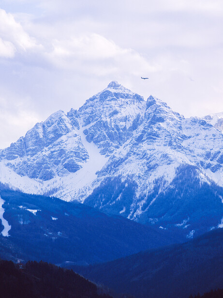
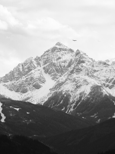
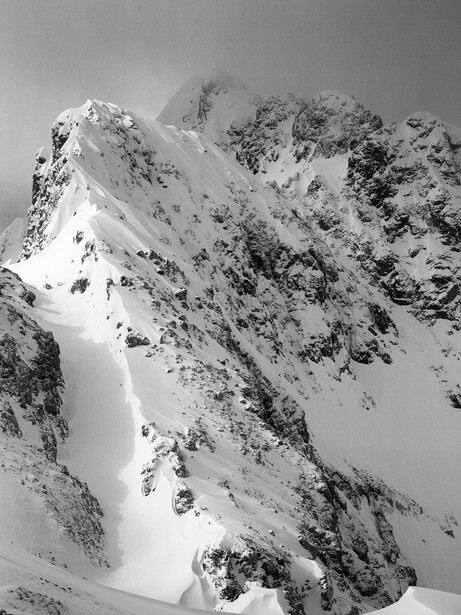
In addition, in situations in which there is minimal variation in color, a photograph can take on a sort of boring quality that may be improved by converting to black and white. This is particularly true if there is a decent to large range of lightness values or isolated, interesting focal points with nice out-of-focus areas. Lastly, and this is the primary reason I convert my images, if the image was pretty dramatically underexposed, black and white images can take the exposure being pushed beyond belief far more than color images. If you shoot film, as I do, you are not able to up the ISO just because it starts getting a little darker out, and raising the exposure in post becomes necessary. In these circumstances, shooting wide open with the slowest shutter speed you can reasonably shoot becomes necessary. If it is still too dark and the photos are underexposed by more than two stops, color shifts are virtually guaranteed, and converting to black and white may be the only way to salvage the image.
How?
This is definitely the fun part and why I will occasionally convert my images to black and white. Truth be told, I convert almost all of my color photographs to black and white just to see what they look like. Sometimes, rarely, I end up liking the monochromatic version of my photograph more than its color counterpart even if it looks great in color!
Personally, I prefer to use Lightroom for some of my simpler edits and Photoshop for most of my editing. As such, I’ll lay out a couple of ways using these programs. In using Lightroom, the way that I’ve found to work best for me is to mute the saturation. And just like that, you have muted all colors in the photograph, and the resulting image is left monochromatic. I should note, though, that this particular method usually leaves the resulting image low on contrast. This doesn’t matter that much, however, since you can always crank up the contrast later on.
Using Photoshop is significantly easier than Lightroom, and I tend to like the end results much more. Simply apply a gradient map from black to white. Done. This method, compared with the method mentioned above for Lightroom, seems much more natural to me. I also prefer to do most of all other editing in Photoshop anyhow. Typically, I use bright/highlight and dark/shadow luminosity masks with Curves adjustments layers.
My Considerations
The timeless quality of black and white photography can definitely leave a photo feeling a bit drab. Indeed, by simplifying your photograph, you may well be taking away from part of what makes the photograph interesting in the first place. Conversely, the simplification may highlight the best attributes of the photograph, leaving you something better than its color counterpart. Some of the considerations I like to make when I critique my work include the use of negative space, lines, contrast, and the presence of emotion. The final characteristic of that list is often what I look for in my monochromatic work. For me, the je ne sais quoi black and white photography is that it's more transportive compared with color photographs. They are more capable to convey a time, place, and emotion — the attributes that make up my favorite photographs. It's for this reason that if I'm photographing/documenting visits and/or trips with friends, I often gravitate to black and white film or converting my photos to black and white.
Converting to Instead of Shooting Black and White
Film photographers such as myself know that there's a benefit to shooting black and white film over the color positive or negative film. Primarily, it's cheaper, and you can easily process it at home. The downside, of course, is that you can always convert a color image to black and white, but you cannot easily add color to a black and white image (this is a point my fiancée reminds me of every time she sees me load black and white film into my camera). As it happens, one of my favorite films for black and white is actually Kodak Portra 400. Yes, yes, it's a color negative film. When it's converted to black and white, however, the result is gorgeous.
What about you? How often do you shoot in black and white or convert your photographs to black and white? Is there something you look for in a photograph before you make it monochromatic?


Join the Fstoppers community for free
-
Post comments and join in the discussions
-
Browse the site ad-free
-
Share your work and get featured in the community
-
Compete in the photo contests for fun and prizes
23 Comments
A nice coincidence. I just discovered MonoFX for Photoshop, a plugin edited by Aaron Dowling and it's a wonderful tool to create AWESOME Black and White images. To discover it here: https://adplumiflow.com/monofx-black-and-white-editing-plugin-for-photo…
I personally just love color and while I agree that messed up colors are a good reason to convert BW, great/fitting colors are to me eye always better than BW. I see the world in color and I want to view media accordingly. Most of the time BW conversions just come across as gimmicky, like UWA lenses, "color pop" and other fads. We give BW more credence because of history but really it's just the lack of something. Minimalism also doesn't need BW.
It's your personal opinion, we respect it. Luckily, all tastes are in nature :)
That's fair. In all honesty, if I didn't primarily shoot film and B&W film is substantially cheaper, I most likely wouldn't shoot near as much of it.
It's basically a question of what to highlight and / or express to me. Simplicity is a key of a appealing shot. Colors often add just additional information and make a photo messy.
I hear the that! I appreciate the perspective!
In the winter:
https://jimhphoto.com/index.php/2020/01/06/winter-photos-on-overcast-da…
Great shots, Jim! Thanks for sharing.
Why? Because colour is a distraction - to (over)simplify, the viewer responds to the pretty colours more than the content of the image. Black-and-white removes that distraction and forces the attention on form, pattern, texture, contrast, and so on. This is why black-and-white photographs are often much more dramatic and compelling than colour.
The downside is that pretty colours are no longer enough. You have to think more about form, pattern, etc. Black-and-white photography is more difficult to get right.
BTW, it is not difficult to develop colour film at home. In some ways it's actually less trouble because C41 film is always developed exactly the same way irrespective of brand, speed, or even whether or not it's colour.
Ilford XP2 Super is a very good C41 black-and-white film - same speed as Portra 400, almost no grain, looks as clear as high resolution digital in many cases.
I definitely agree with color being a distraction at times.
I'm not sure how you can say it isn't difficult to process C-41 at home. Compared with B&W, C-41 is very much easy to screw up and it's much more expensive.
I haven't shot XP2 in a while but I love it. I remember getting some great results from it.
It's easier to develop B&W at home than colour, but colour still isn't difficult. I develop colour and B&W in 35mm and 120 size at home with no problems.
You need to remember that all B&W films are different - they need differing concentrations of developer, sometimes different developers, and different developing times.
C41 is always developed at 38 Celsius for 3 minutes and 15 seconds. It does not matter if you over- or under-expose the film, what speed it is, what brand it is, and so on. I've developed Kodak Ektar (slow colour) and XP2 (fast B&W) in the same spiral tank at the same time with no problems. Do remember that whilst B&W developing is something of a skill and can easily be tuned to push or pull or to achieve a given bespoke effect, C41 was deliberately designed to be done by semi-skilled staff and to produce consistent results with no fine tuning.
C41 takes longer than most but not all B&W developing and of course you need a means of heating the chemicals to 38 - but if you already develop B&W you need only add a water bath, a heater and an accurate thermometer. Because it's always done the same way, it's much less likely you'll mess it up.
As for cost, you can buy (here in the UK) a Fujifilm C41 (Fuji Hunt X-Press) developing kit for about £60 that makes five litres each of developer, bleach, fixer and stabiliser. Keep the developer in an airtight PET bottle (I use five one litre mineral water bottles, squeezing them to exclude all air before screwing the cap on) and it lasts for at least six months. One kit will develop well over 100 films - if you use a one-shot B&W developer, C41 can actually be cheaper, although the difference in cost per roll is pennies. Never buy those kits that make a combined bleach and fixer or "blix" because that does not last long and is expensive - separate bleach and fixer has a shelf life over a year.
Making colour wet prints is a mug's game and is expensive. It's much cheaper, faster and more reliable to scan the negatives. Mind you, same applies to B&W wet prints.
This. I'd never tried developing colour at home until this whole lockdown happened. Now I'm almost at the stage where I think it's actually easier and more convenient than b&w. As mentioned, timings stay the same, and it's quicker. I've started shooting way more XP2 as a result of this. For what it's worth I use the Bellini C41 monopart kit and am loving the results.
I always shoot in black and white. I guess the decision is made easier since I only use black and white film. When I used to have a digital camera, I would constantly have to think about this decision, but now that I’m 100% film (and almost 100% analog. I rarely scan anything into a computer), it’s one decision that I don’t have to make.
You're making darkroom prints? That's awesome! I don't get into the darkroom enough.
Yes. I love the darkroom.
When I look at a photo (and occasionally when I'm taking one), if I notice interesting textures with good contrast, I'll see if it looks good as b&w. (Not that this photo shows much of either! lol ) Winter is the best time for this, since color is usually very muted at this time.
I posted a few people shots on Air Displays UK a few weeks ago and one member mentioned that they would look good in black and white. I've since converted several more and have started taking more monochrome.
I have a Canon 5D Mliv that is converted to monochrome only. It makes images thata re like, but much sharper and better than I remember when I shot and developed my own film starting 70 years ago. Less flexible for manipulating than RGB digital images, but there is a quality (and extreme sharpness due to the modification) that is unbeatable. Possibly as good as Leica's. I'm told it's faster than that higher priced brand.
I didn't know that could be done, but it seems the process involves removing the Bayer filter and micro-lenses and can get you four times the resolution of the original sensor.
Don't you need also to completely replace the camera firmware? And is it enormously expensive?
For me it's about whether color adds to the image or does the texture and contrast tell the story. If the colors aren't interesting but I like the composition, black and white is usually the way to go. As a primarily Florida photographer, I have studied the work of Clyde Butcher and learned mid-day sun when shooting scenes where clouds add interest, black and white is the way to go. But, when the lighting is right, you can't beat color (golden/blue hours). I generally have an idea of where the shot is going when I take it.
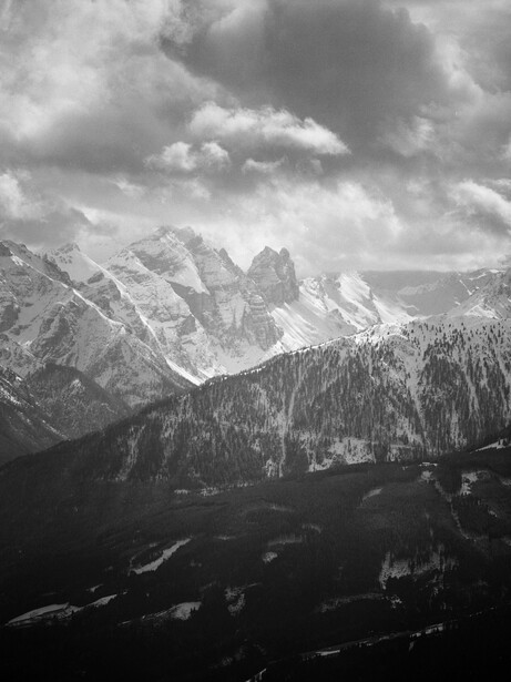
Wow! This is incredible! I'm a sucker for a good cloud picture but still - this one is fantastic
Thanks! This one is from about a week ago. It may end up making it into my portfolio. I'm happy with the outcome.
For me, black and white looks better most of the time. I love shooting black and white, the pure play with contrast and light, with patterns and textures. It's not that I totally dislike colour images, I do take them if the colour adds something or underlines a certain feel like the golden light of a setting sun. What I really can't deal with (as a viewer) is overtly poppy colours with the saturation pushed to the max. That's why my personal approach to colour is always a bit muted, desaturated to the point of being pastel-coloured. But I definitely prefer black and white.