
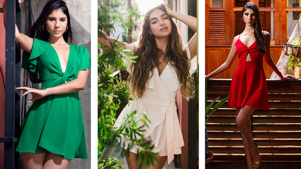
Yes, you read that right. Pye Jirsa is back in Puerto Rico and this time he goes head to head against both Lee and me for the ultimate photography competition. We need your help deciding who took the best image!
Below you will see three photos from our upcoming photography shoot out video. Vote for your favorite image and then see if you can pick out which photographer took each of the three photos. Sometime next week we will release our newest shootout video and all three photographers will find out who is king of the hill live on camera.
Photo 1: The Green Dress
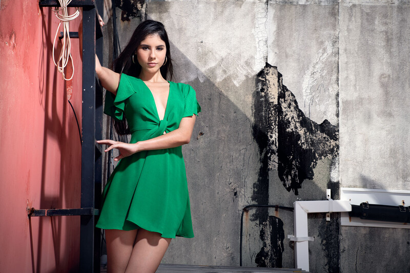
Photo 2: The White Dress
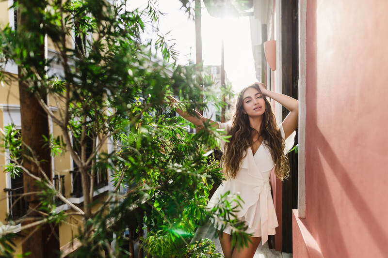
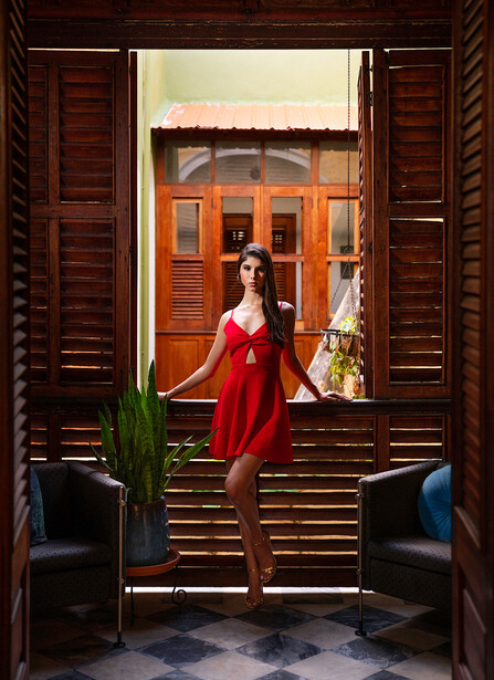
Photo 3: The Red Dress
Which Photo is the Best?
Who Took Which Photo?
Related Articles


Join the Fstoppers community for free
-
Post comments and join in the discussions
-
Browse the site ad-free
-
Share your work and get featured in the community
-
Compete in the photo contests for fun and prizes
56 Comments
Green dress by a mile
Hand posing is all wrong
Yeah, that's what ruins it for me, too.
Although I liked the red one the most, all shots esthetically are quite close. These hands positions taken away from environment might indeed seem awkward, but I like how they harmonize with this particular set. There is a visual rhythm to it.
Patrick took the red dress, his eye for color and lines. It screams architectural photo with a model in it. (Leaning toward my favorite but they just popped up)
On a mobile device, the experience immediately puts white dress in third because the amount of subject to frame is even smaller than print or monitor
Yeah, in the thumbnail I liked the white dress the best - the lighting is the most flattering on her of the three images. But after seeing the full shots, it's my least favorite. She's competing with so much in that shot that a simple crop would minimize all of that.
I love everything about the white dress photo except the model's pose. Her hand is pulling her head too far back and it looks like she's scrunching her left eye or her hand is pulling it back. If her hand was a little higher and chin down slightly it would be perfect. But the shadows, the light, everything compliments her look so well. My first guess is Pye took this. It has all the workings of a fancy wedding photo with shooting through the environment. But I could also see Lee taking this almost to mimic Pye's style and throw off the voters.
The red dress is alright, it's my second favorite. The biggest problem for me is the lighting is way too directional and in a weird position to the point where you can't see her eyes at all. Also for an outdoor photo, the lighting is way too harsh to work as a faked natural light photo. It just doesn't work.
And the green dress shot just has nothing special to it. It just exists. The color grading is cold, the model's face is showing no interest, and the environment doesn't really match the dress. There's gutters in the background, there's like an ethernet cable hanging on the top of the ladder..
To me the Green dress image does not seem balanced and the shadows harsh. The white dress is too busy and there is not good separation from the ambient light. To me the red dress is image is the best. The light is balanced with good separation.
Id say the white dress is by far the strongest portrait, then green, followed by red.
I’m so close to liking them but it’s odd that they all have one hand or arm cropped/hidden. I think slight repositioning could have made the images more flattering. I was first drawn to the green dress because of the interesting lines but can’t get over the missing arm. First person to add the arm/hand back gets my vote. ;)
Come on. You gotta love that Rembrandt triangle in the red dress photo.
Yep.
I like the red dress photo, but the green dress photo has the best composition, best lighting, and best use of backdrop. I'm going to guess Green Dress is Pye with a Canon, I'm going to guess White Dress is Lee with a Sony, and Red Dress is Patrick with a Nikon. I'm going to guess Green Dress is 85mm at f/16, White Dress is 50mm at f/4, and Red Dress is 70mm at f/8, and the jar has 1731 marbles in it...
There are a lot of problems in the first two.The red dress wins easily with only a minor problem (the miising fingers of her right hand.It could be great if was the same model in all three fotos.
I like the red dress picture the most followed by the green dress. The white dress would be fine, but the other two take my votes.
I think the red dress picture screams powerful female in the middle of an office type vibe. I like how she is framed by the doors and then the window behind her and her pose. Granted i would have prefered her hand not being hidden.
I like the green dress because of the contrast with the environment. Its like she is all dressed up and in the shady part of town. Not something you really see everyday.
Are we all having our collective chains yanked? I don’t think any of those images could be hailed as ‘great shots’ by any stretch of the imagination as each have serious flaws that would preclude them from being given that stamp of quality. Can you imagine any of the three being used by an agency in a major product campaign? My first impression was the red dress had it, but when the composition is scrutinised why o why did he choose to leave that awkward green plant stuck behind the chair? Not only does it look ugly in its blue pot and crappy stand, and not in a good way, but it obscures the models right hand. The white dress could benefit from some serious cropping, but why o why did the photographer make it a competition between the model and the bush? The green dress, for me, just has too many competing ugly elements in the frame, which can sometimes work, but not on this occasion. If I were the client I would not be happy and advise each to work with a competent art director.
You have to think of the context of how these might be shot. These photos probably had very little production behind them. Based on their previous videos, you can assume there is some challenge element to them and that they're just throwing themselves into it. So location and tools might be limited. I also don't think the end goal is to sell the dress, but take the best portrait.
For some reason I can't stop thinking that maybe they did these with the latest iPhone and a Profoto C1 to test out that mobile strobe. None of these have a serious depth of field to them, or serious telephoto quality. So it's possible these were done completely on mobile. I don't know how powerful they are so I could be very wrong.
"They" usually don't place any concern for how difficult a shot might have been to take or the limited product time available when they do their critique videos of others work. So I say we all just bash mercilessly and irrationally :)
A challenge video is different from "post your best X photo". If they ask you to post your best surfing photo, they don't expect you to run outside and go find a surfer. They are looking for photographers who specifically have done that a bunch of times and hopefully are pro/semi-pro action photographers where they can see the work of all levels and critique based on their perspectives and the situation.
They're two different situations.
Not necessarily, for example with wildlife shots Lee always says he would rate them lower if they were at a zoo compared to the wild or shot on a group safari with 20 photographers shooting the same thing. They also had the phone shots contest in which they placed things in context. But I get your point
To be fair It was labelled ‘the ultimate photography competition’......’
You basically said what I would have said. I agree on all your points. Each had so much more potential to be really good. It was like they were all trying way to hard to be creative and missed some important points along the way. The cropping was bad on all three photos, with the green being the least terrible. The lighting was bad as well on all three. Either too flat (white), too harsh (green), and too contrasty (red). With that said, they are all very pretty photos, and I don't think anyone would be unhappy if they received these from a photo shoot. Money shots? No way! Keepers? Sure enough. When one relies too heavily on the beauty of the model without getting the the rest correct, the photo is pretty but not sellable. Anyway, I am definitely not being critical...but they DID ask. :)
I have to go with white dress, has a nice glow about her skin and the object of this is to shine on the models. Really want to pick red dress because that is more my style but the harsh shadows on the face throws it off for me.
I was going to vote on the white dressed model, until the full images were shown. After review, the red dress is the best of the three IMO. The colors are spot on and I love the comp. Although she is centered, this works perfectly, especially with the line of the wall leading you into to her dress. Nicely done guys, but I believe the red dressed model photo wins this challenge.
I like the white dress of the three. I like the natural look of it.
The green dress image looks too busy, particularly on the right. That black tar (or whatever) and misc piping just makes it an ugly background. And, her left hand looks awkward with just 3 fingers. Reminds of chicken's feet.
The red dress image looks way too clinical and contrived. Model's expression/pose is too stiff. And, almost everything in the scene is so symmetrical it looks unnatural and overly staged. The pillows and whole plant+vase looks out of place.
I found it odd that all 3 images selected have the model's hand obscured in some way. Was that part of the challenge? :P
Green dress model has interesting post but the background, especially the dirt on the wall is a bit distractive.
White dress would be the best photo if it is cropped. The green leafs on the left are getting too much attention. Crop the picture a little tighter or crop it vertical. I want to see the model's right hand too.
Red dress looks the most carefully planned picture. If more light can comes in through the wooden windows it would be perfect.
1. Green, PYE. 2 Red, PATRICK, 3 White, LEE.
The Red Dress is just unfair because of how it just naturally pops. In this case the Red Dress wins because the environment works with the dress and model. The rosey color of the wood in the room and the red outside the window just tells a better story. The green dress is the weakest story relative to the group. They are all great shots and I am sure there is a video to follow this fun poll shorty.
The green one - The model & her dress is the clear focal point and it works so well with the color palette of the background, the light/shadow contrast, as well as the textures differentiating the environment from the subject. The red one has some awesome technical lighting and depth to it, but the color of the background loses the subject too much. The white one actually looked awesome in the crop at the top of the article, but the full sized one is not as good simply because parts of the foliage are out of focus and others are sharp and it’s distracting.
Red wins for me.The framing of the red is gorgeous, lighting is almost perfect. Whomever shot it looked like they wanted Rembrandt, I kinda wish she tilted her head up slightly.
White's lighting is naturally gorgeous, the fore and background elements add so much too it, however it needs a tighter crop IMO and she lost her arm.
Green is not bad, wish her head was tilted slightly up so she'd not suffer the dreaded skull/dark eyes issue. Pose is good, minus that awkward arm wrapping under and around the ladder.
Green - Lee
White - Pye
Red - Patrick
Everything is subjective. The framing ruins the red one for me. What is all that head room about?
Of course everything is subjective, this was my opinion; it doesn't make it fact. Compared to the others for *me* it looks the best regardless of the negative space at the top. Had the photographer shot upwards more it probably would have looked better, but cropping it, again IMO, would ruin the overall feel of it.
There are couple of things that bother me from the red one.
Rembrandt lighting in this case it's fine—it works. I do wish the shadows were lifted a little on her face though. What bothers me is the mixed lighting/color on her skin. Her left side of the skin is a little red, her feet begin to be pretty yellow, and her shoulder and chest is a little cooler.
The plant bothers me a little. I like the green, it adds more "life" to the picture but it's just right in the way. If enough room, I would have placed it behind one of the seats and let it peak out a little. The whole image is pretty symmetrical so one could have moved the plant somewhere else as well and snap couple pictures in different locations and mask it in.
Her shoulder and neckline are kinda weird for me too. It looks like a she has a thick neck and her shoulder is too low :/
Weird,... If I look the full images I'd vote them esact the opposite as by looking just on the the crops on top of the article
Although I feel like red is technically the best photo, green hits me somehow. I just love it.
What is all the head room in the red dress for?
The head room gives context to the window framing. Not everything needs to be a tight shot. That image is a perfect example. Its good to mix things up (wide, medium, tight) when appropriate.
See that's where I think this shot is weak.
The subject isn't the window framing.
That's distracting and the viewer is left wandering around the composition...
IMHO
A great image isn't just about the subject, it's about the subject + surroundings, and, and, variety. Of course, IMO. I'm sure a gazillion people will disagree with me. Then, again, another gazillion probably will agree. :P
While I love most of the White dress photo, I can't get away from how distracting the plant is from the model. My eye is immediately drawn to it. I personally think the red dress is the best of these if I assume the challenge is "You get one light and whatever you can do with natural light on top of it." I actually like the slightly hard light on the Red Dress as it echoes the hard lines of the scene around her. I think she is better framed than the other two shots and the lighting feels more deliberate. I'm going out on a limb and saying it looks like the light may have a honeycomb or snoot to keep it off the walls around her.
In order of awesomeness: 1. Red, 2. Green, 3 White.
Of course it's all subjective.
"against Lee and *me*."
red dress - but that just might be the pose...naw..take that back - red dress much more dramatic lighting
Red dress by a light year! Not only that, the composition is just better IMHO.
Red dress by a light year! Not only that, the composition is just better IMHO.
Red - Patrick
White - Pye
Green - Lee
Lens flare lee at it again...
Or maybe I learned my lesson!
We can all agree that cropping matters. I agree with other comments about the order of preference changes depending on the thumbnail versus the voting candidates.
Titles and captions matter. By labeling, they frame the audience. Is the dress the “hero” or the model or the whole picture? The vote is for picture but that’s not the title. (I can hear Lee saying, “I was in a hurry and needed to put them up. I didn’t think about how the labels might affect the audience.” Then Lee references the comments, circular reference.)
Also, I bet that this is a follow up on the tech talk they had recently. “What we didn’t tell you was that these were all shot on an iPhone 11. With some lighting, we wanted to see what kind of photos we could make with the newest mobile phone camera.” (Book it!)
My main criticism with all the pictures is about what is chosen to add to the model and dress.
Green photo (Pye?): The photo looks great in crop because seeing the wires hanging down and the pipe on the wall adds nothing to the model. The woman’s black hair, black railing, tonal wall contrasts wonderfully with the dress and skin tones. The lighting on the legs is just enough that it adds an edge to the dress but not so much that it throws off. There’s a shadow diagonally on the wall but the shadow on the face and legs is from another angle. I don’t think it’s noticeable to the average viewer and it works to me. I wish the candidate shot was the cropped one.
The white dress(Lee? God-ray-back-light-man?): The candidate shot has the subject as a minute part of the whole. I can see the eye going to her because of the back light but what is the point of the greenery? The lines of the railing and street are totally obscured and don’t lead the eye to the subject. The candidate shot has green aberration front and center, again gone in crop. It’s bright; her left arm and extended dress are translucent. What better way with back light to show the model and the lines then letting the light through the subject. Her right hand could have been holding her hair or dress something to create a more angelic and/or intimate look. Instead you cut it off (devil look! lol). Even in the crop, the greenery is in the way.
Red dress (Patrick?): This is where I think the captions matter the most. Her dress is the obvious subject of the photo. Notice how her legs differ from green dress. They almost disappear into the woodwork and the horizontal lines of the dress end with the horizontal lines of the woodwork. The high angle lighting is on the model’s chest and the lines of the dress and shadows draw the eye down. The rest of the photo is only there to frame the dress. The distance to the model and the shadow on face and even the natural lay of the hair points to the dress. Also, the model with respect to foreground, mid- and background, the dress is the middle of everything. Right hand fingers.
I think Green Dress reached farther and got more done. I can’t get behind the model on the street look who is lit so well and posing so well with the cables and pipes. That’s personal preference. Red Dress does not reach as far and achieves what it intended. White Dress tries something though I wished the photographer leaned in all the way. I think a solar lens flare (egads!) from her right shoulder to the lower left would have been better than the greenery. I think White Dress reached least and came up short.
If you’ve read this far, thanks. It’s mostly pent-up critique typing because I missed all the other critiques. Your mileage may vary.
Super interesting read; I think you are going to be pretty shocked reading it back after the post goes up.