
In our last photography shootout, Lee Morris defeated Pye Jirsa and I to regain the crown of "world's best photographer." Yesterday we teamed up again to have another battle and we need your help deciding who took the most beautiful or interesting image.
Since moving down to Puerto Rico, we have had quite a few photography shootout challenges. You can watch them all here on our YouTube Photography Shootout Playlist. If you've followed the series, the prize of top photographer has changed hands many times even if the resulting images weren't always worthy of any real awards.
Pye Jirsa has returned to the island yet again (seems he should just move here now,) and this time Lee took the initiative to setup a new challenge for all three of us. I'm not going to share with you who shot what but the basic concept was take the best image you can at the beach with the same model, same dress, and same gear. The time limit was 20 minutes for each photographer, and all three of us had to create images early in the day when the sun was still pretty high in the sky.
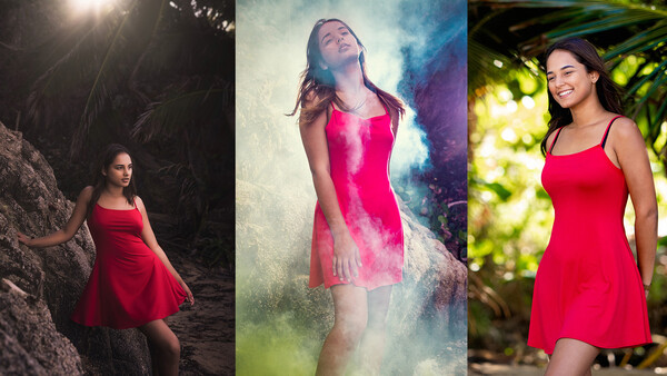
The Submitted Images
Photo 1
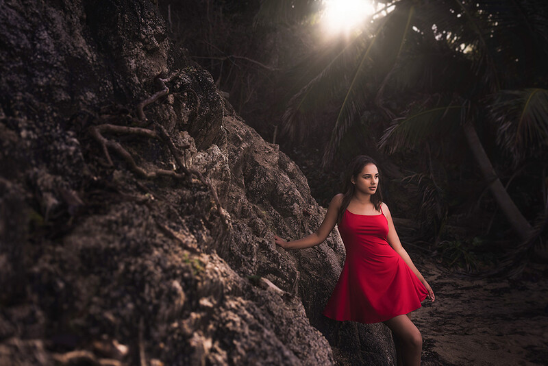
Photo 2
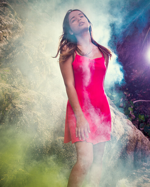
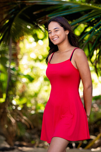
Photo 3
Who Shot What?
With most of these challenges, the winning photo usually stands out pretty clearly to our viewers. However, what isn't so obvious is who shot which image. The poll below outlines all the possibilities and we'd be curious to know who you think shot each image.
Stay tuned and subscribe to our YouTube channel because next week we are going to release this hilarious shootout video and reveal the answers to which image is best, who shot what, and most importantly, who holds the crown of "best photographer in the world!"


Join the Fstoppers community for free
-
Post comments and join in the discussions
-
Browse the site ad-free
-
Share your work and get featured in the community
-
Compete in the photo contests for fun and prizes
29 Comments
Yeah I'm guessing Patrick, Pye, then Lee.
Photo 2’s expression looks as though she needs the toilets and soon.
Photo 1 would have been my pick if she had a different expression. It looks like nothing is going on in the eyes, mouth, and eye brows. It throws off the picture. Otherwise, the picture is very dynamic and I love the mood it brings.
Photo 2 I just think has too much going on. It felt like someone was trying too hard to get a 5/5 and over did it. It was my least favorite.
Photo 2 Was picked because it comes together nicer than photo 2 and she actually had an expression on her face other than blank face from photo 1.
Change the expression in photo 1 and that is what I would have picked. I love the dynamic picture there.
I wish we had more context than just 'which pic is best'. Best for what?
Wow, someone really took a chance on #2, although I love the pose and the dress is most flattering of the 3 shots the effects are just too much for most applications.
Suggestion for next challenge: only cropping and VERY simple adjustments allowed. In other words, who can compete in composition without heavy processing options?
Cant wait for the video!
1st one looks nice, with the lighting being very moody, but the pose and expression could probably be nicer. And I prefer the vertical crop in the header over all the dead space/rocks on the left
2nd, way too much going on. The smoke, colours, heavy and harsh light. All very dramatic, but I don't really like the pose and expression, which aren't dramatic at all. The expression is more her throwing her head back and saying "uuuuugh can we stop this already"
And I also don't really like the dark space on the right, with the flash pop/flare being there, there is no need to have that in the frame.
the 3rd seems very natural. Showing her natural (real) smile and beauty. So it's the one that captures the model best. But compared to the other two, it's a bit bland.
So, basing the decision on the subject (the model) the 3rd one wins it for me. Even if it's a bit basic and bland, simple and very very safe, It's the one that captured the model the best (which seems to be the point of taking the picture in the first place)
1 is more focussed on the landscape.
2 is too focussed on the effects.
This is impossible to decide! I could see all three of you guys taking talking through each shot as if you were taking it.
First photo is for sure the best, third photo is a nice simple clean image, and the second photo looks amazing once you've had 5-6 beers.
Patrick, Lee, Pye. Lee is going for over the top, trying to make people think it's Pye.
1 has a really nice look for a landscape photograph, but the subject really isn't much of the focal point.
2 is just over the top
3 is the best portrait of the subject, but it feels a little like a snapshot. She's looking into frame, smiling, and it has good color, all pluses.
If the pics are judged based on who shot the best picture of the subject, #3 wins. #1 would win as an environmental or landscape photo.
I consider myself more of a landscape photographer, so I am drawn to #1
I'm on board with this - the smile in 3 alone trumps the other two despite the simplicity. In 1 the dress seems to be sitting funny and the subject seems unclear - that flare at the top really pulls me out of it. I often try to relate to an image and feel what the subject is feeling, but the closest feeling I can attribute to image number 2 is trying to hold in a fart while standing in an elevator.
That first photo looks phenomenal in the header (while cropped). Once you see all the unnecessary negative space on the left it loses something.
I'm just looking forward to the video when whoever took number two says "I'm going to try something here, and I don't know if it's going to work"
I would say Lee, Patrick then Pye for the order, and #1 being the winner.
I think image 1 is Pye's because it's the style he does with weddings and such. Also, I don't think he'd have subjects appear armless. :D
The other 2 images, it can go either way between Lee and Patrick.
I voted the Lee, Patrick and Pye.
I like the photo of Lee, good composition, good texture, good contrast, the added effect of the backlight does not bother.
Patrick's picture seems like a pretty picture that any lady could take with her cell phone.
Something happens to me with the photo of Pye, it seems to me a good production in which the model did not collaborate, the posture of the head, her forced neck, the position of her chin, her hair on the cheek and her arm and hand hanging forward I do not really like.
But you are the experts, I know nothing about this.
Oh boy. So here’s my thoughts. 1 is a good image. I like the lighting, however, I would have liked to see another light added for rim to camera left for separation between her hair/body from the background. I probably would have gotten A bit lower to bring the opening through the trees a bit closer to the model and possibly even took a step in. Not that I don’t like the head room in this, I just think it’s a tad bit much. 2nd image is honestly my least favorite. I’ve shot with smoke, and boy is it a challenge. I’m assuming some dehaze was applied and there was an attempt to fix color as well. If this is the case, the dehaze added some weird contrast. Having the light in the frame here is also a bit distracting and is throwing a color that’s not really adding to the image. I also feel like you caught her off guard and took the picture and she looks like she has a lazy eye. (Not her fault). There’s more, but I’ll stop there. Image 3 is technically a good image. I like it. The problem is, it’s super safe. Great expression, great composition, retouching is good, color is okay but not great, the natural frame and leading line from the trees work, etc. I did notice though, there’s some chromatic aberration on her eyebrows that I would fix. Take this all with a grain of salt, because I’m still learning myself, lol. Just my opinion.
My guess is Pye - photo 1, Lee - photo 2, Patrick - photo 3
:D
1 is by far the best. It's just more interesting and has the best editing.
I like #2 best.
My vote went to number one.
Photo 1 is the best, of the three.
These comments crack me up. I'm trying to figure out if they're purposely quoting CTC episodes or not. Anyways, if I was delivering 1 photo to a client, had to choose 1 photo for my site to set me apart, 1 photo of it was me, then I'd want it, #1 hands down. #2 is cool, but not great. #3 looks like a standard senior photo.
I guess I'm the only one who likes the 2nd one, and thinks #3 is boring af!
Nope, I also like the 2nd and can't see what is so special about the 3rd
The 2nd one would have been ok if we weren't looking up her nose.
Whoever took photo 3 should never touch a camera again. In fact, they should be banned from looking at photos completely.
Seriously, "The contest is about interest and beauty, I'm going to take a high-school portrait."
the order is ........... nr 3 the best ...nr.2 second place and nr1 the last plce . ( in my opinion offcourse )
number 2 seriously stinks in my opinion. not good at all. looks like someone just discovered photoshop and went golly gee look at me..number one is better but needs cropped quite a bit..three looks really good but needs legs cropped out and hands brought to the front...
Vertical crop on #1 ftw.
I had to go with 3. It's not super exciting, true, but captures the most natural look and feel of the moment and the model. The first felt like it was almost a bit too plastic and the second looked like it was trying to hard for an indy album cover. I guess I find natural feeling to be most appealing.