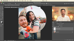
Realism is imperative when creating composite photography. This great video shows you how to check and match colors perfectly when making composites in Photoshop.
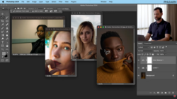
Unmesh Dinda of PiXimperfect explains in great detail the steps required to precisely match and check colors when creating a composite image in Photoshop. This is an important skill to learn when placing subjects on new backgrounds for portrait photography or advertising. The idea is to create as seamless a look as possible. This can be best achieved by first matching the brightness or luminosity of the disparate elements of the image and then matching the color. Dinda's process is fairly complex and requires a solid understanding of how elements such as light, color, and saturation work individually and in combination with each other.
Dinda uses numerous adjustment layers, including Curves, Hue/Saturation, and Gradient Maps, which he combines with various blend modes as part of his process. While he gives the viewer a step-by-step guide, there is a fair amount of artistic subjectiveness involved, as everyone will have a different perception of how best to match subject and background to create a pleasing and realistic final image.
What's your composite matching workflow? Please share any tips or best practices in the comments below.


Join the Fstoppers community for free
-
Post comments and join in the discussions
-
Browse the site ad-free
-
Share your work and get featured in the community
-
Compete in the photo contests for fun and prizes
1 Comment
Is this kid just copying old tutorials? He uses the same examples as this tutorial.
https://fstoppers.com/composite/how-create-realistic-composites-photosh…