Creating a realistic composite goes far beyond just combining and masking parts of an image. This tutorial provides an in-depth look at how seeing and blending colors can give an image a realistic final result.
In this video, Jesus Ramirez of the Photoshop Training Channel simplifies the complexity of blending multiple images by teaching you to look at an image in terms of color, saturation, and luminosity. These three parts of an image are explained well as he creates three layers to help view those aspects more clearly.
In his first step, Ramirez uses the color selector to find the exact luminosity values of the blacks and whites of the background image. He then explains how to use a curves layer to match those values in the foreground image. Next, he matches the saturation of the images with the help of a saturation map. A saturation map is a black and white version of the photo that reveals only the saturation of the various colors, making it easy to use a hue/saturation layer to blend the images. Lastly, he explains how a solid color layer can be used to view the colors of the photos more clearly. A selective color layer is then used to give the two images a cohesive appearance.
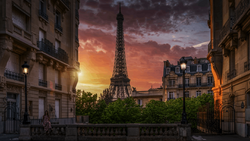
Ramirez’s explanation on dividing the images in this way and adjusting each of these areas individually makes this one of the best tutorials that I have seen on how to make a composite appear realistic. In the end, he was able to take two very different images and create a believable result. This is not only a great composite video but an excellent tutorial on the aspects of color as well.


Join the Fstoppers community for free
-
Post comments and join in the discussions
-
Browse the site ad-free
-
Share your work and get featured in the community
-
Compete in the photo contests for fun and prizes
2 Comments
Frankly, this is not a good example
Fstoppers really needs to exercise better editorial control. When the result so badly mismatches the title, it brings down your brand.