When it comes to branding, there are a number of elements that need to be considered. It needs to speak about your business while also evoking something in the viewer. It doesn't necessarily need to clearly explain what you do.
Take Apple, for example. It's an apple, yet they don't sell apples. McDonald's is represented by the golden arches, but they sell burgers and fries. MKBHD is a tech reviewer, but the brand itself says nothing about tech.
So what is it that actually works when it comes to a brand? It's something I've been asking myself for a while.
Brand Recognition vs. Description
In my previous roles in the corporate world, many of the companies I worked for had no direct reference to what they sold in their name. A small visual icon would sometimes help that narrative and attract attention.
Looking at more brands like Pepsi, there is no mention of cola in the brand now, but there was previously when it was called Pepsi-Cola. Over time, the brand itself became recognized, allowing them to drop the "cola."
Another example to consider is camera brands:
- Canon started as "Precision Optical Instruments Laboratory."
- Nikon originated from "Nippon Kogaku."
With all that in mind, how do you get your brand noticed? Strong visual design is a starting point.
My Own Branding Approach
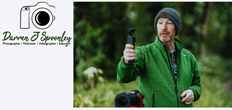
My own brand, Darren J Spoonley Photography, is my name, so I need to ensure that my name appears in the brand.
When I first started my photography business, I wanted my brand to include my name alongside what I do. I'm a photographer, videographer, writer, educator, and podcaster. I considered using icons to represent those skills, but they may not be immediately recognizable.
So I went with a clearer approach: my name, the wording of my skills, and a camera icon so it would be immediately obvious what my main focus is.
Did it work? Perhaps it did, but I've always felt it needed to be fresher, more stylistic, and more unique, while still retaining the visual clarity it provided.
Testing Zawa
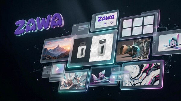
When Zawa reached out to Fstoppers to see if we would like to try their new product, I was immediately interested as I had been considering updating my logo and branding.
It promised to remove many of the pain points people experience when it comes to brand creation, while also reducing the cost of hiring a design agency to create a new logo and brand asset suite. It sounded good on paper, so I took the opportunity and explored it.
Zawa is a web-based AI suite of tools with a user interface that, on first login, reminded me of Canva. That was a positive start, as it presented a clean interface.
To create a logo and brand suite, all you need to do is provide prompts, and it generates the suite for you.
Setting Up the Rebrand
For me, I already had a logo and an image of myself, and I wanted a fresh logo and brand suite built from those.
So I uploaded both and gave it a simple instruction:
"This is my existing logo. I want you to rebrand it and then give me a full brand kit. The logo needs to be modern and fresh. Here is an image of me also to help with this task."
AI Analysis of Existing Assets
This was the response I received back within about a minute:
First Image (Logo)
- Image type: A professional logo for a creative professional (Darren J Spoonley), combining a graphic icon with text.
- Graphic features: A simple black-and-white line drawing of a DSLR camera, representing photography and videography. The illustration is minimalistic with clean outlines.
- Color matching: Black for the icon and text, and a rich green for the name. The palette is limited and could be expanded for a more modern look.
- Design style: A mix of styles — minimal line art, script font for the name, and sans-serif for the roles — which feels slightly disjointed.
- Layout composition: Camera icon centered above the text. Clear hierarchy but could benefit from more dynamic spacing.
- Relationship to the task: Functional but dated. Improvements needed in typography, detail, and color range.
Second Image (User's Photo)
- Image type: A lifestyle/action photograph showing Darren J Spoonley in an outdoor work environment.
- Graphic features: Natural elements, camera equipment, and professional attire.
- Color matching: Dominant greens and neutral tones, linking well with the existing brand color.
- Design style: Natural, candid, and modern with shallow depth of field.
- Layout composition: Slightly off-center subject with environmental context.
- Relationship to the task: Suggests a brand that is approachable, natural, and connected to real-world creative work.
It then followed up with a request for clarification, asking what elements I wanted to retain or change. I told it to go with a fresh approach.
The Proposed Design Direction
Core Concept
A cohesive, modern visual identity that bridges technical media expertise with an approachable, organic teaching style.
Visual Elements
- Visual Language: Contemporary minimalist style, using clean, abstract shapes instead of literal icons.
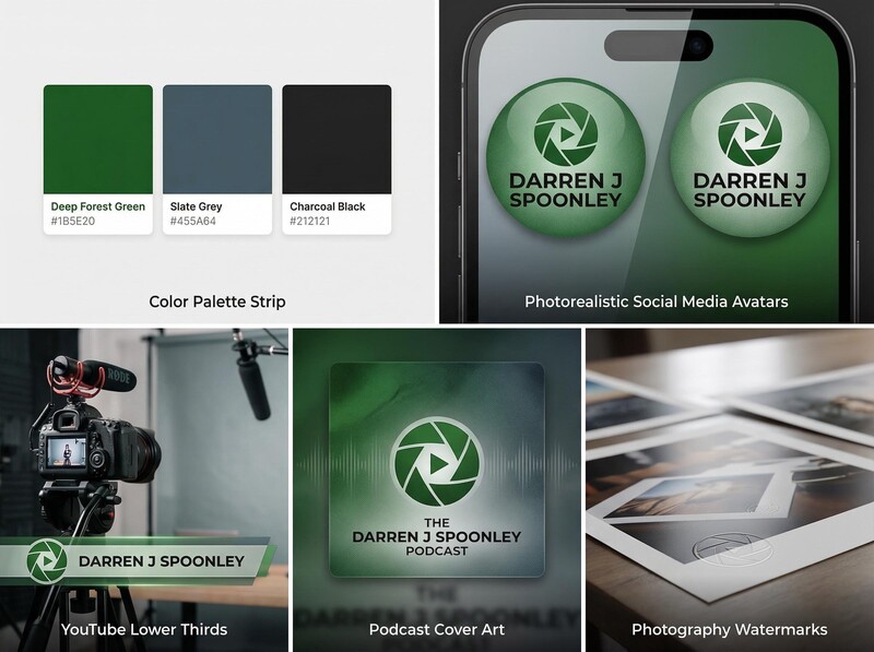
- Color Configuration:
- Primary: Deep Forest Green (#1B5E20)
- Secondary: Slate Grey (#455A64)
- Accent: Charcoal Black (#212121)
- Font Strategy: Modern geometric sans-serif typography.
Brand Tone
Professional, approachable, contemporary, expert, natural.
Technical Details
Social media avatars, YouTube lower thirds, podcast cover art, and photography watermarks.
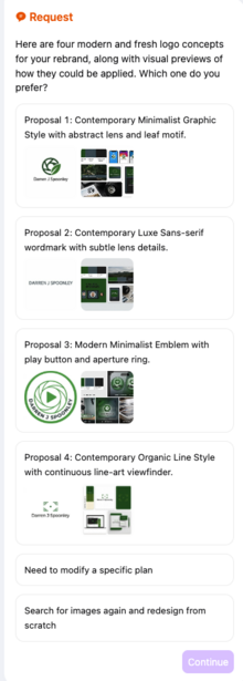
Logo Design Proposals
Next came four design proposals, each outlining a different direction for the brand. These ranged from minimalist graphic styles to more typographic-led approaches, all aligned with the design guide.
All of this happened within two minutes, which was notably fast in terms of understanding the brief, analyzing the assets, and presenting structured outputs.
Results and Output
The result was four different options. I chose one direction, and it then generated a full logo and brand toolkit.
Not bad for a total of five to seven minutes of work.
I did continue to ask it to generate more options, and the one it created seemed to fit my genre of landscape photography quite well. What do you think of the result?
Additional Tools and Features
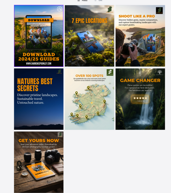
I then explored some of the additional tools on the platform. One allowed me to create social media posts from a single image upload.
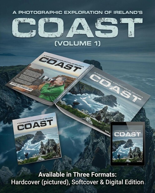
I uploaded one image of my digital location guide, and another for my book COAST, and within two minutes, it produced several social media post ideas. For someone looking for inspiration or fresh ideas for sharing content online, this could be useful. I did have to tweak these, of course, but overall the output looked good.
There are also a number of other tools included in the platform, which would appeal to users with varying levels of experience. If you want a full design suite available quickly, this appears to be a viable option.
Pricing and Value
The pricing model also seems competitive. If you were to employ a design agency for even one of the tasks this tool can handle, it would likely cost multiple times the monthly fee of this software. The use of credits for each request ensures that you know where you stand. It's not unlimited use, which I can understand, otherwise it would be on the go constantly.
How It Works
In terms of how it works, it uses a combination of tools including Nano Banana, agent-based systems, Midjourney, and ChatGPT to generate outputs using credits for each usage.
Given that all of these tools can work from a single central prompt, it makes sense that the system is able to deliver across multiple use cases.
From one service, it then takes your request to the other platforms and provides you with the artwork you need based on the skills of other AI services. Good to have it all in one location too, rather than having to switch between multiple AI agents and providers.
Limitations and Considerations
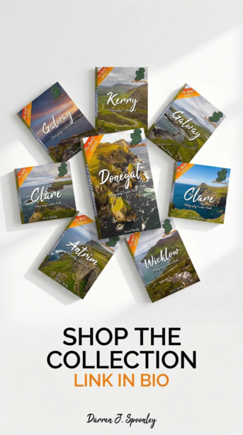
I also asked it to generate additional assets, and while the outputs were generally strong, there were minor errors that required manual adjustment. I gave it all of my covers for all eight of my location guides; however, it changed them and created its own versions and even added locations too.
It's not yet a fully automated solution, but that appears to be a limitation of current AI systems rather than the platform itself.
Final Thoughts
Overall, testing this software has been quite eye-opening.
It can save time and produce solid outputs, though the quality is heavily dependent on the strength of the input provided.
It does what it says it will do, and the results are overall quite impressive. If I hadn't shared the process of creation with you, would you know how they were done if you saw them for the first time? If the answer is no, then it has done its job and done it well. Even if the answer is yes, it still shows that it's capable of producing work strong enough to stand up to that level of scrutiny.
Join the Fstoppers community for free
-
Post comments and join in the discussions
-
Browse the site ad-free
-
Share your work and get featured in the community
-
Compete in the photo contests for fun and prizes
2 Comments
As expected AI branding and logo designs always produces poor design and yes it does scream bad AI design. It is still better to get a decent graphic designer involved.