Color grading in Lightroom can be the difference between a photo that feels alive and one that falls flat. The color grading panel is one of the most powerful tools in Lightroom, but most people either skip it entirely or use it wrong.
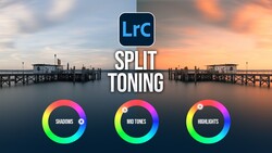
Coming to you from Sean Dalton, this practical video walks through exactly how the Lightroom color grading panel works and how to use it to build photos that have real depth and mood. Dalton starts at the foundation: before you touch the color grading panel, set your white balance using the temperature and tint sliders. That gives you a neutral starting point to build on, rather than trying to fix a broken base with creative color tools. The color grading panel itself lets you push specific colors into the shadows, midtones, and highlights independently, which is something the HSL sliders simply can't do. The HSL panel can only edit colors already present in an image, while the color grading panel lets you introduce entirely new ones.
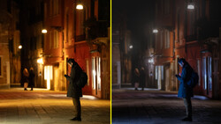
One of the most useful parts of the video is Dalton's breakdown of complementary color combinations. The blue-and-orange pairing is the most common, and for good reason: it's naturally occurring in a lot of scenes and looks good almost everywhere, especially in night photography where the shadows give you a lot of room to push in cooler tones. Dalton also covers the green-and-red combination, which he describes as giving images a classic Fujifilm film aesthetic, and he shows how even a subtle application of it adds color depth without looking overdone. He works through real examples shot in California, Hong Kong, Vermont, and Japan, showing before-and-after comparisons at each step so you can see exactly what each adjustment is doing.
The video also gets into a few practical editing habits that don't get talked about enough. One is color fatigue: if you stare at the same edit for too long, your eyes adjust and you stop noticing what's off. Dalton recommends stepping away for 30 minutes or more and coming back with fresh eyes. He also makes the case for subtlety, noting that the examples in the video are deliberately heavy-handed to show how the tools work, but that small adjustments often produce better results than dramatic ones. There's also a useful tip about using Lightroom's snapshot feature to save multiple color grade variations of the same image so you can compare them side by side. The video covers a few more specific techniques and combinations that are worth seeing applied to actual photos rather than just described. Check out the video above for the full rundown from Dalton.


Join the Fstoppers community for free
-
Post comments and join in the discussions
-
Browse the site ad-free
-
Share your work and get featured in the community
-
Compete in the photo contests for fun and prizes
No comments yet