Knowing when to convert a photo to black and white is one of those decisions that separates a thoughtful edit from a forgettable one. Get it wrong and you strip out color that was doing real work; get it right and you reveal something the color was actually hiding.
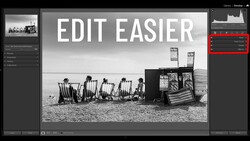
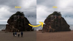
Coming to you from Gareth Evans of Park Cameras, this practical video walks through a decision-making framework built around three things: light, texture, and whether color helps or hurts the image. EVans works through a range of photos in Lightroom, including portraits, landscapes, wildlife, and seascapes, comparing color and black-and-white versions side by side. The core question he keeps coming back to is simple: is the color serving a purpose, is it neutral, or is it actively taking something away? A warm wildlife shot of a squirrel stays in color because the warmth reinforces the feel of the image. A moody portrait goes to black and white because the color was muddying the light rather than supporting it.
One of the more useful moments in the video is the boat image, a slightly flat, underexposed sea shot that doesn't do much in color. Pulling it into black and white and working the contrast, clarity, and masking tools transforms it into something with real drama. The waves hit harder, the boat reads more powerfully against the water, and the whole image gains a weight it didn't have before. It's a demonstration of how black and white can actually solve problems that color editing can't. He also shoots everything in raw specifically to keep this decision open, rather than locking in a look at the time of capture.
What the video doesn't spell out in full is exactly how he handles the more ambiguous cases, the photos where color is neither helping nor hurting. There are a few of those in the edit session, including a fishing boat shot that reads as perfectly acceptable in color but becomes noticeably more layered and textural in black and white. The reasoning he uses to push those calls one way or the other is worth watching closely, because that middle ground is where most real editing decisions actually live. He also touches on specific masking techniques in Lightroom, including using radial gradients intersected with subject masks and color range masks to isolate sea foam, that go beyond the basic black-and-white conversion and into actually shaping light within the image.
Check out the video above for the full breakdown from Evans, including every edit and the complete decision process behind each photo.


Join the Fstoppers community for free
-
Post comments and join in the discussions
-
Browse the site ad-free
-
Share your work and get featured in the community
-
Compete in the photo contests for fun and prizes
4 Comments
Interesting. I grew up shooting B&W and never really learned to "see" color photos. As a result a lot of my shots look better in B&W because I tend to shoot for shapes textures and tonality. Still love B&W.
The digital camera makes it easier to switch back and forth. I have learned to listen when the image tells me to shoot one or the other or both.
Agreed, and this is the reason I can't see the point of monochrome sensor cameras. What little, if anything you gain in resolution you give up in the ability to post process and employ filters and other effects.
An on line acquaintance uses the Pentax K3iii Monochrome with spectacular results. Along with a couple of other monochrome cameras. She does use filters as needed or for effect. Her work can be found on Flickr at https://www.flickr.com/photos/84761842@N03/.