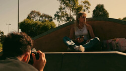
I've been shooting commercial photography for years and despite any fancy gear I might have in my arsenal, I never walk on a set without at least one reflector with me. SLR Lounge put together a great tutorial showcasing the power of one of the most affordable photography tools that every photographer should learn to use.
They made a great point in the video that if you use available light and effectively, that reflectors can be used to take an awesome portrait in lieu of buying flashes. Personally, a lot of my work has a particular look created by using powerful flashes with modifiers, but I understand how some could definitely use this skill set in a creative fashion. It was really incredible what Lauri was able to create.
Related Articles


Join the Fstoppers community for free
-
Post comments and join in the discussions
-
Browse the site ad-free
-
Share your work and get featured in the community
-
Compete in the photo contests for fun and prizes
20 Comments
Why the strong light to the left in the image? To me it distracts and draws attention away from the subject. I always base my lighting on the principle that whatever is the main subject should be the brightest (or the darkest if it's a silhouette, or a dominant color or shade) to make it stand out from the surroundings. If something else (like for instance the strong light to the left in this shot) takes up more space, is brighter and sets the tone for the entire image it steals/distracts from the main the subject.
That's because we are different.
Well the type of lighting was used to give a type of mood, in which photographers should always strive to draw an emotion from the viewer, besides just showing the view you can taking pretty pictures. It doesn't distract it away from the subject, it compliments it.
Photography is not only about principles and rules! It's about making it work. The bright part kind of become a negative space (like a white wall) ... If you didn't know about that principle in the first place, you probably wouldn't see it that way. This photography looks great to me because it works!
I understand what you are saying, and most definitely is photography not about principles and rules. I don't agree with you in this case though. I don't think it becomes negative space. I think it becomes distracting space. I'd say if I'd strive for negative space, I'd add more contrast between the subject and the white area. The only real reason for that white "cloud" there that makes sense to me is that if it was created to put text on top of it.
This is of course my opinion, I respect yours. You definitely seem to have a great eye when it comes to photography (no sarcasm intended).
Well magazine editors may like this type of images, since they have so much space for text-editing.
In that case, it's not a good example to show.
I like and use reflectors but I gotta agree, the eyes naturally seem to go to bright spots in the picture more than they do on the subject.
perhaps the photo was prepared for an editorial piece and some copy text was supposed to go there? Im speculating of course
But i do agree with the bright areas getting the attention first
You are seeing it from a technical standpoint than an emotional one. That is why it draws you
Previous comments just show how closed minded and unoriginal people are. Hurts my heart that photography is taken for granted and under appreciated. This image is beautiful. No flaws.
Or... OR, people just have different taste and opinion than you.
Great tutorial. I like the idea of a smoke machine.
Which is the best resolution for Facebook uploads? Thanks!
I just think the image is too blown out and the image itself lacks saturation I think the image might have been a better without the smoke.. But at the end of the day it's not what I think or anyone else - if the client likes it then thats all that matters.
I agree! I think this creates an awesome mood! I had an amazing teacher that taught us to texture the light create more feeling in the photograph. If the photographer wanted to simply photograph to subject, he would have focused the lighting on the subject.
FYI, in the audio, there's a weird thumping in the background. Sounds like microphonics in an IEM cable but that makes no sense :-P
First, I disagree that the white space is distracting, and more importantly, if this is going to be a musician's cd cover, which is only my guess, it will be cropped to a square format and text will most likely fill that space. I think the image is well executed, and the lighting adds great mood.
What lighting diagram program is he using in the video?
Hi Lauri, great work!
And I concur 1000%!
Just a tip.. when showing Sylights diagrams.. simply hit cmd + to zoom in your browser. It scales nicely.. and will let the viewers see what yorue showing more easily.
Hope it helps.
Be well
~j.j.