
If you've dug through your camera's settings a few times, you've likely ran into the Color Space setting. You may have asked another photographer what it all means, and they've probably just told you to set it to one or the other, and forget about it. However, both sRGB and AdobeRGB have their advantages and disadvantages, so how do you distinguish one from the other?
What is Color Space?
In layman's terms, color space is just a specific range of colors that can be represented in a given photo. JPEG images can contain up to 16.7 million colors, though neither color space actually uses all 16.7 million colors available. Different color spaces allows for you to use a broader or narrower range of those 16.7 million colors used in a JPEG image. The difference lies within what is considered wider and narrower color spaces.
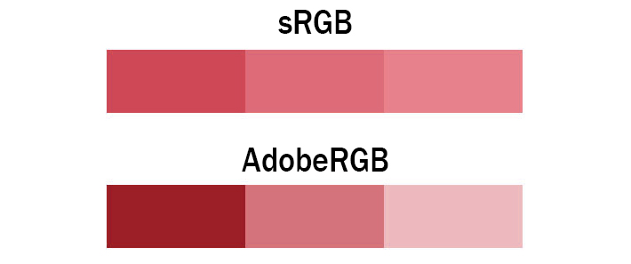
The image above explains it pretty well. Both images contain only three colors, however, the colors shown in the AdobeRGB scale have more differential between them. This means photos taken in the AdobeRGB color space will have more vibrancy in their colors, whereas sRGB will traditionally have more subtle tones. In situations where you're photographing strong color tones, sRGB may need to dull them out to accommodate, whereas AdobeRGB is able to display those colors with more accuracy.
The Types
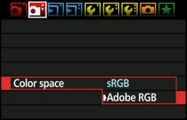
In digital photography, there are two main types of color spaces, AdobeRGB and sRGB. If you go into your camera’s settings, you’ll see that you’ll have the option of using either, straight out of the camera. You’ll also have the option of converting it to one or the other in post processing (with limitations), but which one should you use?
The Difference
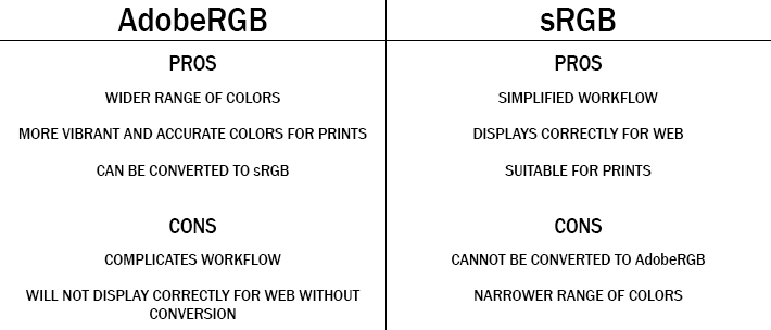
To better understand which one to use, you must first understand the difference between the two. AdobeRGB, by all accounts is better, as it represents a wider range of colors. How much better? They say that AdobeRGB is able to represent about 35% more color ranges than sRGB is able to. But does that make it the best for photography? Not exactly, as the world works with sRGB far more than it does with AdobeRGB.
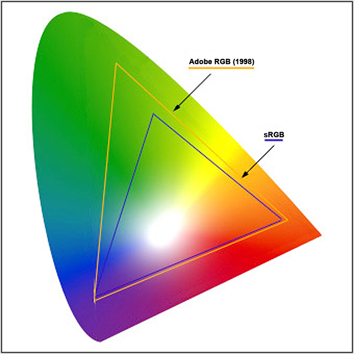
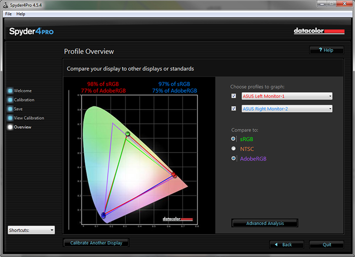
sRGB came first, and almost everything on a computer is built around sRGB. The internet, video games, applications, personal devices, and most everything else has adapted sRGB as their standard for color space. Even the monitor you’re using likely cannot display all the colors of AdobeRGB. That's right, most traditional computer monitors can only display about 97% of the sRGB color space, and only about 76% of the AdobeRGB color space. Even screen calibrators will often tell you how much of the color gamut you're able to display.
Since most web browsers have adapted sRGB as its color space, if you upload an image to the internet with the AdobeRGB gamut, the browser will convert it to sRGB, and it’ll do a terrible job at it, as shown below.
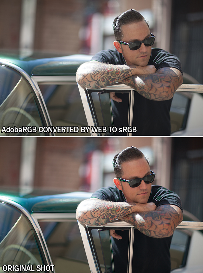
The photo above is an unedited photo that I took this summer. If you shoot in AdobeRGB, and let web convert your photos, you’ll be left with dull, muted tones. So why not shoot in sRGB full time? You absolutely can. However, if you’re printing your work, you’re losing potential colors in your images by shooting sRGB.
Printers, have began adapting the AdobeRGB color space. This allows for more vibrant colors in your prints, with better color consistency that your own monitor cannot even replicate. But do you want your prints to look differently than they do on your monitor? I say yes, as it provides richer colors that bring out details that would otherwise go unseen.
When shooting in AdobeRGB, you're able to convert it to sRGB at any time, without any loss of color in your images. However, this is a one way street, as sRGB is unable to accurately convert back to AdobeRGB.
If you’re not printing your work often, sRGB is the choice of color space for you. It’ll be the surefire way to guarantee that your photos look great on the web, and still look accurate in print. However, if you’re often printing your work, and looking for vibrant colors, AdobeRGB may be the choice for you, it just adds a few steps to your workflow process, as you'll need to save them as sRGB to correctly display them on the web.
How to Accurately Convert Your Photos from AdobeRGB to sRGB
In Adobe Lightroom
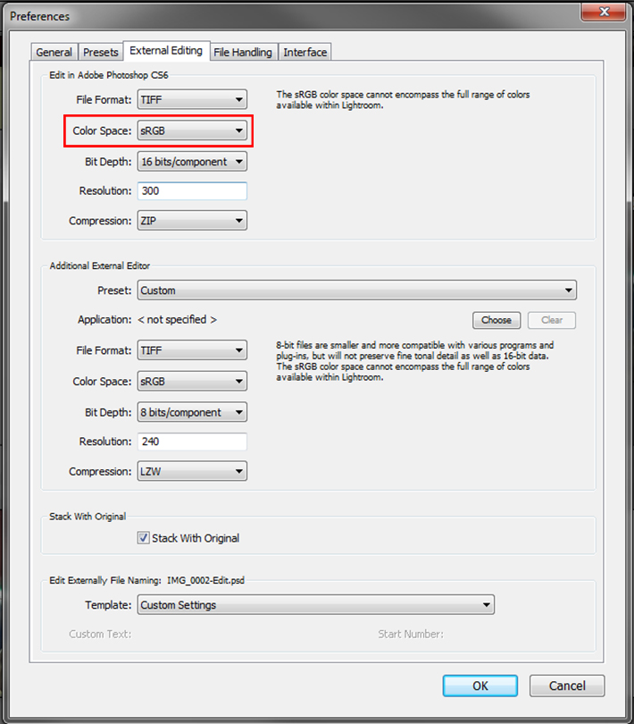
If you use a tandem of Lightroom and Photoshop, Adobe makes this conversion process painless for you. My workflow, and many others consists of loading images into Lightroom, making basic corrections, then importing the image directly into Photoshop. Upon importing to Photoshop, you can have your images converted for web with just a few simple setting adjustments. Simply go into Edit>>Preferences>>External Editing and adjust your color space to sRGB when being imported to Photoshop. This technique is the most preferred, as it'll automatically convert all images you export to Photoshop to sRGB, without any color loss in the web format. This will also allow you to keep both an AdobeRGB copy of the image for print, and an sRGB version to use for web and everything else.
In Adobe Photoshop
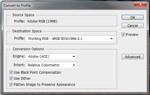
If you work without Lightroom and still want the benefits of AdobeRGB color space, you can also convert your images for web in Photoshop. Simply navigate through your menus to Edit>>Convert To Profile and change your destination space to sRGB after editing your image. To insure that you do this everytime, I recommend you incorporate it an action used for saving your images. Remember, failure to convert your images prior to saving them for web will result in dull and unflattering color tones.
Conclusion
If this at all confuses you and leaves you feeling overwhelmed, switch your camera to sRGB color space, and leave it like that. It'll still allow you to photograph and print beautiful images. However, if you're shooting specifically for print, AdobeRGB offers more range and versatility in the images taken. It all really comes down to personal preference, AdobeRGB does offer more colors, but at the cost of complicating things for a subtle difference in your photos. However, if you're a perfectionist, like myself, the extra steps taken to shoot in AdobeRGB may be worth the headache to achieve nicer prints, and get the best of both worlds.
If you'd like to learn how to use Adobe Lightroom more efficiently on any device, make sure to check out our Mastering Adobe Lightroom course with Pye Jirsa. The content Pye covers will appeal to every level of photographer and will save you an incredible amount of time on your image editing. Save 15% by using "ARTICLE" at checkout.


Note that this is regarding Jpegs. If you shoot raw, your photo will be in Adobe RGB not matter what color space you chose.
Adobe RGB gives more room in post. But since the web only allows for sRGB, and from what I know - most printers will only print within the sRGB range (unless they're terribly expensive) - you will most likely still covert to sRGB when outputting the image.
Actually, when shooting in RAW, you'll be shooting in ProPhoto RGB, which is a larger scale color space than both sRGB and AdobeRGB. I was going to touch base on that, but I didn't want to complicate anything any further.
And from my understanding on printers, a lot of them are adapting the AdobeRGB color space, because of the richer tones gained from it. And yes, your average printer might not have this support, but more printers used in print labs will.
As part as I know, Lightroom uses ProPhoto RGB internally, enabling you to keep as much color information as possible until the last step (publish/export/print). So why would you convert to sRGB (instead of keeping ProPhoto RGB) if you need to use Photoshop for a certain part of the workflow?
I mentioned that this would allow you to keep the AdobeRGB (or in the RAW files case ProPhotoRGB) and the sRGB file for editing.
Personally, I edit in AdobeRGB for my work, and convert to sRGB upon saving for web, or in other words, use the second method mentioned above.
Dont mix Raw files with the ProPhoto RGB Zach. You wont be shooting in ProPhoto RGB when shooting in Raw as you claim. Raw files have no colorspace, and its up to the user/photographer to define what colorspace to use when pixelating the raw-file. Even though I get where you're going with this article, its off.. way off.
You need to separate between colorspaces for viewing files and for editing files.
This is correct. ProPhotoRGB is just another color space (with an even bigger gamut than both sRGB and AdobeRGB). But the benefits are few and far between because typical monitors and CMYK printers can't reproduce the colors at the outer edge of the gamut.
Zach, I know you wanted to keep this article simple, but it would probably be beneficial to explain some of the conversion types such as relative and perceptual, especially since it can make a big difference in the final lresult.
There is a color space when shooting raw... it's the native color space of the sensor. That's why new cameras' raw files don't instantly work in Lightroom/Aperture... someone at Adobe/Apple has to figure out what that color space is and push out a software update that includes support for it.
FYI, the in-camera sRGB/aRGB setting *does* have an impact even when shooting raw. The JPEGs embedded within the raw file are converted as per that setting, and (more importantly) the on-camera histogram view is derived from that JPEG.
This article describes it from a Nikon NEF point of view, but I'd think it's pretty standard across camera makes: http://regex.info/blog/2006-12-08/303
My practical "Introduction to Digital-Image Color Spaces" has been well received over the years: http://regex.info/blog/photo-tech/color-spaces-page1
Jeffrey; I get what you're saying about the Cameras colorspace, but still its not directly comparable to the issue at hand here. The sRGB, Adobe RGB and Profoto RGB are static colorspaces they don't expand. Even though the camera sensors have their limitations, we see that updates to the firmware and software sometimes are able to pull out more info from the sensor than earlier versions. I believe its not a wise thing to be mixing the cameras native "color capabilities" and and what happens to a rawfile when pixelating it and assigning a working colorspace to it.
Also, the fact that the set colorspace in your camera effects the way the raw-files embedded jpeg files are created is something I personally dont consider a problem, even though it a fact that the histogram is generated based on that jpeg file. Its an whole other discussion but what you can pull out of todays sensors is way beyond what the histogram will show you anyway. I swear by a lightmeter and wish more photographers would too.
Ive been working closely with both Hasselblad and Canon, and one thing I've learned is that every expert has his or hers own perception of whats a fact.
PS: I liked your articles
When you shoot in RAW you shoot in... RAW. There is no color space or color management. It is only RAW data. First time color space is used is when LR or ACR displays(!) that RAW data on your screen using AdobeRGB. However the file still is not limited to any color space. After applying adjustments in LR or ACR you can export to file limited by chosen color space. The biggest is ProPhotoRGB which is best for farther image manipulation. If it is exported for print AdobeRGB is enough and if it is going for WEB it must be sRGB.
Roman, i thought the labs only use srgb shouldn't we convert the raw file on export to srgb? or should i check with my lab what they do?
You should definitely check with your lab. Professional lab will provide you with ICC profile for soft proof or will tell you which CMYK profile you should use if they print in CMYK.
You have to dig deeper about print and color management. If "LAB" requires sRGB you can't expect the best from that lab.
actually, when you shoot raw, you have no profiling, but because everything is known about the raw file, it can be converted correctly to any color profile
Nice to know that when shooting in Raw it saves it as Prophoto RGB, just to mention one more alternative step for saving the final image in sRGB, by using Ps, just when you finish post processing go to file and choose ------ (Save for Web) and then choose the color space and save it :), though I'm sure you know that
Raw has no color space. It is not assigned until you process the image with software.
So your statement that "shooting in RAW it saves as Prophoto RGB" is not correct. It saves as RAW, period.
Actually, I think Jon Rune Trengereid is correct.
RAW files store channel data in the camera sensor's native color space - which is definitely not ProPhoto (or sRGB or Adobe RGB). The sensor's native color space is determined by the dyes in front of the pixel photo sites. Unlike sRGB or Adobe RGC (which have nearly monochromatic primary colors), and unlike ProPhoto (which is has primaries that are actually outside of the CIE color space and is used only for processing in programs like Lightroom and Photoshop), sensors must have broad monochromatic response curves not unlike the LMS cone response curves of cone cells in our eyes. RAW files capture data as produced by the camera's ADC with no additional processing (including color space transformation) other than lossless compression. Camera settings such as white balance and the sRGB or Adobe RGB only affect the JPEG preview that is included with the RAW file.
Look it up in the Wikipedia article on RAW files, or you can read about it in the Adobe DNG file format specification (which is the non-proprietary RAW format) that you can download from Adobe.
You've just ended a five year quest for me. I will never thank you enough.
I don't think it is ended because this article is inaccurate ;)
Thanks for that article. It was very helpful. I've noticed that when I "save for web" out of Photoshop I get some pretty drastic differences between what I see in LR and what I see in the save file. Is this due to conversion of colour space? The pic on the right is what I see in LR and the one on the left is after the export to PS and a "save for web" in sRGB.
http://www.flickr.com/photos/23687796@N05/8481787843/in/photostream
This could be a couple different things. Lightroom has a tendency to edit your photos upon importing them. So it could just be going through the editing process the Lightroom does automatically.
Most likely it is because of JPG compression. Check what is the compression set to in PS. Probably it is value 60. Change it to something over 85 and you will have no problems like this again ;)
It's actually a Windows Color Management problem. If you put the compressed image in ya' Dropbox and then open it up on your iPhone or even a MacBook, the image will appear as it should. Adobe products manage the display profiles independently to the OS. So it's not a problem when your editing. But Windows will also be clipping the blacks on images you open through the browser. I have the same problem. Going to buy a display calibrator. Hopefully that'll fix it.
I’m sorry but this post is completely misleading. It would take a few additional posts to explain some of the basics of the color management just to see what is wrong here.
My thoughts exactly. The first paragraph alone is so wrong I checked my calendar to make absolutely positively sure it's not April 1st.
I couldn't find anything wrong with the first paragraph, and in going through the article, I think it did a great job of showing practical application of color space made simple for more people to understand.
Whats inaccurate with it? The failure to mention ProPhotoRGB? That was done intentionally, as not to confuse people further with another system all together.
"JPEG images can contain up to 16.7 million colors, though neither color space actually uses all 16.1 million colors available."
16.7 or 16.1?
In any case, all (8-bit) color spaces use 256^3 different values. The REAL difference is which (physical/perceptual, depending on the color space) colors these values actually represent.
If you need a simpler explanation, try this:
---
The different color spaces are like using a 10-inch ruler vs. a 10-cm ruler. Each has 10 divisions for each unit, and while the inch ruler covers a longer distance, it doesn't do it as accurately as the centimeter ruler. So the trick is to use the cm ruler for more accuracy where the additional length isn't needed. AND telling the other person which one you used, or they won't be able to accurately reproduce the part you measured.
In color spaces the difference isn't a factor of 2.51, but it is still visible in direct comparison.
---
Nice move, incorporating the suggestions I made in reply and then deleting my comment.
Stephan,
I didn't delete your comment. Infact, I wrote a long reply to your comment that wasn't able to post because your comment was deleted....
Further more, your suggestion was nothing but a typing error on my part. That's hardly ground breaking discreditation like you suggested.
Must be a disqus hickup, then. Strange coincidence.
Anyway, thumbs up on the rewrite. It's a bit like the image size / print size / dpi / ppi confusion that aspiring photographers often suffer; essentially a simple concept but hard to wrap your head around the first time you're exposed to it.
I’m sorry. I really didn’t mean to bash you down with my comment. I would really love to explain that to you here but as I mentioned this is not an easy topic. It would take several posts to write all that. But if you like I can send you some links to some real good posts and books about this topic.
I'm not offended. I do have a pretty good understanding of color space, as I've worked with printing for many years now. I'm simply asking to take this post with a gain of salt. Its meant to provide a basic explanation of the two, and not to be as in depth and intense as some of the posts elsewhere might be. This is just an explanation for those who have no idea of the differences.
I thought it was an excellent and practical article that would be of immense help to most people. I just did a YouTube video on this topic, and saw the same type of behavior. Whatever you say about RAW vs JPG or sRGB vs AdobeRGB will be hotly debated, with the most verbose of the writers offering the least knowledge or insight, but plenty of typing and opinion - - mostly all wrong.
Current web browsers support colour management and will display colours accurately for AdobeRGB if the image is tagged with the colour profile. Otherwise you will get muted images as stated above. Lightroom automatically tags the images with the colour profile when they are exported.
AdobeRGB is larger than the colour gamuts used in commercial print. There are some colours used in commercial print (ie some yellows) which are not contained within the sRGB colour gamut.
If you are printing to an Epson or other photo printer you will be able to print colours that do not exist within the AdobeRGB colour gamut. ProPhotoRGB will preserve all the colours you can print on a good photo printer. You will need to work from RAW files if you plan to convert to ProPhotoRGB.
I posted a video on Flickr this week that demonstrates this.
http://www.flickr.com/photos/psteeper/8481945698/in/photostream
While some browsers are adapting AdobeRGB color spaces, not all of them have yet. Most mobile browsers will not adapt to AdobeRGB yet.
As for ProPhotoRGB, you're absolutely right. When shooting in RAW, you preserve all the colors used with in the image. However, if you outsource your printing, most print labs will not support .CR2 or .NEF files as its too much of a work load to convert correctly. So for printing, its recommend that you convert to AdobeRGB rather than sRGB, so you preserve more colors used for printing.
All current browsers support colour management and have done so for a few years. This includes Internet Explorer, Firefox and Chrome. They support not only AdobeRGB but will convert from any colour space as long as the image is tagged with the profile. Test it.
I did....yesterday. And mobile browsers did not support AdobeRGB.
http://i.imgur.com/SrxRDfS.jpg
But do you think we should consider about the mobile platform?
What I mean is you can’t calibrate and profile phones. There are just two mobile platforms that support that right now. And these are Microsoft Surface Pro (and other tablets that use Windows 8) and Apple iPad.
All the rest (like Android or Windows Phone or iPhone) can’t be calibrated/profiled. Take my Samsung Omnia 7 for example. It has a Super OLED display that has a bit oversaturated colors. You will have wrong colors no matter you have color managed software behind or not.
But sure. I always convert my photos to sRGB for web use no matter of what I wrote above.
never mind calibrating phones. 99% ( my guess ) of the world sees whatver you are trying to sell on an uncalibrated monitor, in unmanaged ambient light, at sub-optinmal viewing angles that it makes not a hill of beans worth of difference what yu export in.keep your raw files and re-output as required.
iOS browsers are not color managed... I don't think iOS even allows apps to color-manage images. Even Datacolor's
SpyderGallery app is not color managed.
Many details here: http://regex.info/blog/2012-03-27/1964
YES. The web is going mobile faster than ever. If your website (where you display images) isn't mobile friendly good luck finding a job.
'do you think we should consider the mobile platform' lol, that was a bit rude. Also: I don't think that is the point. The reason for this post is: It is better to do this VS not do it. End of. So can you guys stop trying to find things to argue about?
While Zach is correct that not all browsers, particularly mobile devices do not support sRGB. there is another issue to consider. CM unaware browsers do not convert to sRGB as the article states. They simply present the RGB values in their native space. Any non-grey build will appear more saturated in a larger colorspace. Hence when a large colorspace file is presented in the smaller color space of a non-CM browser, it appears less saturated. This is not conversion per-se, but merely presentation in the software's native space.
Peter is spot on regarding the extended yellow gamut of the inkjets compared to Adobe 1998. The caveat to such a large space is that neighboring levels have a larger visual jump between colur HSV than in a smaller space. It's stated incorrectly in the article that Adobe 1998 offers more colors than sRGB. Numbers of colors are a result of bit depth NOT colorspace. The distance between color values per bit is a factor of the size of the gamut/space. I often hear authors try to convince their readers that 16 bit has more tonal range than 8 bit, and that too is false. The range is pure white to pure black in both. Same range. Number of levels withing the range is what is different.
It is extremely uncommon for me to be publicly critical of an article, but this particular piece is so out of alignment with the truth that I am finding it very difficult to remain calm and positive.
Trying to keep an article simple for the reader is commendable and appreciated. Spreading incorrect information is not however appreciated. As a professional in the fine-art photographic reproduction field since prior to digital, the countless hours of re-education invested to "fix" the misunderstandings resulting from articles like this are burdensome. I personally would rather spend the time getting to understand the photographers creative vision so I can meet their needs, than spending it retraining them so they can get better results from their files.
Lee - you hit the nail on the head. How does the conversion process deal with out-of-gamut colors. Lightroom supports two "rendering intents" - relative and absolute - in the print module. You need to learn the difference and use the appropriate one for your prints.
However, you should always use ProPhoto in your processing - and there is a very good reason. Most of the adjustments we apply are linear operations, but they can create new colors in the image. Thus, when you adjust, say, saturation, you are creating new colors in the image and even if the original image was completely sRGB (or Adobe RGB), the adjusted image may contain colors outside of those gamuts. OK - that fine. If you are processing in sRGB, then every time you make an adjustment the processor has to render the results back to the restricted space. Rendering out-of-gamut colors is a nonlinear operation and it can result in undesirable results. However, if you process in ProPhoto (which is a huge RGB space), it is very unlikely that your adjustments will create out-of-gamut (for ProPhoto) colors. So, you should always process images in ProPhoto. Then, at the very last step when you print, or when you create an sRGB JPEG as a final result, you deal with out-of-gamut colors once! Lightroom and PhotoShop print modules will show you out-of-gamut indications for both your monitor and your printer. You do your final rendering with the full light of this information, and you select the proper rendering algorithm them.
Summary: Always use ProPhoto in processing to eliminate nonlinear (and uncontrolled by you) out-of-gamut renderings between each adjustment. Do out-of-gamut rendering once - in the print module.
I'll have to ask the film labs that I use if they scan to AdobeRGB or sRGB.
All reputable labs will scan to AdobeRGB, if they don't drop them immediately.
>>All reputable labs will scan to AdobeRGB, if they don't drop them immediately.
Far better, scan and embed the NATIVE scanner profile. Anyone could scan into sRGB and then convert to Adobe RGB and you'd never know. Why convert from the native scanner color space to Adobe RGB (1998)? An extra conversion for no reason, especially if (and it's quite likely) the native scanner color space has a larger gamut in some area compared to Adobe RGB (1998).
I am a long time follower of this blog, and this is the first comment I have ever posted. I felt the need.
This article is a wonderful, and accurate to within the confines of its content, guide for people who have yet to deal with that overwhelming world called color management (what I call color wrangling). Yes, there are more advanced discussions to be had; however, I agree that this was not the place for them.
Zach, it was wonderfully informative. Beginning photographers out there, follow this advice, and you are already 1000x more prepared to face this realm of color conundrums.
You made my day.... Thanks Steven :-)
Totally agree Steven,
For the first time ever I had a firm foundation to be confident that I was doing the right thing with the different colour spaces
THANK YOU