Apple’s Photos app on MacOS has been through many changes. We’ve come quite far since its predecessor, iPhoto. This time around, Apple has its sights set on bridging the gap between a consumer app and something more professional. Where does it fit in, and is it worth using?
I’ve often thought that using Adobe Bridge with Lightroom to sort through large batches of photos was the best workflow out there. Now though, we’re finding ourselves taking two sets of photos. One set with our smartphones and another with our cameras. For the former, I’ll never go through the effort needed to transfer photos on my iPhone to my MacBook and edit through large batches. That’s just too much work when Photos takes care of it for me.
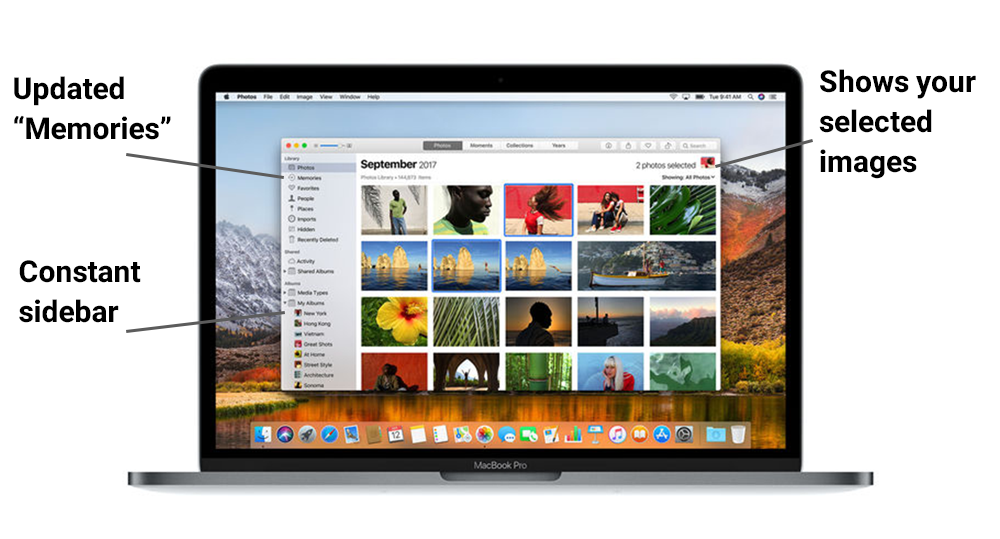
The new layout has more options at the forefront.
What’s New
If Photos isn’t quick and easy to use then there’s not much point in having it. My favorite update is that they’ve brought more advanced editing tools to the front, making it faster to get the right look. Here’s what else we can look forward to:
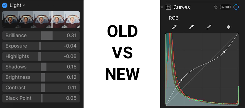
- New filters and ways to adjust your photos. Curves and selective color is now available.
- New "Memories" categories, like birthdays and babies.
- More support for Live Photos. I mean if Apple’s not getting behind this then nobody is, so it’s an obvious update. Loop, bounce, and long exposure Live Photo effects are available.
- Access to printing and publishing services from Shutterfly, WhiteWall, Wix, ifolor, Mimeo, and Mpix from inside the app.
- Support for third-party apps like Photoshop. Users will be able to send a photo to a third-party app and have it update in Photos.
- Recently imported images in a chronological list.
- Better facial recognition, which in turn will help the search function.
- Support for animated GIFs.
- Constant sidebar, much like iPhoto.
The General Consensus
I like it. It does what it’s meant to do, and caters to prosumers as well as your mom and dad. I can’t say that it’s not professional enough, but I can appreciate that Apple are attempting to meld these two markets together. We're looking at an app that will appeal to iPhoto and Aperture fans more than anything else.
While we can compare it to iPhoto, which I used to love, that’s not the point anymore. iPhoto was meant for your family vacation or school graduation. Photos is built to tackle your massive barrage of iPhone snaps sent via iCloud. How the hell do you organize that mess?
Pretty well, actually. With organization at the heart of this Photos update, we’re getting a different beast. Before, I preferred Google Photos attempt at facial recognition. It was largely better than the competition and did a decent amount of legwork in categorizing photos. Now, I’d say they’re on par (although I haven't put it under too much stress). Apple finally gotten this right and it’s going to make scrolling back through thousands of photos a thing of the past.
Unlike Google Photos though, Apple Photos does this computing locally. This means that they’re not sending any data back to Apple, which is an amicable result for sure. Part of their AI tech relies on the surrounding images. For example, if our buddy Jeff is wearing a purple jumper all day, and we get his face in a couple shots, then we can hedge our bets that we’re still looking at Jeff when his head is turned awkwardly.
What I would like to see here is more than facial recognition. For example, with Google, I can search “Passport” and get every photo of every passport I’ve ever taken. It’s crazy handy to be able to pull up arbitrary images like that, but Apple’s support for this doesn’t go very far beyond facial recognition.
The Advanced Features
I say advanced, but to you or me they arguably aren’t. Most of these features are available on iPhone apps, or even in the iPhone’s Photos app. As I’ve already said, either the pros will use it for some of their photos, or the consumer will use it for all their photos. For somebody that’s never used a curves adjustment though, bringing out these to the forefront is a big change.
We can’t compare Photos to Photoshop or Lightroom, but at least Apple’s deciding to play nice with third-party apps now. We can send single images to our favorite photo-editing apps like Photoshop or Pixelmator. After the user edits the photo, the changes are updated in Photos. Simple, easy, and no need to dive into the Photos Library. Unfortunately I couldn’t send a batch of photos to Photoshop for processing; perhaps this feature will crop up later as it’s obviously annoying to send images one by one.
That should cover any major retouching or editing. For the rest, there’s the basic photo editing built into Photos. I think this is where the new version shines. We’ve got curves for nailing exposure, and then selective color adjustments. I also prefer the new layout this time around. To change the white balance I don’t have to go into the color adjustments, there’s a dedicated tab for it. A dedicated sharpening tab too. Generally I found it easier to get what I want, and what I’m used to in pro apps.
What I Liked
- It’s easy to use. There was never a moment I didn't understand what it was doing.
- It’s arguably the best solution for iPhone users. I would still recommend Google Photos for Android users though.
- Being able to move your images outside of the Photos app, which has been a pain in previous iterations. Selecting multiple images now has a counter too.
- Improved photo editing.
What I Disliked
- It would be nice to send batches of photos to be processed in Photoshop or otherwise. If I need to apply the same Photoshop Action to 100 photos then I won't be able to use Photos to send them (as it would be one by one).
- For pros who want a solution for their iPhone’s massive amount of photos they’re out of luck again. Unfortunately there's no solution from either Apple nor Google.
- iCloud isn't an unlimited package like Google's offering. That's a bigger gripe with Apple as a whole, nonetheless it's something to consider.
In general, if you're upgrading to High Sierra today then you won't have much of a choice. This new Photos app is what you’ll be getting. After reviewing it, I can certainly say that it’s the easiest and smoothest option for any iOS user.


What is your impression of the RAW conversion and handling? Is it better in any way? My major concern with the previous version is the quality of the RAW conversion. Now, I don't expect Capture One results, but for instance, raising the exposure just one stop is more than enough to skew the colours and yielding unusable results. I love Photo for it's speed and sharing capabilities, so for me it means I do the RAW processing of personal photos in Capture One and then export JPG to Photo.
I haven't found it to be any different – although mind you I never really used Photos for raw files much anyways. When I get two machines beside each other I'll let you know if there's any color difference!