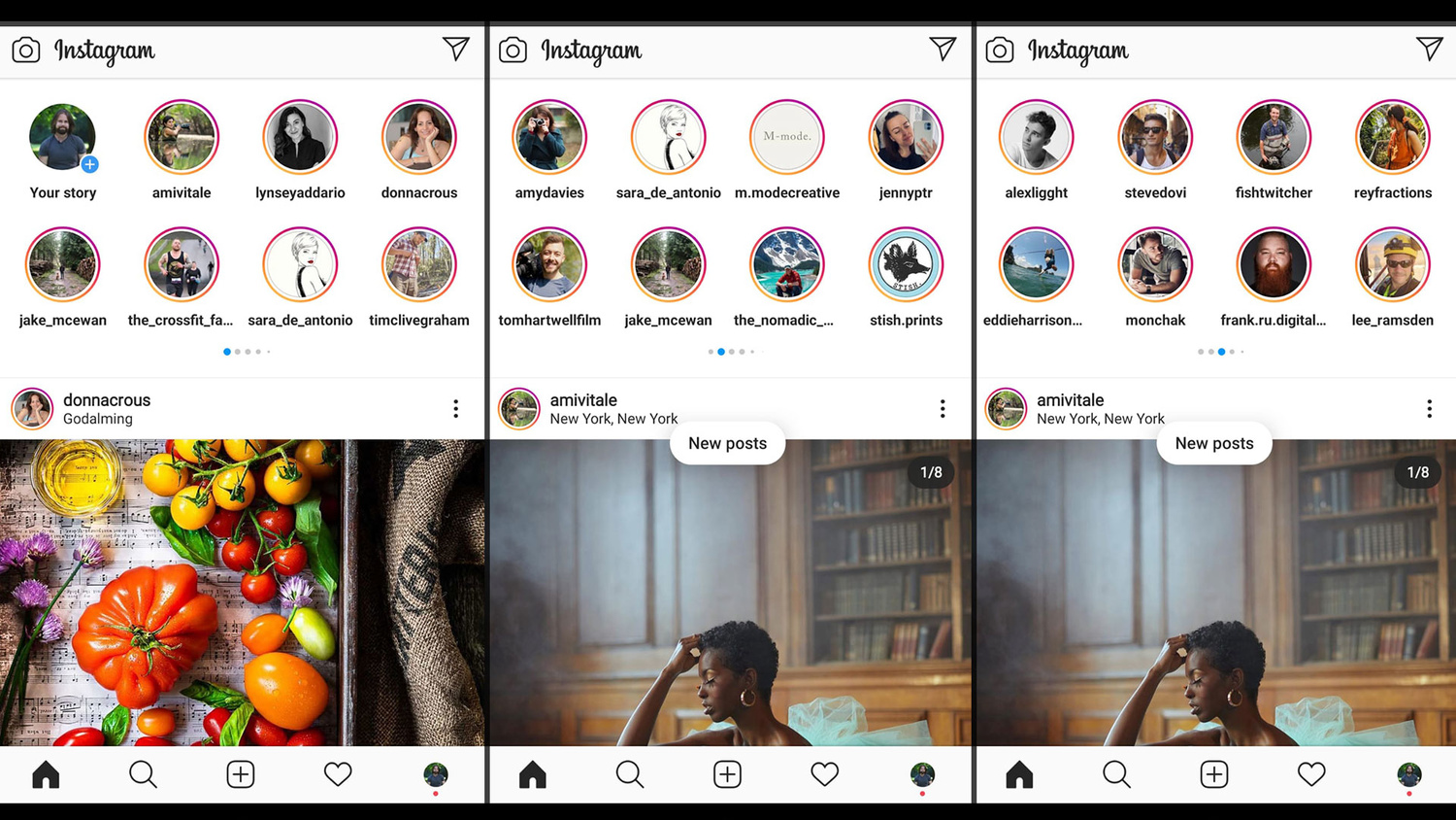
Instagram appears to be testing a new layout on select user accounts across the globe, as users wake up to find a big change to their Instagram home feed.
Currently not every account has this feature, but for those that don't have the update you may find soon that you'll be seeing a display of two rows of Instagram stories at the top of your main feed.
There are two rows, with four stories per row. This changes from the traditional single row of stories at the top of the app that usually displays around four and a bit stories, with the ability to swipe through, and view more on a kind of film-strip roster. Now though, the stories are arranged in a rigid four icon block, one row above the other, and allows users to swipe to reveal another eight icons.

Instagram's new tow row stories layout takes up quite a bit of room at the top of the home feed
This Has Been Done Before
Facebook have owned Instagram since 2012 when they bought them in cash and stocks for around $1bn. Since then Facebook have been pushing new features in order to improve engagement, and monetize the site. Stories have been at the forefront of their monetization attempt, with huge numbers in daily active story users, and they've been rolling the same technique out to Instagram now for some time. Facebook tested two rows of stories back last year for a few select accounts, and we're seeing the same happen in Instagram now too.

The old style single row layout still shows on many accounts, and feels like a sleeker design due to the ability to see the first full image when opening the app
Though Facebook doesn't appear to have rolled this out on their main app, and instead have moved to Rooms, is this something we see sticking in the Instagram community? Perhaps the introduction of two rigid rows in the app will allow Instagram to use IGTV to monetize video content. Do we really want about a quarter of the main home feed taken up with stories as we open the app? It appears to have a lot of dead space between story icons on some devices — although different sized screens, at different resolutions, will display differently, of course. How this remains to impact users will be a matter of time, but I'm not entirely sure I like it — I prefer the single row at the top myself.
Has your Instagram updated to the new display? And if not, do you want it? Let us know in the comments below.


I hate stories as it is. If I had it my way, there'd be an option to not show them at all. And, to turn off the notifications.
I wish I had the double stories. There are way too many packed onto the single row. I pretty much just open IG to watch the stories as it is. I guess that’s the side effect of following too many photographers who fear ruining their pristine photography feed with a little bit of their own personality. You only get that from their stories.
Thankfully, mine has not changed. I too do not care for the stories, I thought that it was all about the image or video that is posted.
I find the stories feature very annoying and pointless. If they do make this change universal, it will be yet another social network that I will be coming off of
I have this "feature" and I hate it. Takes up almost half the phone screen, sure you just scroll past it. Its like they want to push stories more, I tend not to watch them. Agree with Deleted User Wish I coukd turn them off.
You could try using IG on a web browser, mobile and desktop. That's what I use IG mostly on. An added benefit is there are no ads. I only use the app to upload images because I can fine tune it a little and it uploads at the higher res, 1350px long.