Understanding how to use color as the subject of your photos can turn a pleasing composition into one that stops people in their tracks. In this video, Alex Kilbee breaks down a few viewer-submitted photos to explain why they work and how you can use the same principles to improve your images.
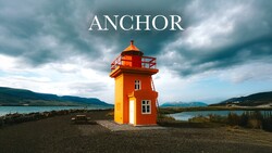
The thumbnail photo is striking for many reasons; the bright orange lighthouse is the primary one. On its own, the building is certainly interesting, but the photo's composition and how its colors interact bring this image to the next level. The use of color to balance the image, with dark colors at the top and bottom and lighter colors in the middle, allows the subject to pop.
Of course, the powerful Icelandic landscape isn't available to everyone, but the good news is that you can create images with a similar impact elsewhere. When you understand the basic tools, leading lines, rule of thirds, etc., you can expand to how shapes and bold colors impact the image. Then you can use those fundamental principles to enhance that impact.
The next two photos discussed are excellent examples of being observant, framing a scene, and understanding the power of color. The street scene with the construction netting may not be easy to replicate, but the principles Kilbee illustrates are. The way the surrounding buildings and the cobblestone street lead you to the subject is textbook composition work, but the color and movement are what truly bring the image home.
My favorite example is the final image Kilbee reviews because it represents so many possibilities. The image of the orange-roofed building against the dark blue sea is nice on its own, and I like many of the photographer's decisions, including the small strip of ocean above the roofline. Kilbee illustrates several choices that could enhance or change the photo's power.
Some of the suggestions are crops of the existing photo, but others are compositional adjustments a photographer could make with slight changes to the camera's position or their own. A small move forward, a tilt of the camera, or even switching from landscape to portrait orientation can significantly alter an image's impact.
If any of the subjects in the photos were white or neutral, the images wouldn't be as successful. The color and its interaction with the surroundings become the subject and focus, and the building becomes irrelevant. Knowing how to use that color is a powerful tool for your photography.


Join the Fstoppers community for free
-
Post comments and join in the discussions
-
Browse the site ad-free
-
Share your work and get featured in the community
-
Compete in the photo contests for fun and prizes
No comments yet