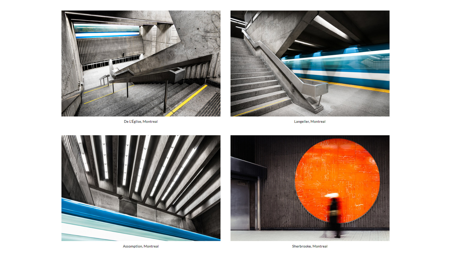
In a crowded industry, standing out can be difficult. Chris M Forsyth, Montral-based photographer specializing in capturing unusual spaces, manages to do just that, and with aplomb. Chris describes himself as a photographer whose work primary explores the design and history of spaces and places. The results of which are as singular as I have seen in the architectural and design photography space and his work is truly memorable. When I first opened his portfolio, I had this immediate sense of the highest commercial quality. There is a minimalist feel to his Squarespace website and to even his busiest of work in a way I struggle to explain. Chris has spent the last 4 years working on the architecture of metro stations around the world which are infamously crowded and claustrophobic places even when empty. However, Chris brings a quiet and beauty to these workhorse locations.

Photography of architecture and design is one of those genres that prompt few people to buy and learn to use a camera. Most start with portraiture and landscapes, but not Chris. What originally drew him towards a camera was architecture and design. "Architecture and design has always been a big interest and influence of mine. Here in Montreal, with our long snowy winters, it’s difficult to motivate yourself to head outside to work on projects for a good bit of the year. So I took to the metro where I could explore a wide variety of spaces conveniently all interconnected and out of the cold. Being in a city, I also take public transport everywhere, so I was already quite familiar with most of the stations. The project just made sense I suppose."
For me, that's a difficult project for me to imagine. Metro stations are ordinarily associated with stressful commutes and overcrowding, which — if this isn't to artsy of me — makes the peaceful nature of the scenes he captures a pleasing juxtaposition. However, Chris's focus is more on composition. "When photographing these spaces, as with any type of photography, you have to be highly selective. This can mean being selective as to which vantage point to photograph from, as well as whether or not to photograph a certain station at all. From there, it’s all about finding a dynamic composition and getting everything to light up as I like it."

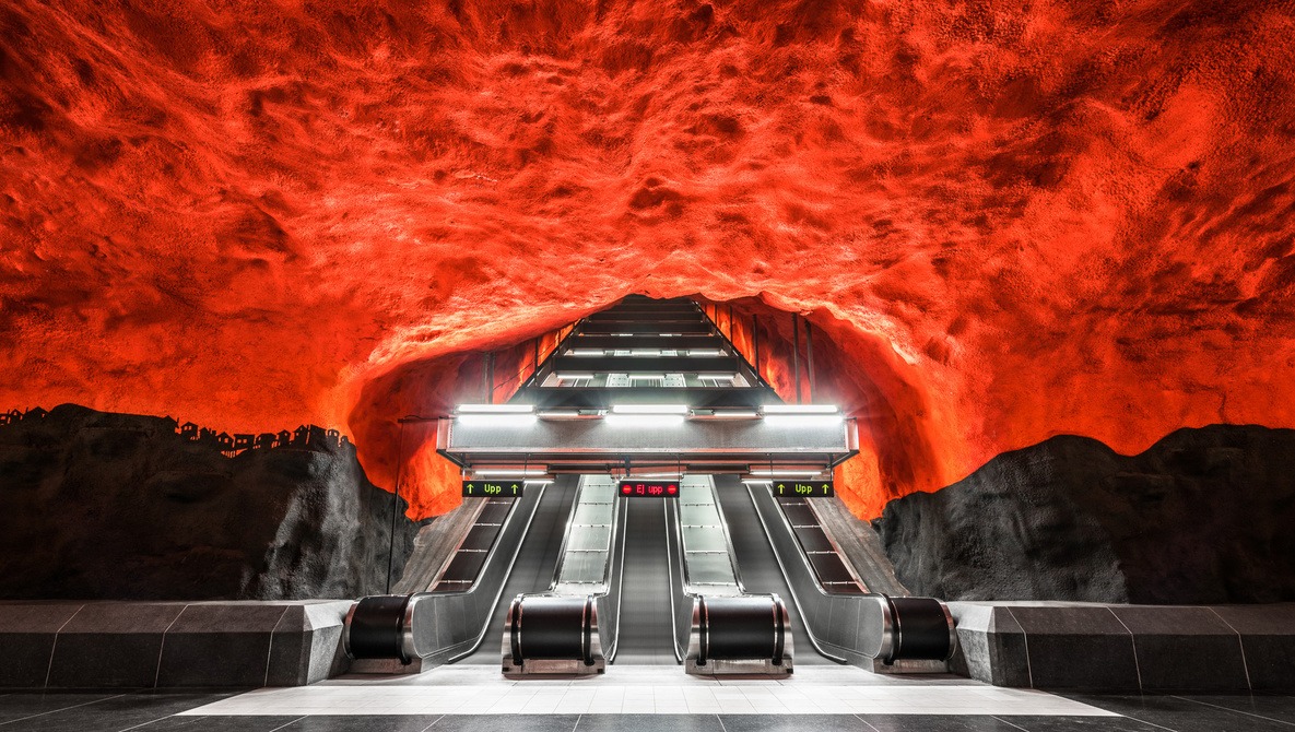
Both of the above images are taken from Chris's first book, titled Stockholm Sub, in conjunction with Swedish architecture writer, Mark Isitt, commissioned and published byt Frank Review in Stockholm. They are undeniably striking and would lend themselves very well to print. However, presenting sets of images which are intended to be viewed together can make portfolio design a careful process. Chris uses Squarespace which has a wealth of options, but getting everything perfect — something that becomes crucial when presenting a body of work so carefully crafted — takes real forethought. "The most important aspect when designing my online portfolio was making sure that everything is really straightforward and obvious for viewers. The website itself should distract or detract from the work. Things shouldn’t be difficult to view or confusing to navigate to. The website design shouldn’t be the focus," Chris explained. It's a valuable point; your portfolio is a vehicle for your product and ought not to steal any of the limelight.
I have worked with a number of online portfolio building websites with mixed success. In a recent article with Squarespace I was impressed at the variety of options and level of customization, but Chris's philosophy is different to mine. I asked him what put Squarespace ahead of their competitors for him. "When I created my website, I wanted a platform that was both simple when I needed it, but flexible with code when I wanted to modify a template to what I desired. I’ve always found Squarespace’s community forums really helpful for finding that little modification that I was looking for." In a way, Chris's portfolio reflects his simple but meticulous presentation of the design and architecture he captures.

www.chrismforsyth.com SquareSpace portfolio.
Carefully curated collections of images are fascinating to me, and they are often more the result of what has been excluded than included. Chris told me "Before laying out any project online, I always sequence the series first, whether with little thumbnails on a screen, or prints on a wall. It’s also key to decide how many images is appropriate for a certain purpose. When it came to laying out my website, the sequence and number of images was already decided and I knew exactly where I wanted things to go. From there, things just fall into place that much easier."
One area of this series that is so compelling is one I mentioned in a recent article: a thread that runs through all the images tying them together. This is the sign of a master craftsman and I explore Chris's approached. When asked how he ensures uniformity, he immediately highlighted just how important it is to him. "Whenever I start a project, I like laying out some visual guidelines. Is the work in color? Is the work horizontal or vertical? What’s included and what’s not? Of course these aren’t hard rules, and they evolve as I make new images. Ultimately, when I’m sequencing the work later on, if there’s an image that just doesn’t fit with that rest of the work, it’s left out."

When talking with Chris, I noticed something ever present in his work, project ideas, portfolio, and even his answers to my questions: he's incredibly deliberate and specific with everything he does. Every step he takes appears to be perfectly calculated. He even admitted to me that he always works alone, very slowly, and meticulously, which is exactly what I'd expect; it transfers in to his work somehow. His next project is above ground and has taken 2 years of research, but that is as much as I could coax out of him. There are no missteps from this artist!

The images in this article are just a few from his beautifully curated Squarespace portfolio, and I would implore you to have a look around it.
If you would like a free trial to create your own masterpiece online portfolio, click here.
All images used with permission of Chris M Forsyth.


Seems like ad placement for squarespace.... just saying
Squarespace. Nice article. Squarespace. Very beautiful photographs. Squarespace.
Squarespace...
Two mentions of Squarespace and one of them in is the description of a photo? If you dislike Squarespace so much maybe you should just sponsor FStoppers, I'm sure they would gladly take your money.