Photographers could talk about soft light and color temperatures all day long, but what could we bring to interior design? Could photographers do a better job than an interior designer?
Last week I was walking through IKEA’s lighting area and to their credit, it’s a wonderful selection. If the CRI was higher (most of their LED bulbs sit at a CRI of 80) I wouldn’t hesitate to use these as practical lights on set. In fact, some of them you could nearly use as a fill or key. We know most architects and interior designers have a rock solid understanding of what makes lighting great – but what can they, as well as the average joe, take from photographers?
Compare that soft lighting you’d expect from an IKEA showroom, to a subway car or corner store. We’ve all been to a 7-Eleven that has daylight balanced bulbs, sometimes without any diffusion. While that’s perfect in the day (you need see the correct color of what you’re buying right?) it’s pretty harsh and jolting at night compared to incandescent street lamps. Without an understanding behind styles of lighting, people can easily drag this clinical lighting into their homes.
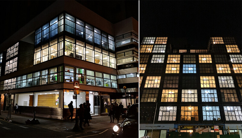
I passed by this office in London, and these apartments in Brooklyn. Both can't decide on a color balance – even in the same room!
Of course there are reasons to use harsh, 5000K+ balanced bulbs, sometimes even to keep us awake. Could you imagine a soft, tungsten glow on the Subway? It wouldn’t work! Nonetheless, there’s no need for this in your living room. So here are the points and parallels between a photography studio and a home:
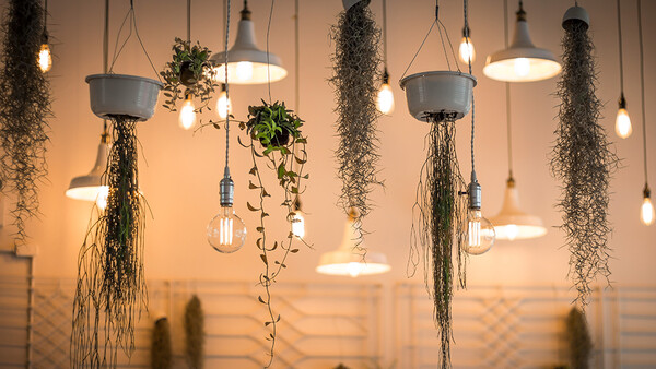
Soft Lighting
I'm not saying a softbox has a place in the home, but some decent shades wouldn't go amiss.
A pet peeve of mine is an exposed bulb, causing a glare from the corner of your eye. Often a lamp will simply be too high up, so when you sit down the shade won’t cover it. I can appreciate that brands are trying to combat this with clever design. Going back to IKEA, a simple floor lamp or their new LED panels are soft but offer enough light to read a book beside.
You can also see this in a newer trend: hidden LED strips. Under kitchen cabinets, desks or wardrobes. I’m a fan of recesses in the ceiling that house LED strips that bounce back down into the room. You likely wouldn’t shine a studio light at somebody’s face without some diffusion or bounce, so why do it at home?
Color Temperature
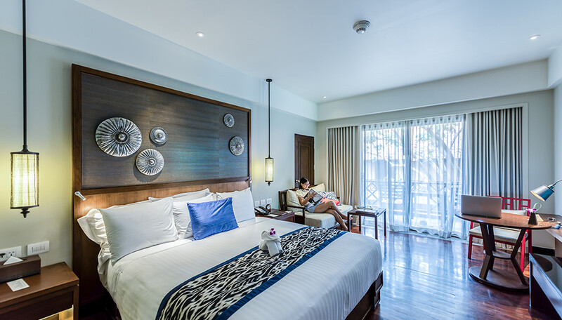
The lights on either side of the bed have a green tint here. Annoying and unnecessary if better quality bulbs were used.
I think the public sphere has been more aware of this in recent years. Now that the iPhone supports a “Night Shift” mode to match tungsten balanced lights in the evening, users might begin to wonder what color temperature their ceiling fixtures are. Not just the Kelvin value, but what about a green/magenta tint? Paying attention to the Kelvin value and CRI on a bulb is really important to lighting a space.
You wouldn’t want the same bulbs used in retail spaces in your bedside lamp, just like you wouldn’t want to shoot with the wrong color temperature on set. Awareness on this is surely heightened with the adoption of Philip Hue bulbs (or similar). Now your lights can match the time of day, like your iPhone.
You might also aim to have more pragmatic lighting in a kitchen or workshop, striving for something closer to daylight balanced lights. I believe that a bathroom should have a color temperature that’s close to lights that you’ll encounter in your day to day life (like the office) since you’ll may be getting ready here each morning. There’s no need for this in a relaxing bedroom, where you can tone down the level of blue.
Contrast
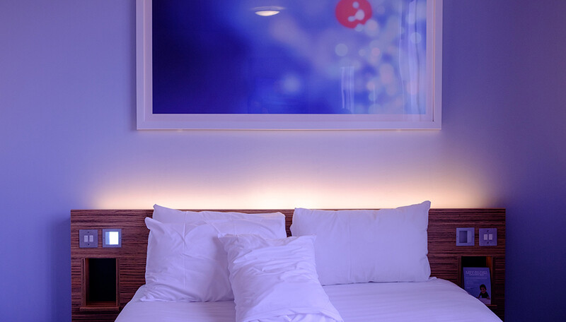
Color contrast used in a bedroom, to direct your eyes to the main features like the bed and framed photo.
It’s not often that I would want to shoot a portrait with flat, boring light. Perfectly ambient light isn’t overly flattering and doesn’t draw the eye where you might want it to look. So why not introduce contrast in a house by using color and light levels?
Nobody wants glare on their television screen, so you might avoid harsh lights beside or in front of the TV. However at the same time, you might not want to highlight an empty corner. If I filled my ceiling with one giant LED panel, the room would look like really industrial and sterile. Alternatively if had a really cool table in the middle of the room, a well focused lamp shade above would bring attention where it’s needed.
Similarly color contrast in a room can show off the right parts of the space. With the likes of Philips Hue bulbs, we could use that contrast to highlight our table in the center of the room. Perhaps shining white light on that while using colored lights for the rest of the space. Even a more subtle task light, like a desk lamp with a 4000K bulb, would create nice contrast among 2700K lights. Of course there's a difference between smart color contrast, and just using an odd bunch of bulbs.
In conclusion, I don’t think that this is revolutionary thinking by any means. However it’s both interesting to see brands incorporate new LED tech with these principles in mind, and disappointing to see homes break these rules by accident. How do you light your home? Does photography play a part in that?
As an architect and an architectural photographer, I must say the hubris in writing this article knows no bounds.
For starters, the two buildings in the article are clearly the result of different designers, done over an extended period of time. Different floors have different tenants, each with different needs and lighting designs to match. Also, the lights next the bed are warm because when you use them at night, that's the appropriate color balance.
Designers don't design for photographs. They design for their clients' needs. It is the photographer's job to work within those constraints, not suggest the designers don't know what they're doing.
Furthermore, lighting designers or electrical engineers design the lighting, not interior designers. They may have input, but it is my experience that they are not solely responsible.
Did the author speak to even one designer before writing this article?
When designing interiors - I talk to an interior designer first. I co-design interiors for motor homes. I also photograph those same interiors after the fact. Over the years we have switched to LED lighting - mainly for power and longevity concerns. But the pleasant after effect is more consistent and even lighting without those pesky burnt out bulbs we use to encounter.


3 Comments
As an architect and an architectural photographer, I must say the hubris in writing this article knows no bounds.
For starters, the two buildings in the article are clearly the result of different designers, done over an extended period of time. Different floors have different tenants, each with different needs and lighting designs to match. Also, the lights next the bed are warm because when you use them at night, that's the appropriate color balance.
Designers don't design for photographs. They design for their clients' needs. It is the photographer's job to work within those constraints, not suggest the designers don't know what they're doing.
Furthermore, lighting designers or electrical engineers design the lighting, not interior designers. They may have input, but it is my experience that they are not solely responsible.
Did the author speak to even one designer before writing this article?
When designing interiors - I talk to an interior designer first. I co-design interiors for motor homes. I also photograph those same interiors after the fact. Over the years we have switched to LED lighting - mainly for power and longevity concerns. But the pleasant after effect is more consistent and even lighting without those pesky burnt out bulbs we use to encounter.
Great article, I feel like a lot of us would make fabulous interior designers. I love seeing beautifully put together spaces it makes me so happy haha