Today, a short story about how forcing yourself to look at art from a different perspective can sometimes help you see the whole picture.
I hate superheroes. Actually, that’s not completely true. I hate movies about superheroes. Wait, no, maybe that is still an overstatement. It’s not that I hate superhero movies. It’s just that I hate that there are so darn many of them. Perhaps it's because I grew up during a time when movies about people in capes and tights were only an occasional thing when a plucky producer could somehow scrape the money every few years to put together a new Superman movie that I find the current big studio slate which seems completely devoid of any films not containing a superhero to be a bit much. It could also be because, despite the bloated CGI budgets and unquestionable technical merit, very few superhero movies have made much of an impression on me. They are all fine and good while I’m in the theatre. But, usually, I have completely forgotten the plot and characters by the time I hit the parking lot.
There are only a handful of exceptions to this rule in the last couple of years. One such exception was Patty Jenkins’ first “Wonder Woman” film. For whatever reason, that film really hit the sweet spot with me and has gone on to be one of the guilty pleasure films that I throw on when I’m in the mood to veg out and spend a little time on the couch with the television volume at full blast.
Having been released in 2017, I’ve seen the movie several times by now. But that didn’t stop me from heading out to the theatre again this weekend to check it out once more. Now before you think me a little obsessive, the reason I saw the film again on the big screen this weekend was only partly due to the plot. The big draw was that the screening was being held by the American Cinematheque on a 70mm print. I won’t go down the rabbit hole of film projection technology, but 70mm is a somewhat rare release format for motion pictures. Nowadays, most movies are, like everything else, released and projected digitally in movie theatres. But, prior to that, films were mostly released on large heavy, and tactile 35mm film reels. Only special films think something like “Lawrence of Arabia,” of a certain scale would be released in select theatres on 70mm. So, the prospect of seeing “Wonder Woman” on 70mm appealed to me. The second equally appealing draw was the fact that Patty Jenkins, the director of the film, as well as “Monster” and one of the upcoming Star Wars movies, was going to be present for a Q&A after the screening. I love a chance to learn from talented people and am fortunate to live in a city where this type of thing is possible.
So, I grabbed a ticket and took a seat in the theatre as the film started to play. It was just as good as I remembered. Having seen it before, I wasn't going to be surprised by the story. But what I didn't expect was that everyone in the audience would be in for a surprise around the hour-and-a-half mark.
So here’s the thing about movies projected on film. Unlike digital where it can be one big data-heavy file, film distribution is done through physically big heavy reels. Because each movie consists of an unfathomable number of feet of physical film, a single movie arrives at the theatre in multiple sequential reels delivered in king-sized metal cases. It is then the role of the projectionist to line up these reels in the projector and make the switch between reels multiple times throughout the film in real-time. If they do it right, as they do in 99.9% of the cases, the change is seamless and you won’t notice the changeover. But when it goes wrong? Well, in this case, just as we had reached the film's action-heavy finale and the projectionist went to load the final reel of the film, somehow the audio track for the film seemed to be dislodged. I am not a projectionist, so I can’t tell you exactly how this happened. But suddenly, the richly detailed and bombastic sound of explosions and the beautiful musical score was replaced with absolute silence. The movie’s picture actually continued to play. But the only sound in the theatre was the confused hum of the crowd.
Thankfully, I and, from what I could gather, the vast majority of the others in the audience, had seen the film several times over. So, the hiccup didn’t ruin the film as it might have if we were seeing it for the first time. But what it did offer was a surprising few minutes where I was forced to sit there and watch the visuals and only the visuals of the movie without the added filmmaking tool of the audio mix.
Yet, despite only seeing the visuals, the scene was still good. Even more, despite the dialogue suddenly being on mute, you could still follow the story through the images. Without being able to hear, you got to focus on the other storytelling elements like the cinematography and the editing. Where was the director putting the camera? How was the way the director of photography lit this scene affecting my emotional response to the action? How was the editing being paced? When were they deciding to cut quickly? Which shots did they decide to linger on? How did those choices affect me as an audience member?
Filmmaking is a collection of elements that add up, hopefully, to a greater whole. As audience members, we see the final result. But, in order for a film to be good, a multitude of things need to be working together in unison. So, if you are trying to study a film or any piece of art and trying to deconstruct why you like it (or don’t like it), it can be a good exercise not just to look at the complete picture but to break it down into its elements. It’s a great way to learn and better develop your own ability to apply different techniques.

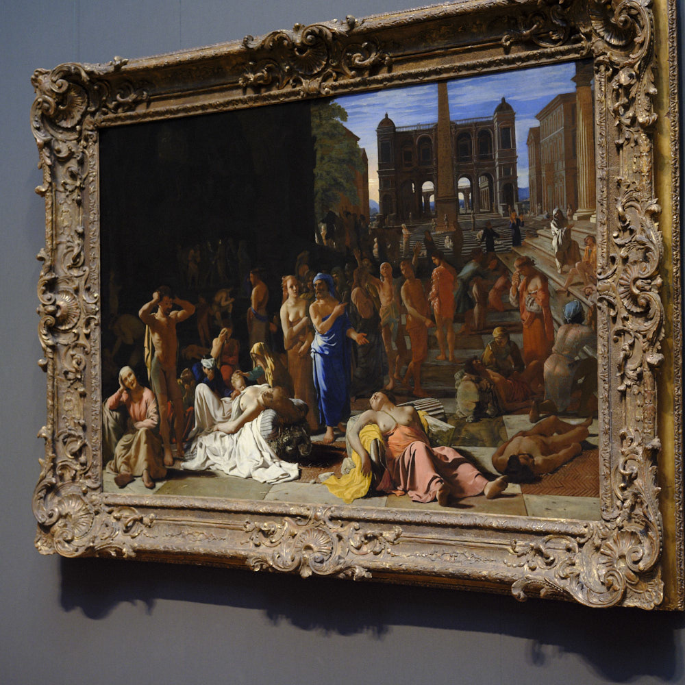
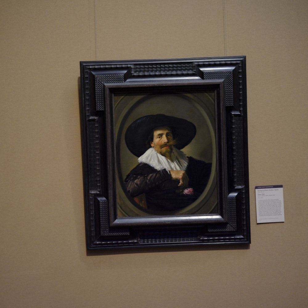
A couple of years back, I remember going to the Getty Museum. While I have exactly zero skill with a brush myself, my favorite part of most museums in the painting gallery. As I am an artist who makes a living creating photographs of people, it shouldn’t come as a surprise that I am mostly drawn to portraiture or larger tableaux depicting scenes from the epic to the mundane. I had my camera with me, because, well, of course, I did. And, as happens, I started taking some snapshots of the gallery and a few paintings that caught my eye.
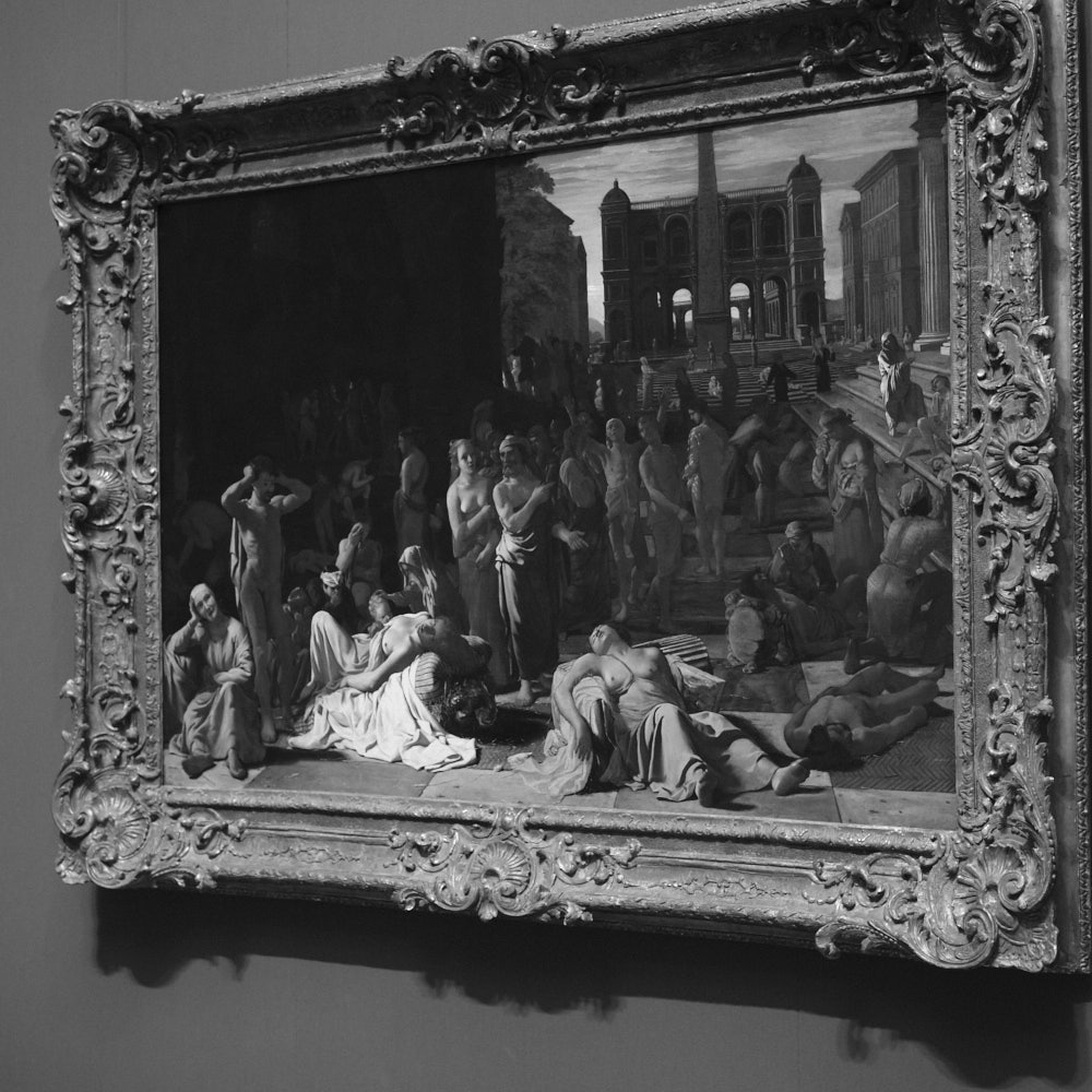
Midway through, I got bored and decided to change things up and shoot in black and white. Why not? I wasn’t creating any masterpieces here, just having a little fun as I strolled through the gallery. But in making the change, I realized that I had accidentally stumbled onto a great method for helping to deconstruct some of what made these paintings special that could help me as a photographer.


As photographers, our job is literally to paint with light. Without light, there is no photography. Knowing how to use that light can be the difference between success and failure. Painters rely on light in much the same way. There’s a reason it’s called Rembrandt lighting. The way they choose to delineate the line between light and shadow is how they go about conveying the mood of their canvas. The colors, poses, and subjects they choose will draw attention. But light is still the foundation.
When I started snapping pictures of these beautiful colorful paintings in black and white, I found that I was stripping each painting down to simple light and shadow. I could study each painting, not for its overall effect, but rather to get a sense of its chosen light values. While I wouldn’t suggest doing this to any piece of art without taking in its full grandeur first, after you’ve allowed the piece to have the initial emotional impact, this type of detailed study is a great way to break the piece down to its components. Like having the soundtrack of "Wonder Woman" stripped away and being forced to look more closely at the cinematography, breaking the color away from the painting forced me to focus on how the painter was using light. This is important, because, as a photographer who might want to employ a similar lighting technique, it helped me to understand things like where the light was coming from, what the lighting ratios were, and what the artist chose to illuminate, and what they decided to leave in shadow. By removing the color, you are simply left with light values from absolute white to absolute black. Seeing which end of the monotone spectrum the artists decided to play in and when can tell you a lot about how they achieved their masterpiece.


Now, do I recommend you go to your local theatre and demand they strip the audio track from the latest blockbuster? No. But sometimes, when a piece of art has an effect on you and you want to better understand how it is having that effect, it can be beneficial to strip that work down to its parts and look at each part individually and the choices made. It helps you better understand why the image you’ve spent so much time drooling over is having so much effect. And, it will help you discover new techniques that you might be able to use in your own work to have an effect of your own on others.


