
Photography websites are here to stay, despite social media's best efforts. Having a website is really affordable and simple in 2020, but there are several faux pas that could be stopping your viewers from booking you.
Who Are You?
Now this only applies to those who want to make money from photography. If you just want to showcase your images, skip on to the next paragraph. If you are looking for clients, then these are perhaps the most important paragraphs. You need to be clear as to who you are. Are you a portrait photographer? If so, what do you specialize in?
It is fine to have more than one thing that you photograph, but it should be clear as to what you are best at. For me, I shoot food, I am a food photographer, but I also take portraits. This works in my niche as sometimes I am needed to shoot a book cover, some images of people making the food, or being from a small town, simply taking someones portrait. However, if I started to add weddings (don’t ever mention weddings unless it is your specialty as its a real red flag for agencies and agents alike), interiors, street photography, landscapes, and everything else I have ever photographed, I become a jack of all trades. This isn’t to say that I can’t take a half decent interior photograph. I have taken loads for some reasonably big clients. However, it is certainly not what I live and breathe and showing these images would put off my high-end food clients who work with me because I specialize in exactly what the want. For the image below I shot the book cover portrait, but not the food photography, but I only got the job because I am in the food world.
Minimal Clicks
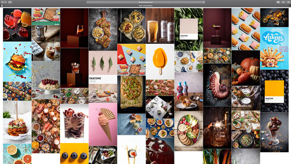
This came from one of my friends who designs software. She was saying that most of her role was minimizing the amount of times someone had to click to get to where they wanted to. For a photography website, you really don’t want to have to click anywhere before seeing the work. It is one of the reasons why I have a grid on my home page. Having to click through a pointless “enter” page doesn’t really serve anyone. Likewise with having to navigate through a maze of menus. Most of us are pretty lazy and expect instant gratification these days, so making sure you have your full portfolio in front of your viewer as quickly as possible is a wise choice.
Your About Section
As photographers, we can on occasion be a tad pretentious, about pretty much everything. But the one thing that you must hold back on is your about section. Unless you are famous, and I mean really famous, do not write your about section in the third person. Nothing comes across as more detached and pretentious as a third person about section, especially if it was written by yourself. Let people know who you are and what you do. Add a photo of yourself at work to, it helps people know who you are and puts a face to the faceless internet. No one wants to book an invisible photographer. People buy people, show them who you are.
File Size
Your website isn’t your full resolution print portfolio or PDF. There is no benefit to having super high resolution images on your website. As a commercial photographer, the people looking at my website know that they are not full resolution, they also don’t care. When they see your printed book or if you send over a PDF, that is the time to let our megapixels do the talking. For my website, I have opted for a 1000 px longest side at 72 dpi. They load fast and look fine. The content of your work will be more important here than the quality of the image capture. But if your site won’t load on poor 3g when the director is dashing between meetings on their phone, then you won’t get a second lookin’. Try not to fixate on things that only techy photographers care about, put yourself in your future clients shoes.
Search Engine Optimization
In commercial photography search engine optimization isn’t really all that important, in the wedding industry and family portrait world I can fully see the benefits. However, I think this applies to everyone who wants to run a premium service. Don’t make your website content read like an S.E.O how-to guide. Yeah, you might rank highly on Google, but it will put people off working with you. It is better to have good and personal content and to find other means to bring traffic to your site. Not that you should throw the S.E.O book out of the window, but I would certainly advise against following it all to the letter.
Contact Forms?
This one is a personal pet peeve of mine, so it might not be shared by the entire internet. I hate having the only option being to fill out a contact form. I don’t want to email someone so I can get their email address to then be able to send them the attachments I need to explain a request nor do I want to email them to get their phone number. If you are going to use a contact form, make sure you have your phone number and your email address listed below for fellow contact form foes like myself.
Social Media
This isn’t something that I had really thought of until a friend of mine who works as an art buyer mentioned it in passing. We were chatting about someones website and he noted that they had Facebook and Linked-in as their two social media platforms. “What sort of photographer isn’t on Instagram but still uses these dinosaurs?”. Being so out of date that you use Facebook as your primary social media platform and that you don’t engage with Instagram (and more recently TikTok) is very off putting to people wanting to hire a photographer who should understands where we are as a group socially as well as what is trending. How can you shoot a campaign that will also end up on social media if you don't engage with it?
Does it Look Like Everyone Else's?
Standing out with your photography is great, but standing out with your web design or layout can be a real issue. There is no requirement for clients, art buyers, or creative directors to be IT wizards. Simplicity and making sure that your website works like everyone else's is very important. When looking at 20 websites, if they can’t work yours out within a couple of seconds, the tab will be closed, along with any chance you had of being hired. This is something that I learnt the hard way. I let a website designer make me a really fancy site years ago. It was amazing, but it annoyed people when it didn’t work and look exactly like the current trends.
What would your website top tips be?


Join the Fstoppers community for free
-
Post comments and join in the discussions
-
Browse the site ad-free
-
Share your work and get featured in the community
-
Compete in the photo contests for fun and prizes
16 Comments
Hi Scott, what happened to your Youtube-channel?
Hey. It got hacked. Article on this coming hopefully soon haha. It has been grim!
Very useful considerations that are not usually discussed.
Thanks Richard
Scott Choucino with, as usual, the most valuable professional advice on Fstoppers
Thanks for the kind words Zak
Your last point is very good, an art buyer/producer friend of mine says they like sites made with Square Space and Wix as they may not be 100% original they're easy to navigate. Confusing the viewer because your pretentious one of a kind site is not user friendly to navigate is not a good idea.
Yeah, I think it is so easy to get carried away with cool and creative website ideas. But remembering who the website is for is crucial.
I never updated my contact page so quickly as I did now, great advice!
Ah nice one, glad it helped.
This is a very useful article. A pet peeve of mine is spelling, grammar or typos as in: "Add a photo of yourself at work to" from above. So, have someone proof the text portions of your website before going live.
Very useful info, thanks for sharing. Came right on time as I put the finishing touches together. Glad to see I got a few of them right.
https://mattcrace.com
It was a hot and humid morning in Malaysia when Rob – a talented mid 40’s portrait photographer hailing from ‘Gods Own County’ in the UK – was reading Scott’s article on 8 Ways Your Website Is Holding You Back. When asked his thoughts on the article, Rob (whose never won an award in his life) was quoted as saying “When I read that paragraph on ‘Your About Section’, you know, the part about not writing in the third person I chuckled so much I nearly dropped the Hasselblad H5D 50C I was cradling in my hand. I’ve shot on an array of [camera] systems over the years; Sony, Nikon & Pentax but that Hasselblad was so damned expensive it would have been a shame to drop it”. Rob will now be putting aside some time to review and update his website accordingly. Rob would like to extend his thanks to Scott for writing such a great article.
Wise words Scott, thanks! One thought about having the email address "open" on the site. I used to have mine like that a few years back, but I ditched it because spambots picked it up and I got tons of spam emails that I had to sort through each day. Any thoughts on that?
Cheers,
Eivind
If it were me, I’d open up 100 junk emails which would take less than 5 mins rather than lose a client.
All my potential clients are on Facebook and LinkedIn. They may be on other platforms as well, but those are their "base" social media that they check every day. And they are not chasers of the latest hot social media platform. So it depends on where your clients are.