
One of the formulas to success is to have a website that is remarkable! If you are not staying on top of design trends and continually developing your site, you will find yourself behind times and will lose business because of it. Gone are the days when we could set up a site and let it sit idle for a few years. We are marketing to the the millennial generation, a generation that has grown up with the internet, mobile devices and social media. Is your website ready to cater to them?
1. Mobile is King
According to a survey by Google, 48% of users said if a website didn't work well on their smartphone then it made them feel like the company didn't care about their business. That statistic will surely continue to rise each and every year as more people stop forgiving businesses that don't offer a fantastic mobile user experience. Here are two more important statistics to think about.
- 57% of users say they won't recommend a business with a poorly designed mobile site. (Think wedding planners will want to refer you?)
- 40% have turned to a competitors site after having a bad mobile experience. (Google Research - The Mobile Playbook)
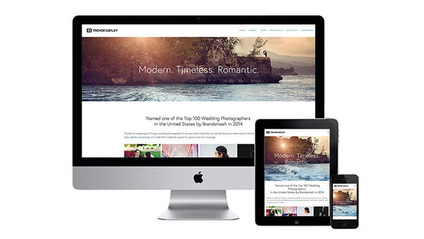
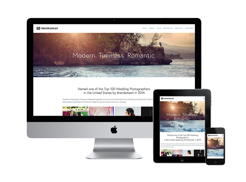
It's no longer enough to have a dumb-downed version of your website for mobile users, these days responsive design is where you need to be. Your site experience should be impressive and consistent when your visitors access it on any size desktop, tablet or smartphone. Your customers want a top-notch mobile experience, deliver it to them!
2. Scrolling vs Clicking
Today's web users are using touchscreens, mouse wheels or trackpads, and with a flick of a finger they can scroll through a website. Scrolling allows users to continue reading and discovering more of your page but each time you require them to click a link you are forcing them to make a decision. In addition, by designing your page using the scroll your are able to guide your user through a story that you would like them to read in the correct order. Another way to think about it is that it's a lot easier to move just a little further down the page then making the decision to click a link to guide you someplace else.
3. Put Your Pricing On Your Site
Gone are the days when people want to fill out a contact form to get an email with your pricing. In fact, it wasn't too long ago people would send us their address and we would mail them info. Seriously, do you remember that? These days if people don't see your pricing on your website they will move on. They don't have time to bother. They want things immediately. They want to be empowered with the information at their fingertips. To some wedding photographers, this might just mean putting a general starting price, to others it might mean listing your detailed pricing - that's up to you. Whatever you choose, don't make it difficult to find, because your visitors will no longer waste their time looking for it.

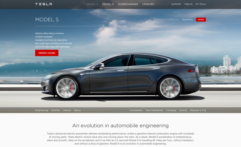
4. Large Stunning Images That Expand The Full Page Width
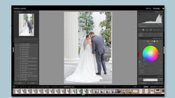
Let your images shine by filling the entire width of the page. Use images to break up sections of your site as vistors scroll through it giving them a periodic break in gathering information. Tesla Motors' website does this perfectly. In addition, pick out your very best images that make the best first impression. You probably have 100's to choose from so create a gallery of favorites and ask as many friends, family and other photographers you respect to choose their top 10. Gather the data and see what really stands out to others and use those images.
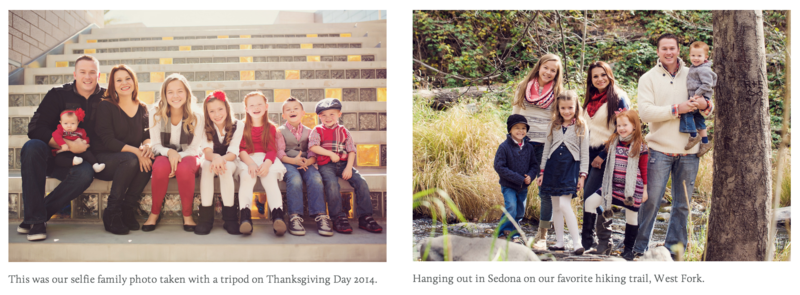
On occasion we pick an image to use on our sites because of the story we have behind that particular photo. It might be how lucky we were in capturing it at just the right moment, how our gear was acting up but we managed to pull together something incredible or even how the father of the bride was terminally ill but was able to walk his daughter down the aisle on her wedding day. We know the story behind the photo and so it resonates with us, but it might not with others viewing it for the first time on your page.
5. Uniformity In Your Editing Style
Often photographers will evolve and change their editing style throughout the years, especially if they are still discovering their style for themselves. As a result their website will be a potpurri of styles with no real consistency. This makes your visitor second guess the result of their own images if they hire you and whether or not the style you are now serving is one they really like. If you need to, go back and edit some of your old favorites that you want on your site to match your current style.
6. Stay Current
Blogs are a great way to keep fresh content on your site. But if you are like me you might not have touched your blog for a couple years. If that's the case find a way of staying current on your site so your visitors know you are still relevant. Share a slideshow of your favorite photos from 2014. Another strategy is to keep updating your main images to include photos from recent weddings. The advantage to this is that your clients featured in the photos will be elated to see they were chosen to be on your site and share the news with their friends thereby generating more traffic to your page by people who realize you are staying current on your site. This in turn will result in referrals as the visitors to your site will talk about you to their friends.
7. Get Personal
No more hiding behind a generic studio name with no photo of yourself on the site. Millennials are connected people. They want to get to know people on a personal level before they hire them. If you don't have a photo of yourself on your site it's guaranteed they will be searching Facebook, Twitter, Google Images or Instagram to see if they can track down an image of you. If you have a pet, include it. Have kids, don't be afraid to share a photo of the family. Web visitors want to relate with you, so make it possible by sharing information they can associate with.
If you haven't changed up your website in a year or two then it's time for a 2015 update. There are plenty of great website companies that are offering new simple ways of building yourself a fantastic site. I currently use SquareSpace for my site but I've also invested in The Grid as well and anxious for it to launch this Spring. Don't waste another day with a less than stellar website. There is no excuse to sit and wallow in despair over your current design when so many resources are at our fingertips to create the site you want and have it launched within days. After all, once a potential client is on your website exploring around, they are yours to lose.
Let me know your thoughts in the comments below and if you have a website you feel is worth featuring feel free to post it in the comments. I'll do a follow up article next week with some of the best photographers sites I have found with modern design and a fantastic user experience.


Join the Fstoppers community for free
-
Post comments and join in the discussions
-
Browse the site ad-free
-
Share your work and get featured in the community
-
Compete in the photo contests for fun and prizes
41 Comments
Good list, especially the point about being personal. While it makes sense to be a little bit impersonal when discussing the company as a whole if you're a collective or a company of, say, 5 photographers, but even then, it's nice to know a little bit about the actual people running the business and not just the glossy marketing front that they want to present to you. This includes writing in first person and putting a face to the name.
There's just something...off-putting...about bios (especially if there's just one photographer) written in third person, particularly if it's evident that the photographer wrote it themselves.
Um...and...
DON'T USE AUTO-PLAY MUSIC AND SLIDESHOWS.
There's nothing more annoying than going to someone's portfolio and having to hunt for a stop button for the slideshow while some crappy royalty-free music plays in the background (however, generally it's illegally placed copywritten music).
I would also be wary of using parallax. This isn't brought up in this article, but more often than not, parallax is more confusing than cool. I only put this point in here because one-page sites are becoming popular and parallax is basically turning into the new "flash." Just because you can use it, doesn't mean you should.
But if you can make it work, more power to you. I've just never been to a parallax-centered photo portfolio without being like "This is too much."
YES! Please don't put auto-play music on your site. I agree on your points about Parallax. I tried really hard to use it in my previous site. Loved the look of it and really wanted to make it work. But it just seemed like too much and the user experience wasn't necessarily the same depending on what they used to access the site. It was cool the first time I saw it on a website, but when I had it on my own I grew tired of it pretty fast.
"Just because you can use it, doesn't mean you should."
+ a billion.
I use Koken.me and I love it It's free with 5 free themes, but I paid a premium for my theme. It has blogs/essays and it's super easy to add to. I agree with all of your thoughts on this. And I do agree with putting your pricing up there. It should be easy to find, because honestly it might be the only reason someone is on your website.
Here's a tip to Wedding photogs, stop calling the tab for your pricing packages "Investment"
It makes you sound like a pretentious asshat.
Hahahaah true!! Wall Street photography with Nasdaq prints!!
Great advice Greg. I'm going to have to agree with you.
Ha ha ha ha, so true. I can't stand the idiotic "investment" wording. It's retarded.
q
Wow, This is ironic to see this article. I just looked at your website last night after seeing your name on brandsmashers top 100 and though wow that is a great site lol. So thanks for the great insight.
Thank you so much Josh! Glad the article was helpful.
I am super excited for The Grid! So happy to hear you mentioned them!
Alexander it does look amazing.
As a professional web developer I was thinking about using a plattform like SquareSpace or building my own solution with WordPress and some plugins. At the end I have chosen www.goodgallery.com. I had some high expections when it comes to Responsive Design and mobile user experience. Just because a website "looks" good on a mobile device doesn't mean that it "works" good. The website also needs to be super fast.
My requirements were:
- Fast loading & rendering times for laptops/PC AND mobile devices
- Responsive Design with optimized mobile user experience
- Only load a few images first and "lazy load" images later when the user scrolls down the page
- deliver a smaller size of my images on mobile devices and HiRes on laptops
- some tools for search engine optimization
- ... and some more technical requirements
With all due respect to the beautiful website of Trevor (btw. I'm a fan of your pictures and also following you on FB, and I even was inspired by your website design), but this is not a good example for a mobile optimized page when it comes to page load times. The homepage is loading around 10 - 15 MB at the first request, with an iPhone 6 plus around 25 - 40 MB and 103 requests! That is huge, even for a fast WiFi connection.
After I analyzed some SquareSpace pages a decided not to sign up for their solution. I'm not saying SquareSpace is bad. No, it's one of the best solutions on the market. It depends on your specific needs. But hopefully they will improve their overall mobile user experience when it comes to lazy loading page components and resizing images. GoodGallery is doing a great job for me. The websites of Jerry Ghionis and Susan Stripling are built with that tool and their websites load only around 1.2 MB (80 - 90 requests) on an iPhone 6. And their mobile user experience is great.
Maybe this information could be useful for someone who has similar requirements. And sorry for my grammar, English is not my native language.
Couldn't agree with your more on the requirements. 25 - 40 MB and 103 requests are too much for even desktop, let alone mobile device.
I'm old school...You gotta load fast. KB, never MB.
My website's home page just 29 requests 522.8kB
The blog page, 35 requests 714.9kB.
Test here...http://tools.pingdom.com/fpt/
Dennis this is awesome information. Thank you for sharing that with me. I'm going to work on optimizing the site so it loads much faster. What tools do you use to get that information?
Trevor, as J. Malonson mentioned you can check your page with http://tools.pingdom.com/. But I would recommend Google PageSpeed Insights (https://developers.google.com/speed/pagespeed/insights) because you will see the mobile and desktop analyzes. Google also will tell you what and how you can improve your website. If you are using Google Chrome as a browser, you can open the developer tool bar with F12 (or right click on the page somewhere and click "Inspect element" in the context menu). A new panel will open at the bottom of the page. Click on the "Network" tab and reload the page. There is also a mobile device icon on the left side of the toolbar menu. Click on that and you can check your page on different mobile screens. You will find more information of Mobile Emulation here https://developer.chrome.com/devtools/docs/device-mode . Hope that helps!
I hope my words have not offended you. To be clear, it's not about you or that you have done something wrong. Your website design is great as well as the content and your images! There are too many technical details to consider. It's the responsibility of the framework provider to deliver the websites of their customers as fast as possible to each device. If you have any further questions you can also send me a pm via my Fstoppers profile.
https://developers.google.com/speed/pagespeed/insights/ is the way to go...
the initial eyeopener was the http://tools.pingdom.com/
Just tried out both these links. How cool. Thank you for sharing.
Dennis you have't offended me at all. In fact, quite the opposite. I am very grateful for you taking the time to teach me about this. It is something that I definitely need to do and using your advice and that of J. Malonson I will work on optimizing the page so it loads much faster. It truly means a lot that both took the time from your day to help me.
That's all good and wonderful, but I think almost every wedding photography website actually fails at is sales. Your brand and sales pitch needs to be more than, "Here are my photos, they're pretty, here's my prices and here's what I do in my free time." My website sadly is a victim of this philosophy.
For 2015 focus more on lead capture, value, and product sales. Maximize your sales. It's not that you can't use these drag and drop website builders to do this kind of thing but I think they've saturated the market and have sold the fact that these overly simple portfolio websites are the best thing you could have. Your website should be more powerful than just showing pretty pictures. I'd even argue that a good chunk the normal wedding photograph's client couldn't confidently even tell you what they like about your photography.
Interesting input Andrew. Can you think of a website that would be a good example of the ideas you mention. Curious how it looks.
Great tips mate! Spot on too!
Thanks Kyle!
Great article but putting your pricing on your site ? I think it's a bad idea unless you benefit from a very good reputation of course (which it's obviously what you have Trevor, but think about us who are not -yet- in the top 100).
Doing this as a wedding photographer will make customers comparing you with competition on your price rather than on your work.
Therefore, they can reject you from their list just because you're maybe the 3rd cheaper guy they found, not the first or second (according to a certain degree of quality of work of course, not the absolute cheapest ones). You're throwing them prices at their faces acting as a seller where a photographer has to explain why his work and above his services stand out from his competitors.
Anyway if people like your work they'll get in touch with you and query about your pricing. Listen to what they need, guide them and then talk about pricing.
Putting a general starting price may be a good option though as it helps filtering out people who can't afford your work.
+1 to the "packages starting at" a certain level as opposed to your entire pricing strategy.
Yann I can appreciate that. I do think that if your market is the millennial generation than it is important to include at least a starting price or average price. They want information! They are a generation of smart consumers!!!
Maybe I should ask my customer what they would have done if I had told them my pricing on the phone or by disclosing the starting price on my website.
By the way, your article made me think that my website needs an upgrade.
And I love your work. I see the pic with the tourist in the water in the background with the blurred couple sharing the rings. Made me laugh :)
Oh yes the "Great White" during the wedding in Cape Cod. :)
Since reading this article in addition to the conversation thread you started in a photography group yesterday I've decided to include pricing on my website and changed "investment" to "pricing" thanks to Greg Tennyson's comment :)
Thanks for sharing!
Awesome Anna. Glad this was helpful and yes that conversation in the group was so useful!
I did as well Anna! I was able to remove my hat made of asses and it feels great! =)
facebook's website and apps suck... they don't care right? ;)
Shoot for under a 2 second load time on your homepage. Pingdom is great, as is gtmetrix.com.
WordPress is another great platform with thousands of themes, both free and paid, and there's plug-ins for basically anything you'd ever want. It's used by a little under 20% of the Internet right now, so it's definitely something to give a look at. It means you aren't stuck with one host either, which is nice. YouTube tutorials are great to learn how to get going with it too.
Now I want a Tesla.
Hahaha!!
True, mobile now is the king.
I definitely agree on making your pricing up front. I'm a millennial myself and it's all about research. Being able to get information up front to help me make a decision sooner rather than later saves me time and effort. The focus is on instant gratification and making a decision asap, overall I'd say we're a very time greedy group.
Great and informative post. Am glad there are things on this post that I am already implementing
Thanks for a great and informative article. I have a question regarding my photography website and would love your opinion, I have done one wedding so far and absolutely loved it, and have the images on my site, should I include somewhere that I have had limited wedding photography experience that is why I charge what I charge? As I've recently had an inquiry asking to see more pics of other weddings. I don't want to lie but I want to be able to word it properly. Not sure what to do? I'm shooting another wedding at the end of June so I will have more pics for my website. Thanks. Gerrie Mifsud Photography
For wedding Planners, must visit Shaandaar Events, Chandigarh
https://www.shaandaarevents.com