
Over the years, I've looked at a ridiculous number of photography websites. Partly because I'm nosy, partly because I do website critiques, and partly because during lockdown, I worked for a marketing agency and did a lot of UX work. After a while, patterns start appearing.
Interestingly, most of the problems I repeatedly see have very little to do with photography itself. In a lot of cases, the actual work is great. The problem is how everything is being presented.
Photographers obsess over cameras, lenses, editing styles, presets, Instagram, SEO, and social media algorithms, yet the one thing designed to actually convert visitors into paying clients often gets treated like an afterthought. It doesn't matter where your clients find you; they're all going to filter through your website.
Here are some of the biggest mistakes I keep seeing over and over again.
No Clear Calls to Action
One of the most common issues I see is websites that look visually nice but completely fail to guide visitors anywhere.
What should people do next?
- Inquire?
- View pricing?
- Read more?
- Check availability?
Too often, the answer is unclear.
Photographers sometimes approach websites like digital art galleries rather than tools designed to convert visitors into clients. A good website should gently guide people through a journey. Every page should have a purpose, and that purpose should be obvious.
You should not have to go hunting for the contact button.
Most visitors are not sitting there carefully studying your website. They are comparing you to several other photographers while half-watching Netflix.
If the next step is not obvious, people leave. A website should not just look pretty. It should guide behavior.
Here's an example of someone's navigation which fails to guide couples:
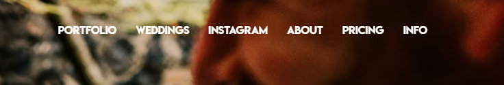
As you can see, it contains no clear CTA.
Photographers Copy Other Photographers
One of the biggest traps photographers fall into is using other photographers' websites as their primary source of inspiration.
The problem is that most photographers are not trained in UX design, conversion strategy, user behavior, or marketing psychology. They build a website (or use a generic template), launch it, and then rarely analyze how people actually use it afterward.
As a result, the photography industry ends up copying itself in circles. It is very much the blind leading the blind.
If you want inspiration for things like navigation, structure, user flow, or calls to action, you are often better off looking at high-performing marketing agency websites rather than photography websites.
Marketing agencies spend huge amounts of money testing what works. They hire specialists. They look at user data. They constantly tweak things based on behavior. Photographers, understandably, usually do not.
A while ago, I was rethinking the navigation on our own website. Instead of immediately looking at other photographers, I looked at local marketing agencies to see how they structured things.
That made far more sense to me because these are businesses actively investing in understanding how people interact with websites. Photographers often focus heavily on aesthetics. Agencies focus heavily on behavior. Ideally, you want both.
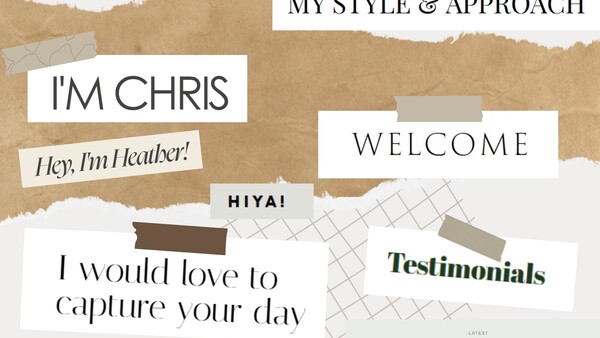
Your Headings Say Absolutely Nothing
Many photographers waste the most important text on their website.
Large headings often say things like:
- "Welcome."
- "Hello."
- "We're so glad you're here."
The issue is that users scan websites incredibly quickly, and headings are usually the first and only thing people read. Your biggest text should communicate value, not simply acknowledge someone's existence. Headings should function almost like mini sales pitches and contain all of your brand messaging.
Here is a simple exercise.
Scroll through your homepage and only read the headings. Ignore everything else.
Write them down and ask yourself what a potential client would actually learn from them.
Would they understand:
- what you shoot?
- who you are for?
- what experience you offer?
- why they should care?
Or would they simply learn that you know how to say "hello" in a large font?
Above are some examples I grabbed from our photographers' websites. Instead of putting "my style and approach," it would be best to describe it. Instead of "testimonials," include a snippet from a testimonial or instead put "trusted by x number of families/couples/businesses." Sometimes, you'll have no choice but to use generic wording, but your website should at least have some descriptive headings.
Your Images Are Too Small
Photographers are visual people, yet surprisingly many photography websites display images very timidly. Tiny images weaken impact.
Photography is emotional. People should feel immersed in the work, not like they are squinting at thumbnails surrounded by acres of whitespace. If photography is the product, the photographs should dominate the experience.
Sometimes photographers become so focused on minimalism and trendy layouts that they accidentally minimize the very thing clients came to see.
The Portfolio Gets All the Attention
A lot of photographers carefully curate their portfolio page and then forget the rest of the website exists.
Suddenly, the "About" page contains random filler images. The contact page has throwaway photos, and all the other pages feel visually disconnected from the rest of the brand.
Every image on your website contributes to how people perceive your work, not just the portfolio page. Potential clients do not mentally separate your portfolio from the rest of the website. To them, it's all one experience. Weak images anywhere weaken the brand overall.
Your Contact Form Feels Like a Job Application
Some photographers ask for an unbelievable amount of information before someone can even send an inquiry.
Couples are expected to provide:
- a location
- their budget
- their guest count
- their wedding timeline
- their proposal story
- how many pets they have
- their favorite films
- the nicknames they have for each other
- a Pinterest board
- their Instagram handles
- how they met
- and possibly the name of their firstborn child
— all before they have even received a reply.
The longer and more demanding a form becomes, the more people abandon it. Yes, photographers want information, but users want low friction.
Your first goal is getting the inquiry, not conducting the entire consultation process upfront.
Your Branding Does Not Match Your Photography
I see countless photographers describing their work as "documentary" while showing heavily posed imagery.
Your photography style isn't what you say it is. It is what your images repeatedly demonstrate.
Words create expectations, and the photographs either confirm or contradict them.
This happens constantly:
- "luxury" branding paired with cheap-looking design
- "relaxed" photography paired with stiff posing
- "editorial" branding attached to generic imagery
The disconnect creates confusion. Good branding should feel like a natural extension of the actual work.
Your Website Talks Too Much About You
Many photographers structure their websites almost like autobiographies. They talk about when they first picked up a camera, how lucky they feel to do their dream job, and their love of coffee, dogs, and traveling.
The problem is that potential clients usually arrive with one question in mind:
"Can this photographer give me the experience and photos I want?"
Personality absolutely matters, but clients are interested in you in relation to what you can do for them. Your website should reassure people that they are in safe hands — that you can handle pressure, that you know how to make people feel comfortable, and that you can consistently deliver strong work.
Most clients care far less about your personal origin story than photographers think they do. Even your "About" page should be telling the client how you can serve them, with a little nod to autobiographical detail — they want to see that you're human, after all.
Everyone Sounds the Same
Photography websites have started to blur into one giant collection of identical phrases.
- "For the madly in love"
- "For adventurous souls."
- "Capturing love stories."
- "For the wild at heart."
At a certain point, the branding stops reflecting the actual photographer and starts sounding like an AI-generated mood board.
I live in one of the flattest parts of the UK, yet I regularly see photographers branding themselves around mountains, wilderness, and adventure despite shooting almost entirely around local scenery.
There will be a mountain logo. There will be references to hiking. There will be wording about chasing sunsets across the wild. Meanwhile, they are shooting weddings in Norfolk.
Ironically, in trying to sound unique, many photographers end up sounding identical — and possibly foolish. Good branding should reflect your actual work, your actual clients, and your actual personality, not whatever happens to be trending in the photography industry that year.
Final Thoughts
The irony is that photographers care deeply about aesthetics, yet many photography websites fail at the thing they are actually supposed to do: communicate clearly and convert visitors into inquiries.
Good photography matters, but presentation matters too. Sometimes, improving the messaging, structure, clarity, and usability of a website can make a far bigger difference than redesigning your portfolio entirely.
A successful photography website is not just about looking impressive to other photographers. It is about making potential clients trust you enough to get in touch.
Want Me To Take a Look at Your Website?
Alongside photography, I also offer website critiques for photographers who want honest feedback on how their website is actually performing.
Sometimes the issue is not the photography at all. It is the messaging, layout, navigation, user experience, or simply how potential clients are moving through the site.
If you would like a professional critique of your website from both a photographer's perspective and someone with a UX background, you can get in touch through my website.


Join the Fstoppers community for free
-
Post comments and join in the discussions
-
Browse the site ad-free
-
Share your work and get featured in the community
-
Compete in the photo contests for fun and prizes
15 Comments
Great article and so true not just of photo websites but many sites where the aim is to sell a product or service. I do however think you also fall in to the similar trap by assuming what someone does or doesn’t know. “I worked for a marketing agency and did a lot of UX work” first off you assume everyone knows what UX means and then what UX is. I know that the what sort of explains its self in the article but it does rather undermine the clear concise message you are suggesting.
Hey Nick! This is really interesting, thank you! I'll definitely watch for this in future articles I write! That's super helpful.
While your article has many good points, you are jumping into the assumption that everyone is out to make money from their photography and as a result, the goal is to seek clients. That may be true in your industry and amongst many photographers, but some of us just do it for the love of the art. Just something to consider.
Hey Robert! As you can tell, I'm new here :) My whole angle is to write business pieces. This is my expertise. There's plenty of staff writers here writing about gear, rightly so. You can absolutely read those and gloss over my articles if they don't apply to you. We like to cater to different types of photographers here at Fstoppers
Great article - I am guilty of making many of these mistakes myself. Would love to see some examples of sites that get it right. Any recommendations?
Thank you! I'm gonna be brave and throw my website into the ring (be as critical as you like) (https://lisaandneil.co.uk) and also Sarah here: https://sarahannweddings.com/
I do offer website help so feel free to reach out!
Thanks Lisa!
Really enjoyed this, Lisa! The point about photographers treating websites like galleries instead of tools is very true. A beautiful site still benefits from giving visitors a clear sense of where to go next.
I would actually love your honest take on my own site, www.kisau.com, if you ever have a moment. On my end, I have tried to keep the design from getting in the way of the photographs and to make sure the site works well on mobile devices.
That said, I am sure there is plenty I could improve, especially around clarity, navigation, and how visitors move through the site. A fresh perspective from both a photographer and someone with UX experience would be incredibly helpful. Cheers!
Hey Paul! Thank you :)
I'm gonna take a look at the homepage and so far what I've gathered is this:
- The opening tag lines are way way too long. I only know it's fashion + editorial from the last sentence. A bit of font hierarchy above the fold would be awesome to see.
- I'm not sure the hero picture is best serving you but I don't know your ideal client, so it's difficult to comment on that. If you're targeting yourself at product photography clients then this shot is awesome it shows off the sunglasses.
- The book section is a bit ambigious. It took me a hot minute to work out what it was/what was going on. The "Take a look" button should describe where the user will be taken to when they click the button. I think sometimes, to us the creator, everything is really obvious. But looking around I'm just faced with questions. For example, when I go onto the page about the book, there's then an audio. Is this a podcast of you talking about the book or is it an audio of the book?
Overal top two things is font hierachy (fonts are all generally the same size which is awful for brand messaging and just being clearer about what everything is. You have some nice photography though! But as I explained, none of this is about how talented you are.
I hope that helps! That was just a quick 5 minute cursory glance. If you want a full audit I do offer these :) https://lisaandneil.co.uk/wedding-photography-training
Thank you so much, Lisa! I really appreciate you taking the time to look at my home page and share such valuable feedback. I will take it to heart and think carefully about how I can improve the page based on your suggestions. I will also take a look at your full audit offering. Cheers!
For artists and sole proprietors, writing in the third-person seems distant and phony to me. I've always preferred writing first-person in my biography and throughout my website, hoping to create a more personal connection with the reader. That's not just an arbitrary writing style decision, it's the core of my sales and marketing. If there's one thing sorely lacking in business these days, it's personal service.
With so many purchases of all types made online, essentially by one machine interacting with another, I want to offer something old-fashioned... mainly because that's what I am. I want the prospect to feel comfortable calling me with questions and concerns, for which there are many in a services oriented business. You're not calling "us," you're calling "me" and I'm the one who can solve your problems. You won't get shuffled around in a maze of press one for this or two for that. You'll get answers. That's the advantage of working with a small business, and my website language needs to support it.
I've noticed a lot of businesses don't even publish a phone number on their website, or they use AI technology to interact with customers. Everything seems designed to greatly reduce the amount of time and labor required to service the customer. Maybe United Airlines can get away with that, but it all seems self-destructive to me as a small business. I want my customer's engagement with my website to be the beginning of a relationship, so I use the words "I" and 'you" frequently throughout my website to bring us closer together.
These are all really interesting points! I agree with all of them, especially writing in the third person on their own websites.
The phone number bit is interesting. We hid ours up on our contact page just because of the sheer amount of spam calls we get, but still an interesting point.
Phone calls are a constant source of debate around here. I agree that spam calls are a nuisance, although my wife gets just as many on her cell phone as I do, and she doesn't have a website or public display of her number. We have a land line too that gets plenty of spam calls, so I can't imagine hiding it on your website would make much difference. There are times we would love to disconnect the phone, but we hate missing the calls that we do want to receive.
I have mixed feelings about this dilemma. The phone is certainly not used as often in business communication as it was. I get on the phone periodically and call interior designers on my list to introduce my services. Maybe you do the same with wedding planners. However, about seven out of ten phone calls go to voice mail which feels like a waste of time. But when I follow up a voice mail with an email, it greatly increases the chances of the person responding. This may sound like a slimy way of looking for business, but the phone and a good pair of shoes were the most effective tools we had for B2B prospects before the Internet was invented.
Besides, people who do answer the phone genuinely seem to enjoy the personal contact. They no doubt feel the same way about irrelevant spam calls, but enjoy talking with someone who wants to talk about them more than just a salesman rattling on incessantly about himself or a product they have no need for. Interesting subject though.
I wish there were easier ways to reach my prospects, but phone calls, emails and note cards which I mail occasionally go straight to my target market. No more and no less. Websites are a great tool for showing my product and communicating my message, but I have yet to discover a manner in which websites can circumvent the process of getting the right people to visit in the first place. That has to come from outside and the phone seems to still play a critical role. As you can probably tell, I'm not a believer in social media, but I suppose that's a discussion for another day.
This is really interesting! I might write an article on this, thank you!
Where abouts are you located and who is your target demographic out of interest? I ask because i'm a millenial (32) and the thought of phoning someone is horrific haha. I've done live talks, I've lectured.. I'm not shy. But there's something about phones and my generation, we just don't like it. So I wonder what your experience is vs mine. What genre of photography are you marketing?
When I did SEO for an agency, I would tell plumbers and tradespeople to put their phone numbers in their meta titles and descriptions. I think for some businesses it makes the world of difference. In my mind, wedding photograpy is a slower, more considered choice.
But my mind has been opened!
Ha. Social media. Mixed feelings on that. So are you cold calling people to try and generate leads?
I could write a book about my life in graphic arts. Started in 1979 when I decided to launch my own business selling commercial printing (forms, brochures, catalogs, envelopes, etc.) along with graphic design services. Photography came later. My website URL is shown in my Fstoppers profile. For the most part, that career ended a few years ago after I sold my printing business, but I can't see myself retiring in the strict sense of the word.
I love photography from the artistic perspective, so I presently sell my work through interior designers and specialized commercial art buyers. I have a list of about 1100 people in that field, mostly located between Denver and Salt Lake City, about 200 of whom I contact by phone a couple times a year. I send monthly emails to everyone in the list. I also mail handwritten note cards. It's all organized in a Filemaker software database.
I definitely have a different background and story than yours, which obviously affects our preferred way of advertising. In 1979, I had no choice but to use the phone. If I didn't succeed, I'd have had to go to work for someone else, tied to an office desk. And for me that would have been terrible. There was no such thing then as social media, print advertising was prohibitively expense and ineffective, so learning to get in front of other people and tell them what I did was fundamental to business survival. As far as I'm concerned, it still is.
I suspect that it's kind of a generational thing, but I find people your age and younger who love to talk on the phone. So I think there's some diversity even among millennials. The key is who's initiating the call. Most people fear rejection, regardless of age, so I recognize that dialing a phone and introducing yourself is not easy. It becomes a skill, however, just like lighting or composition in photography.