Welcome back to The Art of Composite Photography. In the previous parts, we have covered pre-visualization, planning, and unbreakable rules.
In part three, we are going to talk about blending and style! As I mentioned before, composite photography is all about selling the fake. You can create fantastical worlds, but to make them believable, you need to add realism. Sounds a little like an oxymoron, doesn't it? But with some practice, you will understand exactly what I mean. A big part of selling the fake is down to blending. What is blending, you ask? Well, let us get into lesson three!
 Blending is where you take your color-matched elements and start to add life to them to create a living, breathing work of art, where subjects interact with background and foreground and surroundings interact with your subject! If you composite a model into a background with no blending, you are going to have a pretty boring composite. Even if the color matching is spot on, the composite itself will be very two-dimensional. Yawn. Sorry, nodded off for a moment there just even thinking about it. Blending gels your image together as a whole while adding realism and story. You are creating something more three-dimensional. So, how do we blend? By using some of or all of these techniques.

Light and Overlays
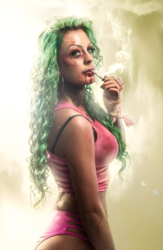
One of my favorite ways to blend elements into their surroundings is by using light and color effects. By adding light flares, sun glare, and rim light onto your subjects, you are blending your subject into the background through interaction with surroundings. J J Abrams uses this technique a lot in his movies, typically the lens flare from a bright light behind a character, wrapping around them. Not only does it look cool, but it grounds the character in the scene. it shows interaction with the world around them, and creates realism. Well, guess what, we can also do that in our photos! We can paint fake rim lights onto our subjects or add color changes relating to our surroundings.
You can paint in the light leaks and sun flares with a brush. But the easiest way to do this if you are new to this is to use pre-made overlays. An overlay is an effect, shot against a black background, the reason for this being when you add the overlay to your image, you can switch it to multiply and anything darker than 50% gray disappears, leaving you with only the aspects lighter than 50% gray.

Color
Color plays a huge role in composite photography, not only in the matching of all the elements but the final color grading which unifies everything together. When you add a global color over the already color-matched elements, the whole image just gels more realistically. One trick is to add a photo filter above all your layers, which does something similar, but color grading is where you want to make sure you get the final color.

Dodge and Burn
When you put all your elements together, depending on the source, they will be of various contrast and detail. A way to unify all the elements together is through dodging and burning. Dodging and burning is one of my go-to techniques in all my images. It can be used in multiple ways and also achieved in multiple techniques. My favorite use of dodging and burning is pulling out detail and to create the painterly feel you get in stylized images. Adjusting the contrast throughout the image will unify the pieces so they all look like they should exist together. I would advise everyone to learn how to make the most out of dodging and burning, as it is one of the most important techniques for blending and for style.

Depth
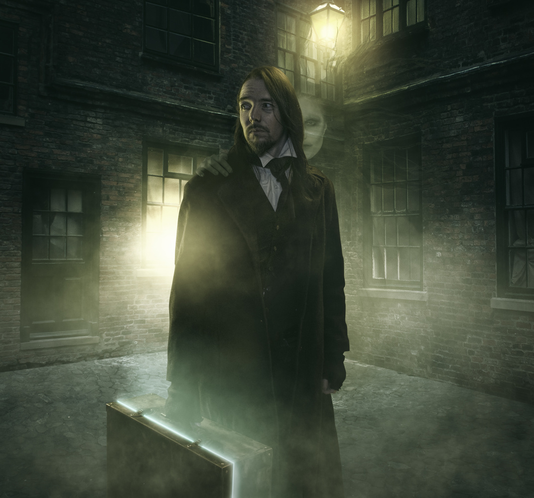
The best photographs are usually the ones which have depth, when it feels like you could walk into the image. We want to achieve the same feeling in our composites. The best ways to do this are by adding a foreground interest, contrast, and blurring. A huge component usually missing from the composites I see online are foreground elements. And it is really easy to add them in if you know your story beforehand. You just choose an element that aligns with that story, place it in the foreground without it being distracting, and blur it using Gaussian blur. Simple.

The background is a little trickier, but depth can be achieved by using a lack of contrast the farther back the eye goes. The old painters would call this technique aerial perspective, when you see an epic landscape photo and each mountain range gets softer in contrast as it goes back in the distance. It creates amazing depth. This is aerial perspective, and this is what we want to mimic in our composites. It is easily achieved with a curves adjustment. If you mix a good out of focus foreground element with some aerial perspective, you are on the right path for depth.

Little Details
Last but not least, we get to the little details. To create a believable world is to create a successful composite. We can blend realism into our image by adding small details that add to the image as a whole. A sense of realism in a fictional image is what will make your composite stand out. The atmosphere is one of the best ways to achieve this — fog, dust caught in the rays of window light or the glowing haze around a lamp, location details, etc. If your composite is set in the jungle, you can add butterflies or light rays through the tree branches. You have a character by the sea, then add sea splashes. Again, we circle back to story, one of the points from part one. If you know your story beforehand, adding these small details should be easy: hair blowing, sweat, spiderwebs. The more little details you can add without creating a distraction, the more you are on to a winner.
There you go: five ways to think about blending your composites. Let me know if you use any of these techniques already or if you have something I missed. Photoshop can be used in a million different ways to get the same result. I would love to hear yours.


