
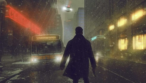
Recently I was thinking about the year so far and noticed that my output for the year was down compared to other years. Why was this?
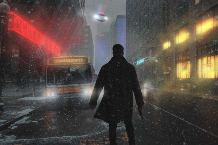
Maybe I have been too busy with other aspects of the business. Sometimes it can be hard to get to shoot when the business issues have to be dealt with. Even so, I still want to keep my Photoshop skills sharp and some kind of regular image rate. So I decided to start using stock more. I prefer to shoot my stock images, but using other people's stock frees me up to create images I may not have been able to if I was shooting everything myself. So for my first stock-based image, I decided to create something inspired by Blade Runner.
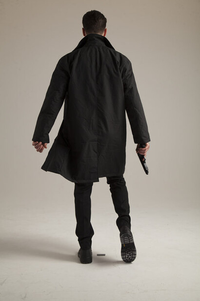
Because I knew what I was aiming to create, I knew the kind of images I wanted. For the person in the image, I purchased some amazing model stock from NeoStock. NeoStock is a great site that offers premium model stock for genre work.
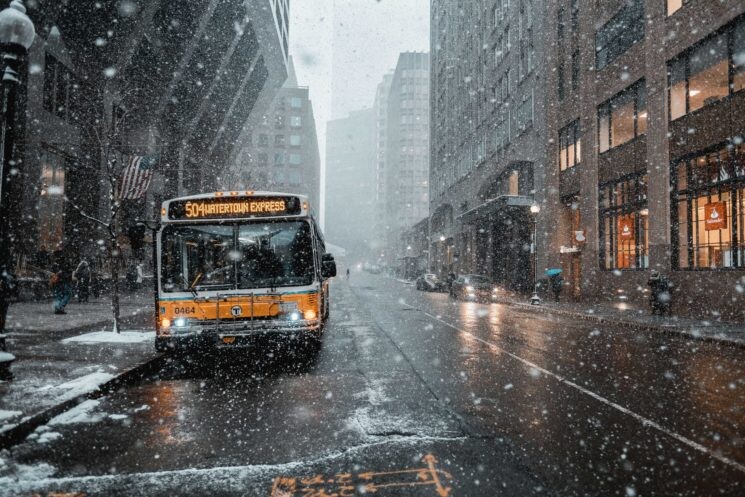
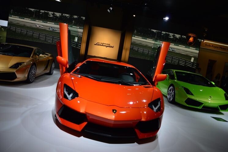
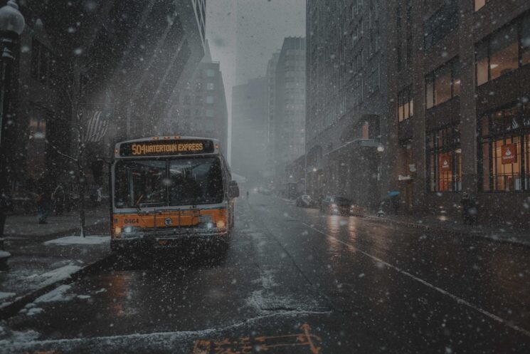
I also downloaded 2 free stock images from Pixabay. One of a city, and one of a sports car.
All will become clear what the car was used for soon! But first I had to get my background city image to a place where it would be a good template for a Blade Runner style image. Blade Runner is a very night driven film, so to make the city image look more like nighttime I created a curves adjustment. With that adjustment, I pulled down the slider on the right which is for your highlights. I also pulled down the center which is for mid-tone. The image was a little too dark so I pulled up the darks just a little to lessen the contrast.
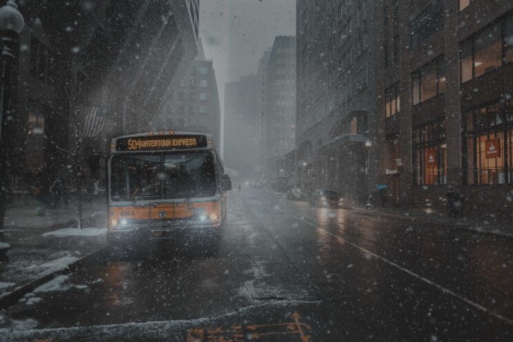
Now to add to the nighttime effect I need to make the lights of the vehicles brighter. I did this to each of them by creating a blank layer and switching the blend mode to screen. Screen mode is good for glowing light effects. I then sampled the headlight color of the vehicles and gently painted the effect in over the lights.
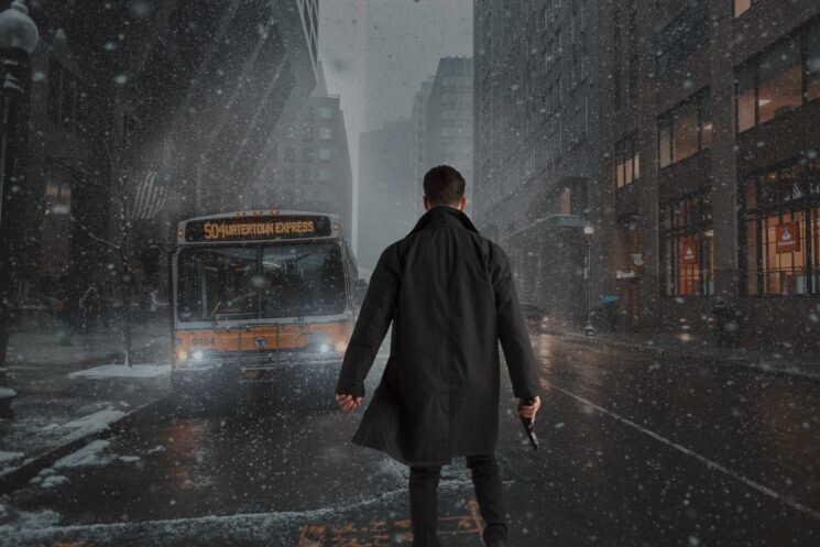
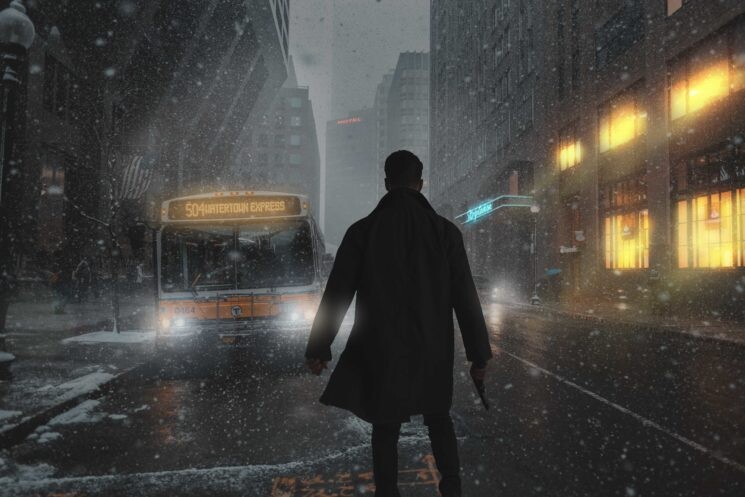
Our backplate is now looking pretty good, so let's add in our model stock. I played around with the size of the model and roughly worked out the horizon point, so I could place the man somewhere near to the point he would have been.
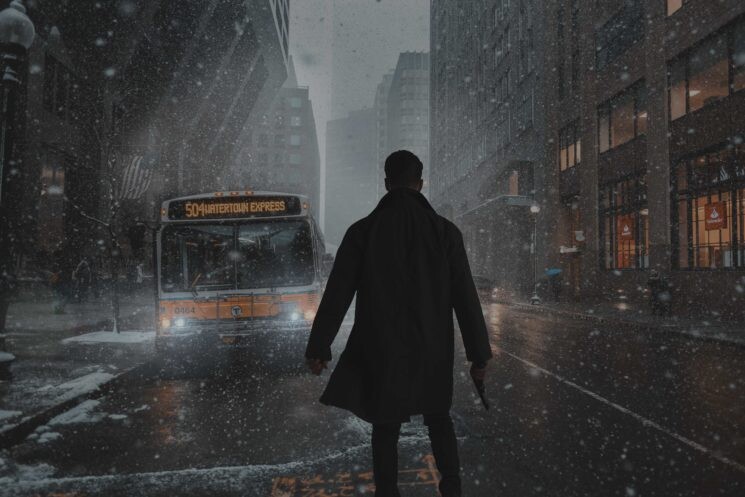
Our guy is in place but now we need to blend him into his surroundings more, he is far too bright and contrasty. To deal with this I used a curves adjustment. Again I pulled down the highlights with the slider and pulled up the darks a little. This a good way to lower contrast but also make something darker.
Now we are getting to the fun part, lights! Styling an image is always fun, and adding lights is a good way to stylize a fantasy/sci-fi piece. I started with the building on the right-hand side. I selected all the windows and filled them with a yellow/orange color on a screen blend mode. I then sampled the color, and on a new layer on a linear dodge blend mode painted in more glow. I then move on to the doorway of the building. I wanted the door to have a neon sign above it. So I found a good text font online and typed out striptease in blue. Using a distort transform tool I then fit it to the top of the doorway. Next, I create a new layer and place it on a screen blend mode. I sampled the blue of the type and gently painted over it giving a glow effect. The same technique was used for the hotel sign in the distance.
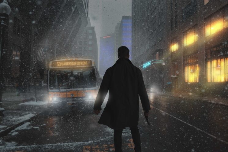
The image still needs to look more Blade Runner-esque, so let's add more neon lights! I added some strip lights to the building in the distance on the right. To do this I created a blue line with the marquee tool and simply kept duplicating it. I then matched it up with all the window ledge lines down the building. For the building in the center at the back, I wanted to try a different effect. So I downloaded some computer motherboard stock, turned it to blue and then switched it to screen blend mode. All that was left was the bright areas in blue which I transformed over the building with the distort function.
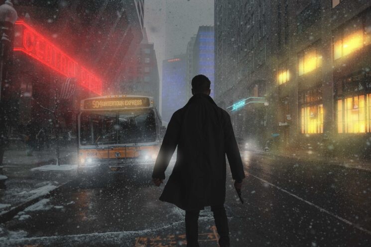
We are starting to get somewhere. But the image feels a little out of balance. We need some neon lights on the left side. Knowing this, I also had to keep color harmonies in balance. So I checked my color wheel. I already had blues and yellow, so to make that a complementary triad, red would have to be the color of the light on the left side. To create the neon sign, again I found a neon looking font from a free site. I typed out what I wanted it to say (Central Casino) and then with the distort transform tool matched it to the angles of the building. I then Added glow painting over it with the same color on a screen blend mode.
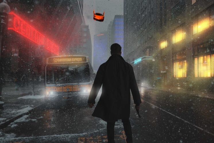
We got our badass neon sci-fi lighting, but what next? I thought the image needed a little more story or drama. Our character needs some kind of opposition or challenge. So what better than a flying vehicle coming towards us. I took the free stock image of a sports car, cut it out and brought it into the image. I added a little motion blur to it so it looked as if it was moving.
So far so good, although the color is not what I want. To change this I simply created a hue/saturation adjustment layer and moved the hue slider until it changed to a color a preferred. In this case, blue. I then pulled down the darkness with the lightness slider in the same adjustment.
So we now have a blue floating sports car. We need to change it into something more Blade Runner. Lights and more lights will do the trick. To create the sirens on top, I pinched some of a free stock image of a police car and transformed them onto my sports car. With a new layer on a screen blend mode, I painted in the glow for each color. With another new layer on a screen blend mode, I then painted in the light flare of the headlights. Light flare is super good for stylizing as I said before.
Having a glance at the image, I realized that I need to blend the model into the scene a little better. There is snow falling in the image but our model seems immune so what we need to do is have the snow falling behind him too. To apply the snow all I did was search DeviantArt for a snow stock image. I dragged this into my layers palette, making sure it was above the model layer and switched it to a screen blend mode. This just left the white flakes over our model and nicely made him feel more part of the world around him.
The image is looking pretty much done, all I felt it needed was a final sci-fi feeling color tone. As usual with all my images I usually mix a color gradient adjustment layer with a selective color adjustment layer. In this case, I used murk greens for the gradient and put some blues into the darks with my selective color.
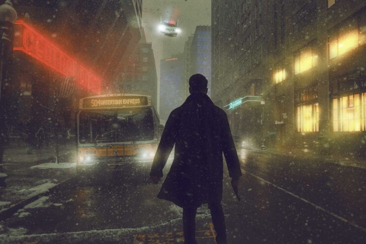
The home stretch! To finish the image off I added some text to the front of the flying car saying police I thought it was a nice touch to the story. Once I had done in Photoshop, I finished the image off in Lightroom as I always do with some sharpening, clarity, and vignette adjustments. There you have it! A Blade runner inspired piece comprised solely of stock.
Do you guys use stock in your images or do you like to shoot all the elements yourself?





24 Comments
Great work. I think utilizing stock imagery is key for completing pieces like this. Trying to capture all of this on our own can be time consuming and cost-prohibitive. Using stock gives you flexibility especially if you forgot a key piece say like a car for instance in this situation. Really appreciate the insight on how this was done.
The problem with this for me is it's not your image in the end but an edit you did of someone else images. Kind of like sampling hit songs and throwing a rap over the top and calling it yours. Example: https://www.youtube.com/watch?v=NVVFvKYUAlo
The majority of your finished pic is one really nice photo taken by someone else with a cut out body taken by someone else. Regardless of adding lights if you slapped a bad pic as the background the entire image would look bad. So hard to take credit when 90% of the image is someone's pic added. Nothing against you, I know you're using it as an example but I see tons of images getting praise because the people viewing it think the person took all the images in the composite. Or even just stealing pics off Google.
I heard replies like "I blurred it or I flipped it so it's okay to use." There are plenty of times I've been frustrated by not having the right piece for a comp because I haven't taken stock. Creating it from scratch is a long process but it's all me. Otherwise I could just take the image you made from other works and change it up and now call it mine. Doesn't seem quite fair.
On your point about the music sampling.. so many awesome rare soul and disco tracks have been brought to the forefront by sampling, opening them up to people who would never have heard them otherwise. Not everything in the world is negative.
And none of these songs you know would've ever been created if not for having music from other to sample. Of course there the original artist make money from their songs being used or just sue the hell out of the person using them.
Like i said, not everything in the world is negative.. although in your case it seems like it is.
That is not true. It is a known fact that two people who have never met have written the same song, different lyrics, but same melody.
To David Love, it's like you entirely missed the point of the article. He purchased the image of the guy, giving him the right to use it. The other two stock images are free use, giving him the right to use them. The images are placed on the sites FOR people to do as they please. Create composites and whatnot. He created something totally new from those images. Imagination and creativity do that. It is HIS image. What was your point again?
You missed the point. Doesn't matter if you license the stock image, they are still created by someone else. Slapping one stock pic in front of another and color grading doesn't make an original piece. If I draw a mustache on the Mona Lisa can I say I'm the person that painted it? If 100 people buy these same stock pics then this isn't an original piece because they can all do practically the same thing just like I did.
Being able to "use" images shouldn't give someone the right to claim them as original works. Especially when the only difference is a cut out person is slapped on a full image and some colors are altered. That's my opinion and why I don't do it. But do what you want. I would just never be able to look at my work and not see the persons shoulders I stood on to create it.
Written by a man with an avatar that is a photo of Wonder Women he didn't take.
I just love it buuuut, I much rather would do this by myself...with real objects, etc. I know, I know, but I have nothing but time as I am retired. For anyone else....whatever you like. I prefer the work I do be just that...the work I do.
Not the point!
The Hein mage is the farthest away from Blade Runner. Happy people in clean preppy cafes? Not 2019 Los Angeles.
It's amazing how many people missed the entire point of this compositing tutorial.
Thank you! I am bookmarking this for future, etc. Despite the comments of the naysayers and Keepers of the True Path, i love what you did and agree with Daija Ginyard's comment about the use of stock for this purpose.
When Photoshop came out there was blather about how it wasn't "pure" because it altered photos in new ways. Who thinks that now?
Whether you capture the elements or buy them separately, the final work is yours.
I agree. Here's my new original piece created by me. I used two of your pics but don't worry, I slapped one on top of the other and added a cool effect so all mine now.
David, I understand you appreciate the creative process from beginning to end. But you missed the point of the article. The author is simply showing his workflow for how he is able to use advanced techniques in photoshop to create his own piece of art. In the end this is his made up of images he either licensed or used on free sites, which you are able to manipulate and use at your own freedom. To your comments on the music side of things, if this was wrong then why do so many artists recreate other versions of popular songs? And your Mona Lisa comment just is not relevant as that is not creating something unique or original by putting a mustache on it lol. Anyways rather than trying to put someone down for creating something that works for him, we should be building the community up. If you don't believe in this type of thing, then keep on doing things your way, but there are plenty of others using this type of technique.
Tell that to the guy that was selling Instagram pics in a gallery when all he did was wrote a comment on them and screenshot. My comment is not a put down. We're photographers, so take stock pics, create your own library. It has benefits of the images being in raw, shot with the same lens and you're not spending hours going through already processed jpegs on some site. And being a photographer I enjoy traveling and taking images. It's fun thinking about what that image could be used for in a composition, shooting it imagining where someone would be standing. Then there is that finished composite composed of all my work, not just a remix of other work.
You want to use stock sites to grab a door or a brick texture, sure but when I can see one stock image just slapped on another, that loses something for me. I know that's not the point of his article but any time I see stock pics being used that way I like to remind new photographers and designers that more effort should be put into it. Even more, to remind them that just grabbing pics off google to use is illegal. (even though that's not what he did here.)
I totally understand your commitment and appreciation to the full workflow to create a final image. I get it, but for some folks it may not work, and especially for retouchers and designers, they may not be photographers in true nature and therefore are either utilizing stock or collaborating with a photographer to create the final image. It's very opinion based, but in the end the final result is what matters, not how it was done. I like your composite above, which if it was done all stock, nothing wrong with it. You took the time to source the images, come up with the concept, and ensure that everything was seamlessly blended. If anything you add more value by being able to do this as well.
Did you license these images, or just steal them and slap them together?
While your argument about taking someone else's photos to create your own art isn't in the pure enough form you wish, I promise you the people that offered up their work for licensing isn't offended. They knew what they were getting into.
The article is just showing how to create Blade Runner like images. A great starting point for some people to learn and explore.
Nothing wrong with using whatever sources you have. Call it lazy but some people are not rich, so let them just make what they want to make without well intended life lessons that still don't matter.
Growing bad habits by taking shortcuts is not the way to learn. When people say they love your image and 80% of it is someone else picture and you still take lone credit, that's not cool. You see all the time companies getting sued because their designer took a shortcut and used images they didn't have permission to use. It's bad business and you don't have to be rich. You can take your own stock pics or pay for stock images and chop them up to create original ideas. Not just slap your cut out image on top of someone's pic and calling it yours.
This looks like it was created by a C average student.