In this video walkthrough watch, as I show you how I created this stylized female boxer composite portrait image in Photoshop.
I love to create cinematic stylized portraits, but with lockdown, obviously, I can not shoot anything. So to keep the cobwebs off and to make sure I am keeping my creative muscle active, I purchased various stock from Adobe and got down to business. In the video, you will see me cutting out the model and creating depth of field by blurring elements. I also show you how to add light effects and to add a nice color grade. One area where I messed up, in the beginning, was using Photoshop automated color select to cut out. It always takes extra time to refine the edges, as you will see in the video. My usual go-to is the pen tool, and I definitely regretted not using it this time. But it goes to show the easiest way is not always the best.
This video walkthrough is great for beginners who want to see how a composite like this is pieced together. When I was learning I found it beneficial to watch other artists' processes and workflow, taking what I needed and applying it to my own.


Join the Fstoppers community for free
-
Post comments and join in the discussions
-
Browse the site ad-free
-
Share your work and get featured in the community
-
Compete in the photo contests for fun and prizes
6 Comments
At first glance I thought the screenshot was
Star Wars related. It looks like she's holding a light saber because of the blown out rafter in the background.
Or perhaps I just have Star Wars on the mind for some reason.
I had the exact same reaction.
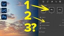
1. Pen tool is the way. Every other way Adobe offers and comes out with each year is a mess. Most of your video was cleaning up their mess of a tool but you knew that. Maybe start tutorials after you've cut out the subject to save time and give yourself enough time.
2. The ceiling moves closer to you so shouldn't be as out of focus as the back of the room ceiling. Maybe copy the layer to start and add a little less to one than the other so you can fade the blur.
3. Light leaks were a smart move to glue the foreground to the background. It's a good pic to show the importance of depth.
Enjoyed this video, thanks! Great feel to the image. I've don'e a bit of compositing work and the main work is actually in the masking. Tedious work. The rest is fun.
The lights on the ceiling are in a bad position as they suggest a lightsaber in the hand of the model. You should have seen that and fixed that with all the time you had! A sloppy tutorial.
James, feel free to post your expert tutorial for us all to marvel at.