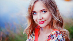
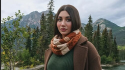
Creating convincing composites is all about matching a number of characteristics, one of them being the saturation between the different elements of the final image. This helpful tutorial gives a quick and very effective method for precisely matching saturation.
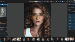
Rarely do I see a technique that makes me stare at my screen, mouth agape, muttering, "you clever [word I can't say here]." This was one of those times. Coming to you from the Photoshop Training Channel, this trick takes advantage of a selective color layer to map saturation to monochromatic luminance. If you're like me, making adjustments that involve precise comparisons can leave you with a bit of a headache, and having something that simplifies the process makes life much easier. By converting saturation to luminance, you simply have to match varying levels of gray as opposed to trying to decide if that blue is as blue as that green over there is green, etc. It's very quick, and by saving the adjustment as a preset, you can quickly load the map in the future with just a few clicks. While there's certainly a lot more to match when making a composite, this makes one step of the process much easier.

Join the Fstoppers community for free
-
Post comments and join in the discussions
-
Browse the site ad-free
-
Share your work and get featured in the community
-
Compete in the photo contests for fun and prizes
2 Comments
To take the convo farther with composites there are a number of things that give away the photoshop work. Various images in the composite all having different color temperatures, depth not being correct, cut out images being too sharp around the edges, bad hair extraction (I call the Darth Vader helmet hair) or simply slapping something on top of a full image. In my image below, I created using dozens of tiny parts to build. To try and full the eye more, I like to add a foreground element so that the character is in the image, not slapped on top.
Hanging vine in foreground, characters, villain, and then background. Layers of depth. And most important in any composite, lighting the subject to match what the background will be.
Very useful. Will definitly be making my own preset for a saturation map.