There's a lot more to compositing than just getting a perfect cutout. Here are some golden tips by Unmesh Dinda of Piximperfect on how to get a seamless blend.
When first getting started with compositing it's easy to overlook some slight exposure or color differences because, at first, getting the selection spot on takes a lot of practice and trial and error of different techniques. When one wants to progress and bring their A-game to compositing, however, one has to learn how look a bit deeper to really make the image believable. In this video, Dinda does a great job at explaining how to get around some of the trickier problems.
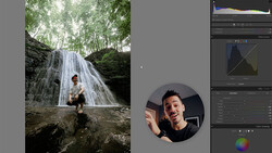
Starting with getting a good selection using various techniques, he then moves through exposure and color matching to get a basic but fairly accurate blend. He then takes it further by adding some blurring effects which makes his subject stand out a bit more but make sure to add the effect to some of the subject to take away the distracting sharp edges. To bring it all together he adds a Gradient Map layer to tie everything in together, and to finish it off, he adds some contrast and a vignette. The last piece of advice is very useful and should be applied to any post-precessing work: take a break. Taking a break, and coming back to the image after 10-15 minutes helps one to look at it with fresh eyes so it's easier to notice any discrepancies.
Have any of our readers got some tips on compositing? Is there anything you would have done differently?


4 Comments
Every time Fstoppers posts an article on compositing, I cringe at the results. As per usual, the subject and background have completely different lighting on them and the results are far from realistic.
So it's not like this photo could have been real and lit with OCF? hahaha
Light is direct on the buildings on the left of frame and buildings on the right of frame seems in shadow. She should be with the key light on the other cheek, but possibly, being on a shaded footpath no light at all unless there was a flash light on camera left or a silver reflector in the sun from the street. The kick/side light on her other side wouldn't be there as well. It really doesn't look that realistic to me. Nice in terms of colour matching and idea, challenging in terms of lighting coherence.
Whoever makes a real photo with OCF would still be better trying at least to match the sun direction respecting the background and not go completely opposite, in my opinion.
Realistic is the magic word there. She could have been placed upside down, hanging from the top of image and still "So it's not like this photo could have been real and with the model hanging down from a crane". It all depend on how much you're willing to blend the definition of realistic.
He sharpened the shoulder furthest from the camera, but not her back. What a bad example. It was 15 minutes explaining how to mask her out of a white background. Yeesh.