For this next critique, we want to see more than just a pretty picture. We want to see photographs that exude emotion. As with many of these genre-based critiques, "emotion" will be open to interpretation but try to upload uniquely powerful images. Keep in mind that we want to feel something when we see your submission, and no, a pretty sunset won't cut it.
Each photographer is allowed to submit up to 3 images. Please write a quick paragraph about how you created your shot so that we can discuss it in the live critique. The highest-rated image and one random image will win a free tutorial from the Fstoppers Store.
Cover image by TJ Drysdale

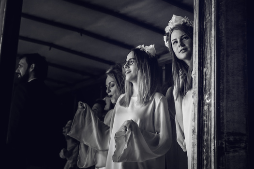
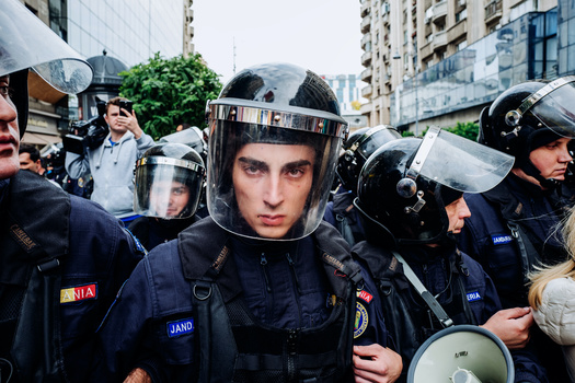
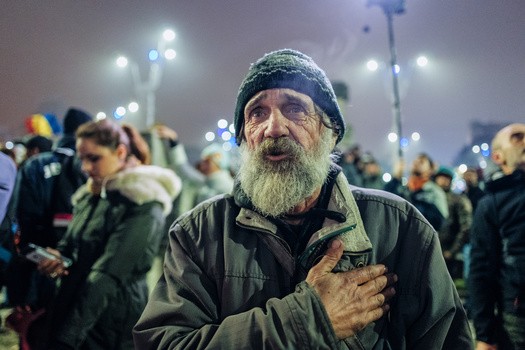
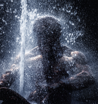
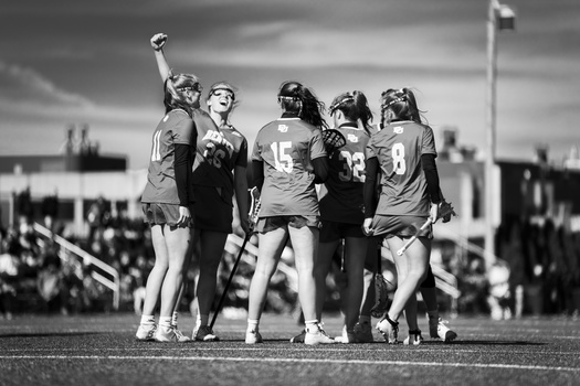
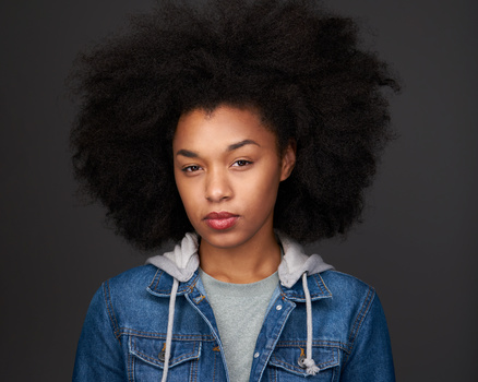
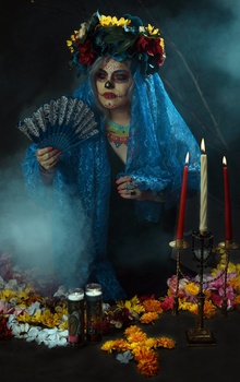
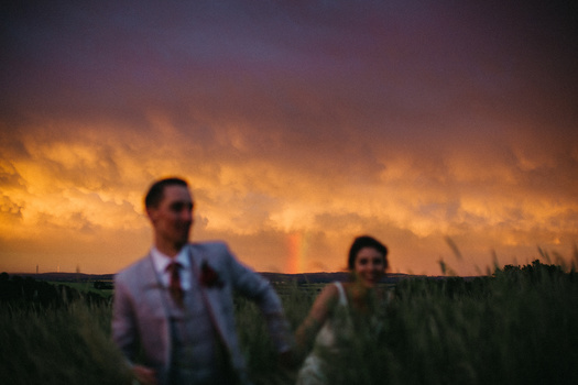
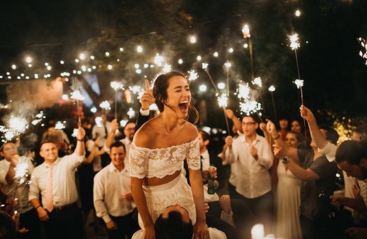
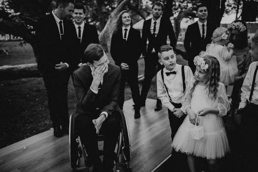


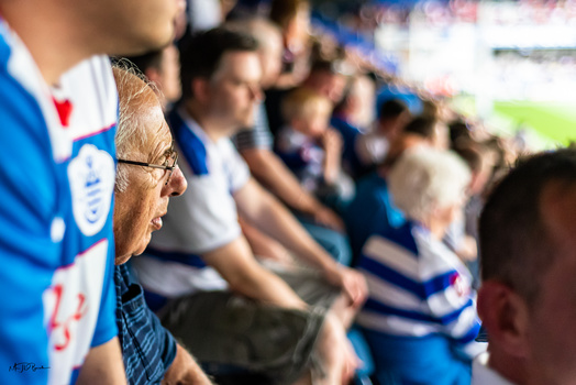
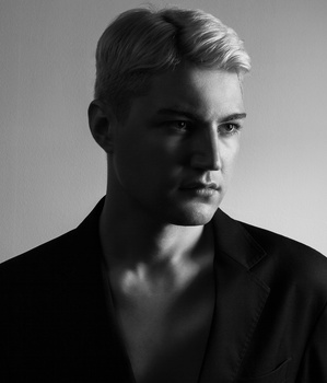
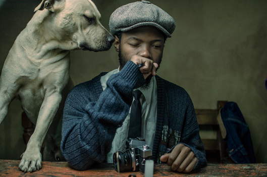

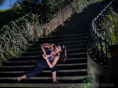
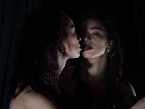
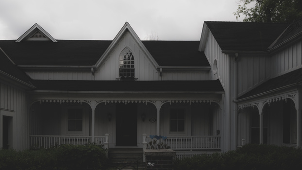
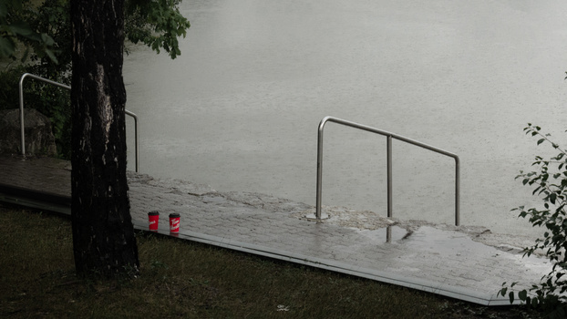




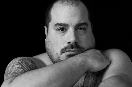
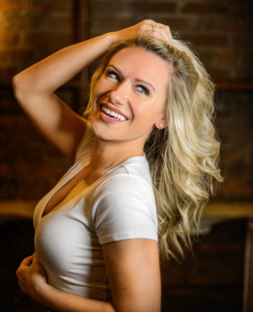
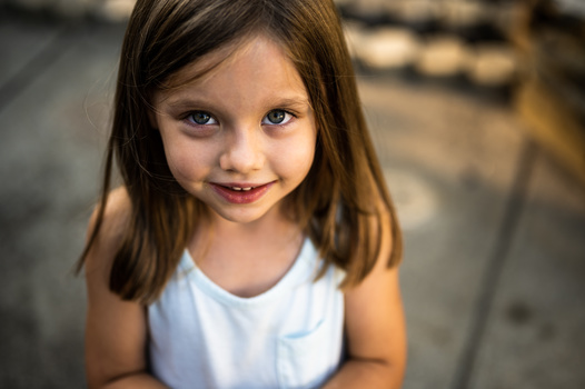



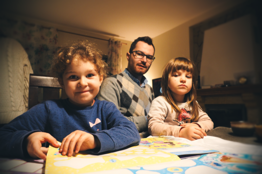
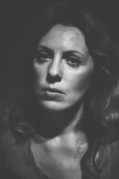

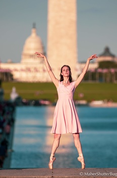
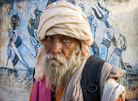
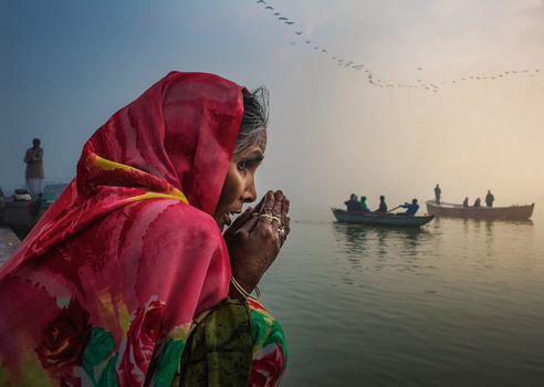
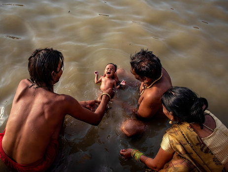
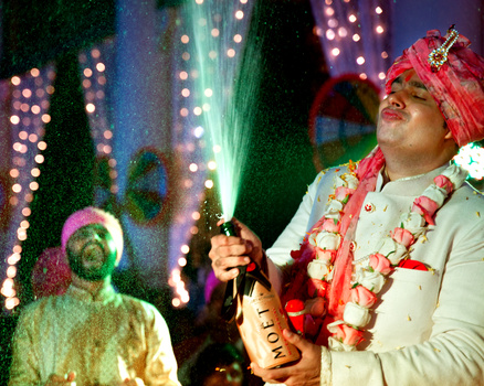
Almost no landscape photography so far. Strange cause good landscape can generate much more emotions than posed portrait.
I think the voting on this is going to be very polarised - some will see emotion easier in a particular genre while not see it in others. Personally I don’t get much emotion from landscape photography so would rather see more people photos in this one.
Aye. Seems a tad subjective. It's like someone who really likes cars say that cars evoke much more emotion than a person showing emotions :p When I saw a landscape photo here I was honestly a bit like "..really? I mean, it's a nice photo, but..."
Emotion is totally subjective. The image should trigger that emotional response.
likewise - hence why I think voting could be really polarised. Additionally, if you have say a top landscape photographer voting on a genre they've not experienced shooting, like a wedding or sports, they may not appreciate the difficulty/challenge in capturing moments of genuine emotion that have a strong composition and vote pictures lower as a result (and vice-versa). I think the voting system on here really encourages what would be perceived as negative voting - a 1 or a 2 is a likely score for a lot of photos because people won't feel it could sell or is "portfolio" ready. Coming away with a 1 or 2 can feel quite discouraging.
Yeah. I posted a picture of a northern lights seascape and it got hammered down to a 2/5 needs work.
So many bitter people on these sites.
I do hope that we get the "Stolen Scream" on this one. I know the guy is on Fstoppers, but I don't know if he does CTCs.
Many good images and portraits, but they seem to lack the emotional impact.
An image that moves you emotionally is about as rare as a leprechaun. Expecting several to show up in a YouTube contest is unrealistic. If you’re looking for lightning to strike in order to hand out your three stars, I’d suggest re-evaluating your rubric.
The goal of art is to make an emotional impact. And a great artist is lucky to create one or two in their entire career. I’m hoping the folks here complaining about the lack of emotional impact in this set can appreciate where the individual artists sit on their personal journey towards their own one or two.
Edit: let me suggest an alternative rubric
——————————————————
1. Can this image be interpreted to meet the theme? Try not to judge against your personal interpretation. Resist the urge to grade on how well the images adheres to the theme. The theme is the threshold, not the scale.
If yes, start with a ‘3’
If no, start with a ‘1’, and stop.
2. Add or subtract a point based on technical competency. If the image is hard to look at do to glaring technical flaws go negative. If it’s interesting to view, and invites further discussion (technically, or in content) go positive.
3. Add a point based on how it personally impacts you. This is where you get to be subjective. Go balls to the wall with this category.
I agree with just about everything you’ve said here Chase, but do you think in this scenario, an image needs to connect with you emotionally in order to award it 3 stars? I’d say if it does hit you emotionally, it should be at least 4 stars (excellent) as it’s managed to convey that emotion despite you not knowing anything about the scene/people. I think 3 in this case would be a technically solid image that you would think would fit on a website/portfolio, but maybe hasn’t hit you emotionally. A 2 means “needs work”, I’d be interested to hear what work someone would suggests who rates an image a 2, as that’s going to be very difficult for them to say given they weren’t there in that moment.
I outlined my suggested rubric.
Too often in these “contests” folks grade an image on how well it meets the theme. This is obviously the wrong way to grade any artistic Endeavor. It’s like grading a movie on how well it adheres to a particular genre.
Yeah I quite like the idea of what you’ve put above for rating images. It’s difficult, because photography being an art is always going to be subjective, and open to an element of interpretation. For me personally, I don’t see any benefit to the photographer in rating their image a 1 without giving some constructive critique- but unfortunately many people can’t be constructive in their critiques while others can’t accept constructive critique - that generally leaves me not rating images that I feel are less than a 2. I still feel a 6 point scale would work better, where 3 would be the “ok” category, 4 portfolio ready. A 2 needs work. Having that would allow people to feel they’re getting a bit of credit for their decent images and not constantly belittled by low ratings.
Chase I really like your grading rubric but this part hung me up.
“ Too often in these “contests” folks grade an image on how well it meets the theme”
Isn’t that the whole point though. Such in the previous contest that was swimwear and someone posts a landscape or architectural photo shouldn’t they receive a low score? Or why they get Mike Kelley for the architectural photos but people submit portraits.
I’m new here and still trying to figure it out but what’s the point of a themed contest or critique if someone is just post something completely different.
The rubric handles it.
If the contest is swimwear, and someone posts an image that could be interpreted to fit the theme, then you start at a 3. Then continue to part two and three.
If it can’t be interpreted to fit the theme, it’s a 1. Period.
So if someone posts an architecture image in a swimwear contest, then that image is a 1. But if someone posts a picture of a woman wearing a fishing net on a boat, then that *could* be interpreted as swimwear, so you start at a 3. And you move on to judging technical merit, and then if the image has any kind of resonance with you personally.
What I don’t like seeing is people rating an image solely on how well it meets the topic. For instance if the theme is “drama” people will try and rate image based on how dramatic it is, rather than rating images that fit a dramatic category. I wish the these topics were treated more as a threshold, or bar to entry, and not as the singular metric on which to judge an image.
Emotion is the perfect example, that’s playing out now. And “design” last time. People are taking great images, but they’re being rated unfairly because of these very narrow definitions of a topic.
I can see where you are completely coming from. These last few contests have been quite subjective and can be so easily interpreted differently.
But in the end some topics are so specific there shouldn't be much of a question or need for interoperation. For swimwear to me at least, it's pretty cut and dry, Would the person go swimming in it? Simple as that.
So a girl wearing a fishing net to me would be basically be a 1 on your scale. The person is not actually going to use that as swimwear.
Once again this is just my opinion and I completely respect your opinion and your body fo work for that matter. I just see it differently.
I appreciate the friendly discussion.
I like your rubric. It worries me that the majority will judge based on how well an image meets the theme when the theme is entirely subjective. And really, Lee and Patrick almost never let how a picture fits a particular theme affect their score. Sometimes they include images a bit outside the theme and talk about that, but in the end judge it based on their criteria related to whether or not it should go into someone't portfolio.
Your suggested rating system makes a lot more sense in this photo category than the rating system documented by the FStoppers guys.Why can a snapshot (1 star) not be a world class shot (5 stars)?
Take for example the shot by Jim Marshall taken of Johnny Cash showing his middle finger after his show at San Quentin's. This is an epic shot I would rate "world class". According to the FStoppers rating system this would be a 1, maybe a 2.
I also never understood what a portfolio has to do with rating a photo. Maybe when you only shoot real estate (which I think is where the FStoppers guys come from) this _may_ make sense.
I agree, an extended rating system would be great. The range of pictures I vote as 2 or 3 is enormous. There could be 4,5 or 6 levels in that range alone.
They like to do the thing with their hands in the videos and only have 5 fingers, and they don't seem to want to get past that. Maybe it's their Dumbo's Feather and think they'll lose all their viewers if they stop doing it.
This is not something people want to hear but if you already have a lack of empathy and only care about yourself then you're not going to be moved by any of these photos. This content isn't for you to judge.
This certainly pertains to me. I’ve been dead inside for too long.
If it's not for the community to judge why are we asked to judge it?
By community you mean everyone here right? Because I didn't mention that. I mentioned a very specific subset of people. People who lack empathy. Those are ones who should not judge something they don't understand. Although this is redundant to say. My original comment states that pretty clear.
If you rate someone needs work you should comment what needs work just saying.
I said the same thing. I LOVE your work Angela. I'm not sure a lot of people understand an art approach as in not a typical technical photo approach. Maybe this isn't the place for artists. I noticed a lot of great photos being rated very low so I'm guessing there are people rating others low so they are knocked out of the competition. People need to think out of the technical box sometimes but maybe this isn't the place. I've been here about 3 days and will probably leave. I am used to supportive groups.
Really many great shots here. But not that much which really invoke emotions. Of course except the guy sitting naked on the plican ...
Hehe thanks ;-)
Some great photo's here but barely a few that I'd say fit the "exude emotion" as per the brief
I was starting to think I was a psychopath and just couldn't process seeing emotion in photographs ... or maybe I am a soulless robot and it's why my last girl ghosted me.. :-/
Joking aside, I agree, some awesome shots but I'm having a difficult time feeling "emotional" about most; it's all subjective of course... as the same could be said about my submission.
Hey! Can y'all fix the bug on firefox where if i comment, then i lose the ability to rate with the number pad on the next image?
Joe Pelosi
It's the same on chrome. Quite annoying.
Can someone explain the rationale for one of two winners being a random selection ? I can’t decide whether it’s weird or dumb.
I think it makes sense.
They already give one to the best photo, so this way it gives hope to the rest of us. They can't give it to the worst photo because that would incentivize people to submit particularly bad photos. And they can't just choose one since that would be biased and look like they are playing favorites.
Besides that, it adds a little bit of suspense to the video (for everyone who's photos made it in).
It encourages people to keep submitting, even if they aren't at a level of people who crank out 4 star images like nothing
Its participation ribbons.
Id love to see a contest of portraits of only plus size models.
I get where you're coming from, but the community contests are supposed to be for the whole community. That category seems a little niche. Kind of like a contest of only pictures from London. That's why the contests tend to be vaugely themed.
No more niche than Real Estate, nudes , product, seamless background, Iceland, etc. They’ve all been done previously. You either can / do work in those genres or you don’t. While inclusivity is nice I’d say “ let’s see how someone would creatively address ......” is the primary criteria in play.
You make a good point.
I think this is a good idea. My only concern is that I guess one would need a definition of plus size. In the industry, it seems like a size US10 is plus size, but that's probably not what most people mean by plus size.
Well, thought i will get higher scores than this. maybe that's not my field. good luck for everyone else.
There are two awards given, and one is random ?
Contests are weird.
I wonder how it would change if those who submitted, can not vote.
There would likely be very few people voting. Case in point, on this contest 237 people contributed images, 283 people cast votes. The delta on that is 46 people who voted but presumably didn’t contribute an image. That presumes that every contributor voted on at least one image. Also presumes that no contributors have other accounts they use to elevate their own images.....
This is FStoppers, most votes for any CTC will be for retouching skills.
Not really, usually the best images get the highest scores...