Welcome to another Critique the Community contest! Each month, Fstoppers is challenging our community to submit their best photographs for our Critique the Community show, and three lucky winners will win a variety of photography related prizes.
For the month of April, we want to see your best Portrait photographs. Since this is a fairly broad category, feel free to submit any photograph that showcases a person in some interesting way. Each image featured in the critique will be picked based on creativity, lighting, subject matter, overall production, final edit, and overall "wow" factor. The community rating does play a small part in our selection but it's not as big as you might think so don't get too wrapped up in what others have to say about your image.
Deadline
This month we are allowing up to 4 photos to be submitted. All images must be posted to this page no later than April 29th, at 8:00pm Eastern time.
As always, every eligible entry must have at least 3 sentences explaining how the photo was taken, any valuable technical information including lighting, camera gear, lens choice, etc, and any background story that might help our viewers understand why your image is so interesting.
The Prizes
Each month we are giving away a variety of different photography related prizes. Below are the specific prizes for the month of April.

First Place - One grand prize winner will receive a free wireless 2-Light Portable Flash kit by Westcott. Included in this kit is a JR400 400 Ws strobe, a second JR200 200 Ws strobe, a wireless FJ-x3 trigger, and a variety of accessories such as Gel set, Magnetic Grid and 55 degree Reflector. This battery operated kit is great for on-location portraits as well as shooting in the studio and can be synced up to nearly any camera with the universal FJ-x3 wireless flash trigger. Valued at $1199.90

Second Place - Our second place winner will receive a suite of post production software from DxO. Included in this software bundle are copies of PhotoLab 7, FilmPack 7, and ViewPoint 4. With PhotoLab 7, you can edit and color grade all your raw files quickly, easily, and professionally. Once you edit your raw files, you can then use FilmPack 7 to give your photos a classic film look based on your favorite color or black and white film stock. Finally, you can fix all sorts of lens and perspective distortion in ViewPoint 4 to make your photos look as perfect as possible. Valued at $467

Third Place - One third place winner will receive a free tutorial from the Fstoppers Store. We have full length tutorials on a wide range of genres such as architectural photography, headshots, landscapes, product photography, and of course portrait photography. Valued at $299
Added Bonus!
And finally, to help celebrate the month of April and get everyone excited about portrait photography, Fstoppers has made a massive sale on our portrait tutorial with Clay Cook. It's normally priced at $300 but for the entire month you can get it for just $49.
Clay Cook is an incredible editorial and advertising photographer based out of Louisville, Kentucky. His tutorial on portraiture is incredibly thorough and covers everything from wardrobe styling to simple set building to both simple and advanced lighting setups. So regardless if you are an outdoor natural light shooter, or you want to step up your studio productions, Clay's tutorial is going to have something for you.
Good luck to everyone entering and we look forward to critiquing your best images in the "portrait" genre!
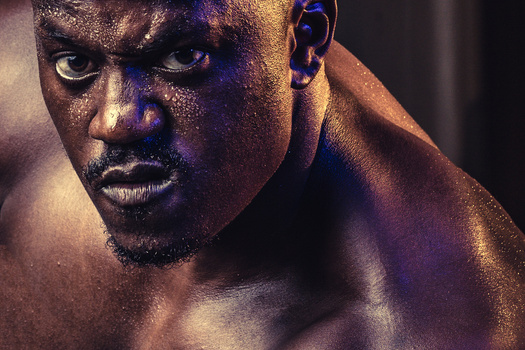
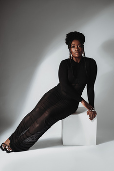
Featured Image by Devon Krige
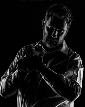
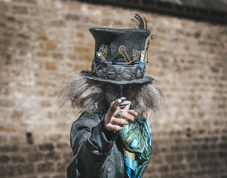
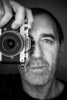
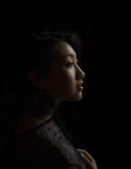


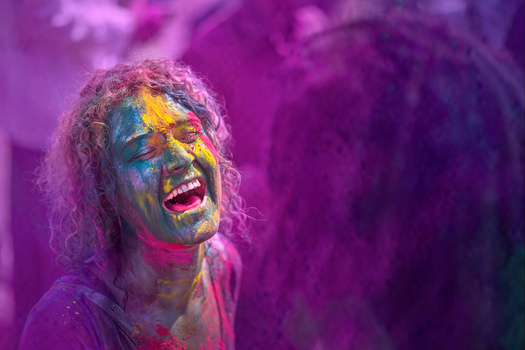












Perfect contest!
This community always amazes me with how absurdly critical it is. I just went through all the submissions so far, and the highest-rated one is 2.75. Most are close to 1. Does anyone honestly think these are all careless snapshots as their ratings imply? None are perfect, but with a few exceptions, every photo here is at "least" a 3 if you go by the definitions linked in the article.
I would strongly disagree. Most of the pictures here so far are only a 2 and many are just lazy (bad) snapshots. My problem with a lot of the reviews is that so few people here actually have good taste. I realize that one can argue excellently about taste. But a good picture is still a good picture, even if it doesn't suit my taste. Here you will mostly find photos that stuck in the past like 15 years ago. Especially when it comes to portraits, the majority tend to view poor retouching, outdated concepts, old-fashioned lighting and cheap poses positively. Not to mention the image of women and what is perceived as “sexy”. I know it sounds arrogant and a lot of people will hate me for it. I dont care. There is a good reason why pictures in magazines and advertising look different.
A ton of images got added since I commented, but I'd still point out that to be voted a 1 an image needs to be a "snapshot" that could be taken by anyone in that moment. The mere fact that an image has posing, lighting, thought going into composition, etc, by definition means it's not a 1, yet enough people are voting 1 that most of the images are scoring less than 1.5. I'd also add that I've noticed in previous critiques there are often world class images that get voted around a 2.
For example, looking at your profile, you have a lot of great work that I'd argue is of quite high quality, but I bet you couldn't score over 3 with any image even though, by the definitions of the ratings, every image in your portfolio is a 3-4 at the very least.
Do you really believe that most of them meet the criteria of 4 stars? “Planning and attention to EXTREME detail"? "Almost FLAWLESS conception, composition, lighting, subject matter, and postproduction”? The standards are high here, which is good.
I personally feel that your criteria assessment is spot on. For me however, being an absolute amateur, I can live with a one or two rating. At least I'd be in the majority average and not below...lol.
What I have found interesting though, IMO, is that ego may be a driving factor for some and there might be room for some humility.
I bet you could put half a dozen musicians in a room, come back a half hour later and the group will probably be jamming. Might not get the same result with photogs... just my two cents.
Oh look! The Emperor has new clothes!
Glanced at your stuff and you should be more humble my friend
You are not wrong.
User ratings on contests are meaningless anyway. I have one that’s a 4.5 on my profile but a 2 here. People are just thinking their rating something badly makes theirs look better and have a better time winning.
That's an interesting observation. How people perceive the quality of an image radically changes depending on the context in which they see it.
That’s not the problem in instances like this. The problem is that people have different markers for what quality is. For a lot of ‘photographers’ a quality image still comes from an ‘unedited’ roll of 35mm that’s been through your local one-hour processing vendor and comes complete with flat lighting, dodgy colour balance and that natural ‘just got out of bed in the 8th century’ skin texture. Any hint of editing or creative lighting and it’s a massive no.
For some photographers it’s nothing but ultra-processed images.
For others the technical execution of an image is second to the conceptual execution.
To some (most in the online space, I’d wager) the defining marker of quality is the ‘prettiness’ of the young model or the size of their exposed breasts - no creativity here please, it detracts from our viewing pleasure…
Naturally, people will have preferences, but why default to a 1 if an image doesn't perfectly fit your style? I can recognize that an image isn't to my taste and also doesn't fit the definition of a 1. It just feels vindictive.
I get that there is a ton of bias, in general, but you see this bias far more radically in these critiques than anywhere else. For example, take the commenter above, who has the same image in his gallery rated as 4.5 and is a 2 in this critique, presumably by the same community. Its just a bummer for less confident photogs trying to learn. I don't really care about what people rate my images but I hate to see other new and learning photographers get bulldozed in a way that makes them feel like they are making zero progress in their craft.
--- "Its just a bummer for less confident photogs trying to learn"
On the same token, you don't want to be giving them a false sense of "amazing", when it's not warranted. They are just going to keep making the same mistakes that got them the 2 or the 1. With that, some people never learn. So, it is what it is.
People scoff at a "Solid" rating. They shouldn't. It's a good rating.
I agree, they shouldn't be getting a bunch of 5s either, it should be a fair representation; most of the work should probably be around 2.5. (at least based on the scale as defined by Fstoppers) But if you pour your heart and soul into your work, only for a bunch of people to incorrectly tell you that its no better than a snapshot grandma could make with her old iPhone it can be pretty deflating.
--- "most of the work should probably be around 2.5. (at least based on the scale as defined by Fstoppers)"
I disagree. That would put them in the "Solid" category, which is incorrect and would be delusional.
--- "But if you pour your heart and soul into your work, only for a bunch of people to incorrectly tell you that its no better than a snapshot grandma could make with her old iPhone it can be pretty deflating."
Images should be judged for what it is, not whether or not you may hurt someone's feelings. This is a contest with big prizes, not a feel good session. Sensitive entrants probably should stop looking at the ratings every 5 minutes; just wait until the contest is over and then look.
I would refer you to Fstopper's definition of "solid":
"A 3 star image is an all around good image. The photographer has a solid understanding of the BASICS: composition, color, focus, subject matter, and postproduction. A 3 star image is "good" but it's not great. Most part-time professional photographers have mostly 3 star images in their portfolios. Usually a level 3 image would have been rated 4 stars if it had been shot in a better location, or with a better model showing a better expressions, or there was better postproduction. A photographer capable of taking a 3 star image is capable of taking 4 and 5 star images if they would simply pay more attention to the details."
After reading that can you really argue that most of the submissions in this contest shouldn't be a 3?
Now if you walk into this thinking a 3 represents professional-tier commercial work, then yeah, there should be very few 3s. But this is why Fstoppers defines the scale for you: These critiques are designed for amateurs. Do you really think most of these images don't even show a basic understanding of photography?
I get that the definition of "good image" is very subjective but that is why they offer qualifiers so that you can better tune your evaluation.
On top of that, I didn't even say the average image should be 3, I said it should be 2.5 which I think is very reasonable given that definition. If that is "Delusional," as you suggest, then are you saying the vast majority of these photographers have essentially no basic knowledge of photography?
Would you include yourself in that? Because while you have a good portfolio, and I feel you deserve well above a 3, most of it would not score above a 3 if you submitted it to this critique by the standards this community seems to vote based on.
--- "After reading that can you really argue that most of the submissions in this contest shouldn't be a 3?"
Yes, that is correct. Most of the submissions are not there yet. And, because I was curious, I went through and tallied the Solid or higher (2.5+). About 34.7% are Solid. From what I saw, I agree with the votes.
--- "Do you really think most of these images don't even show a basic understanding of photography?"
You mean SOLID basic understanding. The basics have 5 qualifiers. And, even each of those qualifiers are subjective, which could heavily influence the overall image rating. In my opinion, yes, most are falling short in at least one of those qualifiers.
It seems you want these images judged via checkbox and stamped with an absolute value. It doesn't work way. And, it shouldn't work that way. It's art and people are going to vote on how they feel about it. And, that, is how it's supposed to be.
--- "Would you include yourself in that?"
Yes, I would. Let's be honest, most of my images are not everyone's cup of tea. :D
No, I want people to judge fairly and to not drive people down for no reasonable reason. Granted, the voting pattern has increased since I originally commented. (perhaps due to this discussion).
At the time I made my comment, almost every image was below 1.5 average. With many at a 1.2 or below. I probably wouldn't have commented if most images were around 2.5.
I'd still argue that the vast majority of these images have a solid, basic understanding of all those things. They don't have an expert or advanced understanding, but they are absolutely basic.
I still feel that "if" you go by the Fstoppers definition, 90%+ of the images "should" be in in 2 or 3 while almost none should be in 4, 5 and very few should be a 1
--- "Yes, I would. Let's be honest, most of my images are not everyone's cup of tea. :D"
No one's images are, but anyone claiming that you don't at least show a solid basic understanding of all those concepts is either lying or ignoring the criteria which is what my point was.
--- "No, I want people to judge fairly and to not drive people down for no reasonable reason."
There is nothing, and I mean nothing, that suggests this is happening. If that were the case, most images would be at a 1. Right?
--- "At the time I made my comment, almost every image was below 1.5 average. With many at a 1.2 or below."
Well, that's to be expected with snapshots. A lot of the early submissions were pretty poor. Even 3 days later, after 30+ votes, most of them are still on the low side. The ratings stabilize after about a dozen votes or so. This averages out the isolated extremes on either side.
--- "I'd still argue that the vast majority of these images have a solid, basic understanding of all those things."
No. That's what the 2 star rating is for:
1. A photographer who has taken a 2 star image has put some thought into the composition, exposure, and postproduction but for some reason has missed the mark.
2. 2 star images should not be in the portfolio of a full-time professional photographer, and amateur photographers should strive for something better.
3. Even complete amateurs who don't understand photography at all are capable of taking 2 star images from time to time.
--- "I still feel that 'if' you go by the Fstoppers definition, 90%+ of the images 'should' be in in 2 or 3 while almost none should be in 4, 5 and very few should be a 1"
That's what's happening. There's only 10.4% that's rated below 1.5. The rest are 1.5 or greater and less than 3.5.
This sort of reminds me of how someone once said all I do is take nude photos. When in reality, only about 22% of the photos I've posted have nudity (bare and implieds).
I disagree with you. A 1 star photo is a really bad photo with no knowledge at all about photography. It is a casual photo you take, like something curious you come about in the street and want to share it with your friends on whatsapp. Many photos are getting 1 star votes, and I find it absolutely unfair. You may not like the photo, it may need work, but it is really difficult to find 1 star photos here. The problem is not with photos 3 stars or higher, it is between 1 and 2.
People think their votes count for the final decision of judges, which is not the case.
For example, I took an erotic model to a park. She posed for more than two hours. I finally got her to pose in a naive attitude so I got the photo I was looking for. It is well exposed, no technical errors at all. I did a lot in postprocess: color correction, horton effect added, contrast, etc., etc. All I get is 1 star votes. I completely understand that the photo needs work. But... 1 star!!! A snapshot???? Really?
--- "no technical errors at all."
There is. Her left hand/wrist. Because of the way it is bent, looks like she has a stump or flippers.
--- "I did a lot in postprocess"
Images are not judged by how much or long it took you to edit a photo.
--- "All I get is 1 star votes."
That image avg is 1.83, not 1. Out of the 30 votes, maybe about 5 (guesstimate) are 1-star's, that's 16.7%. And, therein lies the problem. Some people get too emotional and their conspiracy theories runs wild.
Reminds me of another contest on here years ago. A member was complaining he was getting hammered with 1-star votes on his submission. Lee Morris took a peek, and out of 12 or so votes, there was only one 1-star vote. One.
There should be zero 1-star votes on an image like that per the criteria. If you "did a lot in post-process" or worked on lighting the image but missed technical errors in other aspects of the shot, or the post-processing/lighting/posing/whatever sucks, it's a 2.
Basically, as expressly written in the rating guidelines, any effort in photographic technique makes an image a 2 even if the results of that effort are terrible.
A "solid, basic understanding" of those is what the 3 star rating is for. It says so right in the criteria.
Is there no end to the sniveling? I'm assuming you are grown-ass men, soooo, act like it. Stop throwing tantrums like pubescent butt-hurt boys.
Of the points you've brought up, I've already explained that in my previous comments. I'm not going to repeat myself for every little crybaby that comes along whimpering, "Why? Why? Boo hoo. Boo hoo. Why?"
I get it. You may be in love with your work, but apparently, the community has spoken. It's not like it's a panel of 5 judges. Many images have over 30 votes. The average rating is accurate. Where it is, is where it's at.
I think that goes across the divide though. Looking around the site I see some ratings that I think are wildly inflated. People make the assumption that anyone who can use a camera has a good eye, but it's always subjective, even the objective parts are open to 'subjective judgement' and the objectivity itself it a sliding scale.
Sure, if you've been doing this for a decade and you look at the first-year work of somebody, you'll pick out a lot of problems.
Conversely, it works both ways. People who are new will consider everything to have the wow factor when people who have been at it for a while would consider it very mediocre. All ratings here should be taken with a pinch of salt.
Also, a lot of people (men, I imagine) seem to rate an image with nudity or lingerie far higher than I would call it, purely for the sake it's got nudity.
You'll never get a fair rating system. For some it doens't work out so well, for others it does. But I personally love getting a kicking in a peer-to-peer review — there's no value in 'I love your work'. But that's not for everyone, especially if you're doing this for personal enjoyment.
I'm happy being sat in the mid-range of mediocrity. I've had a few shoots. I've made a bit of money. I don't want to do it for other people anymore. I do what I do once a year and I don't care if you rate it 1,2,3 or whatever. I'm sure I'm in the minority though.
--- "All ratings here should be taken with a pinch of salt."
Exactly. Folks shouldn't be complaining so much and psychoanalyzing the ratings. Just have fun. At the end of the day, Fstoppers staff picks the winners.
--- "Also, a lot of people (men, I imagine) seem to rate an image with nudity or lingerie far higher than I would call it, purely for the sake it's got nudity."
Well, you're not the authority of how nudity and lingerie should be rated. Correct? Though, no doubt they are much more interesting than snapshots of some dude on a boat or a kid playing with fire.
--- "I'm happy being sat in the mid-range of mediocrity."
Therein lies the problem. You look at it as being mediocre, when you should be looking at it as good enough to be in a professional portfolio.
--- "I've made a bit of money. I don't want to do it for other people anymore. I do what I do once a year and I don't care if you rate it 1,2,3 or whatever."
I have no idea why you are bringing this up. No one asked. No one cares. Sounds like you are posturing and making excuses because you, in truth, are not happy where you are at.
*Well, you're not the authority of how nudity and lingerie should be rated. Correct? Though, no doubt they are much more interesting than snapshots of some dude on a boat or a kid playing with fire.
I've been on the various internet sites long enough to see a very clear correlation.
*Therein lies the problem. You look at it as being mediocre, when you should be looking at it as good enough to be in a professional portfolio.
Thank you very much, and some of it has been, but as I brought up below, I have no interest in being a professional or having a professional portfolio. For me I have an obscure website (free Adobe Portfolio) that probably only comes up when someone googles my name, and it's there just in case I'm talking to someone and have to refer them to some examples... hasn't happened for a few years to be honest. Probably won't happen again, either.
*I have no idea why you are bringing this up. No one asked. No one cares. Sounds like you are posturing and making excuses because you, in truth, are not happy where you are at.
Nope, only that I have no stake in photography other than taking a few shots for my own amusement. The ratings aren't important to me, but I know that's not always the case for other people.
I totally agree, and I suspect there's a huge case of that. There's always a case of that on the internet, even worse when you factor in the old Dunning-Kruger. I admit, in some cases personally, personal preference comes into effect when I look at technical and emotive qualities. Some people find flat lighting is a viable lighting technique - I disagree, with some exceptions.
There's also likely a lot of jealousy and, as everyone else suggests, a case of voting down under the assumption their image will rise up... which is just insane, considering it will fall victim to the same problem.
It's a weird case of asking people to be the arbiters of quality, but then realising that quality is not objective to many people, and there's a weird competitive mentality.
I think there is a comparable flip side to this though. When so few people are rating images on individual pages, personal preference can cause an inflation of ratings. If two beginners who are in awe of anything with a shallow DoF see an image and rate it four, when in reality it's a two for most people, it's just as confusing.
Either way, probably one of those annoying human behaviour things that can't be fixed. I think all four of my submissions started with a 2 in this comp... chest la vie.
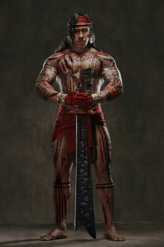
Maybe the main photo of the contest sets the bar really high.
Many people naively think that their votes will have any weight in the selection of winners. In any caso, also in the profile are some ridiculous votes. For example, I posted a long exposure photo of a sunrise with the lights of a car passing by (I waited for a car to pass, I even merged two photos to have the complete trace). It was voted as a snapshot. WTF! You just dont have to give much credits to votes than they deserve.
I totally agree! I hope these "photographers" that are giving 1 or 2 stars are making more money than me, and I am only part time as a photographer! Art is subjective, and if the person who did the photograph loves it, that is all that counts! I haven't seen a photograph here that deserves less than 3 or 4 stars! The photographer did the work whatever that was, hard or easy took the time to make the photo.
If you look at the submissions, It doesn't surprise me that so many people don't have great taste
I think context does play a huge role in how a photo is perceived. Most of the photos here are leaps and bounds better than just a snapshot. Photos in these contests aren't scoring as high as they do on peoples profiles.
There seems to be little productive criticism. If you dislike an image, explain how it could be better instead of just leaving a 1 star. Isn't the purpose of this site to have those kinds of discussions. Too many people are acting cynical. Help each other out.
It is true that the images in these competitions are not well-assessed. For example, one of my pictures, which was published by National Geographic, got 1.25 stars here.
Many photographers consider themselves to be at the top of their game and do not wish to give good grades to others.
I've found many absolutely amazing portraits here, and so far, I've given four or five stars to 22 portraits.
Fstoppers is true to its style, so I don't think I can get far this time with my portraits. I will continue to be true to my style. Autism makes me see the world from a different point of view ;-)
Exactly right. People this community does not understand the rating system at all, or they are just rating with malintent.
BTW, how do you see the image ratings? I can see it for mine, but not others. Thanks.
Excited to be here! First competition I’ve ever entered!
I'm only here because some other photographers told me to upload some photos to get critiqued by other a-holes than me lol. These contests mean nothing because a lot of photographers attend workshops & couldn't light their own photos, even if their life depended on it. I said what I said.
How about just be grateful for FREE contest where you get immediate straightforward feedback, and don't have to do anything to keep it going.
I havent gotten any feedback other than low star ratings lol
How can you all be so super critical of other pictures? I mean, yes: if a picture is bad, let's call it so. But maybe if it is better than yours, you should not be so harsh?
I honestly expected especially the seasoned photographers to be more encouraging and less grinchy, so COME ON dear colleagues!
Most of the people in this community do not understand the concepts Fstoppers gives on each star level :)
A good portrait for the subject themselves is one they deem worthy of using as a profile picture. For others, a good portrait is a photo that tells the entire story in detail without ever having met the person.
The portrait used in the banner of the contest is a 5. It sets the bar REALLY high.
and if it was submitted into contest it will get max 3 rating at best :D
Exactly HAHAHA
I accidentally uploaded a wrong photo. How can I delete it??
On the image you want to delete, there should be three dots "..." to the right of your name. If you click it, there should be a delete option. I think.
About fairness of scoring, shortly, I think it's still ok as it is. Well, here is how I see it, just IMO and my understanding on why it is like it is, my intention is to understand the reasons behind the scoring and why they are like they are, and this is not by any means a truth, just my own reasoning and trying to understand. Surely it looks like few pictures are receiving a score under 2 altough I think they should be rated as a 2 because the photographer clearly have given some thought and effort to make it look more than a snapshot, like used flash, edited the photo, tried to compose somehow according to best practices, so by definition of scoring they should be given 2, not 1. But then, there still are some surprisingly many true 1's.
However, said that, I still think most of the photos don't really quite reach a level of 3, or some even 2 for various reasons, and below are some reasons IMHO.
First off, the ability of a photograph to evoke or communicate emotions to the viewer. Maybe the pose or the intensity of the gaze of the subjects aren't really making it to a 3. Most (yes, most) otherwise technically correctly and cleanly execued images have no story to tell, they are just shots with lights as so many others and these are hard to differentiate, the suject is usually having a dull everyday expressionless empty gaze in their eyes (if the eyes even show properly up) and many times they also just look to some random direction shomewhere in to the mid air, or far too far to either direction, up or down, with too much white in the eyes, what is the meaning of a look like that? It's a cliché, stop it! I would at least prefer a strong gaze directly to the lense or just slightly off, or then at something meaningful or something that the viewer can udertand and realize. For portraits, also the eyes should actually be clearly visible (IMO) or then you need a strong reason why not, the feeling needs to translate over to the viewer. In my opinion, just a random look in random direction in an otherwise technically well produced image might make it into a new starters portfolio, but certainly not into a seasoned or a professional photographers portfolio. In such a competitive and subjective genre than portrait photography, making a small mistake like not being able to get an compelling expression that translates the emotions to the viewer will put it competing with millions and millions of similar average pictures, thus making it a good 2 at most. In my opinion this is still art, not an technical excercise.
Secondly, location, composition and/or background doesn't make sense. So many of the shots are made in random locations without a context or a story of any kind, for example, why shoot a in a park or a forest with the subject having some random fancily themed maybe a ceremonial dress that has completely different environment from the theme of the actual surroundings? Why is the subject there looking like that? For me this is an instant 2 (or 2.5 if well shot) because of the lack of purpose, context or story, no matter how well it is otherwise executed (usually). IMO, again, It's art, not a techical excercise.
Thirdly, photographic execution. In many pictures, the image has distractions in the background, or the subject just is incorrectly lit, eyes or face too dark or small so that it cant be seen maybe at all. Sometimes you maybe just tried too much and it is seen as going a bit overboard. An distracting, random or too busy background is probably the most common reason for receiving a rating of 1. That makes it a snapshot right off the bat.
Fourth, the post processing is bad or missing. It's a basic thing to remove some light patches and distractions from the background, clean up the scene or subject, if you can't do this, didn't notice it or it otherwise slipped through your radar, it means that your picture (and maybe skills) is not up to the standards for a professional photographers portfolio, which by definition then makes it a 2.
And then, mixed scoring. The reason you might get a rating 2 for your image in this contest but a 3 - 4 rating in your portfolio is because normally, in your portfolio, your fellow photographers generally want to be nice and encouraging towards you and they wan't to support you and your growth as a photographer. So, the rule of thumb is that people want to be nice toward each other and don't really give hones feedback, not necessarily even when asked to do so (unless guaranteed anonymous). But then, when you attend to a contest like this, it is a whole different world and you will be judged completely by different standards, as it should be. But fear not, this is the real thing where you get the real harsh and honest feedback that you actually really need in order to grow as a photographer, and based on that, hone your skills up to the next level for the next contest.
Last but not least,
I really think that most pictures that score under 3 have one or more of the aforementioned issues with them. Just remember that this is a contest, there are millions and millions of portrait shots circulating around out there, and everybody has seen tons of them, probably mostly the exceptional ones that make it to the top, so, those that go to a professional photographers portfolio, not only need to be flawlessly executed, which is self-evident, but they actually would need to stand out some how!