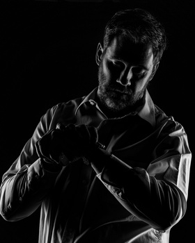


Model head shot for graduating class of clergy. canon r6m2. rf 100-400 lens, 135 mm focal length, 1/6.3 1/60s iso 320. Used 3 two flashes, one in 36" softbox to camera right, ungridded, one behind pointing at backdrop, and then a fill card on camera left. Basically no ambient light, and straight out of camera, just cropped to be square. Clothespin was used to gather collar in back of neck for a nice fit.
Click on the thumbnails below to comment and rate each image.
Click here to learn about the Fstoppers rating system and what each star value means.
3 Comments
If you don't believe this is a bread- and-butter image that could be in a portfolio and make money, please comment on one aspect of it.
I could actually comment on a lot of aspects of it.
For one, the lighting is pretty flat and boring. Even though you have some shadow on the right side of his face, it doesn't provide enough contrast to make it add depth to the photo.
As far as the composition goes, it's very boring. It reminds me of a passport or a DMV photo. The subject is positioned straight on towards the camera and his shoulders fill up the bottom of the frame. This makes his head look abnormally small compared to the rest of his body.
The colors are flat as well. The shirt should be black, but it looks faded. The white balance doesn't help either, because it gives him an ashy look.
Probably the worst aspect of the image is the mood/expression. The smile looks forced and tense, and the direct eye contact makes him look creepy and weird. It's a very unflattering image, and one I would want ensure never saw the light of day. If I was looking to hire a photographer for my portrait, there's no way I would choose someone who thought this was worthy of making into their portfolio.
You only get one chance to make a first impression. Trust me, THIS is not the impression you want to make.
Good afternoon Ed, I can't say I see the image the same way as you, but I 100% appreciate your detailed analysis of the components to back up your conclusion! Please feel welcome and encouraged to hunt up any of my submissions and similarly break them down. Best, Greg