
If you haven't seen the latest episode of Critique the Community, make sure to check out the new surprise we've added to the series. As an immediate follow up, we're inviting the community to submit their landscape images now for our next round of critique. Make sure to follow the submission rules below to keep your image eligible to be chosen. Submissions will remain open until this Wednesday, January 17, at midnight.
To submit your landscape images, you must:
- Have an active Fstoppers account.
- Upload your image to your Fstoppers profile page.
- Paste the URL of the image in the comments below.
The Internet can be a cruel and cutthroat place for photographers. For some reason, photographers are often extremely negative and cynical when looking at the work of their peers. Most photographers overwhelmingly say that they would like others to "C&C" their work, yet the conversation can often become less than inspiring and often downright depressing. Our hope with this segment, Critique the Community, is that the Fstoppers team can offer fair, yet encouraging commentary on some of the images found in the Fstoppers Community.
The Fstoppers Community Rating System
If you have an Fstoppers account, you are able to create your own profile and portfolio directly within the Fstoppers Community. Once you have a portfolio uploaded, you can browse images in the community and rate the photos of your peers. Even though art is usually a fairly subjective matter, we wanted to create a rating system that was as objective and unbiased as possible. This way, if one of your images has been rated 50 times and has received an average rating of two stars, you could feel confident that maybe that particular image is not up to par. Below is a simple chart explaining the Fstoppers Community Rating System.
One Star: The Snapshot
One-star ratings are limited to snapshots only. Snapshots are usually taken to document a time or location, but little to no thought has gone into the creation of the image. If an image has been "lit" with external light (besides a direct on-camera flash), it is at least a two-star picture. The majority of one-star images have had no post production work done to them, but do often have an "Instagram style" filter added to them. The average person these days snaps one-star images every single day with their smartphone. Most one-star images that pop up on sites like ours are images of flowers, pets, landscapes, sunsets, objects around a house, etc. If you read Fstoppers, you should not be sharing one-star images for any reason.
Two Stars: Needs Work
All images, besides maybe five-star images, always have room for improvement, but two-star images "need work" before they should be included in your portfolio. As photographers, we are snapping thousands of images per year, but only a few of those images should ever be shared or put into our portfolio. A photographer who has taken a two-star image has put some thought into the composition, exposure, and post production, but for some reason has missed the mark. Two-star images should not be in the portfolio of a full-time professional photographer and amateur photographers should strive for something better. Even complete amateurs who don't understand photography at all are capable of taking two-star images from time to time.
Three Stars: Solid
A three-star image is an all-around good image. The photographer has a solid understanding of the basics: composition, color, focus, subject matter, and post production. A three-star image is good, but it's not great. Most part-time professional photographers have mostly three-star images in their portfolios. Usually, a level three image would have been rated four stars if it had been shot in a better location, or with a better model showing a better expression, or there had been better post-production. A photographer capable of taking a three-star image is capable of taking four and five-star images if they would simply pay more attention to the details.
Four Stars: Excellent
Four-star images are fantastic. In most cases, four-star images have a certain style to them that links them directly to their creator. Four-star images usually require planning and attention to extreme detail. It's almost impossible to shoot a four-star image by getting lucky. Four-star images have almost flawless conception, composition, lighting, subject matter, and post-production. If you have any four-star images in your portfolio, you should be very proud of yourself.
Five Stars: World-Class
Five-star images are flawless and unforgettable. The amount of time, energy, and talent that goes into the average five-star image is staggering. In many cases, these pictures require a team to produce, including a professional retoucher. The concept, lighting, subject, location, and post-production on these images has to be perfect. In some cases, the jump from four to five stars may be as simple as changing the unknown model in the picture with a celebrity or bringing in a set designer or stylist to make the image slightly better. Although there are always exceptions, most five-star images take days, if not weeks or months to produce.
Strengthening Your Own Portfolio
Even with our objective rating system, people are going to disagree over what they like, because ultimately, art is still a matter of opinion. However, I believe once an image has been rated over 25 times, it will have a rating that is pretty fair and honest (we hope to deter trolls by giving negative Karma Points when a vote is more than one star away from the community average). If one of the images in your own portfolio is rated lower than what you personally feel it should be rated, I'd urge you to try to look at the image from an unbiased angle. Step back, erase your memory of the photoshoot itself, and try to imagine an art buyer, stock agency, potential client, or local gallery as they decided if they wanted to invest in your services. Would your image make the cut?
Lee and I are not the greatest photographers in the world. There are many many genres of photography that we have not been successful in or in many cases, have not even attempted in our careers. However, I believe we have a pretty good idea of what works and what doesn't in terms of commercial viability. Not every image is meant to sell or book you work and that is okay! Snapshots and sentimental images are great and most definitely have a purpose. Hopefully, our insight and critiques can help you decide what is and isn't worth putting in your public portfolio. I hope these video critiques can help you see beyond the technical and personal elements that make up an image and begin looking at your own work in a new light.


Join the Fstoppers community for free
-
Post comments and join in the discussions
-
Browse the site ad-free
-
Share your work and get featured in the community
-
Compete in the photo contests for fun and prizes
593 Comments
Hot water geyser @Geysir - Iceland
https://fstoppers.com/photo/157441
3 star going into 4 star? If I wanted a print of this, I think I'd want more of a 16:9 or something similar for the aspect ratio. Get more of the ground around the spring.
https://fstoppers.com/photo/177781
Nice shot!
I want to move the composition slightly to the left to give the tree just a little more space to mimic the space between the tree and biker.
Sadly to the left there is more "stuff" which would have the picture look messy.
Depending on what it is, it might make for a good exercise to Photoshop it out.
I am giving this one 4 stars. Love the composition. At first glance, the cyclist seemed to be on the trajectory of going up the tree. This gives the overall image a dreamlike and surreal feeling. Great shot!
I would like to see a little room on the left and a tiny little bit more on the bottom. I like the photo. It's something different. Of course just my opinion and would appreciate any feedback on my photos in my account.
Oh yes, can't wait for Lee to talk trash about it.
https://fstoppers.com/photo/209277
I like it but I think there is too much contrast in the sky... Its a long exposure and there is movement so it shouldnt be that contrasty.
Nice but would have been better to have less space. A Wide angle and very close to the stones ... ?
Actually, photo turned out to be exactly as I planned. I wanted wider crop. Those rocks been there long time and will remain. In the middle of nowhere. That kinda "middle of nowhere" is what I was going for. We all know what that is. Zoom in closer and the magic of Stonehenge turns into bunch of rocks. Maybe next time.
That makes sense ;)
Always hard to make decision.
Great image! Composition is simple and there are no distracting elements. Clear differentiation between the foreground, Stonehenge, and sky. Love the contrast and the dramatic feel to the image. It may be too warm for my tastes, but that's a personal opinion. Overall great shot! Keep up the good work:)
This is fantastic!
Well, it seems he heard (read?) you
Yeah, I guess I have 2 wishes left now lol.
https://fstoppers.com/photo/212749
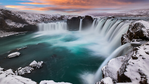
I like the shot however it feels a bit over processed for me. Almost too sharp where the water and rocks seem to be jumping out. Still though I like the shot, especially on a cold winter day here in New England. Of course just my opinion and would appreciate any feedback on my photos in my account.
https://fstoppers.com/photo/212746
While driving in Snæfellsnes peninsula (Iceland), I noticed this lost crater standing still facing the storm while everything was washed away by the rain and the winds.
https://fstoppers.com/photo/211107
I like the photo. Perfect photo for a B&W and the framing is also spot on. The road or path leading towards the hill walks one right into the photo. Of course just my opinion and would appreciate any feedback on my photos in my account.
Awesome
https://fstoppers.com/photo/212756
Looks like a stormy afternoon in FL. The only thing that I don't care for is the shoreline. The sky is the interesting part with the calmest of the water supporting the activity in the sky. When look at the shore there is just nothing there of interest. Perhaps shooting from a lower point of view would move the horizon down to the lower 3rd and provide more sky. Of course just my opinion and would appreciate any feedback on my photos in my account.
Thanks so much Douglas, that feedback is excellent and the low angle idea is definitely something I will aim for next time! Very much appreciated. 👊
Earthquake Sunset, Montana
https://fstoppers.com/photo/212751
No Longer Used
Old loading chute
https://fstoppers.com/photo/212752
Wolf Creek
https://fstoppers.com/photo/212754
I feel that this needs a landscape instead of portrait orientation. Get more of the horizon in the shot.
Yea, that was a kinda pesky shot, a freeway with signs and guardrails was on the right, railroad sign on the left.. I may make another trip out there and see if I can better it with landscape!
Thanks for looking and commenting!
What I think would improve the photo would be shooting it earlier or later in the day. The lighting is too flat. Of course this isn't always possible. Also perhaps a little to the right so that the stream flows through the photo. Of course just my opinion and would appreciate any feedback on my photos in my account.
Marshall Beach at Sunset
https://fstoppers.com/photo/212750
It's nice! Maybe a little oversaturated on the blues in the foreground?
Thank you Cole. :-) Perhaps a little heavy
The picture is awesome but the fact that it's not straight bothers me. It's leaning to the right
Thank you Andrea :-) I didn't notice this detail.
nice but to much blue
Thank you :-)
https://fstoppers.com/photo/212744
I'd like to see how bringing out the oranges and yellow more while subduing the greens would look.
Just a tad under exposed I think. Like the composition and the long shutter blur is spot on. Perhaps just a little flash into the rocks on the left or into the trees on the right would help a little. Of course just my opinion and would appreciate any feedback on my photos in my account.
Tight.
https://fstoppers.com/photo/212757
On the road to Sieben
Unused railroad between Helena and Great Falls, MT. Mile stone marker for Sieben Ranch
https://fstoppers.com/photo/212753
I like this shot. The rails leading you through the picture, perhaps a little more detail in the mountain as it seems a touch flat, but that could just be my colour pallet taste. Awesome shot.
I was fighting the sun, camera left and in front... kept whacking the lens with flare. :-)
Lovely shot all the same Steve. :-)
https://fstoppers.com/photo/212771
vignette is a little much and distracting from the subject here.