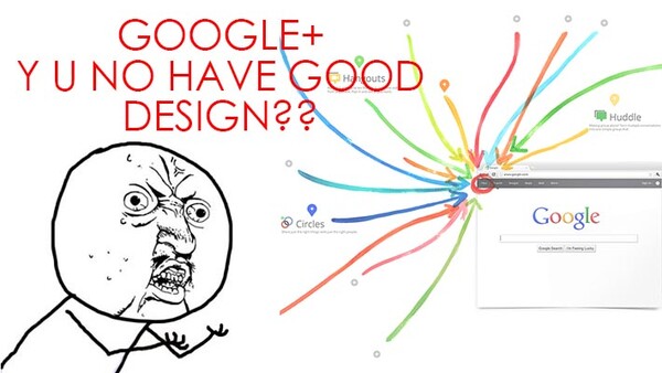
Okay, the post title is a little bit harsh, but hear me out. It will never be the social network it wants to be unless it redesigns the user interface. I love Google products maybe twice as much as the next guy and I have tried very hard, over and over again, to force myself to use Google+ and to like it, but it's just not happening. Since I'm all about user experience, Google+ design doesn't really do it for me. Even though many have said that Google+ has become a photographer's playground, I'd like beg to differ.
Take, for example, a few pictures that were posted by time-lapse photographer Joe Capra (some of you might know him as "Scientifantastic"). Open the link, and then click on an image. Now let's see how long it takes for you to +1 the picture.
It took me nearly 4-5 seconds, and I really had to hunt down the +1 button so I could press it. Now in the grand scheme of things 4-5 seconds is nothing, but when you put that into the world of the internet it is an eternity. The button is placed in such an awkward position where no one's eyes have been trained to go, and it's pretty much a no-mouse land. It's counter intuitive.

While I very much appreciate the dark background, which makes the image "pop," I really don't feel like interacting with the Google+ ecosystem. Why? Because my mouse never goes into the footer. I suspect that yours never goes there either. So while Google tries to make your photos look good, it provides no efficient way of interacting with your work or the work of others. When you look at it from that perspective, as a social network Google+ is not promoting the "social" aspect. In fact, it's downplaying it. Twitter and Facebook succeed because of the ease of interactivity. Google+ makes it hard.
So what you end up with is the ghost town that is Google+.
Assuming that you're not a hardcore Google+ user, I bet it took you a few seconds to get out of that "lightbox" mode too. You'll have to click way on top of the web page to get out of it. Again, as an Internet user, I'm very lazy so I really don't want to travel much with my mouse. Why can't they make it like Facebook (or any other really well thought out site honestly) where you get out simply by clicking anywhere outside of the picture and the comment section.
Now that we are on the subject, let's take a look at how Facebook designs their flow: you read the photo description, you have to option to like it right away, right underneath it. You can also drop a comment or reshare the post without too much mouse movement. You see? BAM BAM BAM, interaction domination. That is the key to success in social networking. None of us love Facebook anymore but it continues to be used because it works so well (though it's not helping itself by recently removing the ability to watch videos within Facebook- this is a bad decision on their part).

The same design philosophy can also be spotted out on 500px website as well. Within a few hundred pixels, you can achieve all three tasks easily. That's a very good way of encouraging users to interact, and encouraging interaction promotes social growth which promotes user activity. You can't have a successful social-based site unless you get the design right. This is something I can't believe Google doesn't get right.

While we're on the topic of designing and user experience, have you ever noticed why Twitter website looks somewhat pleasing to the eyes? It's because they follow the Golden Ratio rule...

...whereas Google, whose motto has always been about simplicity, is now trying to design for eye-candy. Google is a company that is operated by an army of top-notch engineers and I give them much props for making all the products that I use daily, but I think they really should focus on functionality rather than beauty. Unless, of course, they hire someone who knows a thing or two about user experience, as opposed to monkey coding.
So, tell me, how much/often do you use Google+, and are you happy with their design? I love to hear your thoughts in the comments section below.


17 Comments
I have an account. Never use it. Never post on it. I have found it a ghost town. I would love an alternative to Facebook. As of right now Google+ is not it.
PeteSuttonFineArt.com
Pete Sutton Fine Art
Same here. I have an account, but it's unused, as everybody I know are on Facebook.
As long as G+ is nothing but Facebook with a different design, it will never become significant. G+ needs to provide something unique in order for people to become interested in using it.
I agree with your comments about the location of the +1 button. However, It seems that is the only point and way you are wanting to interact with the Google+ community. For me personally, I do love it and find much better engagement on there with people. The dialogue is more frequent than on Facebook, and Twitter has it's uses, but of course it's for very short form blurbs. Simply +1ing pictures isn't very engaging. I'll be the first to admit though, that I don't use Facebook and such the same way I use Google+. I go to Google+ to interact with people, and primarily use Facebook for items, links, etc.. that I just feel like sharing and don't put much effort into engagement there.
As far as exiting the lightbox view, I completely agree there. They really do need to allow clicking outside the picture to close it. Hitting the ESC key works, but sometimes when you're browsing, as you said, we want to be lazy, and mouse travel, extra button presses do get annoying after a while. Google can certainly improve upon their design in every aspect that you mentioned. What I mainly disagree with is the way it appears (yes I am assuming here) you're wanting to use it. It won't be nearly as great if the +1ing is the primary feature you're after. Conversation and better engagement, and the layout are much better for that type of use.
Maybe I follow the wrong crowd, but man I have zero interaction on Google+. It's really a ghost town for me. Also, what's up with the tiny ass usable area even when your screen is big? I feel VERY confined when scrolling down on Google+.
It definitely is a ghost town until you start to circle people who post good content that you're into. I'd say it has a bit of a startup time to get things going to a point where you'll like it and see the engagement, but that also requires engaging on other people's stuff. For a while, I'd post some things, and get a couple comments of the very short variety, but once stepping up my own engagement, things really took off.
As far as the usable area, at least for me on my 24" monitor, it isn't any smaller than Facebooks or Twitters, it's just aligned on the left leaving a huge gap on the right. Facebook's actual content area is about the same width, only centered so the open space is on both sides instead of just one side. Same for Twitter. I don't like the left aligned (justified may be a better term?) and would much rather it be centered.
They can't have code monkeys designing the site man. They need a real UX guru.
Screw the design flaws. When the active user base is small compared to other SNS (Facebook, Twitter, etc.), confusing people that can't where the +1 button is are the least of Google's concerns. Obviously a sometimes awkward/confusing layout doesn't help either. But Google+ underachieving as a whole is a much bigger problem for Page/Brin. I've had a Google+ page set-up since day 1 and it really sucks that there aren't more people using it. I know, the President and the First Lady had "hangouts" on Google+ and really that's pretty much it. I would really love to see a better Google+ that can compete with Facebook. But now all I can hope is that it doesn't become the next Google Wave.
/rant over
Oh man... I was one of the first to be invited to Google Wave... then they killed it even before launch.
i dont see the issue. if you use google plus then you only waist 4-5 seconds finding the +1 the first time you look for it. after that you always know where it is... same thing with anything you use. there is a learning curve to find the things you want to do and the learning how to interact with people.
Sure, you can learn but you can't possibly believe it's a well thought out and designed with an actual use in mind. I can learn how to use anything, but that doesn't make it an enjoyable or fulfilling experience. The only way for Google+ to grow is to make it enjoyable.
You consider facebook an enjoyable, fulfilling experience? I half think you're just trolling Yamaha here lol...
WHAT!!! Wait.... Google has a +1 button... ohhhh that's where it is.... DUH... now I see it...
I don't find the ui or the ux for that matter, that terrible. It has its quirks but then again what ui/ux is perfect? A lot of it is subjective anyway. I find Facebook to be far more confusing, convoluted and all over the place than G+. The reason people keep using Facebook is simply because most people they know use it too and to give it it's due it is not too bad once you get past the learning curve. (Security/privacy issues aside)
Of course G+'s main competitor is not really Facebook as most people that I know use G+ to interact with people they don't know in real life, kinda like Twitter. So from that point of view you might be right that it will never be the social network it wants, ie Facebook, but it sure is more engaging than Twitter and maybe even surpass it one day now that Twitter are being a-holes about 3rd party apps and so on.
Any social network lives or dies by its user base.
I would love to dump facebook for many reasons, but unfortunately it's the one that most of my friends are on.
I never use it, but i love the mobile application for g+, its really good and efficient, unlike that horrible facebook abomination.
The use of the rage face here was particularly cringe-worthy.
I have been trying to use Google+ for my business and I just can't seem to get the hang of it. It just seems so cluttered and complicated to me. I can't seem to get people to connect with me on it either..and I have a lot of business connections on FB. Yet I'm told I MUST be on Google+ if I own a business.