
Today we are asking our readers to vote which of these two photos is the better image. I'm not going to tell you anything about these two images, but I'm excited to reveal the twist in a few days after everyone votes on the more appealing image.
I thought it would be fun to pit two completely different images against each other and see which one you thought was the better shot. Of course there is a twist to this experiment that I'll reveal in a few days. You can see the two images below.
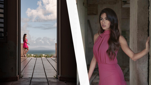
Image 1
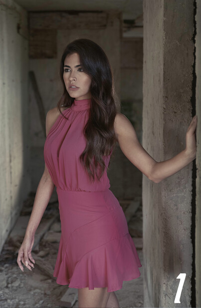
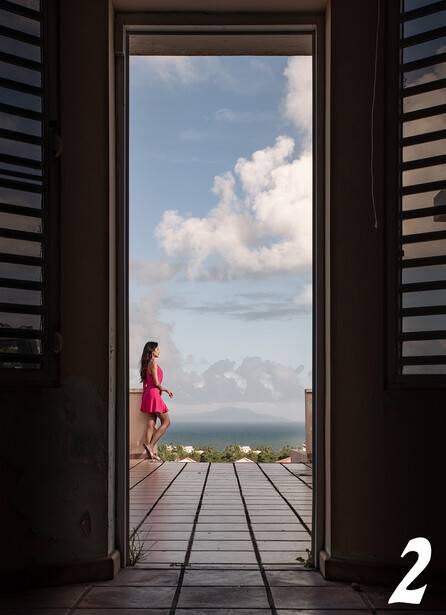
Image 2
If you believe you know what makes these two photos unique, please leave your thoughts in the comments below.
Related Articles


Join the Fstoppers community for free
-
Post comments and join in the discussions
-
Browse the site ad-free
-
Share your work and get featured in the community
-
Compete in the photo contests for fun and prizes
89 Comments
#2. However, neither are anything to get excited about.
#1. The background is quite distracting. Too many things draw attention away from the lovely lady. Needs better blur or someone to take the time to rid the background of some of the 'stuff'. I'm not a big fan of a vignette, but it might help here. Use the Radial Filter if you're using LR.
#2. The outside is nice, but could use some work on the sky. Some heavy cropping would help; get rid of a substantial amount of the sky. Crop out the slats and the string hanging in the right part of the frame. Clone out the weeds in the doorway.
Nice critique / observations!
Personally, I like the weeds in the bottom of the doorway in image #1. They soften up what would be hard, stark corners. They help to create a space that looks more comfortable, and less sterile. I would probably photoshop weeds/vegetation into this area, if they were not there originally.
See, as an architectural photographer I tend to often go to straight lines and compositions that deliver that leading lines effect. SO i voted for #2 but #1 is beautiful too but I had to pick one right? cause they are both better in my eyes. or equal.
2 looks kind of fake, more of a pushed about in processing thing than a camera thing
They both have a took on a phone feel about them.
The one taken on a phone!
Both seem to be. No. 1 is an iPhone 12 Pro image, No.2 a Samsung Galaxy S20 FE image, according to the metadata.
samsungs do have more saturation in them...that might be the issues...That Samsung makes a good images just as Iphone..
They both Use SONY sensors anyway..
For me photography is light and composition the second photo has both of them, the first... not so much!
Hold on, they are in different order in the article header and different in the voting section. I voted for the wrong one, won't be able to sleep tonight... Ah, I can change my vote. Ok, world balance has been restored.
I ordered them in the featured image so the model looked inward towards each other.
I like #2
Dynamic range looks somehow “distracting” in both, in different ways
voted for 1, at least a "kind of" standard 3/4 / head/shoulder portrait, still trying to find a story in pic.2 as the women is too small and if you remove her, there is noting much left to talk about (I don't care about dynamic range or technical stuff...)
If you want a portrait then #1 would be the pick but I find #2 more interesting., quite possibly because I seldom do portraits.
Indeed, I had the opposite experience. I shoot a lot of portraits and I looked at #2 and couldn't figure out what the subject of the image was supposed to be.
I am intrigued to know what you will have to say. In any case, I view these photos from two points, technical execution and artistic meaning of each photo. I voted for the second. The first one is just a young woman standing in the abandoned building. Not much going on. The second, may lead to some thinking, at least for me, of why she is looking out at the horizon or smth we don't see.
Composition aside…Image #1 has no highlights! The light is very flat.
Image #2 is better because both the leading lines and the contrasty light lead my eye to the subject.
EDIT: In fact it appears to be the same dress in both images but looks very different in #2 because of the light.
#1 I see this motif all the time, #2 has style and wonder. I like the low perceptive.
Image one the eyes are not in focus/sharp if you are going to do a fashion shot, I believe the eyes need to be pin sharp
What kind of BS is this! You have an agenda here which you're keeping hidden...for a few days I see. Looking at the comments it's obvious that they are subjective. When you ask which one is more appealing to you, I know which one I will choose, but not at all for any attributes you may think. So, with that in mind, how would MY choice play in to what you have in mind? And don't think you 'know' which one I would choose. You really have no idea. Anyway, I can wait for your final word on this.
So is this what this site is going to become? Trying to convince people how great phone shots are? I guess on the plus side you're giving me time back to do other things.
NO, STOP. I don't care who used their damn phone with heavy editing displayed small on a website. You guys are getting cabin fever there.
Long time reader first time poster :)
What makes these two photos unique is.....
........ both images are created by AI from assets or complety synthesized from a description the AI was provided with.
Quick glance theres nothing odd, after a little consideration..
Image 1 : the lights all off, where are the light sources coming from. Whats with the light cast on the subjects bottom. Where are the shadows falling onto the surroundings. Left hand looks weird like playdough.
Odd lump slash double elbow on left hand side. Why is there a solitary patch of hair light on the her left hand side and top of shoulder. Wisp of hair on right shoulder weirdly cut out also whats the white dot near it. Theres more look for them.
Image 2 : its more convincing... but Light sources again....subjects geting hit with hard light top to toe, yet theres non falling on the ground in front of her. Wheres the front of her left foot either thats the line of a roof top or her foots melted over the edge of the step. Is the subject standing in thin air.
Door scale is odd, too narrow and elongated. The perspective is off. The buildings in the background are colnes of each other and too semetrical. The tile line scale is off for the distance to the subject, they should be way way smaller at the suggested step shes standing alongside, whys the sea not more contrasty if the buildings are bright white?
You're on to something here. Maybe both phones (check metadata or my comment above) offer this kind of pseudo-photography. Not interested in either case if that's so.
I voted for 2. The composition in 1 is simpler and stronger but the vacant stare of the model is distracting and adds nothing. I wouldn't want this on my wall. 2 is less problematical in that respect and the balancing of the exposure from an interior to exterior is impressive. Given all of that, however, it's nothing to write home about. Maybe it would have been better in black and white.
That stare is saying-
WTF is he having me pose in open toed sandals in this filthy condemned dump? i sure hope I don't get tetanus!
The twist: #1 is straight from the camera, #2 is post-processed. I like #1 more.
both are taken with cellphones
2 but it's because the composition is much more interesting then 1
The article seems to ask two questions: (1) "Which is better"; then, farther down, (2) "What makes these two photos unique." But for the question "Which is better", neither of these pics would be worth a second look. Both are hopelessly boring. No. 1, the "portrait", just simply doesn't engage the viewer, model is just standing in a dull pose, the eyes don't engage, colors are flat, background is too intrusive, vertical lines disrupt rather than add. To say the composition lacks dynamic would be a kindness. No. 2, the "through the window landscape" has flat colors, posing that doesn't add anything to the composition (letting that left hand stick out like a claw screams amateur, it would be better if that hand were shading her eyes so it looked like she was observing something in the distance, but even that wouldn't fix the rest of that pic), and, to my taste, too much contrast in the darks muffles any detail of the doors that might aid in directing the eye instead of just looking like a bad vignette. As for what makes these images unique, that is much tougher because these look like any number of bad phone camera snapshots.
Not much more to say, you nailed it!
Both are boring images. What did the photographer trying to convey?
You did not asked wich image with the lady looked good! You asked which is better. My choice was image #2 because of the way the image was framed, the details in the image, the depth, the texture, and the image is easy on your eyes than image #1due to image #1 background.
Which is best depends to a large degree on the intent of the photo. If you wanted a nice picture of a girl, then #1 is fine. If you were a travel photographer, then #2 would be best.
I actually like 1 better, but there seems to be something amiss about the lighting. I'm not sure what. I notice it mostly around the edges of her hair on the right of the picture. Looks like there is a light from behind, but no noticeable source anywhere else back there.
No 2 looks more of the surrounding area with a person who happens to be in the area.
I'm going with Image #1
Edit: One is of her looking through the doorway at two, the same thing as herself standing at the end of the patio. The model visiting a home which is now abandoned.
The images look altered. It may be my phone, but it looks like the background was changed on image 1. The lighting in the background doesn't appear to match the model. Image 2 looks like it was under exposed then the lighting in the doorway brought up in edit. Again the lighting looks off. The composition of picture 2 looks better to me, with leading lines and framing.
I'm learning photography, so I have a way to go. To me it is hard to put a story to image 1. It appears the model is in the middle of a construction site, in the process of demotion, with a dress on, looking as if she just left a stairway and is about to approach someone out of frame. Just odd to me. At least with image 2 it looks as if the model is enjoying the beautiful scenery, and there are several stories you could build with this.
Edit: Reading through some of the other posts made me think about the effort that many photographers make to limit the amount of information in a photograph to tell the story or give focus to the subject. Being relatively new to photography, I have spent a good deal of money on lenses that can give separation. Taking another look at image 1, with this perspective, it makes me wonder why the photographer would have left the background in the image (which is distracting), and why they would have picked a background with those colors (to me they don't seem complimentary even if the background was blurred out). Image 2 kinda feels the same in reverse, although much more subtle as the foreground contributes to the scene. I've sometimes wondered why a photographer would need to travel anywhere unless photographing landscapes as most of the time surrounding information in the image is blurred away. Watching alot of videos to learn more about photography, I see people travel to exotic places to take pictures of people, only to erase evidence of the location. It really depends on what story the photographer wants to tell, and I see no right or wrong, but do have my own opinion about what is "better".
Is one of them secretly an Ansel Adams image, colorized by Adobe AI?
The interesting thing for me is neither composition would I have bothered commiting to film...
#2 has some compositional sophistication and is a little interesting (the sky's all messed up, though). #1, on the other hand, looks like some lame beginner shot from MM. In short, it's horrible.
The dress is actually blue! #PlotTwist
They are both meh. At first glance I figured the top one was more interesting because the bottom one has the forced framing but with weeds.
At second glance the question is which "looks" better. So we're talking quality of the photo, not composition or subject.
The first one has weird bokeh and looks flat. The second one looks flat as well and would have benefited from a lower f-stop to blur a bit of the foreground if possible.
I don't think either of them have any additional lighting used in them and this makes them look flat. I suspect these are smartphone shots.
Both images look like ai / comps. The lighting on both of the subjects look to be incongruous with thier environments.
I may be biased but i find portraits without a whole heck of alot going on boring (which is most portraits imo). There's not much intrigue to whats going on in picture 1. In our self obsessed culture a portrait always has something deceiving about whats happening, I always just see the inauthenticity in them. I dislike when people and photographers try to project an image of what they want people to see, the veil is always so thin with portraits.
But picture 2 gives you a lot more to think about. Its a whole scene. There is a story there, or one at least you could start to imagine. The framing is beautiful with the door and the woman facing the way she is adds the intrigue to the image. The sense of wonder is there and thats what i like most in a photo. Nice cloud formation as well!
The photos are taken at the same time of the same woman from different angles and distances.
No one! This option should be available in any case. Both pictures are somehow lifeless. The pose is boring at best. What about this website? Are we here to stroke an ego?
Image 2 is absolute torture for me. All I can do is stare at those WTF clouds and wonder why there are so many types and what is going on with this Rorschach test. Our brains are hardwired to look for patterns, and these are so distracting. Take it away!
I think #2 - ladylooking out over town...has a fake sky and background is FAKE.....
Her foot looks morphed in this shot.
Both phone images of course. But we’re they taken in somewhat lower light than it might at first appear?
Both images seems to be test shots, before adding artificial light to the scene. They lack any sign of refinement, both in-camera and post-production. Look at the grass growing in the door frame, and the dirty floor. Or, in the other image, look at the colors, they seem as if the picture was exported straight from RAW.