
Today we are asking our readers to vote which of these two photos is the better image. I'm not going to tell you anything about these two images, but I'm excited to reveal the twist in a few days after everyone votes on the more appealing image.
I thought it would be fun to pit two completely different images against each other and see which one you thought was the better shot. Of course there is a twist to this experiment that I'll reveal in a few days. You can see the two images below.
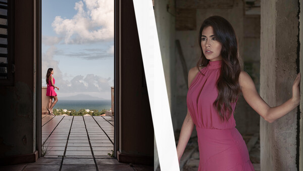
Image 1
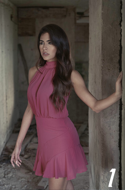
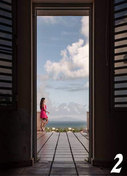
Image 2
If you believe you know what makes these two photos unique, please leave your thoughts in the comments below.
Related Articles


Join the Fstoppers community for free
-
Post comments and join in the discussions
-
Browse the site ad-free
-
Share your work and get featured in the community
-
Compete in the photo contests for fun and prizes
89 Comments
Without having any specific criteria for 'better' or having any information on what the photos are for, it's very hard to choose between the two. It's like being asked to choose between a frisbee and a coffee mug without knowing what you're going to be asked to do next.
Personally I like the first one. I really enjoy it's use of light.
Oh, what I meant to say was ANGER! OUTRAGE! WHAT IS YOUR AGENDA????!1
I don't think number 1 is a real person - I voted 2
One was taken by Ansel Adams?
Can’t vote. They’re too different to be compatible in which case both are fine. If these were going to be use in some kind of ad campaign then we could vote on which fit the layout, message, etc. but I don’t have that info.
Understandably most fall for the second one. Some wonder if it's a trap, understandably. On the second time around I wonder what tweaking for first one it would take to equalise with the second.
What if I said the first image already has been tweaked?
Just to clarify, by tweaking I mean clearing the background from elements preferably preshoot.
background substitution? (:
Was there a reveal for the last set?
It’s currently being edited
Photo 1 is straight up, you are looking at the subject. While photo 2, you get to thinking more, because of the framing, and you are looking through it.
If you are looking for something direct to the point, photo 1 is better. If you are looking for something not in your face too much, photo 2 is better.
I just like the depth of #2.
I chose #2 as i don't find the model especially photogenic, and she is not as present in the second photo.
But none of the photos excites me, they are both pretty boring cellphone photos. WB is off on the first, the second is overprocessed, the first has fake dof ... idk ..
I'm not quite sure on the story on photo 1... all dressed up to hang out in ruins? It's also a little flat for it to be "fashion", IMO. It would need more contrast to stand her out from the scene. The pose isn't super dynamic. Not sure what off camera has her attention. There isn't much connection.
Photo 2, I can see... possible vacation story. Hanging out in a hill top villa perhaps? She's in a similar "thoughtful pose" but you get an idea of what has captured her attention.
I chose #2 as a better shot. I think the secret is that both photos are at the same location using different angles.
The lack of dynamic range is what kills #1. However, if this is a portrait shot, then I guess #1 does a bit more justice to the model. Overall, I rather look at #2...more dramatic light/dark, good depth, and a little intrigue.
Image 1. Distracting background
Image 2. Badly edited photo.
Image 1. The Winner. Looks like a real photo
I like #1 "better", but not a big fan of either...
I do like both images.
Contrary to what many here are saying here in the comments, I think that the depth of field is perfect in the first image. Just shallow enough to enable the subject to stand out, while deep enough to let the viewer get a good feel for the space she is in.
The 2nd image is thoughtfully composed and provides a wonderful "sense of place". The photo is composed in such a way that when I view it, I think I know what it feels like to be there ..... and that is the objective of any such travel photo, is it not?
I find it odd that the question asks which image is better. "Better" is subjective, and therefore not really answerable in a factual, non-biased way.
If you had asked which image I prefer, or which image is more appealing to me, then I would have participated in your poll. But you didn't ask that, so I didn't participate.
With #1, the post processing with its really low contrast is a turn off for me. Picture 2 has a more interesting composition and has more contrast in its processing so I voted for picture 2.
№ 1 — is kind of blah. The contrast-range is narrow, whereas there are not little scintillating highlights nor subtle (and interesting) deep shadow features.
№ 2 — Needed a longer lens. Same door framing ( I like that part ), but with a longer lens the model could have been quite a bit larger. Supposing of course there is enough room in the building for the photographer to back up suitably!
Anyway… just a few old, old photographer's hacks.
PS: № 1 — could easily have been post-processed to widen the contrast range (which would brighten the colors a bit as a freebie); the suggestions of using a vignetting filter, or a 2 layer very slight background blurring is also a good idea. I do that so often that I don't even think about it anymore. The only thing difficult (in the old days) was creating the alpha mask for 'just the girl' and at the same time preserving the sharpness of her wisps of hair and other edge detail. Not so easily done, but when done, so nice.
GoatGuy
again comparing photos without any attractive or interest for us. The quality of both images are poor and also the mastery which the photographers show us are null. There are on Fstoppers hundreds of high-level men and women photographers...please contact with them to next "which ....better" post.
Thank you.
I think they want to proof a cellphone against cellphone snapshot point
I'm liking image #2 a little better only due to the distracting background on image #1. It's not an Ansel Adams is it ? LOL.
Define Better
Partly or fully recovered from illness, injury, or mental stress; less unwell.
Both shot with Tilt Shift lens? Pic #1 taken eye height and shifted down, Pic #2 taken about knee height and shifted up. Saw the exif data too-don't believe it.
#2 is beautifully composed with the converging lines of the paving leading your eyes to the clouds which the model also seems to be engaged with. The surrounding inside area creates a feeling of peering out to the seen while being unnoticed. Lovely and well thought out composition.
Hi. in my opinion, image 1 has equally good potential with few addition / correction.
all left/right from viewing side. (1) the camera angle could be a little changed to have the rear right column as right as possible. (2) on left one vertical element is needed to complete the frame. (3) background could be darkened in post (4) Model face could be highlighted in post (5) background disturbance could be blurred a bit more. Through aperture or in post (5) there is a hint of hair light at right. this could be more prominent adding more value to this story. (6) Right eye could have been clear of hair. so that sharp eyes, bright face will keep holding viewer attention.(7) some better expression by Left hand (8) skin tones below the skirt is distracting. Frame could be cropped just above skirt edge. (9) some play of dodge and burn contrasts to lead the vision to face. (10) Since the location is not that great a little bit of glow with vignette masking to the subject (11) Vignette at the last.
Cheers.
hehe
The recipe to complete overprocessing :)
Ha..Ha..
perhaps I took Patrick and Lee's joke a little too seriously.
I'm now very curious to find out what is special about these images.
Its two cellphones
Yes, but I don't think that can be it - there's supposed to be something 'unique' about these images. Smartphone photos aren't unique!
Why not?
Photography is not a science, its an art-form.
Thats like if you would say you can only draw with the most expensive pencil or the drawing is worthless.
You misunderstand me, I agree that smartphones are legitimate photography tools. I'm saying that if the payoff of this mysterious article turned out to be that they are smartphone photos it would be completely underwhelming, because there's plenty of good smartphone photography.
no the article will end up in a new article stating that x% of our users prefer that camera-phone over that other camera-phone, so that one has to be better according to our studies.
I agree, Chris.
I thought there was supposed to be something unique about these images. About the images themselves, not just something about the gear that was used to take them.
And there is hardly anything unique or surprising about a photo being taken with a cell phone. Cell phones are used to take millions of quality photographic images every single day. So that is something that is literally "everyday" ... a.k.a. the opposite of "unique".
While I am very interested in these images themselves, and intrigued by the compositions and subject matter, I really couldn't care less about what type of camera was used to take the images.