
When processing your precious photos in Lightroom, Photoshop, or any other photo processing software, you make sure the exposure is spot on, the colors are perfect, and the contrast is pleasing. For that reason you may have a calibrated monitor, and the optimum light situation in your room. But did you think about the background shade of your photo processing software?
If you want the best possible quality it is advisable to shoot in raw file format. That format will allow you to use of the full potential of the digital sensor. It makes the use photo processing software mandatory, but it also gives a lot of possibilities for fine tuning the looks of the photo. You can change color temperature and white balance, exposure compensation is possible up to a certain amount, highlights and shadows can be adjusted, and also a lot of other things. This is well known for all photographers that shoot raw.
Processing the raw files can be very tricky. It is simple to adjust the exposure a bit, or change the color temperature. But it is difficult to end up with the perfect exposure and colors. First of all, you need to work a monitor that has a good quality, with a calibrated screen. Reflections on the screen from surrounding lights have to be avoided. Light from windows in the room or direct sunlight can influence what you see on your screen, no matter if it is calibrated or not. But a dark room with no windows or other light sources is also wrong. Light levels should be even, constant, and not reflected in your screen. If you have taken care of that, you probably forgot one very important thing that can influence your perception of the brightness of the photo you are working on. And this is the background shade of your software.
Every software has a canvas on which the photo is shown. Often it is a darker shade of gray to which the photo stands out in an pleasing manner. But this background will act as a reference when you are adjusting the brightness levels of your photo. When the wrong reference is chosen, it may misguide you. For the best post processing it is wise to match the background shade to the brightness of your image.
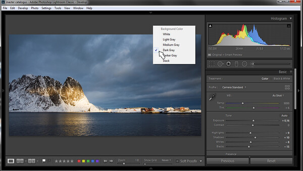
To show how much the background shade is influencing your perception of the image brightness, I have gathered a few examples from my latest photo tour at Lofoten, Norway.
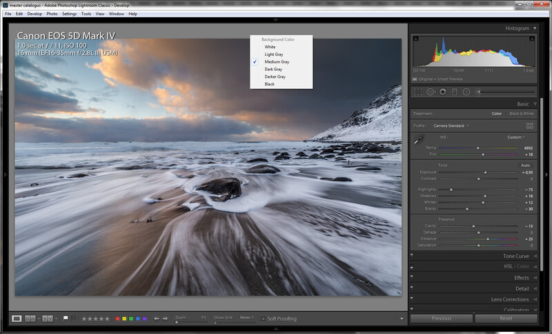
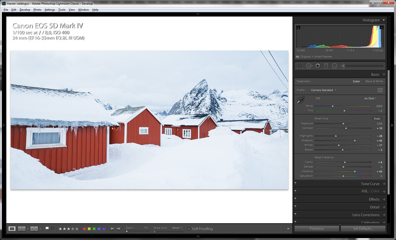
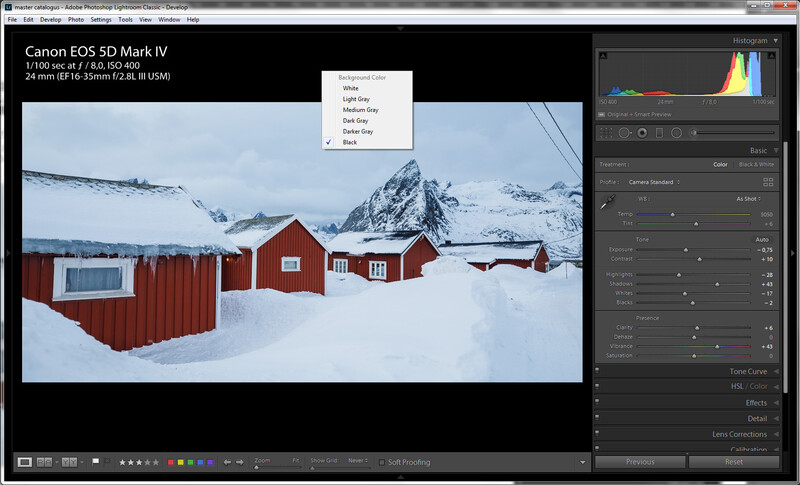
The first one is an image of a snow white landscape. When the background is dark gray or black, the whites in the photo stand out wonderful. But when you change the background into light gray or white, you will notice how the perception of the brightness will change. What seemed to be white turns out to be gray. There is no white to be found in the photo, although the histogram looks perfect.
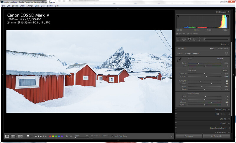
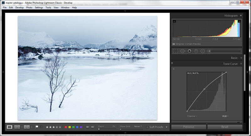
After I changed the background into white, I have a better reference for adjusting the brightness levels of this picture. With a small adjustment it is possible to optimize the photo and make the snow as white as it should be.The end result is shown in the picture below. Again you can see the effect of the background shade, on how the brightness is perceived.
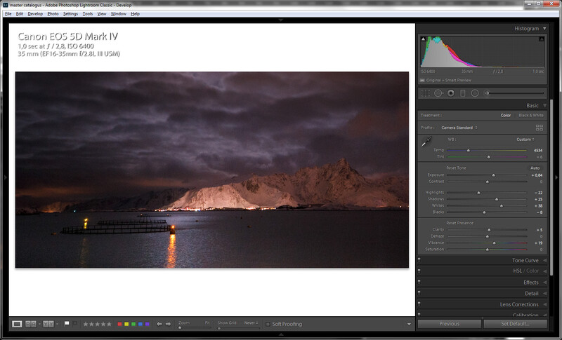
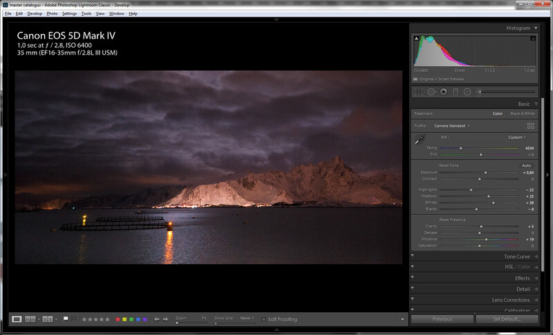
It not only works for bright images. In my second example I have taken a night photo. Against a light gray or white background it looks really dark. You may want to bump up the exposure setting or curves adjustment in your software to make it less dark. But when you change the background to dark gray or black, the perception of the image brightness changes. For dark photos it is best to change the background to a darker shade of gray, or even black. Otherwise you can end up with an image that is too bright.
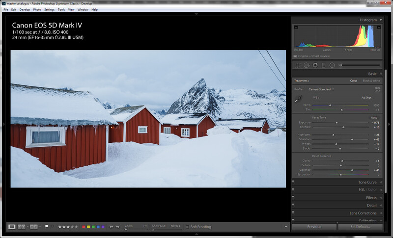
What about photos that are not that bright, or not that dark? I found an 18% gray background (sounds familiar, doesn’t it?) the best for regular photos, so my background is often set to this kind of gray. But if I am post processing images that have a significant amount of lighter shades, like images of snow or perhaps high key photos, I change the background to white. When I am processing images with lots of darker shades I change the background to black. I use this for night time and night sky images, or perhaps low key imaging.
For Photoshop and Lightroom, the software I use mostly, it is easy to change the background canvas. Just place the mouse cursor on the background, and click the right mouse button. You can chose the wanted color in the context menu.
One last thought about post processing photos and using brightness, black point, and white point. These setting can be used to optimize the histogram, but it does not necessarily give the best brightness of the photo. By using curves adjustments you can further optimize the brightness without affecting the black or white point. Just pull the curve a bit higher in the middle to brighten up the photo, or lower it to darken the image.
If you haven’t changed the background for your post processing yet, I advise you to try it and see how much difference it can make. Perhaps it also works for you.
Do you have a good tip for getting your post processing perfect, tips that are perhaps not that obvious? Please share them below in the comments.


Join the Fstoppers community for free
-
Post comments and join in the discussions
-
Browse the site ad-free
-
Share your work and get featured in the community
-
Compete in the photo contests for fun and prizes
5 Comments
Can I add to this, setting your background shade to the same colour of where the photo will be displayed is very useful.
Exporting for Instagram? set it to white
Does your portfolio site have a black background, set it to black..
Are you printing this and the walls in your house are hotpink?... you get it ;)
Another trick is if you know your photo is gonna be mostly viewed on a phone zoom out every so often to see how it looks when small.
Indeed... think of where the image will be displayed. Thanks for adding this
Wondering if there isn’t an “Adaptive Background” option in LR future given the push for more AI integration.
Couldn’t agree more! 'Why do my photos look dim/grey/dark?’ is a question asked by many who are actively assessing their results. The default ’dark mode’ may be an aesthetic decision, but it’s not good for the vast majority of photos that will appear against a white screen, mat, or book/calendar page.