What makes a strong composition? Let’s talk about how you can achieve striking landscape photos in which less is more. Here’s a practical set of tips for minimizing clutter.
1. Clean Up Your Foregrounds
When you’re really close to your foreground (and I mean close to minimum focus distance of your lens), the foreground becomes a prominent part of your wide-angle landscapes. So why not spend some time to clean up your foreground a little? When we’re this close, all those bright, dead blades of grass that point in every conceivable direction work as neon signs that read “Look here, now.”
Take for example a strong foreground, rich with colorful wildflowers. Pebbles, debris, and dead plants can and will distract from your flowers and sometimes even compete with the mountains in the background.

Take note of the brightest parts in your foreground. Especially those small specks of dead grass and unfortunately placed rocks. Then decide if they can physically be removed without harming the environment. If not, then the Clone tool in Photoshop is your friend.
2. Extend the Shutter Speed: Not Just for Water
Using neutral density filters and long exposures are familiar techniques to make clouds streak along the sky or make the surface of ripply water appear flat as a mirror. But in landscape photography, I rarely see a longer shutter speed used to convey motion due to stormy conditions.

If you’re looking to simplify your composition and there’s even the tiniest of movement in your foliage, you can greatly exaggerate the effect by choosing a much longer shutter speed.
Neutral density (ND) filters help to reduce light, so you can expose an image even longer. A polarizer helps to reduce light up to three stops too, but you can always wait until dusk to increase the shutter speed naturally.
More often than not, I see the use of a long exposure used as nothing more than a cool effect. But there is something deeper going on in relation to composition when we choose our shutter speed. In landscape photography, one of the most underappreciated aspects of composition is “kairos,” our ability to act on and to capture the right (but fleeting) moment.

The next time a gust of wind comes along, you can remind yourself to use that to your advantage. Using a long exposure to blur the movement of your foreground foliage can make your compositions simpler and stronger, while saying something about the spur of the moment.
3. Use Negative Space
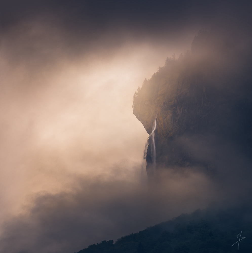
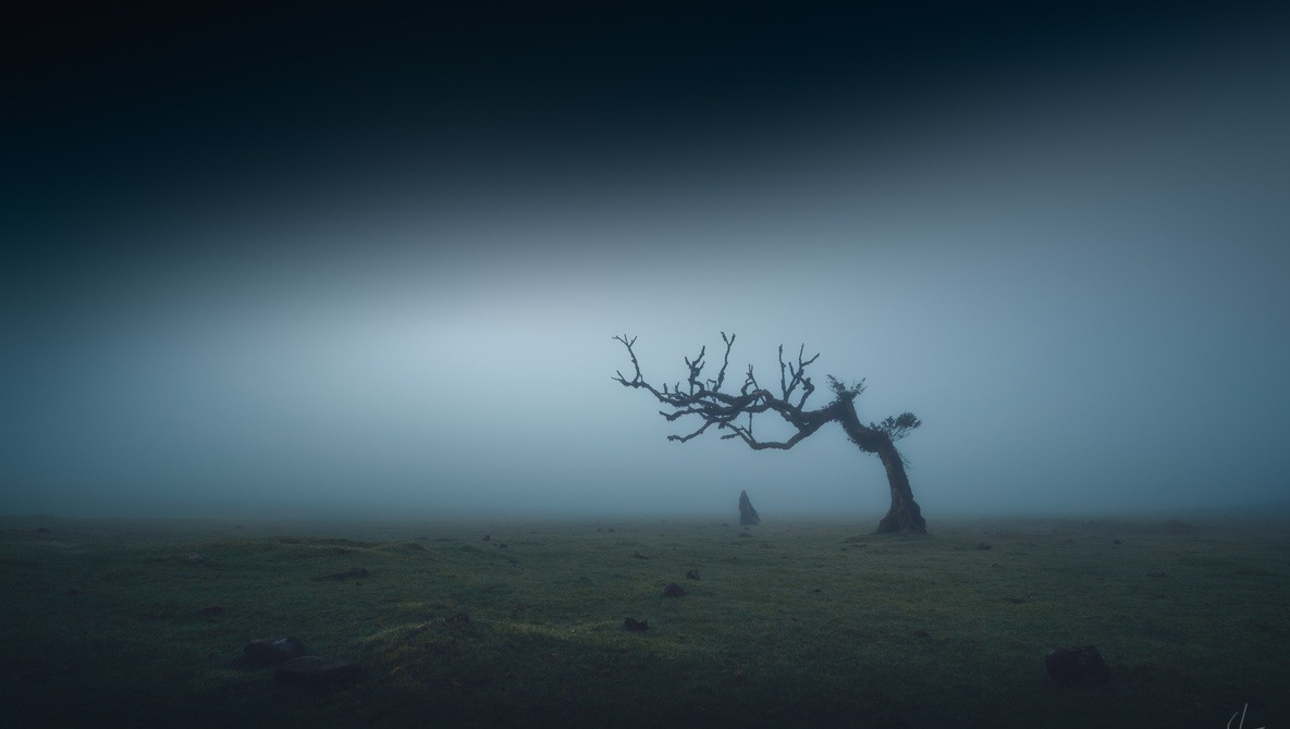
Where painters add stuff in, photographers take stuff out. If you intentionally leave an area of your image blank, then everything outside of that area will command twice the attention. Use this knowledge to simplify an image of a tree, a blue hour seascape, or an intimate shot of a beautiful mountain shrouded in mist.

Start by changing the position of the horizon. A low angle or high horizon will make a strong, dramatic, or even menacing impression, while placing the horizon below the center of the frame will make your landscape feel a lot more airy, lonely, or fresh.
A graduated filter can help to simplify the top part of the image, but I like to do this in post-processing. I just drag a graduated filter in from top to bottom in Lightroom or Camera Raw and work its settings. Be aware that darkening this image will also increase contrast and therefore saturation. If you want your sky to be simple, take out contrast and decrease the saturation.

Negative space is the wording we use to describe areas of an image that are empty. Negative space does not contain any detail or subject that adds to the composition. It can be both really dark or extremely bright, as long as this area doesn't ask for attention. A clear blue sky is an excellent example of an area that’s without detail. The more negative space there is in an image, the more your subject will stand out.
4. Centralize Your Composition
A central composition is the description we give to art that uses a central placement of the subject as a primary means of communication. It can feature negative space on either side or top and bottom of the subject, but it doesn't have to. This is just about subject placement.
Place your subject in the center of your image to instantly make it simpler. But aside from making them more simple but powerful, there is a caveat. Central compositions are easy to look at. That means that these images are often looked at for shorter amounts of time.

One trick that you can use is to combine a central composition with a strong, curvy line. The shape of a river, a crack in the soil, or even a wavy display of the northern lights can be used in unison to something simple in the middle of the frame. It’s why we love curves in art: we tend to look longer at images that contain strong but smooth curves.
5. Use a Telephoto Lens to Select
Remember that “less is more.” Using a lens with a longer focal length will force you to select a part of the bigger landscape. If you’re a beginner in landscape photography, it can be difficult to change to extreme lenses on either end of the focal range. This is because you need to learn what can be seen with a telephoto lens instead of the big picture you build up with your own eyes.

And truly, it takes time to learn how to use a lens effectively. But try this: when you’re out shooting, try to hold your eyes still for a moment. Look in one direction, preferably an area without sky and pay attention to just that area. Just sit still and stare. Stop looking for a composition and just observe. What patterns or shapes do you see over there? What colors speak to you? Is there any sort of repetition or aspect of the land that speaks to you? If you’re not seeing it, then just keep looking there for longer.
Another way of “teletraining” can be done at home. Browse through your old photos. Even the telephoto shots you already have. Then temporarily crop a couple of those images while asking yourself what the most significant piece of the photo is.

A telephoto lens is the perfect tool for training your composition skills. But as with everything in photography, any new technique takes some getting used to. Especially when you are experienced in this field and have been holding cameras outdoors for longer. As a beginner, you certainly have the edge here.
I hope you've picked up some new tricks for simpler and stronger compositions in landscape photography. Let me know if this article was useful to you, and I will consider writing more about helping you with composition in landscape photography. Thank you for reading.


Great post! Sound suggestions!!
Excellent, thank you.
Excellent suggestions.
I'd add:
"Try extreme perspectives and compositions" and
"Always do an alternate shot (different focal length or perspective)".
And a vertical / horizontal one. ;)
Thanks, Thomas.
I've given a lot of thought to slowing the shutter speed to exaggerate vegetation motion but rarely like the results. I need to experiment a lot more, I guess.
As with everything, it doesn't work everywhere. The extreme foregrounds can be quite good for this, but in the forest it just adds to the chaos instead of removing it.
Enjoyable and informative article!
Dude these are really nice photos! Why are you not on Instagram?
Is there some reason to be on Instagram? I don't do social media so I don't know but it seems to me, one is not dependent on the other.
It's the world we live in. I've wasted so much time on Instagram. I guess if that's your goal then have at it. I don't see the value in it anymore.
Nobody I know and nobody I shoot for is on Instagram. I know quite a few people who use facebook but most will only reluctantly admit it. ¯\_(ツ)_/¯
Thanks for your comment, Tam.
I'll tell you why, Tam Nguyen :
https://fstoppers.com/originals/social-deconstruction-why-photography-sh...
I'm still on 500px and on Facebook though - Although that might change in the future as well. Not sure yet.
Instagram needs to get proper native desktop upload support at the very least will I ever return to that platform.
This is a beautiful article which I have well appreciated. I have been looking for ways to step up my landscape compositions apart from the usual rule of thirds and foreground interest, sometimes simpler is better.
Hey Daniel! Great post & GREAT images! :)
Love the images - great tips! Thanks.
Great photos, and great tips. However, can we all agree to stop using the word "trick" for legitimate techniques. Whenever I see the word "trick" in an article title, it's almost always a sponsored link, that is either clickbait, sketchy, or both. That word is inherently an appeal to a certain psychological profile for people who want to take the easy road in life and game the system. Landscape photographers, by contrast, tend to be hard-working masochists, who at best are trying to avoid being gamed by the system.
Well put, Ryan. Those titles are one of my pet peeves, I admit it. However, we've studied the psychology behind clicking and reading and these are one of the "tricks" to get people to read. It does not matter how many times it has been done before, but one's article does get read much more. I can change the word trick to legitimate techniques for this article if it pleases you, though. :)
Like the experiment. Your call on this one, Ryan Graham !